TL;DR: Uibook — a simple tool for visual testing of React components with real media queries.

Hi! My name is Vitalii Rizo, I'm a front-end developer at Amplifr. I'm going to tell you about Uibook and how it can help you.
Why we did it and what's the point
We have lots of components with plenty of states, and it’s necessary to test both the mobile and desktop versions of an app constantly. It is also easy to break one component while fixing another.
That's why we decided to create a page where we could quickly test components.
Uibook allows you to see components in all states and combinations of props quickly. Developers can display the desktop and mobile versions of components on a single page, thanks to the support of media queries. But Uibook isn't just for developers:
- Designers can look at all states of a component on their device without setting up a local server.
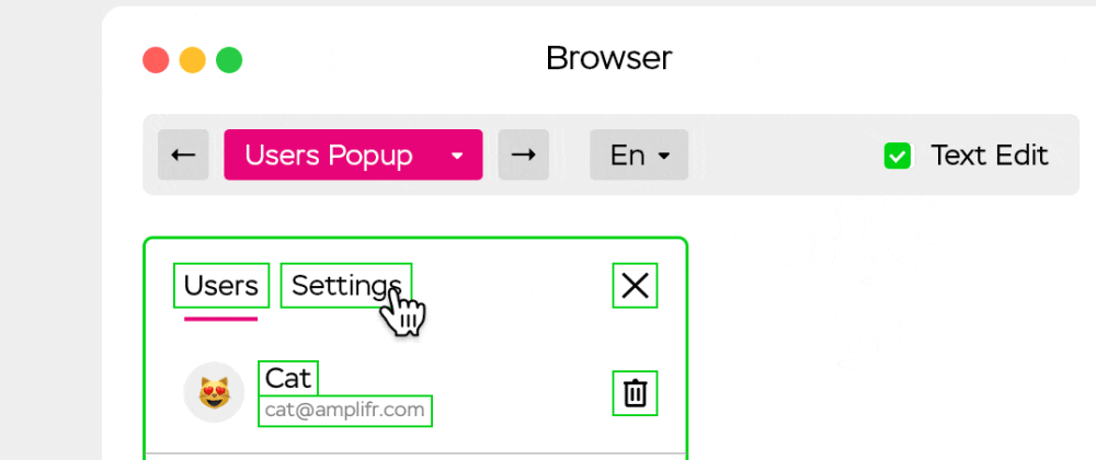
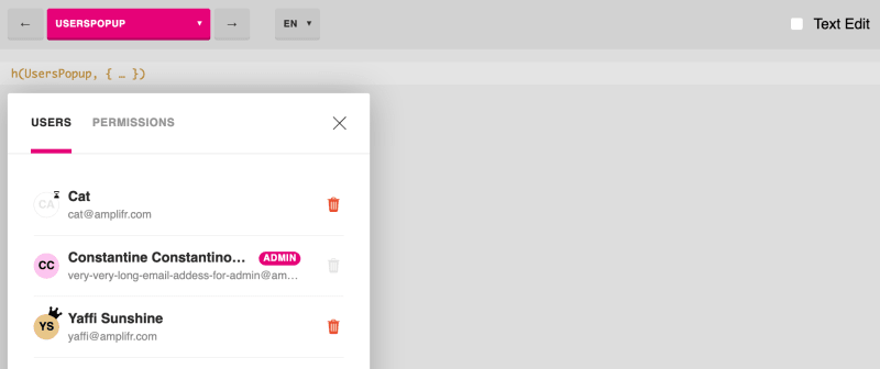
- Managers see that even a popup that seems simple at first glance can contain a bunch of boundary states that developers have to take into account—this helps them better understand the design of the product.
- Editors can check texts in real components using the Live Text Editing mode to make it look flawless.
Uibook in comparison with analogs

There are Storybook, Styleguidist, and other similar solutions exist, but Uibook takes a different approach. I can point to three main differences:
- Uibook supports media queries components out-of-box to check components in the mobile state.
- Uibook does not require a separate builder and easily integrates to an existing project.
- I suppose that your Uibook tests will be publicly available to your customers. Any user can find bugs and leave feedback.
We needed a tool for visual testing mainly, not for development, although developing UI components in Uibook is also convenient. Did you need to make global changes to the project? Run through all the Pages to make sure that all the components are displayed correctly.
Technical implementation
Uibook is a React application. Developer creates a Page—this is a file in particular format with all states of Component. A single state is called Case. Each Case contains props for the Component or JSX if you want to describe a complicated case. You can also define screen width and height for each Case.
Uibook renders the selected Page on the screen using two controllers: with and without media requests.
Since it is impossible to emulate media queries with CSS and JavaScript, we decided to render the Component inside an <iframe>, if the user has specified the width or height of the screen.
The main Controller optionally puts the Component in a user’s wrapper. It allows the user to select values passed to the wrapper in the top navigation bar. The root controller also adds hotkeys and Live Text Edit mode.
I didn't want to have separate bundlers for the project and visual testing. In the other case you have to store more files and dependencies. It takes more time to configure, to run, to build, and to deploy. Uibook integrates into the project’s builder as a Webpack plugin:
plugins: [
 …
 new UibookPlugin({
   controller: path.join(__dirname, '../controllers/uibook.js')
 })
]
webpack.config.js
Uibook adds a separate chunk and does not increase the size of the main application. It works using the webpack’s SingleEntryPlugin or MultiEntryPlugin. It includes CSS and scripts from the main application taking into account the cache buster. Here's how the plugin gets the list of files:
 let files = compilation.chunks.find(function (i) {
   return i.name === 'uibook'
 }).files
The next step is to generate an HTML file. Uibook doesn’t use extra dependencies on this step, because it is easy to do: take a template, add imports, add it to the output:
compilation.assets[outputPath + '/index.html'] = { … }
It’s necessary to exclude uibook chunk if you have HtmlWebpackPlugin. Uibook will nicely remind you, because DX matters.

Uibook is very simple
There are only three dependencies: React, Webpack, and create-react-class. It is written in ES5, so it will work even if you don't have a Babel in your project. Also, Uibook has built-in hints if there is something wrong with the configuration file.

Uibook is flexible

You can wrap all the components in your Controller. It might be a wrapper for Redux, Context, or both. Here is an example with a new Context API:
export default UibookStarter({
 wrapper: (children, props) =>
   <Context.Provider value={ props }>
     { children }
   </Context.Provider>,
 values: {
   locale: ['en', 'de'],
   theme: ['dark', 'light']
 },
 …
})
Uibook displays the list of user keys and their values in the top navigation menu.
How to integrate Uibook into a project
For example, we want to add the Button Component (src/button.js) to Uibook. We need to install the uibook package first, then create a Controller file and a Page file. The Controller is used to import all your Uibook tests, and the Page is a set of Cases, or combinations of parameters for the Component.
Here's how to do it:
- Let's get started,
npm install uibook --save; - You can use
npm init uibookcommand here to create example files, or you can do everything manually. You’ll get the following structure:
your-project
├── uibook
│   ├── button.uibook.js
│   └── uibook-controller.js
├── src
│   └── button.js
├── webpack.config.js
└── package.json
- Add the plugin in the Webpack configuration file:
webpack.config.js
let UibookPlugin = require('uibook/plugin')

module.exports = {
 …
 plugins: [
   new UibookPlugin({
     controller: path.join(__dirname, '../src/uibook-controller.js'),
   })
 ],
}
- Let's write the test (or Page) in
uibook/button.uibook.js. If you have taken advantage of ainitcommand, you have this example already:
import UibookCase from 'uibook/case'
import Button from '../src/button.js'

const PROPS = {
 onClick: UibookCase.event('onClick')
}

const ButtonUibook = {
 component: Button,
 name: 'Button',
 cases: [
     () => <UibookCase props={{ ...PROPS, isLarge: true }}>
       Large Button
     </UibookCase>,
     () => <UibookCase props={{ ...PROPS, isDisabled: true }}>
       Disabled Button
     </UibookCase>
 ]
}

export default ButtonUibook
- Import and pass this Uibook Page to the Controller:
import UibookStarter from 'uibook/starter'
import ButtonUibook from './button.uibook'

export default UibookStarter({
 pages: {
   Button: ButtonUibook,
 }
})
- Done! You can start the project as usual (for example,
npm run start) and open/uibookin a browser. You’ll see three Cases with the Button (if you have a component/src/button.js, of course):

How does Uibook help us?
We've been using Uibook in our workplace for over a year. The front-end developer creates new components through Uibook only, simultaneously creating a test file with boundary props. This is much faster than writing a Controller to see the component in a real web application. Moreover, you can use this test file for further visual testing after any global changes.
Andrey Sitnik, front-end lead at Evil Martians, stopped worrying about node_modules updates after their migration to Uibook:
Uibook finally gave us confidence that
normalize.cssupdate will not break anything. Uibook gives me a way to see all components in all states in a row.@mediasupport helps a lot in this task. We can see all the states on a single page. Developers have fewer worries, and managers see fewer bugs. Everyone is happy.
It also simplifies the whole testing process. When a developer needs to create a React component they create a Uibook page with all possible props. You can start testing UI before internal business logic (smart components, store or sagas) will be written. And you can deploy the component without importing it into the main application.
Other developers review the component using local or production Uibook. They can click on all the buttons and check that it calls the callback.
Damir Melnikov, front-end developer at Amplifr, likes how Uibook improves the communication process between designers and editors:
Uibook allows me to create and modify components quickly. I can check new styles, check the mobile version, check the component in different boundary conditions. Besides, Uibook allows you to instantly share your work with the designer, content editors, and other front-end developers.
Alexander Marfitsin, the content-lead in Amplifr, notices how Uibook has the process of interface text writing:
When writing interface texts, you often work blindly and do not see how the content in the "live" product will look. Uibook solves this problem. You can proofread content both in existing components and in new ones by trying it in a real interface. All text elements are editable so that you can get a complete result—from the title to the smallest label.
Also, you better understand the product and the importance of good text for the interface with Uibook.
⌘⌘⌘
I hope that you decide to try Uibook, and that you can see firsthand how it may enhance your project. If you have any questions, please refer to the detailed instructions in the Github repository. Or tweet/email me.


Top comments (1)
I use Storybook at work but this looks pretty cool with the media queries! I might give it a go on a side project sometime.