Recently, I posted an article about how I created a copy of Red Onion’s The Daily Prophet using CSS flexbox. And since I started learning CSS grid, I decided to implement it again by using the two layout modules along with the multi-columns layout.
However, before we dive right into it, let me make this clarification first cause I think it’s really important.
The next day after posting my previous article, I stumbled upon a post from Smashing Magazine about flexbox and I realized there’s one important aspect of the flex-direction that I completely misunderstood. I thought the rows will always start from left to right. And guess what, not always.
The rows and columns are displayed depending on the writing mode that you’re working with, not the physical dimensions of the screen.
So if you’re working with English, it uses the default writing mode which is horizontal-tb which means content flows horizontally from left to right, vertically from top to bottom. The next horizontal line is positioned below the previous line.
However if you’re working with other languages that uses a different writing mode like Hebrew and Arabic which are written right to left then your flex items would start at the right. Or if the writing mode is top-to-bottom, then your row items would be displayed like a column.
Okay now that’s done, let’s start.
Since I've mostly talked about flexbox before, let's take a closer look on the usage of the grid layout.
Using the grid layout and flexbox together
How do I decide when to use grid or flexbox? Actually, it's simple.
I make use of CSS grid when dealing with two-dimensional sections (both row and column, for example the main stories section).
Flexbox for simple one-dimensional sections (only row OR column, like the publication name section) and for the alignment of text and elements.
Dividing columns
To specify the number (and the widths) of columns in a grid container, you have to use the grid-template-columns property.
Let’s take a look at the main story section.
As you can see, the story’s left content takes three-fourth (3/4) of the section while the right part takes one-fourth (1/4) of it.
At first I declared grid-template-columns with a value of 1fr 250px but when I made the screen smaller, the left part’s content gets squished. The reason is that the right part will always take 250px of the grid parent while the left part will take the remaining available space since I declared it with a fr value (fraction of the free space).
So I modified it to this:
<div class="story--main">
  <div class="section--left">
  </div>
  <div class="section--right">
    </div>
</div>

.story--main {
  display: grid;
  grid-template-columns: 3fr 1fr;
}

.story--main .section--left {}
.story--main .section--right {}
3fr 1fr means the left part will always take three-fourth of the available space and one-fourth will be given to the right part. This also means that whenever you resize the viewport, the columns will automatically adjust their widths depending on the size of the grid parent.
Making the page responsive
The previous flexbox exercise that I made is not responsive but this time, I took care of the responsiveness by using media queries and manipulating the value of grid-template-columns on specific viewport sizes.
.parent {
        display: grid;
        grid-template-columns: repeat(2, 1fr);
        gap: 10px;

        @media (min-width: 768px) {
          & {
            grid-template-columns: repeat(6, 1fr);
          }
        }
}
In the example above, on iPad and desktop view, the columns would be displayed in this manner.

While on mobile, since I specified it as repeat(2, 1fr), it would be displayed like this.

repeat()
Instead of writing grid-template-columns: 1fr 1fr 1fr 1fr 1fr 1fr; which is very repetitive, you can use the repeat() function so repeat(6, 1fr) will repeat the specified width 6 times thus producing the same result.
I’ve also used repeat(auto-fill, minmax(min, max)) in some of the sections for automatically calculating the number of repetitions.
Actually, I’m confused about what is the difference between auto-fill and auto-fit. If anyone knows, please let me know.:D
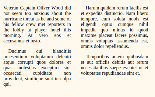
Using multi-columns layout for sections that only contains text
For some sections that only contains text separated by columns, instead of using grid or flexbox I decided to use another existing layout module called multi-columns layout to produce the same effect.
<div class="paragraphs_wrapper">
 <p>Veteran Captain Oliver Wood did not seem too anxious about the hurricane threat.</p>
 <p>Ducimus qui blanditiis praesentium voluptatum delenit.</p>
 <p>Harum quidem rerum facilis est et expedita distinctio. Nam libero tempore, cum soluta nobis est eligendi optio.</p>
</div>

.paragraphs_wrapper {
  column-count: 2;
}

.paragrahps_wrapper {
  p {
    // to ensure that the paragraph will not be broken into two columns
    page-break-inside: avoid;
    break-inside: avoid;
  }
}
Which produces this result.
Conclusion
Using all of these layout modules together helped me understand what kind of scenarios they are most useful of and how to utilize each of its strength to make even better pages. I'm so excited to the possibilities.
Thanks for reading and you can check the page @CodePen.
Have any feedback/comments, please let me know.
*The Daily Prophet copyrights reserved to Red Onion.


Top comments (6)
Thanks for the great article!
About the differences between auto-fill and auto-fit, I agree it’s tricky to remember. As much for myself as for anyone else, I’ve tried to write down an explanation:
Auto-fill: trying to fill the container with as many tracks as possible.
grid-template-columns: repeat(auto-fill, 200px);If the width is set to a specific value like for example 200px, there might be a gap at the end of the row since the last item won’t fit and that item will be placed on a second row.
If one would like the items to be at least 200px, but take up remaining space distributed evenly among them in order to prevent gaps, one can use
grid-template-columns: repeat(auto-fill, minmax(200px, 1fr));However, when the grid container gets wider, there might still be a gap at the end of the row because the grid is being filled up with generated tracks.
Auto-fit: tries to fit items into the container.
grid-template-columns: repeat(auto-fit, minmax(200px, 1fr));the items will always stretch to make use of the full width of the container, and be at least 200px wide.grid-template-columns: repeat(auto-fit, 200px);yields a very similar layout to its auto-fill counterpart, however no extra tracks are being created.Very cool. I learned something new--the multi-column layout.
I know this post has been published for a while. But, I thought you should still know. I noticed a small typo.
Should be
Thanks for sharing! :-)
Your article gives great insights into the flex layout. Much helpful for my work as well. Keep doing 👍
Thanks @ruphaa, I'm glad I could help. I'm gonna keep experimenting further with these layout modules and will surely share what I learned here.
What were you using to learn Grid? I'm just delving into learning Grid to combine with Flex at work and am always looking for good stuff. Probably going to give Wes Bos' course a go :)
I usually read blog posts about it and then apply what I learned by creating some stuff on Codepen. In that way, I really soaked it in.
I also look up the MDN docs but sometimes I find it a bit confusing and hard to understand so I go to Smashing Mag cause their articles are usually very detailed which helped me understand it better.
They have released quite a lot of post series as well covering not just css grid and flexbox but also other layout modules available in the new specifications. You should check it out, you won't probably even need to take an online course after you read them unless of course if the course offers really advanced techniques on how to use it. So far, I haven't taken an online course about it yet but now that you mentioned it, I'll check out the available courses as well.:D
Also, writing about it helped me understand the concepts even better.:)
Update [Sep 18]: I discuss it with my senior as well so that also helps.