
In case it helped :)

We will cover briefly about
- Jetpack Compose
- Create a Custom Card field
- Using state in the custom card
Note: Jetpack Compose or Compose are the same.
Jetpack Compose
As per the documentation,
Jetpack Compose is Android’s modern toolkit for building native UI. It simplifies and accelerates UI development on Android.
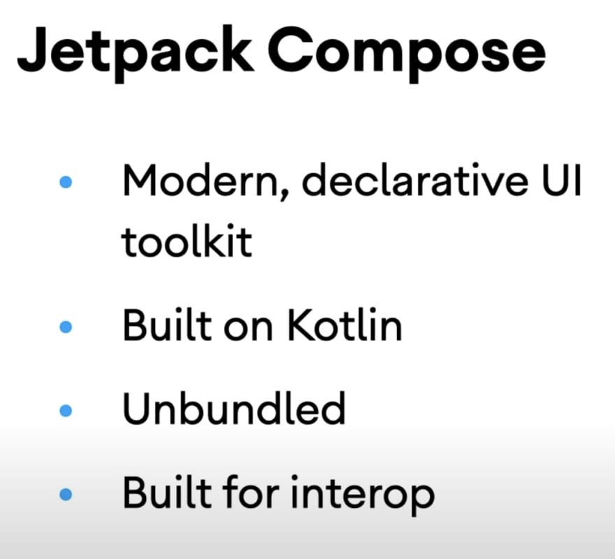
- Compose makes building Android UIs faster and easier
- There is no need to edit the XML layouts
- Instead, use the Compose functions for the elements you want and see them change in the preview.
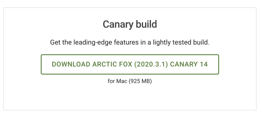
Setup
- As of today, when I write this article, Compose is still in beta
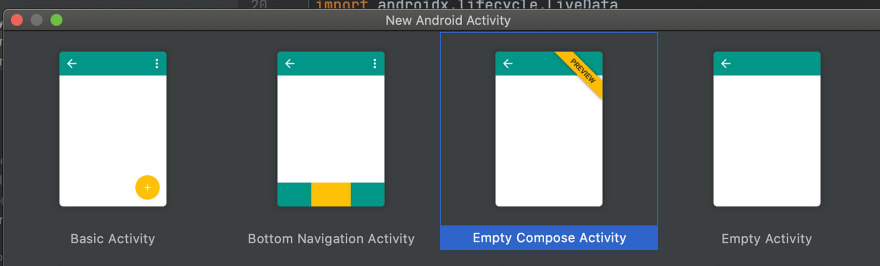
- You need to download Android Studio 4.2 Canary
- Once downloaded, create a new project. Now you would see a new option of Empty Compose Activity -> then Finish (create as per the default settings)
- Notice, there is no
activity_main.xmllayout. - Your main activity extends a Component Activity, instead of the AppCompatActivity.
- Open your module gradle file and notice
buildFeatures {
    compose true
}
- Check the dependencies inside the dependencies section
implementation "androidx.compose.ui:ui:$compose_version"
implementation "androidx.compose.material:material:$compose_version"
implementation "androidx.compose.ui:ui-tooling:$compose_version"

// Can have some extra also
Custom Card Field Using Compose
- In the MainActivity, you would see something like this
setContent {
    HandsOnKotlinTheme {
         Surface(color = MaterialTheme.colors.background) {
              // YOUR COMPONENTS
         }
    }
}
Note: HandsOnKotlinTheme is a variable name, that depends upon the name of your project, (in my case HandsOnKotlin)
anything inside setContent, becomes the root view of the activity
surface: A container influenced by material design, over which you design your UI.
- For making custom card, we create a composable function. Composable functions (marked with
@ Composable), are the building blocks of an application built with Compose
@Composable
fun CreateCustomCard(
    title: String,
    checkboxState: Boolean,
    onCheckboxPressed: ((Boolean) -> Unit)?
) {
    Row(
        modifier = Modifier.padding(4.dp),
        verticalAlignment = Alignment.CenterVertically
    ) {
    Checkbox(
        checked = checkboxState,
        onCheckedChange = onCheckboxPressed,
    )
    Spacer(modifier = Modifier.padding(end = 4.dp))
    Text(text = title)
  }
}
modifier: Allow you to decorate a composable
Row, Checkbox, Spacer, Text: Pre-defined composable functions
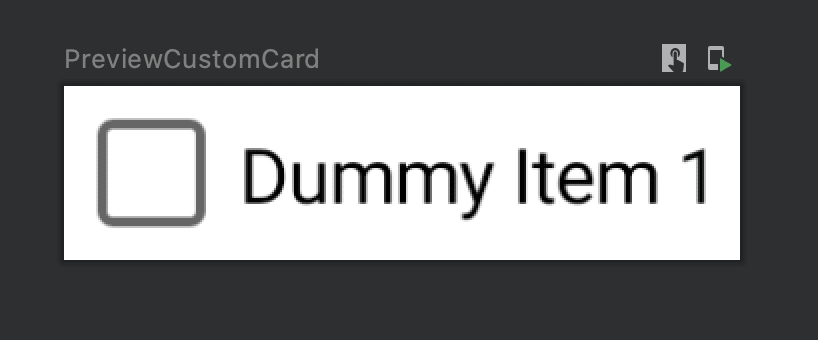
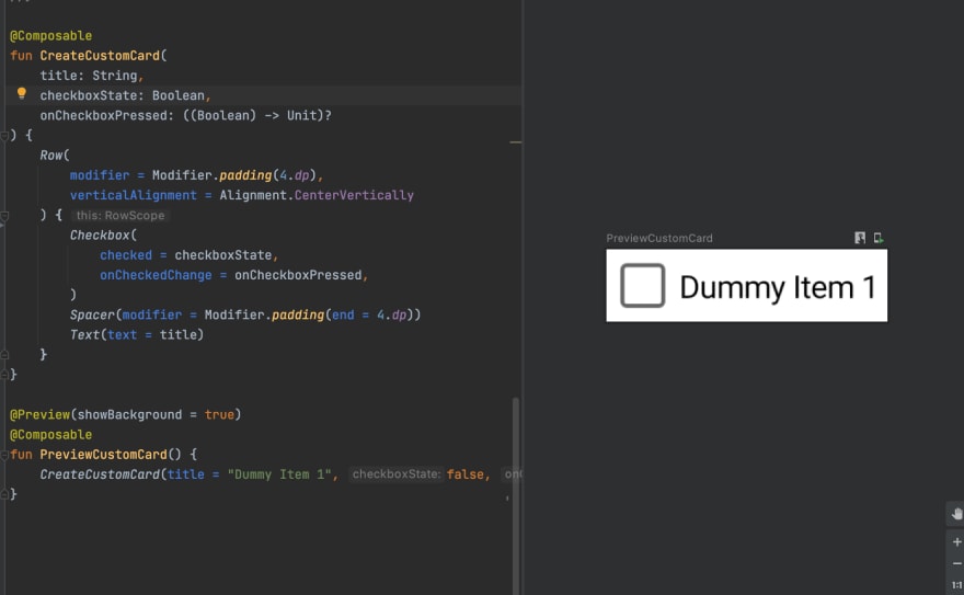
- You can preview a composable by writing another function and marking with
@ Previewand@ Composable
@Preview(showBackground = true)
@Composable
fun PreviewCustomCard() {
    CreateCustomCard(title = "Dummy Item 1", false, null)
}
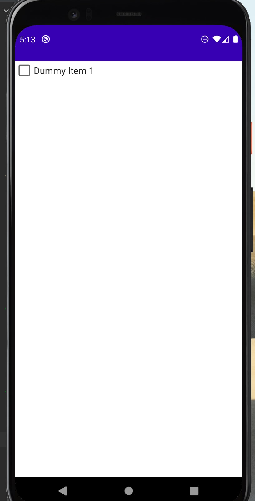
- Now put your CreateCustomCard inside the surface and run your app
Surface(color = MaterialTheme.colors.background) {
    CreateCustomCard(title = "Dummy Item 1", false, {})
}
Using state in the custom card
Our checkbox would have a state in which it can either be checked (true) or unchecked (false).
We will look into 4 approaches, for saving state.
Approach 1 (Remember)
Inside our createCustomCard, lets define a variable like this
val checkboxState = remember { mutableStateOf(false) }
- We will use the value from the checkboxState and assign to checkbox composable
// The lines with Row remain same, and won't be shown in next snippets
Row(
     modifier = Modifier.padding(4.dp),
     verticalAlignment = Alignment.CenterVertically
) {
     // Approach 1
     val checkboxState = remember { mutableStateOf(false) }

     Checkbox(
         checked = checkboxState.value,
         onCheckedChange = {checkboxState.value = it},
     )
     Spacer(modifier = Modifier.padding(end = 4.dp))
     Text(text = title)
}
- Any change in the value of checkboxState will trigger recomposition (rebuild of component)
Drawbacks:
- The state won’t be retained across configuration changes (landscape/portrait)
- Our composable is coupled with the business logic
Approach 2 (RememberSaveable)
Inside our createCustomCard, initialise our checkboxState like
val checkboxState = rememberSaveable() { mutableStateOf(false) }
Rest remains the same as Approach 1
rememberSaveable: saves the state across configuration changes
Drawbacks:
- Still our composable is coupled with business logic
Approach 3 (State Hoisting)
State hoisting is a programming pattern where you move the state of a composable to the caller of that composable.
Extract the params, checkboxState and the onCheckboxChange from the CreateCustomCard and create a new composable (CustomCardState)
//Approach 3: State Hoisting
@Composable
fun CustomCardState() {
   val checkboxState = rememberSaveable { mutableStateOf(false) }

   CreateCustomCard(
        title = "Dummy Item 1",
        checkboxState.value
   ) { checkboxState.value = it }
}
and our CreateCustomCard looks like
fun CreateCustomCard(
    title: String,
    checkboxState: Boolean,
    onCheckboxPressed: ((Boolean) -> Unit)?
) {
    Row(
        modifier = Modifier.padding(4.dp),
        verticalAlignment = Alignment.CenterVertically
    ) {
    Checkbox(
        checked = checkboxState,
        onCheckedChange = onCheckboxPressed,
    )
    Spacer(modifier = Modifier.padding(end = 4.dp))
    Text(text = title)
  }
}
- This way our composable is decoupled from logic, hence the createCustomCard can be tested and reused.
Note: In case of any errors try importing (below) in app.gradle
implementation "androidx.compose.runtime:runtime-livedata:$compose_version"
implementation "androidx.lifecycle:lifecycle-viewmodel-compose:1.0.0-alpha02"
Approach 4 (ViewModel)
- You can use the
ViewModelto expose the state in an observable holder (likeLiveData) and also to handle events that affect that state. - We implement a ViewModel
// Approach 4: ViewModel
class CheckedViewModel : ViewModel() {

private val _isDone : MutableLiveData<Boolean> =  MutableLiveData(false)

    val isDone : LiveData<Boolean> = _isDone

    fun onCheckboxChange(state:Boolean) {
        _isDone.value = state
    }
}
- isDone: LiveData that holds the current state.
- onCheckboxChange: event we define that the UI can invoke.
- Our CustomCardState (defined in approach 3) looks like
@Composable
fun CustomCardState(itemViewModel: CheckedViewModel) {
   val state : Boolean by itemViewModel.isDone.observeAsState(false)

   CreateCustomCard(
        title = "Dummy Item 1",
        state
   ) { itemViewModel.onCheckboxChange(it) }
}
- observeAsState: Observes a LiveData (isDone) and returns a state that is updated whenever the LiveData changes (using the onCheckboxChange)
Note : In case of any errors, try importing (below) in MainActivity
import androidx.compose.runtime.getValue
Calling from Activity
- We create a variable itemViewModel and assign its value inside onCreate
private lateinit var itemViewModel: CheckedViewModel
override fun onCreate(savedInstanceState: Bundle?) {
     super.onCreate(savedInstanceState)
     itemViewModel = CheckedViewModel()

     setContent {
         // LINES OMITTED
         CustomCardState(itemViewModel)
     }
}
Bonus: Showing a toast
- Since, we are using a viewmodel, we can observe the value
isDone - If the value is true, then we show the toast
itemViewModel.isDone.observe(this, { status ->
     if(status) {
         // Show toast
     }
})
In case it helped :)


Top comments (0)