I just recently published a Gatsby resume starter with Netlify CMS. Links for demo and the source code down below. It was my first time using Netlify CMS. So this post will be about Netlify CMS and its cool widgets.
Netlify CMS
First of all, if you haven't heard about it yet, Netlify CMS is an open-source React app that lets you edit content and data files in your Git repository. It works perfectly with static site generators like Gatsby, Hugo. In my opinion, the best free solution for content management in JamStack.
Most of the posts I saw about Netlify CMS are about creating and editing blogs though it offers enough flexibility that you can use it for updating your content (what I used in resume starter) or even changing the look and feel of your website.
I am not going to go through how to set it up or configure as Netlify CMS docs pretty good. I will concentrate on the collections and widgets from my implementation.
Collections
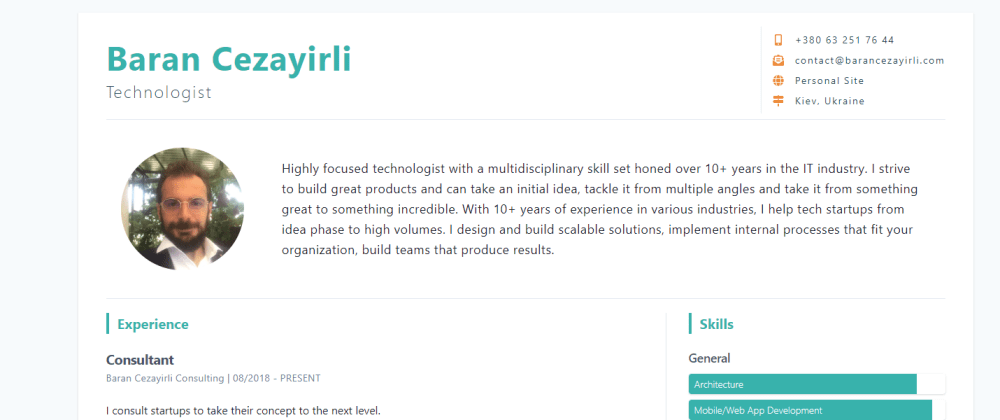
Collections are the heart of the Netlify CMS. They are responsible for determining the type of content that CMS manages. A collection can create or modify files. In my starter template, the content collection is modifying a JSON file that is generating the resume of the user.
collections:
  - name: content
    label: Content
    files:
      - label: Resume
        name: resume
        file: "data/profile.json"
        fields:
          - { label: "Full Name", name: fullname, widget: string }
          - { label: Role, name: role, widget: string }
          - { label: Summary, name: summary, widget: text }
          - label: Contact
            name: contact
            widget: object
            fields:
              - { label: Phone, name: phone, widget: string, required: false }
              - { label: Email, name: email, widget: string, required: false }
              - { label: Website, name: website, widget: string, required: false }
              - { label: location, name: location, widget: string, required: false }
          - label: "Social Media"
            name: social
            widget: list
            required: false
            fields:
              - { label: Service, name: service, widget: select, options: [linkedin, twitter, facebook, youtube, instagram, behance, github, dribbble, angellist]}
              - { label: URL, name: url, widget: string }
          - label: Experience
            name: experience
            widget: list
            required: false
            fields:
              - { label: Role, name: role, widget: string }
              - { label: Company, name: company, widget: string }
              - { label: Description, name: description, widget: text }
              - { label: "Start date", name: start, widget: date, format: 'MM/YYYY' }
              - { label: "End date", name: end, widget: date, required: false, format: 'MM/YYYY' }
          - label: Projects
            name: projects
            widget: list
            required: false
            fields:
              - { label: Name, name: name, widget: string }
              - { label: Company, name: company, widget: string }
              - { label: Description, name: description, widget: text }
              - { label: Link, name: link, widget: string }
          - label: Skills
            name: skills
            widget: list
            required: false
            fields:
              - { label: Title, name: title, widget: string }
              - { label: Type, name: type, widget: select, options: [percent, tag, list] }
              - label: Subskills
                name: subskills
                widget: list
                fields:
                  - { label: Name, name: name, widget: string }
                  - { label: Percent, name: percent, widget: number, required: false }
          - label: Education
            name: education
            widget: list
            required: false
            fields:
              - { label: Institution, name: institution, widget: string }
              - { label: Degree, name: degree, widget: string }
              - { label: "Start date", name: start, widget: date, format: 'YYYY' }
              - { label: "End date", name: end, widget: date, required: false, format: 'YYYY' }
          - label: "Sidebar lists"
            name: sidebar
            widget: list
            required: false
            fields:
              - { label: Title, name: title, widget: string }
              - { label: Items, name: items, widget: list, field: { label: item, name: item, widget: string } }
It may look scary if you haven't worked with Netlify CMS before. I will walk you through important parts.
Let's start with 3rd line files, I just mentioned that you can either create new content or modify it. These options called collection types. On this snippet, the content collection is modifying the profile.json file under the data directory. You define the data structure with fields and set the type of data via widgets.
Widgets
Netlify CMS comes with 16 default widgets. It is also possible to add custom widgets to the app. Let's take a look at some examples from the code (If you want to read about all components and data structure that make up the starter you can check it in my site here.
String widget => - { label: "Full Name", name: fullname, widget: string }
Each field has a label, which determines what will be shown in CMS UI, name that is the key to that field and widget is the UI component that will be responsible to output the value of that field.
String widget renders a text input field, Fields like name, role, company name in experience array all use string widget to get input from the user.
Text widget => - { label: Summary, name: summary, widget: text }
Text displays a text area instead of text input. Fields like summary, project description that has potentially longer content would benefit from a text area rather than text input.
Object widget
- label: Contact
  name: contact
  widget: object
  fields:
    - { label: Phone, name: phone, widget: string, required: false }
    - { label: Email, name: email, widget: string, required: false }
    - { label: Website, name: website, widget: string, required: false }
    - { label: location, name: location, widget: string, required: false }
The object widget allows you to group multiple widgets, nested under a single field. In the resume starter, In the starter, the top-right contact section has multiple contact options to display. Object widget allows users to see these options in UI.
The required field makes a field optional. By default, each field you define is required.
List Widget
- label: "Social Media"
  name: social
  widget: list
  required: false
  fields:
    - { label: Service, name: service, widget: select, options: [linkedin,
      twitter, facebook, youtube, instagram, angellist] }
    - { label: URL, name: url, widget: string }
List widget allows you to add an array of repeatable items in UI. Starter uses it in most of the data as skills, projects, experience all are repeated items that are rendered by their corresponding components.
Select Widget => - { label: Type, name: type, widget: select, options: [percent, tag, list] }
The select widget displays Select input in UI. I used this widget in several places. The skills section in the starter has three types of lists, the implementation allows users to combine different types of presentations and not to worry about what type they should set.
Conclusion
In this post, I just skim through what Netlify CMS is capable of and walk through how I used it. If you have any questions, please feel free to ask here or in twitter. And you can check out the starter here.


Top comments (0)