When I magnify a window in Chrome, I see an icon like this:

When I reduce the size of a window below it's normal 100% I get this:

Clicking either of those icons gives me options for modifying the magnification level.
On DEV when I am following someone I see this button. Clicking it makes me "unfollow" them.

We're inconsistent in our UI in that we treat the home page "save" button differently by offering a hover state which indicates the intended action.
As we seek to make this behavior consistent, I'm curious what you consider to be fundamentally correct behavior. This situation is handled differently across the web but I'm curious if anyone feels like there is a true best practice.
All comments on the subject are super appreciated!


Top comments (60)
In my experience, the button should convey the action. Although the button says Following, that does not indicate what it should do. If we take a page from Twitter's UX, hovering over the button when it says Following, changes the text to Unfollow, the intended action. So I think it's OK to show the current state potentially, but in the end before it's pressed, it should convey the actual action about to happen.
Update... Just adding this comment here as I forgot to mention mobile
Good point about touch/mobile with hover. I should have took a bit more time before answering. 🙃
Looks like Twitter on mobile just shows Following and when you click it, you get the same prompt as desktop prompting you to make sure you really want to unfollow. I agree having just unfollow text would have made sense here like you suggest.
What about touch devices? They don't have hover effects.
This is a huge part of mobile UI that I think a lot of people overlook if they're more focused on desktop. I think you should always design as though hover is not an option, only using it to add extra clarity, but not relying on it to convey the meaning of a button, etc.
I answered it here.
Good point about touch/mobile with hover. I should have took a bit more time before answering. 🙃
Looks like Twitter on mobile just shows Following and when you click it, you get the same prompt as desktop prompting you to make sure you really want to unfollow. I agree having just unfollow text would have made sense here like you suggest.
What is interesting is that with Twitter, even as something as non-destructive as unfollowing someone, they prompt to confirm so even if you didn't understand the meaning of the button, you've got a second chance with a more complete description.
The
unfollowon Twitter can be pretty destructive, in that if you unfollow somewhat who is private, you have to request permission to follow again (so it's very clear to that person that you unfollowed). I'm a fan of any action that can be difficult to redo easily (or may have unintended consequences) getting a two step confirmation.Well, at least they prompt you before you unfollow.
That's no surprise, as Twitter focuses on maximizing engagement from its users.
They really don't want you to unfollow anyone. 🙈
They now even prompt you what the handles you follow like and follow themselves... Quite annoying. 🙄
Here's an example of the worst possible combination of things, courtesy of Quora:
It says "Follow", but that's not an action, because the tiny tick indicates I'm already following. I have no idea what happens if I click on "All notifs" and don't want to try.
This. Confuses me every time.
I thought exactly the same example about Twitter. I think it is always good to convey the action. When I see a "Following" button I somewhat feel that I spend a split of second to understand that it is a button and it may be used to unfollow someone. On Twitter if you hover over it you have no doubt about it. However, this is not true for the app which makes me think what we can do to convey the action and state at the same time on mobile apps.
I expect a button to tell me what will happen if I click. For example, as I write this, I have two choices:
PrevieworSubmit.Both of those are very clear as to what the action will do. (Although clickingpreviewchanges the button tomarkdownwhich I actually find confusing. I expected something more likeedit. )To be honest, I didn't know that
Followingwas a button that would unfollow. 😳 There's nothing about it that indicates to me visually that I can click on it. The+ Followis more clear, mainly because of the+.The
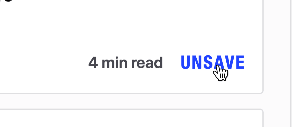
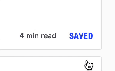
unsavehover over I find really confusing. What does that mean? I don't know how youunsavesomething, unless it means it's going to be deleted.This is an interesting topic. I had an argument with a designer regarding this sometime ago. Personally I think if its a simple toggle which turns something on/off indicated by an icon, I would prefer showing the
current state.If its something which requires a call to action and includes some text (which you could/couldn't cancel in the future) , I prefer showing the
intended behaviorBased on how confusing I find my iPhone mute toggle button, I am leaning toward the idea that buttons that have no text (are they always toggles?) should be different from text-based buttons. Icon toggle buttons seem to make more sense to me when they are, as you say, showing the current state. Then again, play/pause, if it’s one button that toggles, would make more sense to me in the normal way, where the play button means I want to play, not that it’s already playing.
I remember seeing something similar about toggle states on the UX Stack Exchange site. That question/answer talk about on/off options and indicating state etc.
While it is super convenient in one way to have the button be dual purposed, it is probably better to give more distinct actions and have them be more discoverable.
It might take up more space but maybe more:
("Saved." would be text, "Undo" would be a link)
That way you give both the current state and the desired action.
With the following button, I do think you have more flexibility with it simply because of the ubiquity of that type of button across other systems (Twitter etc).
A toggle should show a current state. A button should show an action.
When the button shows a current state, it stops being a button, and becomes a sort of a tag. Whether alternating between a tag and a button on hover is good user experience - is quite subjective. Users might not realize that a tag could be actually clickable or would become a button on hover. Moreover, it is even less intuitive on mobile, because there is no such thing as hovering.
Most of the time the actions can also convey the current state. For example,
Unsubscribebutton would imply that the current state isSubscribed. I don't personally think that the users really need an extra confirmation describing the state in that part of the UI. Perhaps another UI is needed to list all user subscriptions and allow them to manage them all in one place, maybe something like a "SUBSCRIPTIONS" section on YouTube.What we have here is a blend of different paradigms: button and checkbox. In the cases you mentioned here, the button is actually not representing a singular action, but instead a dual-state or in case of the zoom a multi-state switch.
The ideal solution would be a component that conveys both its present state and its future state in an understandable way. In case of the follow-button, this would probably be something like a Checkbox button
[✓] FOLLOWING
[ ] FOLLOWING
The checkbox conveys that this element has a state that could be toggled rather than singularly selected.
There's a tension between screen real-estate and clarity of function. The "state button" takes up less space than the switch or checkbox, but it can be unclear what the current state is, because of the blending of paradigms that you mention.
I would say that I am on team "action". I think a button should indicate what will happen if you click it. For the "Following" button, you could rename it "Unfollow".
I think the hover behaviour @nickytonline mentioned is okay for desktop, but that wouldn't really work for a touch interface. I'd suggest the default should be "Follow" and "Unfollow". Then you could optionally add the fancier "Following" with "Unfollow" when hovering over the button for desktop devices.
One tricky case I've run across though is a toggle for muting. On my iPhone, it shows a speaker with a slash through it when the sound is not muted, and a normal speaker when the sound is muted. That's consistent with what I've said above, but it's actually very confusing to me in practice. It seems to make more intuitive sense to me that the speaker with the slash indicates that the sound is currently off.
Good point about touch/mobile with hover. I should have took a bit more time before answering. 🙃
Looks like Twitter on mobile just shows Following and when you click it, you get the same prompt as desktop prompting you to make sure you really want to unfollow. I agree having just unfollow text would have made sense here like you suggest.
The button should describe the action to be performed. Use a separate label or some other indicator to show the current state.
As a demonstration, most video conferencing apps confuse me with their "mute" button. I'll see a full mic and I'm never quite sure if it means "my mic is currently on" or "click me to turn your mic on". Since they almost always act as both the action and the indication of state, I'm left always worried that I misread the UI and am actually unmuted when I think I'm muted.
Another thought: if a button is intended to convey both state and action, it should be designed as a switch. A switch cognitively makes it clear whether it's on or not, and also indicates an action can be taken. Here, I would expect the switch's text label to indicate the current state, with the switch's own appearance, together with the label for the current state, implying what will happen when I click the switch.
I don't think the label for switches should change between states. That is always something that confuses me:
[ON] Do something[OFF] Don't do somethingWhen seeing the first it's clear: right now "do something" is on, so it'll be done. But the second isn't: "don't do something" is off - does that mean it will now be done? Or not?
If the text were to stay constant, I can switch "Do something" on or off, which makes it really clear in my opinion.
Also, always use the positive clause to avoid double negations.
Do:
[y/n] do somethingDon't:
[y/n] don't do something.The second could lead to "not don't do something" when read out, which doesn't make much sense. "Yes, do something" and "Not do something" make more sense. :)
a.. Now:
b. Otherwise:
In this case, I am subliminally being told to unfollow you so your current choice seems better.
Like, Unicorn & Save/Bookmark are pretty much 1-2-3 rating system where all three btns do almost the same thing (they could be merged, with a built in bookmark aspect). Then you can have other features.
Follow/unfollow on your profile listings, along with descriptions would be useful (so you can follow or unfollow without having to check each profile).
Something like this seems like a correct behavior to me. Straightforward and simple, though it may seem a bit flashy at some point.
This is the way to go, you may want to add the "result" in the button.
When clicking "+ Follow", jump to the "✓ Following" state.
If you hover again display: "x Unfollow"
This Implementation does not consider Mobile UX, in this case you may want to prompt the user for an action.
Don't. Make. Me. Think!
By this I mean, if it's a "button", always make it clear what pressing it will do.
Find another way to convey state if you can't make the button do both things easily.
Also, if pressing the button is trigging an action that might take time, make it obvious I pressed it and they I'm now waiting.
And if you don't want me to press it again while I'm waiting, disable it.
While you are at it, remember to enable it again if the action was successful and can now be done again or if it failed/times out and can be retried.
Where possible, don't make the button change after I click it to be doing another thing. Find room for another button.
And finally, any actions I might want to preform a lot, let me do them against multiple instances of the item, using some kind of multi-select. Bonus points for a "select all".
One obvious place for this, I would like to be able to find all the people who I can "follow back", and do they all in one go! Not one at a time.
Thanks for listening. As always, my opinions are my own. I am open to updating then if presented with a solid argument.
Totally just my personal opinion, but I think a button should indicate the
intended behavior.The
Followingexample doesn't completely offend me, only cause I know it wasFollow'before' I clicked it (however long ago it was).The
Saveexample here doesn't bother me a ton, mostly because of the hover state + the know theSavebutton used to be there so it makes sense thats where un-save lives tooI think I would change both to their intended action, and maybe use something else to display the
state? :shrug:I second this. In most cases, it seems more clear to show the intended action rather than the current state. My thought on this falls back to what feels natural to the average user. For instance, as I'm typing this on my phone, I see a "Submit" button. I know that clicking it will submit this post. But what if it showed "Not Submitted" instead? Would I know to click it to send it? Probably not. At least not right away. But it's a matter of context as with most things and highly subjective as well. I think I err more on the side of "what buttons are considered the most important/most used, and how do I make it most obvious what their function is? " Keeping them simple and easy to understand, I believe most people will pick up the more intricate buttons through experimentation on their own. Ya know, give them enough to understand basic functionality, but not so much that they lose curiosity. DEV seems to balance that line very well so far.
I definitely think buttons should indicate expected behavior, not state. I think we can apply the single-responsibility principle here! While it is usually not used for UI/UX, it was invented to make code easier to understand for humans. So I think it works just as well for UI/UX.
Therefore I think buttons should say "Save"/"Unsave", "Follow"/"Unfollow",... It is possible to add another item to the UI indicating state: "You are following USER123"/"You are not following USER123." Be careful though to make these really clear.
I think of buttons as function invocations, or requests for action. Something else can then tell me the result.
There might be good exceptions though - as there always are.
Oh, also: I don't think hover effects are enough. If someone is using a touchscreen they don't work, and to others it might not be obvious. When using a keyboard instead of mouse they also don't work. Rather have two different UI elements.
I'd lean towards showing current state for consistency not just across this app but across most apps 'cos that's how my minds expects the UI to be across apps these days.
It could be
Save<=>Savedinstead ofSave<=>UnsaveJakob's Law indicates users expect and prefer a similar pattern across the internet.
nngroup.com/videos/jakobs-law-inte...
For example:
1 billion people on instagram are used to seeing this functionality with that saved icon, and possibly majority of us experienced instagram UI. We can make it easier for users to not guess the UI of same functionality and make it quick for them to start.
thepracticaldev.s3.amazonaws.com/i...