Selectors and Rulesets
CSS stylesheets are composed of a series of rulesets, which describe how the browser should style a particular element. They are made up of a selector (which is what the browser uses to determine which elements the ruleset should be applied to) and one or more sets of properties and values. A property is an aspect of the element that can be changed (such as the colour or font) and the value is what that property should be set to (e.g. red or Times New Roman). Consider a simple example:
p {
    color: red;
}
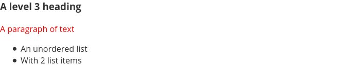
This simple ruleset will set all p elements on the page to have the colour1 red. Here, p is the selector and refers to all p elements on the page; the opening and closing curly braces {} enclose the ruleset; color is the property; and red is the value, following the property after a colon : and ending in a semi-colon ;.
When applied to some sample elements this ruleset would have the following effect:
Any property/value pairs defined inside of the ruleset will be applied to all elements that match the selector, so if we wanted to also set the font of paragraphs to Times New Roman we could add that property to the ruleset like so:
p {
    color: red;
    font-family: "Times New Roman", Times, serif;
}
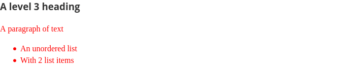
The font-family property accepts a comma separated list of fonts. If the visitor does not have the leftmost font installed on their device, the browser will work its way right until it finds one that is available to use. In the case of the final serif declaration this is a generic family name and a final fallback. All fonts with spaces in their names must also be enclosed in quotation marks.
Our example will now display like this:

What if we wanted to apply our ruleset to more than one type of element? It is quite likely that if we set the colour and font of our paragraphs we might want to also use the same setting on list items. We could create another identical ruleset with a different selector, but CSS also allows use to specify multiple selectors for a single ruleset by separating them with commas, like so:
p, li {
    color: red;
    font-family: "Times New Roman", Times, serif;
}
Which when applied to our example will cause the browser to render it like this:
Inheritance
Any properties that you don't explicitly set values for in a ruleset will instead use the browser defaults2. We can exploit this behaviour to make our styles apply to more elements without adding each one to the selector, as many properties (including the color and font-family properties we have already used) default to a value of inherit.
The inherit value means that the element will take the computed value for that property from its parent. Certain properties in CSS can take a value that includes a calculation. The value that we set in our stylesheets is referred to as the specified value and the value that is actually applied to the element is known as the computed value.
An example of this is when using one of the relative length units. Properties in CSS that accept a length unit, such as the font-size (somewhat confusingly this accepts a length), can either be specified in absolute units, such as pixels px, or relative units such as ems. 1 em is equal to the computed font-size of the parent element.
Lets look at a simple example:
ul {
    font-size: 20px;
}

li {
    font-size: 0.5em;
}
Here, the ul element has its font-size property set to 20px; the specified value is 20px and the computed value is also 20px. In contrast to this, the li uses a relative length of 0.5em; its specified value is 0.5em, but its computed value is 10px (20 x 0.5 = 10).
In the case of a property that has its value set to inherit, the computed value for it will be the same as the computed value of the first ancestor that has a specified value other than inherit. The browser will work its way up the tree of ancestors until it finds one that has a value explicitly set, compute this, and then apply it to all of its descendants that inherit from it.
What this means in practice, is that we can set the value of a property on an element, and all of its descendants will inherit that value (if the properties' default value is inherit of course.)
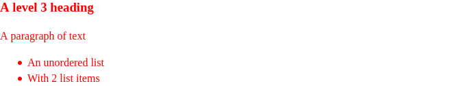
Both the color and font-family properties that we used in the previous example default to a value of inherit. This means that we could set those on the body element3, and every other element in our example would inherit them like so:
body {
    color: red;
    font-family: "Times New Roman", Times, serif;
}
Our example will now look like this:
Every line of CSS that you write increases the size of your webpage, which means it takes longer to download for visitors. If you have specified the same styles for multiple elements, and then decide you want to change how they are displayed, you would also have to update those styles in multiple places. The fewer rulesets you can use to achieve the look you want, the better it is for both yourself and your users.
Conclusion
That's quite a bit we've gone over in this chapter. CSS can be quite deceptive in terms of how easy it is to write, but it still remains very powerful.
In the next chapter we will learn how to actually load a stylesheet into a HTML document and explore what happens when you don't want all elements of the same type to have the same styles.
Footnotes
- CSS uses the American spelling of the word. For those of you, like myself, who are used to the British spelling this can be very confusing at first. Unfortunately, we are stuck with it this way, but you soon should be able to switch between the two in your head with little difficulty.
- Each browser has its own default stylesheet that applies to all elements until a document overrides those styles with its own. These stylesheets are a little different for each browser, so an unstyled element may appear a little differently for visitors using different browsers.
- As the body is the ancestor for all elements rendered on the page, all elements will inherit from it.
This is a chapter from my Creative Commons Attribution-NonCommercial-ShareAlike 4.0 International License book, Building Websites for Beginners. You can read everything that I have written so far on the book website, and can see the source code on github.


Top comments (0)