The flexbox model gives us an efficient way to align, layout and distribute space among elements within document.
Before diving into flexbox property and its functionality, lets have look at flexbox model. Flexbox model got flex container and flex items.
1.Parent Container - Flex Container and
2.Child Container - Flex Items
Flex Container - as the name says Container, it contains items called flex items.
Flex items - are the items within the container.
Getting Started With Flex-Box:

Main Axis - Horizontally laid, along which flex items are laid out. By default
it is horizontally laid.Cross Axis - The axis perpendicular to the main axis is called the cross axis.
It extends in the cross dimension.Main Start | Main End - The flex items are placed within the container starting
on the main-start side and going toward the main-end side.Cross Start | Cross End - "Flex lines" are filled with items and placed into
the container starting on the cross-start side of the flex container and going
toward the cross-end side.
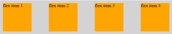
We can easily initiate flex model by simply using the "display" property with value flex (rendered as a block) || inline-flex (rendered as inline).
So to do that lets write a basic html div with parent class "flex-container" and child div with class "flex-item"
<div class="flex-container">
  <div class="flex-item">flex item 1</div>
  <div class="flex-item">flex item 2</div>
  <div class="flex-item">flex item 3</div>
  <div class="flex-item">flex item 4</div>
  <div class="flex-item">flex item 5</div>
</div>
.flex-container {
    display: flex;
    width:600px;
    background-color: lightgray;
}

.flex-item {
    background-color: #FFA500;
    width: 100px;
    height: 100px;
    margin: 10px;
}
We have set display flex and added some basic style to the "flex-item" and the "flex-container".

You might have noticed that the "flex-item" are aligned by main-axis, Which is not a behaviour of div element. The div element is block element which will be aligned vertically. Suppose If we remove the "display:flex" from the styling you will see the difference.
Flex Container Properties.
Flex Container has "Flex-direction || Flex-wrap || Flex-flow || Justify-content || Align-items || Align-content" properties.
We can now look at each one of those:
Flex Direction
Flex Direction have four different values to it, they are
.flex-container {
    flex-direction: row || column || row-reverse || column-reverse;
}
- ROW(default) - row aligns the flex-items along main-axis.
- COLUMN - aligns the flex-items along cross-axis

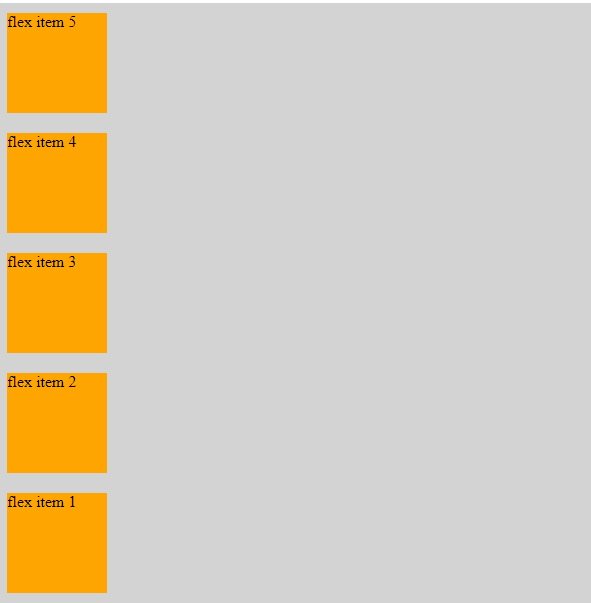
- ROW REVERSE - flex-items reverse along row.

- COLUMN REVERSE - flex-items reverse along column.
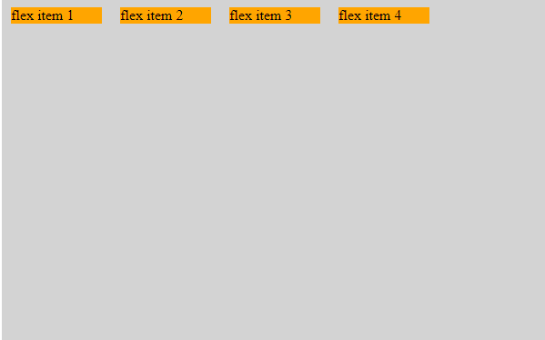
FLEX WRAP
.flex-container {
  flex-wrap: wrap || nowrap || wrap-reverse;
  }
Flex wrap is used to wrap or not to wrap all the flex items along main-axis.
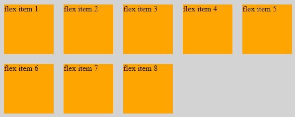
Lets increase the flex-items inside container.
<div class="flex-container">
  <div class="flex-item">flex item 1</div>
  <div class="flex-item">flex item 2</div>
  <div class="flex-item">flex item 3</div>
  <div class="flex-item">flex item 4</div>
  <div class="flex-item">flex item 5</div>
  <div class="flex-item">flex item 6</div>
  <div class="flex-item">flex item 7</div>
  <div class="flex-item">flex item 8</div>
</div>
- NOWRAP (default) - doesnt wrap any flex items into the container along the same main axis. If we had any number of flex items it will not increase the container size and will try to accomdate all along same main axis.

- WRAP - wraps the flex items. i.e., when we add many number of flex items it doesnt make any compromise with the item size and will accomdate all the flex items with its original width and height along main axis first. when there is no space left it will move to the next row to accomdate the flex-items.
- WRAP REVERSE - wraps the flex items but in reverse. i.e., when we add many number of flex items it doesnt make any compromise with the item size and will accomdate all the flex items in reverse, with its original width and height along main axis first. when there is no space left it will move to the next row to accomdate the flex-items.

FLEX FLOW
Flex flow is a shorthand property for "flex-direction" and "flex-wrap"
.flex-container {
    flex-flow: row wrap-reverse;
/*
    flex-direction: row;
    flex-wrap: wrap-reverse;
*/
}
Which will produce the same results has direction "row" and wrap "wrap-reverse".
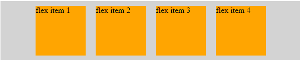
JUSTIFY CONTENT
Justify content will position the flex items. The values of justify content are
.flex-container { justify-content: flex-start || flex-end || center || space-between || space-around
}
FLEX START (default) - By default all the flex items start from the main-start.
FLEX-END - Positions the flex item from the main-end of the main axis.
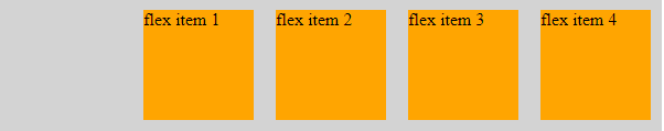
- CENTER - Positions the flex items in the center.
- SPACE AROUND - Positions the flex items with equal space around each item.

- SPACE BETWEEN - Positions flex-items with equal size between each item.
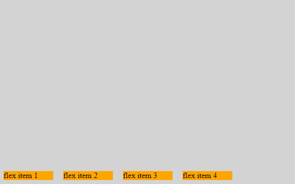
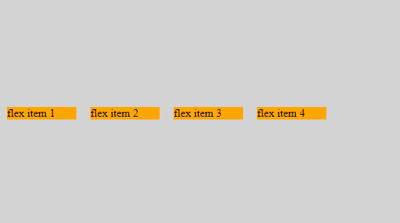
ALIGN ITEMS
Align items property is similar to that of justify content, but the difference is the axis along which both works. Align item works along the cross axis. To explain this i will do a minor change by increasing the height of the flex-container and removing the height of the flex-items.
.flex-container{
    align-items: flex-start || flex-end || center || stretch || baseline
 }
- FLEX START - Flex start value is used to position flex items from the start of the flex container i.e., along the cross axis's - cross start.
- FLEX END - Flex END value is used to position flex items from the "END" of the flex container i.e., along the cross axis's - cross end.
- STRETCH (default) - Stretches the flex item form the start to the end along cross axis.

- CENTER - Centers the flex item along the cross axis.
- BASELINE - Initially baseline looks similar to the flex start, but the difference is, the baseline positions the items in the same line with the first line of the flex item. To make it noticebale I have increased the font size of the first flex item.

ALIGN CONTENT
It controls how the flex-items are aligned in a multi-line flex container. We use align self when the flex-wrap property is set to wrap value.
.flex-container {
    align-content : flex-start || flex-end || center || stretch
}
- FLEX START - Aligns the wraped flex items along cross axis's start.

- FLEX END - Aligns the wraped flex items along cross axis's end.

- CENTER - Aligns the wraped flex items along cross axis's center.

- STRETCH (default) - stretches the wraped flex items along cross axis from start to end.

FLEX ITEMS
Flex items are the elements inside the flex container.
The properties of flex items are
"Order || Flex-grow || Flex-shrink || Flex-basis".
ORDER
Order property is used to order the flex items inside the container.
When we want to change the order of the flex-items without changing the html code we can use order property to do so.
By default all the flex items have an order 0. Which displays the elements in the same order,as in html code.
But when the order of a particular flex item is changed to 1, then that item will be ordered/placed at last.And when we have another flex item whose order value is set to 2, this item will be set next to the item with order 1.
.flex-item:nth-child(1){
    order:1;
   }
.flex-item:nth-child(2){
    order:2;
   }

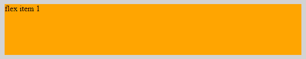
FLEX GROW
By default grow will have the value 0. which is the flex item will not grow inside the container.
.flex-item {
   flex-grow:0;
   }
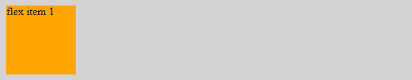
When the value is set to 1, we can see the flex item grows inside the flex container in main axis. Even when we have the width property set to some value the flex item will grow.
.flex-item {
   flex-grow:1;
   }
FLEX SHRINK
By default shrink will have the value 1. Which mean the flex item will shrink when we resize the browser size.
.flex-item {
   flex-shrink:1;
   }
When the value is set to 0,the flex item doesn't shrink even when the browser size changes.
.flex-item {
   flex-shrink:0;
   }
FLEX BASIS
This defines the default size of an element before the remaining space is distributed.
Flex basis with the value auto means the items size will be as of the content inside the item.
.flex-item {
   flex-basis : auto;
   }

Flex basis with the value means the items size will be as of what is defined in the flex-basis value.
.flex-item {
   flex-basis : 100px;
   }

FLEX
Flex property is shorthand for flex-grow, flex-shrink and flex-basis.
.flex-item {
   flex : 0 1 auto;
/*
   flex-grow : 0;
   flex-shrink : 1;
   flex-basis : auto;
*/
    }
This is same as saying flex-grow : 0, flex-shrink : 1 and flex-basis : auto.
ALIGN SELF
We use align self to target a particular item and change the position of a single flex-item along the cross-axis, without affecting the neighboring flex-items.
Align self is same as align item, except that align self targets particular item.
Values used for align self are "auto || flex-start || flex-end || center || baseline || stretch". We will not go into each one in detail because this issame as align items. Lets have only one example to make this more clear.
.flex-item:nth-child(3) {
   align-self : flex-end;
    }

You can see only targetted item is positioned to the flex end.
Understanding Margin Auto
When we add margin auto to the flex item, it centers the flex item by taking all the avilable space.
.flex-item {
    margin : auto;
}

When we add two more flex items and when we target a particular flex item , that particular item taxes upa ll the space available.
.flex-item:nth-child(1) {
    margin-right : auto;
}

Note that everything works perfect when the direction is set to row ,but when we change the direction to column all the properties will behave differently. I will try to cover all those, along with a project in which we will use flexbox.
Flexbox layout is good at small-scale layouts, whereas the (emerging) Grid layout is intended for larger-scale layouts.
There are a few flexbox playgrounds available online for experimenting:
Flexbox Playground
Flexy Boxes
Flexbox Properties Demonstration
Flexbox Froggy


Top comments (4)
Great explanation! Only discovered flexbox this year, seriously changed my CSS for the better. Was glad to drop using floats or display: table-cell tricks. Would also recommend Wes Bos' free course for further experimenting and real world examples.
Thank You David James.
This is such a comprehensive intro to flexbox, thanks for taking the time to write it!
I've been meaning to learn Flexbox better, I've seen that Bootstrap 4 supports it as well. Thanks for the explanation!