Context
For my second contribution towards Hacktoberfest 2021, I stumbled upon grommet which is a react-based framework that provides accessibility, modularity, responsiveness, and theming. I decided to work on #5735 to enhance the stories components to allow theming.
Grommet: Enhance Stories to Use Storybook Theming Functionality
Storybook is used to document and explore the components in an isolated environment and recently, an ability to view the storybook stories in multiple themes through a Theme button was added to the top bar in grommet storybook:

The user can now use the options using the Theme button to switch the theme of the component. However, there are a total of 60 stories in the grommet storybook and only 1 was refactored when the Theme functionality was added. Thus, the issue asked for help with the other 59 stories so that they could also use the new theming functionality.
So, for my second contribution, I decided that I would work on a few stories and add theming functionality to them.
Working with grommet storybook
Setting up the project was quite straightforward after going through the setup and contribution guide. The project seemed complicated at first, but once I started storybook and explored it a bit I was able to get a basic understanding of how it worked. I narrowed down to 3 components that I would work on:
- Anchor
- DropButton
- Menu
Each component further had multiple stories within it that needed to be enhanced. For instance, Anchor contained:
Color.js
Default.js
Gap.js
Inline.js
Size.js
Weight.js
The reason why theming wasn't working was because all the components were using the default grommet theme which now needed to be removed:
  <Grommet theme={grommet}>
    ...
  </Grommet >
So, I went into each story for these components and removed the Grommet wrapper and the imports. For some stories, this messed up the layout of the component so I had to go in and add a <Box> wrapper to center them as required.
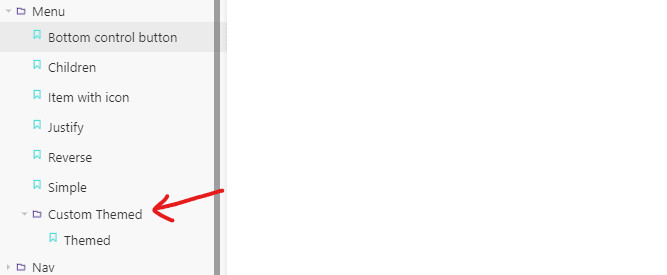
Also, some stories used custom themes instead of theme={grommet}. This was highlighted in the issue description, and in these cases I moved them to a /CustomThemed folder inside the component and changed their export title so that storybook would render them in a subfolder called Custom Themed. For example:
After doing this for each component, I tested to ensure that the Theme could now be switched between base, grommet and hpe. I also tested that there were no layout discrepancies introduced with my changes. A quick run of tests through jest, I was now ready to push my changes and create a pull request.
*Link to the pull request: Allow theming for Anchor, DropButton and Menu stories - Issue 5735
Pull request
After creating my pull request, I left a comment on the main issue to highlight the pr. It was then reviewed and the developer said it looked good. However, there was an issue with how the Menu story behaved. This was due to Grommet missing a full prop and the developer created a pull request to fix that issue:
Add ability to specify Grommet full with themed storybook - https://github.com/grommet/grommet/pull/5737
My pr was now waiting on this fix to be merged and since I wasn't sure how long it was going to take, I asked the developer to consider adding a hacktoberfest-accepted on the pr, which they did!
While I was a little disappointed that it couldn't be merged, I was still excited as I had learnt and explored another new project and this marked my second contribution towards hacktoberfest!


Top comments (0)