![Cover image for How to create a simple dashboard using Bootstrap in 5 minutes? [PLUS VIDEO]](https://media.dev.to/cdn-cgi/image/width=1000,height=420,fit=cover,gravity=auto,format=auto/https%3A%2F%2Fdev-to-uploads.s3.amazonaws.com%2Fi%2Fe6ojovmqsnrp4pp1rue2.png)
This article was originally posted at Bootstrap Tutorial
Would you like to create websites from a ready element? Bootstrap is one of the most popular CSS frameworks. It allows us to build a beautiful UI from ready components, like navbars or forms. Bootstrap also provides a responsive design so, while using the grid properly, you don’t have to do additional styling for mobile views.
For advanced developers, CSS frameworks seem to be simple because it’s mostly about reading the documentation, but beginners sometimes may have issues building projects from Bootstrap components. That’s why I decided to create this tutorial and build a simple dashboard, with step by step explanation.
In this article, I’m going to create a responsive dashboard with a navbar, side menu, some cards, and a table. I’m going to use Bootstrap, without any additional plugins. I will go through the following steps during this tutorial:
- Creating a starter template
- Creating a navbar
- Custom styles
- Creating a side menu
- Creating a table
- Creating cards
Let’s start!
1. Creating a starter template
In the beginning, we have to create a simple HTML file to start our project. I’m going to call mine dashboard.html.
Inside the file, I’m not going to create a basic structure. I’m going to use the Bootstrap starter template with all the CDN links added. If you would like to get it from the Bootstrap page, use search form and type „Starter template”. Let’s start with the code below:
<!doctype html>
<html lang="en">
  <head>
    <!-- Required meta tags -->
    <meta charset="utf-8">
    <meta name="viewport" content="width=device-width, initial-scale=1, shrink-to-fit=no">

    <!-- Bootstrap CSS -->
    <link rel="stylesheet" href="https://stackpath.bootstrapcdn.com/bootstrap/4.4.1/css/bootstrap.min.css" integrity="sha384-Vkoo8x4CGsO3+Hhxv8T/Q5PaXtkKtu6ug5TOeNV6gBiFeWPGFN9MuhOf23Q9Ifjh" crossorigin="anonymous">

    <title>Hello, world!</title>
  </head>
  <body>
    <h1>Hello, world!</h1>

    <!-- Optional JavaScript -->
    <!-- jQuery first, then Popper.js, then Bootstrap JS -->
    <script src="https://code.jquery.com/jquery-3.4.1.slim.min.js" integrity="sha384-J6qa4849blE2+poT4WnyKhv5vZF5SrPo0iEjwBvKU7imGFAV0wwj1yYfoRSJoZ+n" crossorigin="anonymous"></script>
    <script src="https://cdn.jsdelivr.net/npm/popper.js@1.16.0/dist/umd/popper.min.js" integrity="sha384-Q6E9RHvbIyZFJoft+2mJbHaEWldlvI9IOYy5n3zV9zzTtmI3UksdQRVvoxMfooAo" crossorigin="anonymous"></script>
    <script src="https://stackpath.bootstrapcdn.com/bootstrap/4.4.1/js/bootstrap.min.js" integrity="sha384-wfSDF2E50Y2D1uUdj0O3uMBJnjuUD4Ih7YwaYd1iqfktj0Uod8GCExl3Og8ifwB6" crossorigin="anonymous"></script>
  </body>
</html>
Next, if you will run the file in the browser, you can see the Hello world header! Now, let’s create the first component, the navbar.
2. Creating a navbar
Before setting containers and grid, I’m going to add a navbar that will take the full width of the window. For this, I will use a navbar component, if you wish to see all the navbar components search for it on the Bootstrap website.
I will use the following code.
<nav class="navbar navbar-dark fixed-top bg-primary flex-md-nowrap p-0 shadow">

</nav>
You may realize that I added some additional classes like bg-primary or fixed-top. They will give as the result of a sticky header and blue color.
My navbar will have three elements inside, project name, search bar, and a logout link. Let’s add them.
<a class="navbar-brand col-sm-3 col-md-2 mr-0" href="#">Duomly Dashboard</a>
<input type="text" class="form-control form-control-primary w-100" placeholder="Search..." >
<ul class="navbar-nav px-3">
  <li class="nav-item text-nowrap">
    <a class="nav-link" href="#">Logout</a>
  </li>
</ul>
Inside the search bar, I added a custom class, because I would like to style the element a little, but this I’m going to do in the next step.
3. Custom styles
To add custom styles for bootstrap elements, I need a CSS file, so let’s create one. I will call my file dashboard.css to stay consistent with the project. To make this file readable in your HTML structure, you have to add a link in the head of the document just below the Bootstrap link.
<link rel="stylesheet" href="./dashboard.css" >
Now, you can add some styles to the search bar in the new CSS file.
.form-control-primary {
  margin: 10px;
  opacity: 0.2;
  border-radius: 2px;
}
Great, the first element is ready; we can see how it looks like now.

4. Creating a side menu
I think everybody knows how most of the dashboards look like, they usually have a side menu, and that's what we are going to do right now. But first, let's add the container.
<div class="container-fluid">
  <div class="row">
    <!-- Sidear -->
  </div>
</div>
If the container is ready, we need to make some space to build the sidebar, because Bootstrap doesn't provide ready one. But no worries, it's just a matter of styling the column and adding a menu in our case. Let's create a space for the sidebar first with the following code inside the row div.
<div class="col-md-2 bg-light d-none d-md-block sidebar">
  <div class="left-sidebar">

  </div>
</div>
It’s time to add some real menu to our side menu. Let’s take a look at the vertical nav at the Bootstrap website, which you should use. Besides the pure menu, I used icons in each menu item. Icons are added as SVG.
<ul class="nav flex-column sidebar-nav">
  <li class="nav-item">
    <a class="nav-link active" href="#">
      <svg class="bi bi-chevron-right" width="16" height="16" viewBox="0 0 20 20" fill="currentColor" xmlns="http://www.w3.org/2000/svg"><path fill-rule="evenodd" d="M6.646 3.646a.5.5 0 01.708 0l6 6a.5.5 0 010 .708l-6 6a.5.5 0 01-.708-.708L12.293 10 6.646 4.354a.5.5 0 010-.708z" clip-rule="evenodd"/></svg>
      Candidates
    </a>
  </li>
  <li class="nav-item">
    <a class="nav-link" href="#">
      <svg class="bi bi-chevron-right" width="16" height="16" viewBox="0 0 20 20" fill="currentColor" xmlns="http://www.w3.org/2000/svg"><path fill-rule="evenodd" d="M6.646 3.646a.5.5 0 01.708 0l6 6a.5.5 0 010 .708l-6 6a.5.5 0 01-.708-.708L12.293 10 6.646 4.354a.5.5 0 010-.708z" clip-rule="evenodd"/></svg>
      Jobs
    </a>
  </li>
  <li class="nav-item">
    <a class="nav-link" href="#">
      <svg class="bi bi-chevron-right" width="16" height="16" viewBox="0 0 20 20" fill="currentColor" xmlns="http://www.w3.org/2000/svg"><path fill-rule="evenodd" d="M6.646 3.646a.5.5 0 01.708 0l6 6a.5.5 0 010 .708l-6 6a.5.5 0 01-.708-.708L12.293 10 6.646 4.354a.5.5 0 010-.708z" clip-rule="evenodd"/></svg>
      Orders
    </a>
  </li>
  <li class="nav-item">
    <a class="nav-link" href="#">
      <svg class="bi bi-chevron-right" width="16" height="16" viewBox="0 0 20 20" fill="currentColor" xmlns="http://www.w3.org/2000/svg"><path fill-rule="evenodd" d="M6.646 3.646a.5.5 0 01.708 0l6 6a.5.5 0 010 .708l-6 6a.5.5 0 01-.708-.708L12.293 10 6.646 4.354a.5.5 0 010-.708z" clip-rule="evenodd"/></svg>
      Invoices
    </a>
  </li>
  <li class="nav-item">
    <a class="nav-link" href="#">
      <svg class="bi bi-chevron-right" width="16" height="16" viewBox="0 0 20 20" fill="currentColor" xmlns="http://www.w3.org/2000/svg"><path fill-rule="evenodd" d="M6.646 3.646a.5.5 0 01.708 0l6 6a.5.5 0 010 .708l-6 6a.5.5 0 01-.708-.708L12.293 10 6.646 4.354a.5.5 0 010-.708z" clip-rule="evenodd"/></svg>
      Reports
    </a>
  </li>
</ul>
Great, now we need to add some styling.
.sidebar {
  position: fixed;
  left: 0;
  bottom: 0;
  top: 0;
  z-index: 100;
  padding: 70px 0 0 10px;
  border-right: 1px solid #d3d3d3;
}

.left-sidebar {
  position: sticky;
  top:0;
  height: calc(100vh - 70px)
}

.sidebar-nav li .nav-link {
  color: #333;
  font-weight: 500;
}
Now, we can check what's the result!

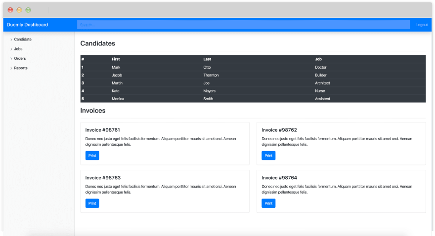
5. Creating a table section
In this step, we are going to create the main space in the dashboard and add a responsive table to the section.
To create the main section, we will use the following code after the side menu.
<main role="main" class="col-md-9 ml-sm-auto col-lg-10 px-4"></main>
Great, now we can add a heading and table. I selected a dark table and added some fake data. Also, to make it pleasant, I added a divider between the title and table. Let's create it.
<h3>Candidates</h3>
<hr>
<div class="table-responsive">
  <table class="table table-dark">
    <thead>
      <tr>
        <th scope="col">#</th>
        <th scope="col">First</th>
        <th scope="col">Last</th>
        <th scope="col">Position</th>
      </tr>
    </thead>
    <tbody>
      <tr>
        <th scope="row">1</th>
        <td>Mark</td>
        <td>Otto</td>
        <td>Project Manager</td>
      </tr>
      <tr>
        <th scope="row">2</th>
        <td>Jacob</td>
        <td>Thornton</td>
        <td>JS developer</td>
      </tr>
      <tr>
        <th scope="row">3</th>
        <td>Larry</td>
        <td>Bird</td>
        <td>Back-end developer</td>
      </tr>
      <tr>
        <th scope="row">4</th>
        <td>Martin</td>
        <td>Smith</td>
        <td>Back-end developer</td>
      </tr>
      <tr>
        <th scope="row">5</th>
        <td>Kate</td>
        <td>Mayers</td>
        <td>Scrum master</td>
      </tr>
    </tbody>
  </table>
</div>
Probably now you see it a little bit broken, and I have a solution right here, as a small piece of CSS code.
main {
  padding-top: 90px;
}
6. Creating cards section
Now, let’s add another section with a few cards representing invoices. Let’s add another heading and divider to stay consistent.
<h3>Invoice</h3>
<hr>
When it’s done, let’s use two cards, each for a half column, and I’ll use it twice.
<div class="row">
  <div class="col-sm-6">
    <div class="card">
      <div class="card-body">
        <h5 class="card-title">Invoice #184382</h5>
        <p class="card-text">Donec nec justo eget felis facilisis fermentum. Aliquam porttitor mauris sit amet orci. Aenean dignissim pellentesque felis.</p>
        <a href="#" class="btn btn-primary">Print</a>
      </div>
    </div>
  </div>
  <div class="col-sm-6">
    <div class="card">
      <div class="card-body">
        <h5 class="card-title">Invoice #184386</h5>
        <p class="card-text">Donec nec justo eget felis facilisis fermentum. Aliquam porttitor mauris sit amet orci. Aenean dignissim pellentesque felis.</p>
        <a href="#" class="btn btn-primary">Print</a>
      </div>
    </div>
  </div>
</div>

<div class="row">
  <div class="col-sm-6">
    <div class="card">
      <div class="card-body">
        <h5 class="card-title">Invoice #184389</h5>
        <p class="card-text">Donec nec justo eget felis facilisis fermentum. Aliquam porttitor mauris sit amet orci. Aenean dignissim pellentesque felis.</p>
        <a href="#" class="btn btn-primary">Print</a>
      </div>
    </div>
  </div>
  <div class="col-sm-6">
    <div class="card">
      <div class="card-body">
        <h5 class="card-title">Invoice #184391</h5>
        <p class="card-text">Donec nec justo eget felis facilisis fermentum. Aliquam porttitor mauris sit amet orci. Aenean dignissim pellentesque felis.</p>
        <a href="#" class="btn btn-primary">Print</a>
      </div>
    </div>
  </div>
</div>
The last thing which has to be done to make it look pretty is adding a little margin to the rows. Let’s do it.
main .card {
  margin-bottom: 20px;
}
Woohoo. It’s ready. Let’s check the result. Also, feel free to check the responsiveness.
Conclusion
In this tutorial, you can learn how to build a simple dashboard with Bootstrap without the tone of additional styling. Using CSS frameworks is a great way to make a simple layout that is fully responsive in a short time.
With a vast selection of ready components and a flexbox based grid, Bootstrap is a convenient tool. Beginners can do more advanced things very quickly, but also for advanced developers who don’t want to spend a long time building their base of reusable CSS to each project.
I hope you will find this tutorial useful and helpful as a base to create projects with Bootstrap. If you would like to learn how to create some more advanced layouts, join us at Duomly to take our newest course Build E-commerce with Bootstrap
.Thank you for reading,
Anna from Duomly


Top comments (2)
Love this tutorial. The dashboard looks great, and very easy, I'll use for my next dashboard as a starting point. One recommendation for next time, make the font size a little bigger. Everything else is great 😊
Hi Bruno,
Thanks for the feedback 🙂
Definitely we will make font bigger in the next movies!