
Overview
One of the ways to make our components reusable is to pass props, whether they are strings, integers, booleans, objects, arrays, and so on. But eventually you will need to reuse a component and the only thing you need to change is for example the header.
The most popular way is to use children, that is, you will have a parent component that will have an opening and closing tag. If you only have to change one component, you don't need to do anything else, however if you have to pass more than one component, the situation is different.
For this, the ideal situation would be to have a parent component with a self closing tag that renders the children components if they are passed in the props.
Today's example
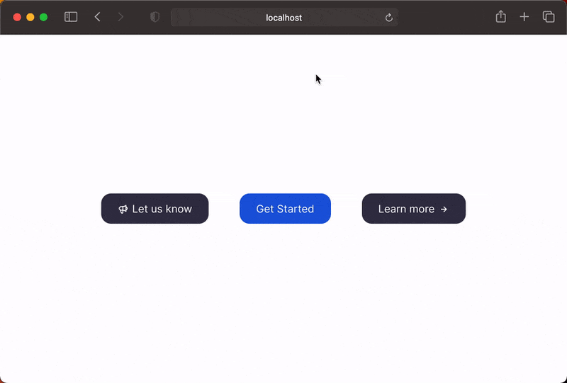
Today we are going to create three totally different buttons, one with an icon on the left, one without an icon and one with an icon on the right.
However we are going to use reuse the same component and through the props we are going to change the icon's positioning and the button's background color.
In addition, as you might have already figured out, the icon will be passed as a prop.
Let's code
Let's install the following dependencies:
npm install classnames react-icons
All component styling in this application will be done using CSS Modules and to join them through conditions I will use the classnames dependency.
First let's start by working on our component that will be reused. Starting with the styling of the button, the button will have two background colors (the primary and the normal), in addition to this we will change the position of the button elements, for that we will do a simple flex direction reverse to reverse the order of the elements. Last but not least, we will add a spacing to the icon according to its placement.
/* @src/components/Button.module.css */

.button {
  display: flex;
  flex-direction: row;
  align-items: center;
  margin: 20px 0px;
  cursor: pointer;
  font-weight: 500;
  padding: 13px 25px;
  border-radius: 15px;
  font-size: 1rem;
  border: none;
  color: #fff;
  transition: all 0.25s ease;
}

.button:hover {
  transform: translateY(-5px);
}

.reverse {
  flex-direction: row-reverse;
}

.primaryBG {
  background: #185adb;
}

.primaryBG:hover {
  box-shadow: 0 10px 20px -10px rgba(24, 90, 219, 0.6);
}

.normalBG {
  background: #363449;
}

.normalBG:hover {
  box-shadow: 0 10px 20px -10px rgba(54, 52, 73, 0.6);
}

.icon {
  margin-bottom: -5px;
  margin-right: 6px;
  margin-left: 0px;
}

.iconRight {
  margin-right: 0px;
  margin-left: 6px;
}
Now we can start working on our web component.
// @src/components/Button.jsx

import React from "react";
import classNames from "classnames";

import styles from "./Button.module.css";

const Button = () => {
  return (
    // ...
  );
};

export default Button;
Now let's define the props we will receive in our component:
- icon - will be the icon component;
- hasIconRight - will be a boolean, to know if the icon will be placed on the right side;
- title - will be a string with the value of the content we want to have in the button;
- onClick - is the function to be fired on the on click event;
- primary - will be a boolean to indicate that the button's background color should be the primary color;
On our button, first we'll apply the base styles, then we'll make two conditions. If the component receives the primary prop, the button will have the primary color as its background color, otherwise it will have the normal color.
The second condition will be the placement of the elements of the button, if the prop hasIconRight is received, the placement of the elements will be reversed (in this case the button will go to the right side).
// @src/components/Button.jsx

import React from "react";
import classNames from "classnames";

import styles from "./Button.module.css";

const Button = ({ icon, hasIconRight, title, onClick, primary }) => {
  return (
    <button
      className={classNames([
        styles.button,
        primary ? styles.primaryBG : styles.normalBG,
        hasIconRight && styles.reverse,
      ])}
    >
     // ...
    </button>
  );
};

export default Button;
Now let's deal with the icon, if it is passed in the props we will render it otherwise we don't want it to take up space in the dom. Afterwards we will pass the base styles to the icon wrapper and we will also have a condition, if we receive the hasIconRight prop we want the ideal spacing to be applied.
// @src/components/Button.jsx

import React from "react";
import classNames from "classnames";

import styles from "./Button.module.css";

const Button = ({ icon, hasIconRight, title, onClick, primary }) => {
  return (
    <button
      className={classNames([
        styles.button,
        primary ? styles.primaryBG : styles.normalBG,
        hasIconRight && styles.reverse,
      ])}
    >
      {!!icon && (
        <span
          className={classNames([
            styles.icon,
            hasIconRight && styles.iconRight,
          ])}
        >
          {icon}
        </span>
      )}
      // ...
    </button>
  );
};

export default Button;
Finally, just add the title, so that the button has some textual content and we'll pass the onClick prop to the button's tag.
// @src/components/Button.jsx

import React from "react";
import classNames from "classnames";

import styles from "./Button.module.css";

const Button = ({ icon, hasIconRight, title, onClick, primary }) => {
  return (
    <button
      className={classNames([
        styles.button,
        primary ? styles.primaryBG : styles.normalBG,
        hasIconRight && styles.reverse,
      ])}
      onClick={onClick}
    >
      {!!icon && (
        <span
          className={classNames([
            styles.icon,
            hasIconRight && styles.iconRight,
          ])}
        >
          {icon}
        </span>
      )}
      <span>{title}</span>
    </button>
  );
};

export default Button;
Now we can start working on our App.jsx. I share the styles with you:
/* @src/App.module.css */

.container {
  display: flex;
  justify-content: center;
  align-items: center;
  height: 100vh;
}

.section {
  display: flex;
  justify-content: space-around;
  align-items: center;
  width: 600px;
}
Now let's pretend this is your component:
// @src/App.jsx

import React, { useCallback } from "react";
import { HiOutlineSpeakerphone } from "react-icons/hi";
import { BiRightArrowAlt } from "react-icons/bi";

import styles from "./App.module.css";
import Button from "./components/Button";

const App = () => {
  const fn = useCallback((message) => {
    console.log(message);
  }, []);

  return (
    <div className={styles.container}>
      <div className={styles.section}>
        // ...
      </div>
    </div>
  );
};

export default App;
As you can see, we already have our icons chosen and we already have our Button component imported. All that remains is to create the three buttons that were defined in the introduction of the article.
// @src/App.jsx

import React, { useCallback } from "react";
import { HiOutlineSpeakerphone } from "react-icons/hi";
import { BiRightArrowAlt } from "react-icons/bi";

import styles from "./App.module.css";
import Button from "./components/Button";

const App = () => {
  const fn = useCallback((message) => {
    console.log(message);
  }, []);

  return (
    <div className={styles.container}>
      <div className={styles.section}>
        <Button
          icon={<HiOutlineSpeakerphone />}
          title="Let us know"
          onClick={() => fn("Clicked 'Let us know' button")}
        />
        <Button
          title="Get Started"
          onClick={() => fn("Clicked 'Get Started' button")}
          primary
        />
        <Button
          icon={<BiRightArrowAlt />}
          title="Learn more"
          onClick={() => fn("Clicked 'Learn more' button")}
          hasIconRight
        />
      </div>
    </div>
  );
};

export default App;
You should get a result similar to this:
Conclusion
As always, I hope you found it interesting. If you noticed any errors in this article, please mention them in the comments. 🧑🏻💻
Hope you have a great day! 🔫


Oldest comments (3)
It would be useful that you create a custom icon component to understand how the parent component will render such prop.
It would render the same way. Basically everything you pass to the prop icon will be rendered in the Button component in the same way as using the prop children.
In this article I simply chose to have the icon wrapper on the Button component because of the css classes I would apply. However I could pass the span along with the icon component and I would just have to remove the conditional rendering (because if the prop icon had no content to render, it wouldn't even take up space in the dom).
I hope I understood your statement 😬
I guess this article should be titled 'How to pass props to components in React'