In todays post, we're going to briefly go over what glassmorphism is - and learn how to replicate the effect in Figma!
Introduction
Glassmorphism - It's a fresh new design technique which we've seen used recently by many companies, and most notably, Microsoft in their Windows 11 video

The design trend for 2020 was Neumorphism - which had some rather obvious issues relating to accessibility and contrast.

Developers started to use this with a lot of things, which was driving people a little bonkers.
Now, I'm not bashing neumorphism whatsoever. In fact, I myself like the idea of it somewhat. However, there are of course accessibility issues for people who have eyesight issues, causing the shadow-based contrast system to make the interface inaccessible for them to use.
Glassmorphism & Accessibility
Now, another important question which arises from these trendy new design styles is how accessible they are for people with disabilities.
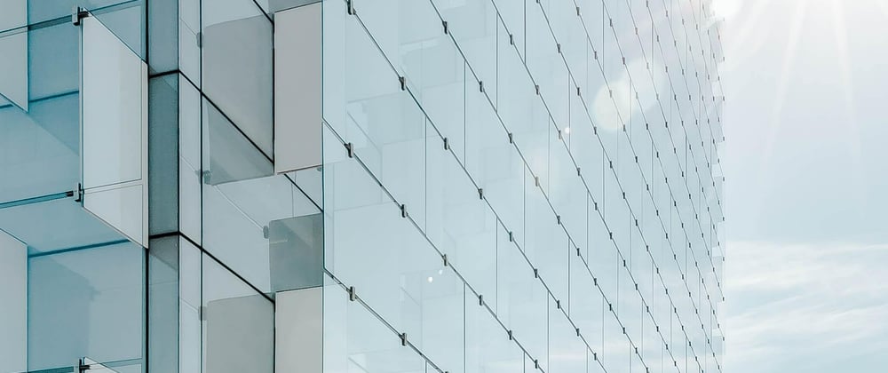
The main appeal of Glassmorphism is how sleek and minimalistic it looks. We've already seen some examples of Glassmorphism in our daily lives, most notably in operating systems like MacOS Big Sur or the new Windows 11.
However, this doesn't make Glassmorphism an accessible style which the US Government should consider using for their unemployment insurance portal. Let's have a look at some of the accessibility problems that come with it:
Fonts
Oftentimes with Glassmorphism, developers struggle to make their fonts and text accessible from the website's background and the glass. Developers will often use larger fonts to get around this.
Borders & Contrast
Glassmorphism, in a way, revolves around borders to distinguish glass elements from non-glass ones. Many developers tend to use thin, light & rather transparent borders which take a toll on the accessibility. However, as can be seen in MacOS Big Sur, a sharper colour contrast between the background of the app and the background of the glass element improve on this issue.
Let's make our first design!
So, let's hop into Figma and create a new file.
Next, I'll search for some Mesh Gradients and pick one which I really like. I think I'll settle for this one:

Let's just copy and paste this image file into Figma. I'll set the size to 1920x1080px.
Next, let's just create a simple rectangle. I'll dimensions to 900x500px and set the border radius to 30px.
Now, let's go in the rectangle toggle a few things.
First, I'll get started by the colour. Go over to the fill, and change it from solid to a linear gradient.
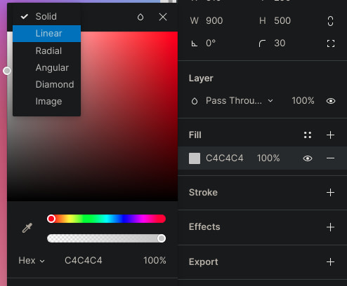
I'll move the two points diagonally across the small box we just made.

Now, let's toggle the colours for these two. I'll go to the one up top and change the colour white (#FFFFFF) and set opacity to 70%.
Let's toggle the bottom one. I'll set the colour to white (#FFFFFF) and set opacity to 40%.
Here's a code for the linear gradient, for those interested.
background: linear-gradient(107.18deg, rgba(255, 255, 255, 0.7) 1.84%, rgba(255, 255, 255, 0.4) 100%);
Next, let's give it a small outline. I'll go to outline, hit the "+" and create a new outline. I'll give this a thickness of 5px.
Let's go into colours again, and also make the colour on this a gradient.
I'll follow the same process as I did last time with the background colour. I'll move the two points diagonally from the top left corner to the bottom right one.
I'll give the top one a colour of white (#FFFFFF) with a opacity of 30%.
I'll give the top one a colour of white (#FFFFFF) with an opacity of 20%.
Great! Now we have a cool looking outline.
Next, let's add some blur. Go into "effects", hit "+" and toggle the setting to layer blur.

Let's not go anywhere too crazy on this. I'll just set it 5.
Now, let's add some background blur. Do the same as said before. I'll set it to... maybe 15 for now.
Then, to show this effect I'll just add some text. Let's choose a colour of white (#FFFFFF), size of 144px a font of Poppins Bold.
Let's move it below the glass rectangle we created, and tada 🎉 you can now see the effect.
Spoiler:

Foreword
I have a Linux system (and no money) so I can't use Adobe Xd, therefore I'm only able to show this effect to you in Figma.
Here is a tutorial I will recommend to you, if you're interested in learning how to achieve this in Adobe Xd.
I personally have been learning about an experimenting with glassmorphism myself too. Check out this dribbble design post for my latest creation with it!
You can view the Figma Board for this project, along with the board for my First one.
To sum everything up, Glassmorphism is in my opinion a great new design trend which I seem emerging and taking the place of Neumorphism in 2020. It has a lot of potential, as there are not nearly as many accessibility issues with it as when compared to Neumorphism.
Opinion
After some discussion with people in the comments, I'll have to say that Glassmorphism isn't something you'll really be seeing too much on websites. Think of the basis of the design to begin with. For it to look good, you'll probably need some extra space in the background which isn't really practical for websites, in all honesty. Me and others believe that it will be a more popular trend in perhaps advertisements, due to it's clean and attrative look while still being accesible.


Latest comments (30)
Hi, I have seen lot of website design layout with rounded div corners recently like below.
dribbble.com/shots/8509427-Smart-H...
dribbble.com/shots/13819210-Task-S...
dribbble.com/shots/6914699-Smart-H...
dribbble.com/shots/14707518-Web-UI
Is it rounded corners reveal design or Neumorphism or card ui design ?
What is the name of the trend ?
To my knowledge, this isn't any specific design trend. It looks like shadows simlar to neumorphism but with better contrast.
It doesn't make sense. Blurs are generally annoying, and if you're gonna blur an element of the screen because a more important one overlaps it, you may as well hide it completely.
So we end up with glassmorphism being only used to give the classic overlay to increase the contrast between background and content.
Hm. Intesting that you think this. I agree it might be a bad idea to overlay this on text elements, buttons, etc.
As you sound, I think it'll more be used for just UI cards, ads, etc. rather than the example I showed.
I'm not sure if i really agree as these would be interesting trends in 2021.
But thanks for the cool article.
Maybe less for websites, but more for elements like cards on websites, and things like trailers, ads, etc.
This feels like a simplified version of Microsoft's Fluent "acrylic".
Yep. Microsoft has been one of the firsts to start this trend.
Reminds me of acrylic from Microsoft's Fluent Design system.
Yep I've seen Microsoft embracing this style the most (in terms of corporates) as shown in this ad
Very nice, thank you and keep writing about these trends!
Thanks very much!
A bit retro but a good tool to have in your skill-set. Glass-like overlays (and a sort of frosted glass) was a really popular design choice in the mid 00s.
As with everything, accessibility should be a top consideration. Intentionally blurring and distorting content and text should be done very carefully. Same with using transparencies, gradients, and gradients on top of gradients.
Interesting. I didn't know they were used back in mid 2000s
probably because I wasn't born back then. But I agree with the rest, I don't think in most cases it would be the most genius idea to put this effect on text, buttons, etc. Rather just maybe a few background styling elements, cards, banners, etc.Accessibility should always be a critical part of any new design. If it’s not obvious of the intent, people may think there is something wrong with their eyes. This is different than simply switching from light to dark mode - we once misunderstood a complaint for contrast issues when in fact, it was simply on font choices due to blurring.
But on a different note, great walkthrough
More background blur would be better but honestly glassmorphism has another problem. It is not practically applicable to websites and apps because it looks nice only is there is a gradient background or if there are multiple colors or layers behind the sheet of glass. That is the problem. At least in websites, each component has sub components so when you use glassmorphism, you won't get the desired look. In theory and design, it is awesome and even in designing logos and banners and branding it is cool! But practically it has challenges right now.
I see where you're coming from -- and I'll have to agree, to be honest. It will be very upractical to use this on an actual website, and I think it'll be more centered towards banners, or maybe even things in advertisements and stuffs as shown here
Yeah, you get it! But neumorphism has a larger scope in web development and app development in terms of frontend and design.
I'd agree. But for things like UI cards and stuff on sites we might be seeing more glassmorphic elements come into play :D
Looks nice, but tricky to have good contrast between background and text.
I personally don't think people should be putting text in the background... I just added it to better show the glass effect 😄
Nice post
Thanks!
Nice effect for modal background! 😉 Keep writing
Thanks for your kind words! Made my day :)
You deserved it! 😉
I think these are one of those designtrends that look neat now but in a few years will look very outdated. At least the very verbose designs that make everything glass and see through.
Yeah, similar to Neumorphism these designs just look posh now but will be a pain for people to use in a few years from now.
It reminds me the days of Windows Vista
Interesting... 😄