
Hello, users! 👋
Today I wanted to teach you how to transform this kind of menu 👇

To this 👇 other kind of dynamic menu, where you can see active tabs when you select them:
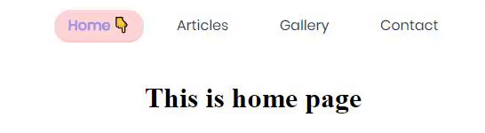
in whatever style that suits you:

I'll be using Vue cli 3 and SASS. But don't worry, code is actually easy to understand even if you don't know SASS.
You'll be able to check also a repo in Github with the source code of this article and you can also check the process below this words
First of all, why should I build a dynamic menu with active tabs?
The answer to 50% of questions in the web-design/development field is: usability, and the other half, accessibility.
Using an active tabs design for your menu will increase your usability by letting the user know
👉 where she/he is
👉 what she/he just clicked
👉 where she/he is not (this may be too obvious but there are some times when our brain detects colors before letters and if we know that the "contact" option is at the end but we see the active tab at the beggining we already know where we aren't)
👉 because we can
Setting up
You'll need Vue Cli installed. If you don't have it, create a folder in your desktop, open your cmd inside that folder and type
npm install -g @vue/cli
Perfect. Now it's time to create a new Vue project by using
vue create nameyourprojecthere
set your project manually and don't forget to use the options
👉 router (without history mode)
👉 SASS preprocessor (the one you like)
and that's it.
In case you already have a Vue project where you'd like to create a dynamic menu but you don't have SASS please see this.
The project structure
For the purpose of this article I'll be having 4 views: Home, Articles, Gallery and Contact.
Therefore, I have 4 .vue files in my views folder, like this:

and the code inside each of those views is as follows
<template>
  <div>
    <h1>This is a (type) page</h1>
  </div>
</template>
and inside our router folder, in our index.js file inside of it, the code is also as follows:
[...]

//all my routes are directed to the views:

const routes = [
  {
    path: '/',
    name: 'home',
    component: Home
  },
  {
    path: '/articles',
    name: 'articles',
    component: function () {
      return import('../views/Articles.vue')
    }
  },
  {
    path: '/gallery',
    name: 'gallery',
    component: function () {
      return import('../views/Gallery.vue')
    }
  },
  {
    path: '/contact',
    name: 'contact',
    component: function () {
      return import('../views/Contact.vue')
    }
  }
]

[...]
But this is just so we can add some real functionality to our project. We'll focus in our App.vue file. Inside this file, the magic will begin.
Creating the monster
Please note your code could be different if you just created your project with Vue Cli. I'm not changing that code, I'm explaining how and why it works, so please read carefully :)
First of all, what we have here?
The App.vue file is a big, huge, boss-ninja-rockstar in our project. Why? Because inside this file we'll have our < router-view/ > element, which decides what we're seeing in our screen depending on the url we're visiting.
We have the following template:
<template>
<!-- Our #app div contains our website -->
  <div id="app">
    <!-- Our #nav div contains our beloved menu -->
    <div id="nav">
      <!-- with router-link we manage the url's of our website -->
      <router-link to="/">Home</router-link>
      <router-link to="/articles">Articles</router-link>
      <router-link to="/gallery">Gallery</router-link>
      <router-link to="/contact">Contact</router-link>
    </div>
    <router-view/>
  </div>
</template>
and the following styles (in SASS):
<style lang="scss">
//Okay I'm just importing a font here from GoogleFonts that I like A LOT
@import url('https://fonts.googleapis.com/css?family=Poppins&display=swap');
$font: 'Poppins', sans-serif;

//This is our #app div, it contains the whole universe of our website
#app{
  text-align: center;
}

//This is our #nav div, it contains our menu
#nav {
  padding: 30px;

  //We're using SASS, so we're nesting the links inside the #nav div here
  a {
    color: inherit;
    margin: 0.667em;
    font-family: $font;
    text-decoration: none;
  }
}
</style>
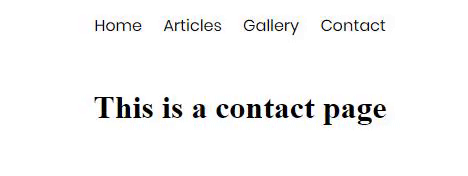
Right now, this is what we have
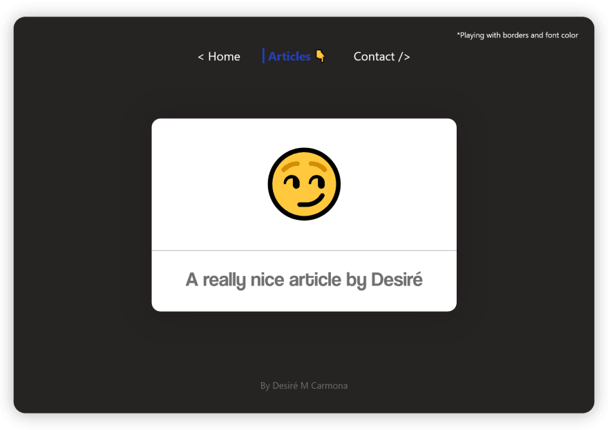
First of all, let's include an indicator to our menu to make it look more "tab-like". Choose one! It can be from the emoji 👇, to 🤘, 👌 or a simple symbol like ⤸, ˅ or ⋮.
Choose your own indicator visiting the emoji page and the symbols page.
We'll include the indicator with a span tag inside our router-link tag, like this:
    <div id="nav">
      <router-link to="/">Home <span>👇</span></router-link>
      <router-link to="/articles">Articles <span>👇</span></router-link>
      <router-link to="/gallery">Gallery <span>👇</span></router-link>
      <router-link to="/contact">Contact <span>👇</span></router-link>
    </div>
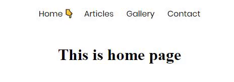
It'll look like this:

Now... We don't want our indicators to show all the time, right? Just when the section they belong to is clicked.
We'll add one state to our SASS, called: &.router-link-exact-active. You could read more about this here, the essence of this state is that the styles we're using inside it will only be active when the URL of the link it's active (active here, meaning that the user actually is visiting that URL by clicking on it).
First, we'll tell our SASS that the span inside our links by default will have display:none, we don't want to see it all the time:
#nav {
  padding: 30px;

  a {
    color: inherit;
    margin: 0.667em;
    font-family: $font;
    text-decoration: none;
    //Bye bye by default, sweetheart
    span {
      display: none;
    }
  }
}
and now, right below that, we'll tell our SASS that the span actually will be displayed when the state &.router-link-exact-active is actually active:
#nav {
     [...]
  a {
     [...]

    &.router-link-exact-active {
      //And, hello again!
      span {
        display: inline-block;
      }
    }
  }
}
Now we'll have this:
Easy, right?
Believe it or not, we're already done here.
Time for your imagination
Now it's time for you to use your imagination and creativity, and use as many styles as you'd like to in your SASS.
Remember that the styles for the Active tab must be placed inside the
&.router-link-exact-active {
    //inside here
    }
&.router-link-exact-active state. Use borders, background-colors, shadows... As you'd like to!
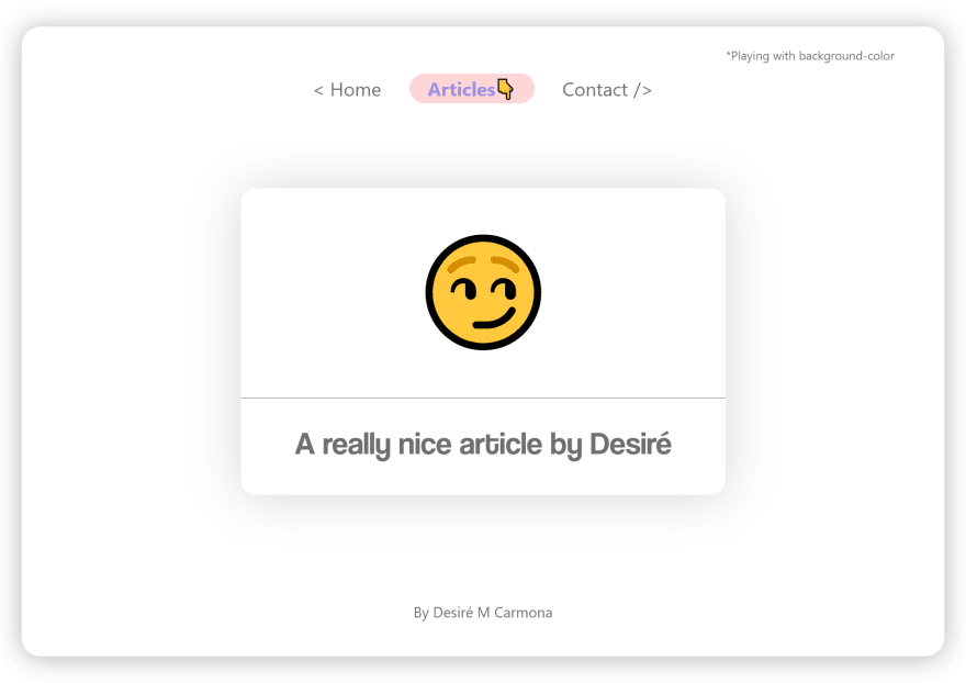
However, I'll give you some ideas with these designs:

In conclusion
Thank you for reading this far!
You can get the source code for this menu here, or also visiting my website where I created a cute menu.
In case you create your own style active-tab menu, share it with us in the comments!
See you around, let's keep coding and learning 💻!


Top comments (7)
Thanks for the article. I think I may now have to add eyes to my active links 👀
I think that link is broken - it just takes me to this post again.
I'm generally not a fan of overriding an entire element's format like that, or adding DOM elements and then using
display: none;to hide them. Wouldn't it be better to use something likeinstead?
So sorry! It's up and running now, thought! Thank you so much for pointing it out!
Also, it's no big deal since we're not destroying/creating the element in the DOM all over again. Since this is not a function or variable it's a minor thing to override it!
But please use this as you may like and as you prefer, that's the important thing! Thank you for sharing it!
I'm not so worried about performance as breaking other functionality.
Admittedly, I don't think I've ever used a
<span/>inside a menu before, but I might want to, one day* (e.g. for e-commerce, add a<span class="category-discount">-15%</span>to the Shoes menu).If you set
<span/>stodisplay: none, you might have to use something like<span class="category-discount" style="display: inline-block !important">-15%</span>, or another override to your override.I always try to work on as specific selectors as possible, and only add what is needed.
*Maybe a case of YAGNI and overthinking :)
Thank you for this very informative tutorial! Now I know how to do it in VueJS. I also did one similar in Reactjs: react-routes.netlify.com/ | github.com/the-akira/react-routes
Really nice, Gabriel!
Always keep learning! 😄
Nicely explained! I've bookmarked it when I'll start with Vue I'm surely gonna do this.
Thank you, Vaibhav!
I hope it'll be useful for you! :)