Through this article, I'm going to show you one way to setup a theme for your React app using styled-components, and how to implement it in a structured and readable manner by applying functional programming practices.
styled-components
styled-components is a CSS-in-JS library. According to the State of CSS 2019 survey, styled-components is one of if not the most popular option for those opting for CSS-in-JS solution. It's not hard to see why, it gives us the best of ES6 and CSS.
To style a component we write CSS in template literals. The styling of the component can be adapted by passing a function that accepts component's props into the template literal.
const StyledButton = styled.button`
    height: 40px;
    background-color: ${props => props.primary
        ? 'white'
        : 'blue'
    };
`;
A button component style that will adapt its background-color based on component's prop primary.
styled-components appends a theme object to the props for you to access the values that are provided in the setup. The same code previously would be written like so to apply theme values instead.
const StyledButton = styled.button`
    background-color: ${props => props.primary
        ? props.theme.color.white
        : props.theme.color.blue
    }
`;
Accessing these theme value can get messy when you have a lot of them.
Functional programming
How does FP plays a role here? FP is its own subject, but for the purpose of this article, the key concepts we'll need are function composition and function currying. A simple explanation and example to illustrate each:
Function currying
A curried function is a function which takes multiple parameters one at a time.
const add = x => y => x + y;
The first function takes in the first argument, variable x and returns another function that is ready to take the second argument, variable y and finally returns the sum of x and y.
Function composition
Function composition in the simplest term is to combine multiple functions to create a new function.
const addDash = x => `${x}-`;
const oneDash = add(addDash(1));

oneDash(2); // outputs '1-2'
addDash function returns a string with a dash appended at the end of the argument. When it is passed into add it returns a function that will return a string with a dash in between first and second argument.
Ramda
In this article I will use my favorite FP utility library, Ramda to demonstrate. It provides us an arsenal of small functions that are ready to be curried to compose from. It is what I'm using in most of my React projects, if you like applying FP in your javascript projects do give it a go.
Setup
Your theme values will be provided in a ThemeProvider that comes with styled-components. To set it up:
const theme = {
    color: {
        white: '#ffffff',
        primary: '#3b49df'
    }
};

const Layout = ({ children }) => (
    <ThemeProvider theme={theme}>
        {children}
    </ThemeProvider>
);
Accessors
Accessors are functions to access your values. A simple props.theme accessor written in plain javascript can be:
const theme = props => props.theme
We'll compose increasingly complex accessor functions by currying them. I'll use the color accessor as an example:
import { path } from 'ramda';

const theme = (keys = []) =>
    props => path(['theme', ...keys], props);

const color = key => theme(['color', key]);
The path function from Ramda will return you the value based on the path that you've passed in (in the form of array).
The theme accessor will return a function that expects props as argument and returns you the theme object.
The color accessor takes the theme accessor and compose into a function that, again expects props as argument and returns you the color object.
Given that our props object shape to be...
const props = {
    theme: {
        color: {
            white: '#ffffff'
        }
    }
};
To get the value of white #ffffff, we'll call the color accessor with 'white', and that'll return us a function that expects props as argument. Which we can then do this...
color('white')(props); // outputs '#ffffff'
To review this in plain javascript, it is equivalent to...
const whiteColor = props => props.theme.color.white;

whiteColor(props) // outputs '#ffffff'
Because styled-components's template literal openings expect a function that takes props as argument, you can pass in these accessors to keep the code short and concise like so:
const StyledButton = styled.button`
    color: ${color('white')};
`

// is equivalent to
const StyledButton = styled.button`
    color: ${props => props.theme.color.white};
`
You can see from the snippet above how big of a difference it can make to your code. More complex accessors can be made by composing them with helper functions.
import { pipe } from 'ramda';

const props = {
    theme: {
        space: 10
    }
};

const space = (multiplier = 1) => pipe(
    theme(['space']),
    space => space * multiplier,
    space => `${space}px`
);

space(2)(props) // outputs '20px'
pipe will allow you to chain multiple functions together to create one big function. We chain the space accessor up with 2 other functions, a function that multiplies the base value of space (10) and another that appends the px unit, to come to the final output of 20px.
Helpers
Helper functions help us better compose our function for reusability, similar to mixins in SASS. Some simple helpers to get you started:
Appending unit
const px = x => `${x}px`;
All fixed sizes of elements should be provided as number value without its unit for ease of calculation and reference. Function like px will allow us to append px unit to our size value by composing it with the accessor function.
Media query
const mobile = x => css`
    @media all and (max-width: ${breakpoint('sm')} {
        ${x}
    }
`
A simple media query for targeting mobile styles. It'll make your media query look clean and simple.
const StyledSection = styled.section`
    height: 100vh;

    ${mobile(css`
        height: auto;
    `)}
`
css is a function provided by styled-components to forward the props.
Unit converter
const pxToRem = x => `${x / 16}rem`;
It is recommended to set values (ie. padding, margin, font-size) to rem, as that'll scale to user's browser settings. It does involve some calculation though. I like to set my values as px, and have a little helper function to convert px value to rem, so I can apply rem units without thinking about it too much.
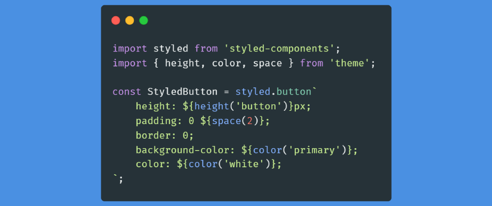
Implementation
Here's a snippet that shows how your code can look like...
import styled from 'styled-components';
import { height, color, space } from 'theme';

const StyledButton = styled.button`
    height: ${height('button')}px;
    padding: 0 ${space(2)};
    border: 0;
    background-color: ${color('primary')};
    color: ${color('white')};
`;
Compiles into...
button {
    height: 40px;
    padding: 0 16px;
    border: 0;
    background-color: #3b49df;
    color: #ffffff;
}
Conclusion
So there you have it, that's how you can setup a theme with styled-components and write it in a structured and readable manner.
I have setup a sample project in github that applies all that is written in this article for your reference. You can find it here.
You can find me on Twitter, feel free to DM me if you have questions.


Top comments (2)
Nice!
Thanks for sharing :)
How cool this was .Thanks Jenning