Before I begin, check out this list of 5 Really Cool Portfolios that I have ever seen!! Read the description because I've written the facts that a recruiter looks for in your Portfolio.
Click on the images to visit the respective websites
#1 Bruno Simon
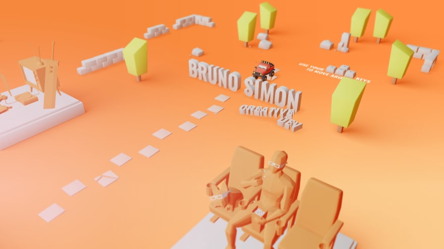
Developed in WebGL Studio, www.bruno-simon.com is probably the best portfolio that I have seen. His portfolio and projects have always inspired me to learn 3D Web Dev. And who doesn't love 3D? Although it feels like a 3D video game, Simon has done a really great job in showing off his skills and side-projects.
#2 Rally
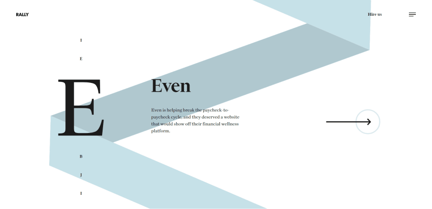
The only thing that is missing in the above image are the animations. That ribbon that you see behind the text actually transforms into the side menu!! UNBELIEVABLE right? I love it how they kept the website design so simple yet so sexy.
#3 Antoni
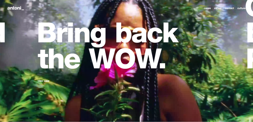
This website left me speechless, it's not only responsive but also it has really cool interactive features that will leave you in awe. There's a video running behind in the background that makes it look even more beautiful. Visit the website to experience the animations and the beauty of the website.
#4 Love For Iceland
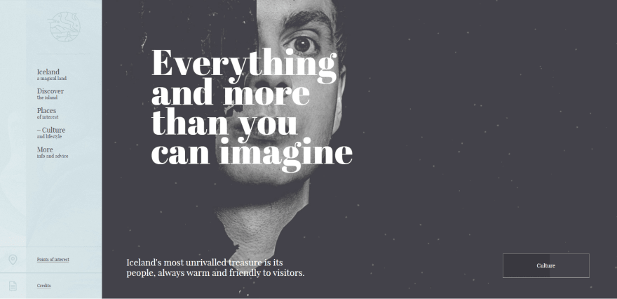
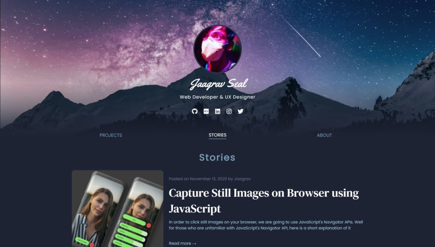
One very important thing that recruiters look for in your portfolio websites are blogs. They want to see articles that you've written, public talks you've given and hackathons you've participated in. Having a blog in your personal website makes it 10x more attractive and useful, because in order to create a blogging website, you require basic skills related to both backend and frontend. Love For Iceland is the most beautiful blogging website that I have ever seen.
#5 Uruoi
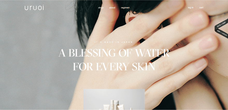
If you're here on Dev.to, I consider you to be extremely creative. Because Creative People love to explore, love to learn. That's what recruiters look for in your portfolio, they need to know how creative you are. No matter how good of a developer you are, even the simplest of website designs also end up looking super attractive. Like Uruoi's Website itself, if you look closely you'd notice there's not many elements in the picture, all that the website has is some soothing animations and a huge background image. Other than that it's literally a regular website, but just the background and the animations make it the Website of the day.
You can check out more such websites on Awwwards
Things to keep in mind
You might have noticed in the above websites, they are literally award winning websites, however if you visit them, you'll notice the key ingredient that makes them so attractive is their animations and their simplicity. In all of the above websites notice how less text they have written? Most of it comprises media like images and videos. And that's what makes them award-winning.
Now to get a job at one of your dream companies DOES NOT require you to become an award-winning developer, but if you are then that's awesome!! It's literally just another advantage, which would of course make it easier to get a job at your dream company. However, if you are a beginner, and you also want to make super attractive portfolios, which let's say would atleast grab you a job then take a look at these three fundamental tips:
Tip 1 - Choose a Color Palette
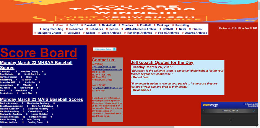

Above as you can see their are two blogging websites with two UIs. Now of course just by seeing your face I can tell you did not like the first images. If you're a regular visitor here on Dev, you might have enabled the dark mode, because of how cool it looks. Well we all love Dev's UI because they used less colors, rather the designers of Dev worked according to a color palette which is basically a bunch of colors of either the same shade or they look good in contrast. Like the background of Dev is a shade of dark grey, the blog posts are a bit lighter, and finally in order to attract users into writing more posts, they made the WRITE A POST button in a calm indigo color. Whenever you are working on your portfolio or any kind of website, make sure to use calm colors instead of aggressive primary colors like Red, Blue, Yellow or Black, calm colors are basically a lighter or better shade of these primary colors. There's a reason why girls prefer nude colored lipsticks over blood red ones. And if you don't follow a proper color palette then you might end up with something like the first image.
Tip 2 - Website Responsiveness
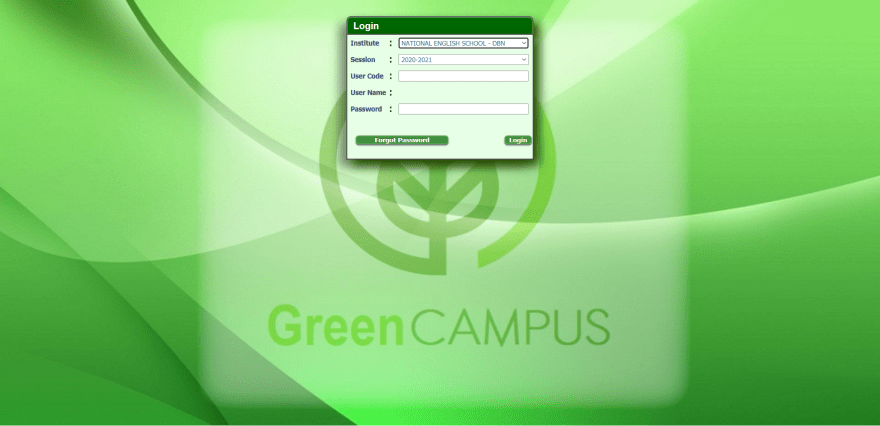
I know I know, you must be like OH COME ON JAAGRAV!! NOW YOU ARE HURTING MY EYES I am sorry but let me explain first, oh wait I have nothing to explain, we already can see what makes the website's UX so poor. It is it's responsiveness, I have seen so many portfolios that are not responsive which is like the nightmare for web developers. Always remember when designing an awesome UI, you always need to worry about the UX (User-Experience), that is more important. You need to follow the accessibility rules, and everything in order to become a good developer. You see, Google or Facebook could have had a UI like one of the five best websites I showed you above. But still they follow the rules because even after having a great UI, those websites don't have a good UX. Now look, we are web developers, that's why we always care about UI design but always keep in mind, most users care about the UX of the website i.e. how simple it is to use rather than the UI of the website. Did your dad ever day while using Google Maps that, Google Maps has such a great interface, instead he'd probably just reply that Google Maps is very easy to use. That's because of the great UX criteria that every Google Developers and Designers follow when they are working on the next big thing by Google. However my school's website lacks both the UI and the UX.
Tip 3 - Only Add Content that matters
Before I made my own portfolio, I had gathered a lot of inspirations from Dribbble and Awwwards, I wanted to make a website which would be as beautiful in design and also be able to say a lot about me, however after I made a design that fancy I realised that my portfolio did not look professional enough because it was too fancy. Though it had a lot of animations and the design was also pretty cool, I did not like the UX. The website was not simple enough. When a recruiter visits your portfolio always remember that he wants to get a quick look at your skills, projects, experience and talks in public. Because the recruiter has thousand other applications that he/she needs to go through before/after yours. Try to show your work to the recruiter as fast as possible, put content that you think is more useful over the others which are probably not so much. Show off the projects you have worked on, show off the articles you have written, your social media accounts and of course your experience. That's what matters the most. Here are some professional yet simple websites that I feel are an eye-catcher and life saver for the recruiters.
Click on the images to visit their websites!!
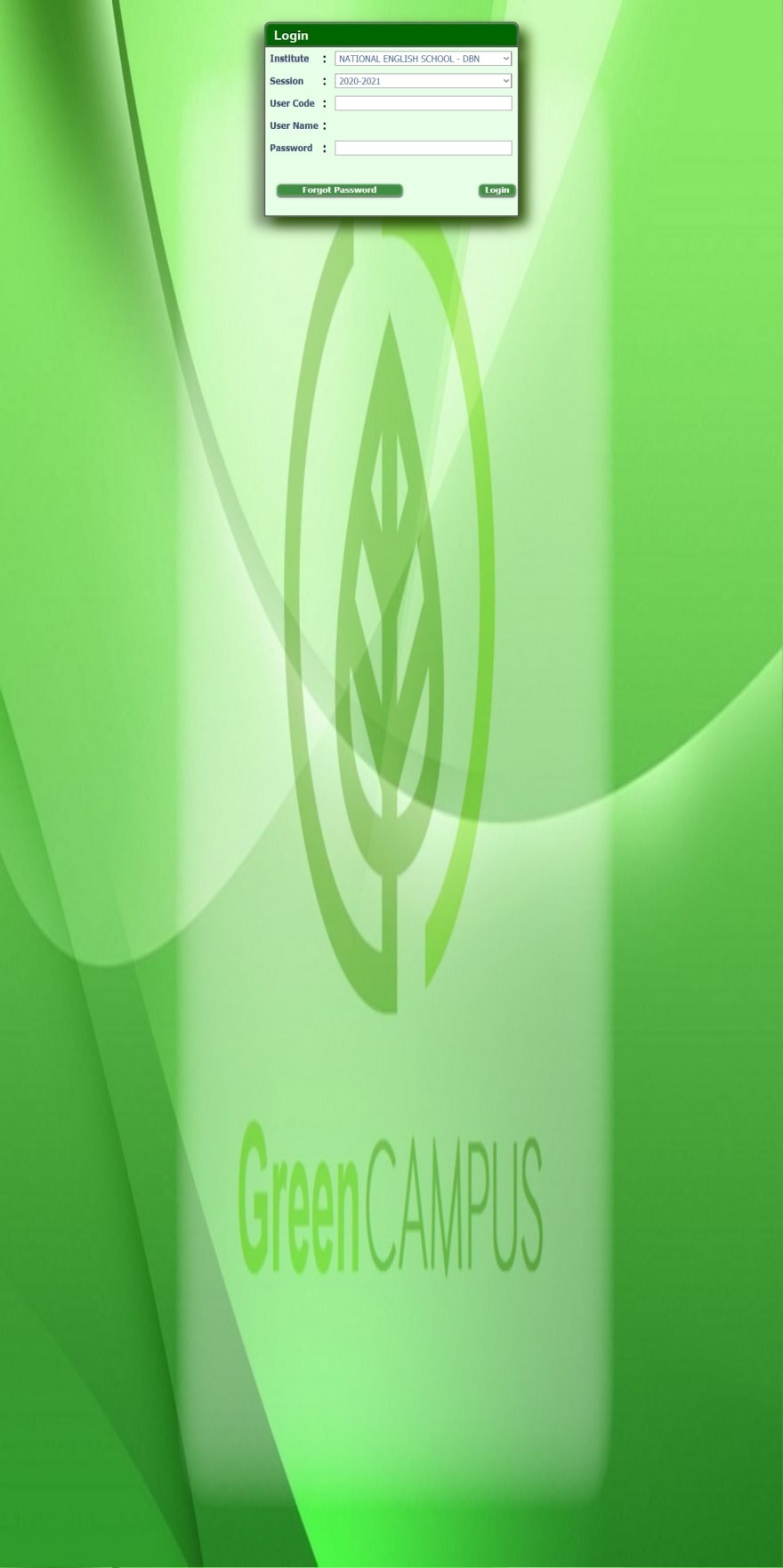
aleksandarpopovic.com by Aleks Popovic
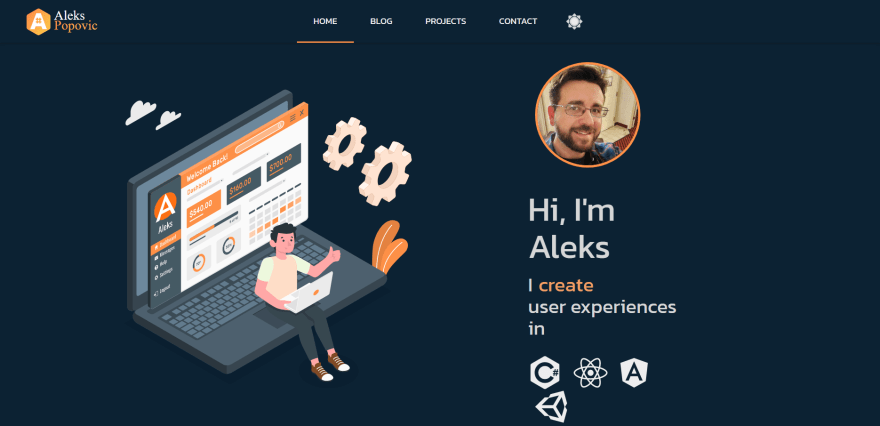
haxzie.com by Musthaq Ahamad
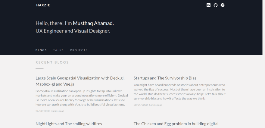
devraj-chatribin.netlify.app by Devraj Chatribin
And finally,
Book Of Jaagrav by me!!
Conclusion
Now I know many of you may not like any of our designs or any one of our designs but with this article I basically want to say one thing, whatever design you make, KEEP IT SIMPLE. Do not go too fancy, maybe a little, but try to keep it the best of both worlds. Also if you like writing articles, you can create a personal blog for yourself, there are so many tools like FirebaseJS for Database, MarkedJS to add markdown to your website, ReactJS to have a great User Experience and also SendGrid which you can use in order to notify your readers about your new post. You can browse through YouTube to know how to make your own blog, here's one video by WebDevSimplified that you can watch in order to create your own blog with Mongo.
And in the meantime, you can either check out my blog
Or the code for it.

🧔 About Me
-
🔭 I’m currently working on Recess -
🌱 I’m currently learning React, Arduino, Tensorsflow and CNN -
👯 I’m looking to collaborate on React/Vue/Vanilla Projects -
👨💻 All of my projects are available at https://xjaagrav.vercel.app/projects -
You can check out my Arduino projects right here.
-
📝 I regularly write articles on https://xjaagrav.vercel.app/stories -
💬 Ask me about React, Vue, Web Development and UI/UX -
📫 Contact me here -
📄 My Resume https://drive.google.com/file/d/10z7nWMOMKMj2KtOxszcxYI2b0sQrxFpn/view?usp=sharing -
⚡ Fun fact People often call me an alien
✍ My Work
Here are some of my projects on Github that I am proud of:
📚 My Skills
🤝 Connect


Top comments (5)
Good job :)
Keep it up
Love the effort you put into this in terms of examples and resources, thank you! I’m quite new and trying to learn more about design so this was great content for me🙌🏻🙏🏻
nice one 🤩
Thanks. iam looking for it!