This article was first published and hosted at jackdomleo.dev/blog/2020/hover-css-media-query.
"The hover CSS media feature can be used to test whether the user's primary input mechanism can hover over elements." - MDN web docs
Not to be confused with the :hover psuedo selector, this is a media query you may have never used or never considered using.
Let's look at an example and see how it could be improved using the hover media query.
Let's assume we're using this HTML for the below demonstration.
<button class="button">
  Hover me?
  <svg>...</svg>
</button>
Showing an icon on hover
I want a button, that when hovered will show an icon. The icon should be hidden when not hovered.
This is a typical feature request. It's not very detailed, but as front-end developers, it's enough for us to work with and create a prototype button at the least.
For this to work, we may jump to do something like this:
.button {
  background: darkorange;
  color: white;
  border: none;
  padding: 1rem;
  text-align: center;
  position: relative;
  cursor: pointer;
}

.button svg {
  height: 2rem;
  width: 2rem;
  position: absolute;
  top: 50%;
  right: 0.6rem;
  fill: currentColor;
  opacity: 0;
}

.button:hover {
  padding-right: 3rem;
}

.button:hover svg {
  opacity: 1;
}
This would for sure show the icon when the button is hovered! 💪 But it doesn't work on my mobile... It doesn't know I'm hovering the button.
So, how do we cater for touch screen devices that can't hover? A common solution would be to always display the icon on mobile devices (take note of this, I will come back to it later) and add the hovering functionality for larger screens by using a min-width media query, typically these are screens that are 768px or wider:
.button {
  background: darkorange;
  color: white;
  border: none;
  padding: 1rem;
  padding-right: 3rem;
  text-align: center;
  position: relative;
}

.button svg {
  height: 2rem;
  width: 2rem;
  position: absolute;
  top: 50%;
  right: 0.6rem;
  fill: currentColor;
  opacity: 1;
}

@media (min-width: 768px) {
  .button {
    padding-right: 1rem;
    cursor: pointer;
  }

  .button svg {
    opacity: 0;
  }

  .button:hover {
    padding-right: 3rem;
  }

  .button:hover svg {
    opacity: 1;
  }
}
Great! We now have a button that always shows the icon on devices with a screen width less than 768px and will initially hide the icon on devices with a screen width of 768px wide or wider.
Chances are, this works for most cases and has been an acceptable solution for many years. However, we can't assume a device doesn't have a hover input mechanism just because of its screen width, and vice-versa.
This is where our hover media query comes in. Let's take a look at how we can refactor our min-width to use hover instead.
.button {
background: darkorange;
color: white;
border: none;
padding: 1rem;
padding-right: 3rem;
text-align: center;
position: relative;
}
.button svg {
height: 2rem;
width: 2rem;
position: absolute;
top: 50%;
right: 0.6rem;
fill: currentColor;
opacity: 1;
}
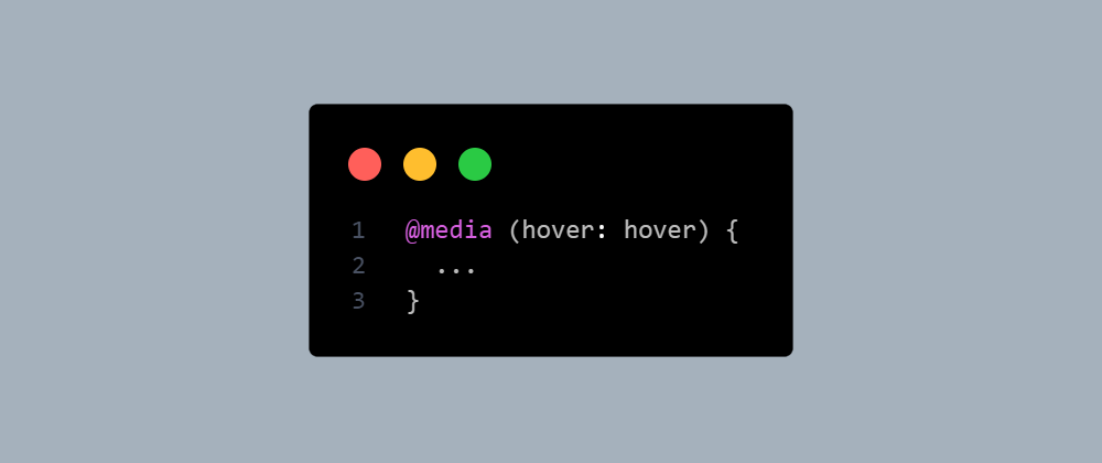
@media (hover: hover) {
.button {
padding-right: 1rem;
cursor: pointer;
}
.button svg {
opacity: 0;
}
.button:hover {
padding-right: 3rem;
}
.button:hover svg {
opacity: 1;
}
}
Outside any media query, we define our base styles that apply to everything. Inside our hover media query, we define styles that are specific to devices that have a hover input mechanism.
Can you see how this is better than determining hover specific styles based on screen size?
It's also a cleaner method because we define our hover styles in our hover media query, it's grouped them nicely for us. These hover styles would be harder to identify in the stylesheet if they were encapsulated in a min-width media query.
For a working example, I created a CodePen below (with a few extra CSS properties) that I hope will help 🙂.


Top comments (5)
That's really cool! I love how CSS has all these little neat tricks that can do useful.
Yeah! This media query is now in Level 4 which means it's next step is to be a fully-fledged feature. drafts.csswg.org/mediaqueries-4/#h... If it were in Level 3, I wouldn't have posted this. There's lots more queries than
hover: hover🙂.button:hover svg {
opacity: 0;
}
opacity should be 1, or?
Good spot, thank you!
check @media (min-width: 768px) too