Let's refresh Our CSS Flexbox Memory. Here's a Tutorial & Cheat Sheet of everything you can do with CSS flexbox. Let's Go 🎖️
The original Article at FreeCodeCamp
Table of Contents --
- FlexBox Architecture
- flex-direction
- justify-content
- align-content
- align-items
- align-self
- flex - grow | shrink | wrap | basis
- Short Hands
- Conclusion
You can watch this tutorial on YouTube as well if you like:
FlexBox Architecture
So how does Flexbox architecture work? The flex-items [Contents] are distributed along the Main Axis and Cross Axis. And, depending on the flex-direction property, the layout position changes between rows and columns.

FlexBox Chart --
This chart contains every possible property and value you can use when using flexbox. You can reference it while doing the project and experiment with different values.

How to Set Up the Project

For this project, you need to know little bit of HTML, CSS, and how to work with VS code. Follow along with me ->
- Create a folder named "Project-1" & Open VS Code
- Create index.html & style.css files
- Install Live Server & Run Live Server.
Or, you can just open Codepen & start coding.
At the end of this tutorial, you can make website layouts more accurately.
HTML
In HTML, write these lines of code inside the body tag 👇
<div class="container">
    <div class="box-1"> A </div>
    <div class="box-2"> B </div>
    <div class="box-3"> C </div>
</div>
CSS
target the .container class & all the boxes. Then style the boxes so that all of them looks similar. Like this 👇
Note : don't forget to put the height of the container.
.container{
   height : 100vh;
}

[class ^="box-"]{
    width: 140px;
    height: 140px;
    background-color: skyblue;
    border: 2px solid black;

// To view the letter better
    font-size: 65px;
}
But Wait....

Before starting, you need to understand the relationship between parent & child classes.

Flexbox works on the parent class, not on the children classes.
Here, the .container class is the parent & our .box-* classes are our children.
so, apply the display: flex inside .container class. And place the letters at the center of the box like this ->
.container{
    display : flex;
    height : 100vh;

// To place some gap between boxes
    gap : 25px;
}
[class ^="box-"]{
// Code from previous step are here

// Placing text at center
    display : flex;
    justify-content : center;
    align-items : center;
}
And.... we're all set! Let's start coding. 😊

flex-direction
The Direction/Orientation in which flex-items are distributed inside flex-container.


To recreate these results, Let's write on CSS These lines ->
Note : We'll write inside .container class
.container{
//code from setup stage are here

// Change the value  👇 here to see results
    flex-direction : row;
}
justify-content
This property arranges flex-items along the MAIN AXIS inside the flex-container
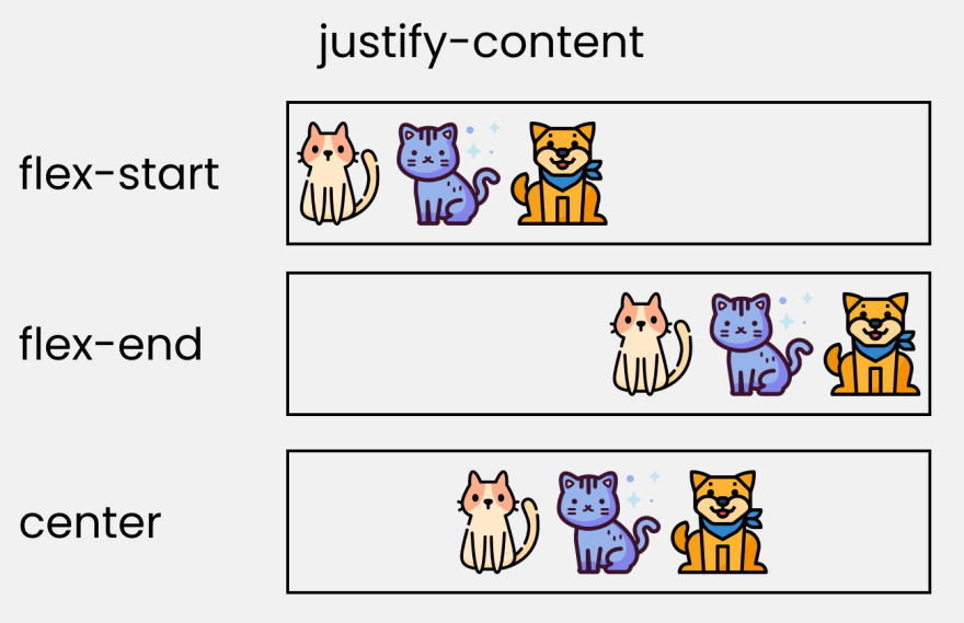
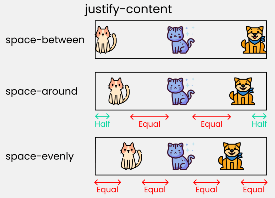
To recreate these results, Write on CSS These lines ->
.container{
//code from setup stage are here

//  Change the value  👇 here to see results
    justify-content: flex-start;
}
align-content
This property arranges flex-items along the CROSS AXIS inside the flex-container. This is similar to justify-content


Please note that, without the flex-wrap property, this property doesn't work, here's the demo ->
.container{

//  Change the value  👇 here to see results
    align-content: center;

// without this line, align-content won't work
    flex-wrap: wrap;
}
align-items
This property distributes Flex-items along the Cross Axis

To recreate these results, Let's write on CSS ->
.container{
//code from setup stage are here

// Change the value 👇 here to see results
    align-items: flex-end;
}
align-self
This property works on the children classes. It positions the selected item along the Cross Axis

In total we have 6 values
- flex-start
- flex-end
- center
- baseline
- stretch
- auto
To recreate the results, select any .box-* & write
.box-2{
// Change the value 👇 here to see results
     align-self : center;
}
flex - grow | shrink | wrap | basis
The properties that we're discussing right now will work when we resize the window. Let's dive right in.
- flex-grow : grows the size of a flex-item based on width of the flex-container.
- flex-shrink : The ability for a flex item to shrink based on width of the flex-container. Opposite of flex-grow.

To achieve these results, follow me ->
Please Note : flex-grow & flex-shrink works on children classes. So, we will target all our boxes ->
.box-1{
    flex-grow: 1;
}
.box-2{
    flex-grow: 5;
}
.box-1{
    flex-grow: 1;
}
Resize the window & see the results.
To duplicate result of flex-shrink, write ->
Please note : Delete the flex-wrap property, otherwise it won't work.
.box-1{
    flex-shrink: 1;
}
.box-2{
    flex-shrink: 5;
}
.box-1{
    flex-shrink: 1;
}
Now, Resize the window & see the results.
- flex-wrap : Amount of Flex-item you want in a line/row.
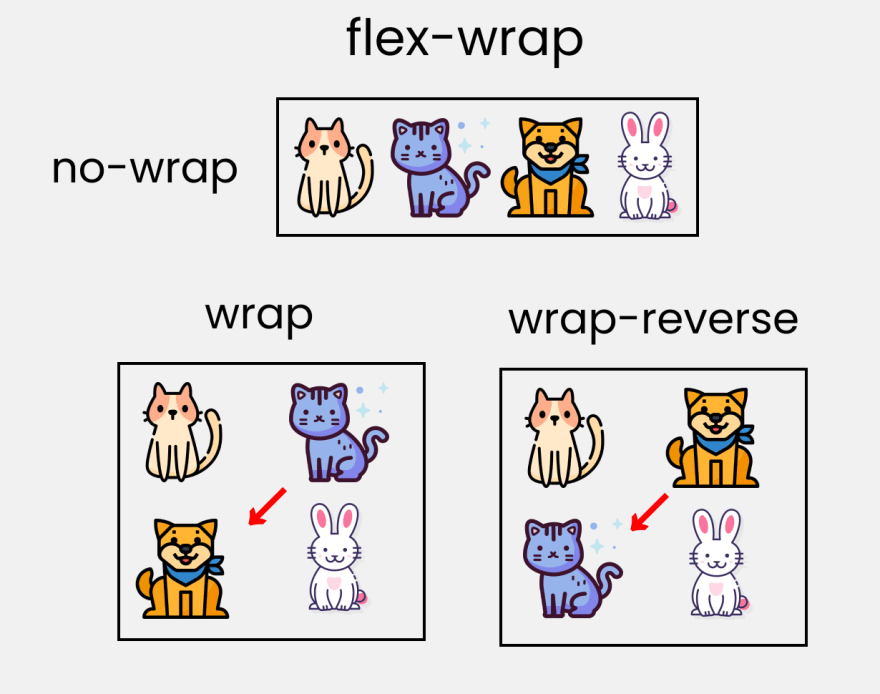
This works on the .container parent class. So, write ->
.container{
    //other codes are here

// Change value 👇 here to see results
    flex-wrap : wrap;
- flex-basis : This is similar to adding width to a flex-item, but only more flexible. flex-basis: 10em; it will set the initial size of a flex-item to 10em. Its final size will be based on available space, flex-grow, and flex-shrink.
Short Hands

- flex : It is a shorthand to flex-grow, flex-shrink and flex-basis combined.
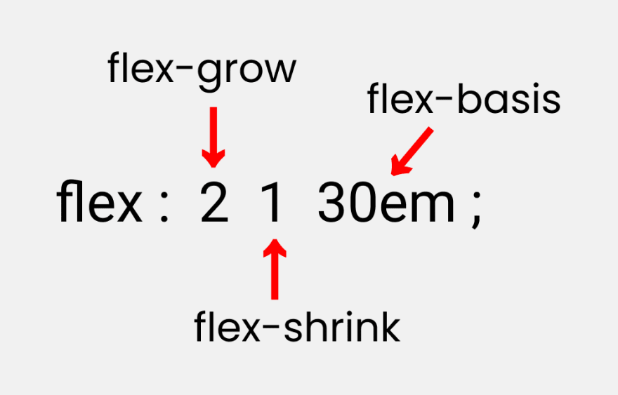
You can try this by writing ->
Please Note : It only works on the children classes
.box-2{
    flex : 2 1 30em;
}
- flex-flow : Short hand to flex-direction & flex-wrap

You can try this by writing ->
Please Note : It only works on the parent class
.container{
    flex-flow : row wrap;
}
place-content
This is the shorthand of justify-content & align-content

Let's duplicate the results
Note : It works on the parent class
.container{
    place-content : center flex-end;
}
Credits

Read Next :

Conclusion
Here's Your Medal For reading till the end ❤️
Suggestions & Criticisms Are Highly Appreciated ❤️


YouTube / Joy Shaheb
Twitter / JoyShaheb
Instagram / JoyShaheb


Top comments (82)
This tool is awesome. Makes flexbox easy to understand. I use it alot.
demos.scotch.io/visual-guide-to-cs...
Nice. This is also a good one: https://progressivered.com/fla/?d=0&v=1&h=1&s=0&i=000&a=000#playground
This is also good for beginners to see how common components can be structured. flexboxpatterns.com/
Wow, that's a really good resource. Thank you for sharing.
Most welcome ❤️
A legend made this software, thank you for sharing this 🏅🙏
Thanks
Niiiice!
Why not this is a PWA?
nice visuals, may I ask what you used? 👀
I took Images from Flaticon.com
I gave them credits before conclusion part
Awesome, thanks! 🙏❤
Can you please tell me whats the name of icons pack you used? I am a member at Flaticon, I liked the icons you used.
Dear Joy Shaheb, may I translate your article into Chinese?I would like to share it with more developers in China. I will give the original author and original source.
Sure. Best of luck ❤️🎖️
Thank You Very Much!
Awesome reference. Thanks for this!
Thank you sir... that's cool..but could I download or save it offline?? Bcz I have some Net issues
Sure,
How could I download it offline?
Click on the image. Then download/save it/ take screenshots
Thank you ❤️
Really good job! Thank you. It would be amazing if you could do something similar about Grids 😊
Thank you for the well wishes. I'll think about Grids in future. Till then, stay tuned ❤️
Thank you for sharing this.
Most welcome ❤️
Excellent article!
Wow, very simple to understand with pictures!! 😍 Finally, I'll get all info easily with flexbox! Thank
Most welcome ❤️
Awesome, i just learnt place-content...👍🏿
This is very good content. Well done!
note that
ordercan be used with negative valuesThis tool makes me feel happy and confident. When next I will use my flexbox now, no more struggling with positioning child elements
youtube.com/watch?v=OZk0rHtLnd8&t=...?