
In this tutorial we will create search input form, search input with right side icon, search input with left side icon, search input with focus states and single boder, Simple search input with button, examples with Tailwind CSS
Tool Use
Tailwind CSS 2.x
Heroicons Icons
Setup Project
Using CDN
<link href="https://unpkg.com/tailwindcss@^2/dist/tailwind.min.css" rel="stylesheet">
or
The Easiest way to install Tailwind CSS with Tailwind CLI
How to Install Tailwind CSS with NPM
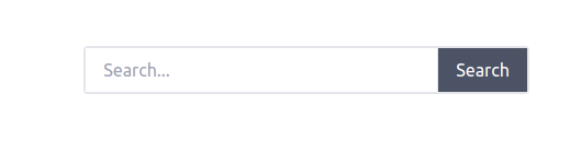
Example 1
Simple Search Input with Button
<div class="flex items-center justify-center ">
    <div class="flex border-2 border-gray-200 rounded">
        <input type="text" class="px-4 py-2 w-80" placeholder="Search...">
        <button class="px-4 text-white bg-gray-600 border-l ">
            Search
        </button>
    </div>
</div>
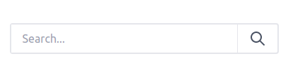
Example 2
Search Input with right side SVG Icon
<div class="flex items-center justify-center">
    <div class="flex border-2 rounded">
        <input type="text" class="px-4 py-2 w-80" placeholder="Search...">
        <button class="flex items-center justify-center px-4 border-l">
            <svg class="w-6 h-6 text-gray-600" fill="currentColor" xmlns="http://www.w3.org/2000/svg"
                viewBox="0 0 24 24">
                <path
                    d="M16.32 14.9l5.39 5.4a1 1 0 0 1-1.42 1.4l-5.38-5.38a8 8 0 1 1 1.41-1.41zM10 16a6 6 0 1 0 0-12 6 6 0 0 0 0 12z" />
            </svg>
        </button>
    </div>
</div>
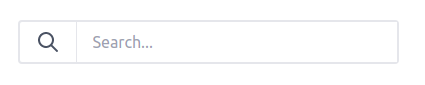
Example 3
Search Input with left side SVG Icon
<div class="container flex mx-auto">
    <div class="flex border-2 rounded">
        <button class="flex items-center justify-center px-4 border-r">
            <svg class="w-6 h-6 text-gray-600" fill="currentColor" xmlns="http://www.w3.org/2000/svg"
                viewBox="0 0 24 24">
                <path
                    d="M16.32 14.9l5.39 5.4a1 1 0 0 1-1.42 1.4l-5.38-5.38a8 8 0 1 1 1.41-1.41zM10 16a6 6 0 1 0 0-12 6 6 0 0 0 0 12z">
                </path>
            </svg>
        </button>
        <input type="text" class="px-4 py-2 w-80" placeholder="Search...">
    </div>
</div>
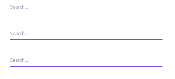
Example 4
Search Input focus states with single border
<div>
    <input type="text" name="name" placeholder="Search..."
        class="w-1/3 py-2 border-b-2 border-gray-600 outline-none focus:border-green-400">
</div>
<div>
    <input type="text" name="name" placeholder="Search..."
        class="w-1/3 py-2 border-b-2 border-green-600 outline-none focus:border-blue-400">
</div>
<div>
    <input type="text" name="name" placeholder="Search..."
        class="w-1/3 py-2 border-b-2 border-blue-600 outline-none focus:border-yellow-400">
</div>
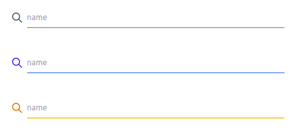
Example 5
Search Input with single border, focus states and SVG Icon
<div class="flex items-center">
    <svg xmlns="http://www.w3.org/2000/svg" class="w-6 h-6 mr-2 text-gray-600" fill="none" viewBox="0 0 24 24"
        stroke="currentColor">
        <path stroke-linecap="round" stroke-linejoin="round" stroke-width="2"
            d="M21 21l-6-6m2-5a7 7 0 11-14 0 7 7 0 0114 0z" />
    </svg>
    <input type="text" name="name" placeholder="name"
        class="w-1/3 py-2 border-b-2 border-gray-400 outline-none focus:border-green-400">
</div>
<div class="flex items-center">
    <svg xmlns="http://www.w3.org/2000/svg" class="w-6 h-6 mr-2 text-blue-600" fill="none" viewBox="0 0 24 24"
        stroke="currentColor">
        <path stroke-linecap="round" stroke-linejoin="round" stroke-width="2"
            d="M21 21l-6-6m2-5a7 7 0 11-14 0 7 7 0 0114 0z" />
    </svg>
    <input type="text" name="name" placeholder="name"
        class="w-1/3 py-2 border-b-2 border-blue-400 outline-none focus:border-green-400">
</div>
<div class="flex items-center">
    <svg xmlns="http://www.w3.org/2000/svg" class="w-6 h-6 mr-2 text-yellow-600" fill="none" viewBox="0 0 24 24"
        stroke="currentColor">
        <path stroke-linecap="round" stroke-linejoin="round" stroke-width="2"
            d="M21 21l-6-6m2-5a7 7 0 11-14 0 7 7 0 0114 0z" />
    </svg>
    <input type="text" name="name" placeholder="name"
        class="w-1/3 py-2 border-b-2 border-yellow-400 outline-none focus:border-green-400">
</div>
See Also 👇
Tailwind CSS Simple Table Example
Tailwind CSS Simple Button Examples
Tailwind CSS Simple Responsive Image Gallery with Grid
Tailwind CSS Simple Alert Components Examples
Tailwind CSS Simple Card Examples
Tailwind CSS Badge Examples
Tailwind CSS Simple Modals Examples
Tailwind CSS Simple Avatar Examples


Top comments (0)