
Imagine my thoughts when I first saw the TailwindCSS Framework, in my head I already thought this was one of the usual frameworks like Bootstrap, Bulma, and Foundation, etc that I have tried using before and I took my eyes off it for a second. Until recently I decided to give it another look after I saw the recent release of v1 and to my greatest surprise, I fell in love with TailwindCSS. In this article, I’ll be introducing you to TailwindCSS and why I think it is a different ball game entirely with useful examples. Let’s get right into it, shall we?
Introduction
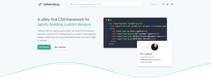
TailwindCSS is a utility first CSS framework for building custom user interface designs. It is a highly customizable, low-level CSS framework that gives you all of the building blocks you need to build bespoke designs without any annoying opinionated styles you have to fight to override.
Why TailwindCSS?
One of the common reasons why I think I got love struck with TailwindCSS is that I found out I can get the following out of the box:
- Customization on the fly: Tailwind is easily customizable to fit your needs. You can customize your own colors, border-sizes, shadows, spacing and a whole lot more. You're the limit as far as customization is concerned with TailwindCSS.
- Component-friendly: TailwindCSS is also a component friendly CSS framework, what this means is that instead of having repeated utility classes for your UI, you can combine common patterns and abstract it out as component classes that eventually become reusable.
- Responsive to the Core: TailwindCSS comes bundled with responsive variants for different screen sizes that can be adopted in your UI by only prefixing the screen size to the class.
Getting Started
To get started with TailwindCSS in your project you will need to install it as a dependency or you can use it as a CDN. But mind you it's not a recommended choice to use the CDN option because some features that make tailwind awesome won't be available for use.
// using CDN
<link href="https://unpkg.com/tailwindcss@^1.0/dist/tailwind.min.css" rel="stylesheet">
# using npm
npm install tailwindcss -save-dev or

# using yarn
yarn add tailwindcss --dev
After installation, we will need to inject tailwind's styling into our CSS using the @tailwind directive. So let's go ahead and add Tailwind's base, components, and utility styles into our styles.css
@tailwind base;

@tailwind components;

@tailwind utilities;
With the recent release of
v1.0, the good news is we won't need to createtailwind.config.jsfile anymore as this is now optional.
Using TailwindCSS CLI
Now, we can use tailwind's CLI to build out our CSS into tailwind's styles using the command below.
npx tailwind build style.css -o output.css
The tailwind command is simply taking our default CSS file style.css as the input and processing the styles into output.css as the output file.
Instead of using style.css as the stylesheet in our HTML you can now use output.css to ensure tailwind styles are being applied to our HTML content.
<link rel="stylesheet" type="text/css" href="output.css">
Let's now go ahead and create some examples that we can utilize to explore the capabilities of TailwindCSS. We can also spin up tailwindcss on codepen or have it on our local computer whichever one works for you. I'll be sharing a few codepen examples in this article along with the code examples.
Example 1: Creating a Card
Let's create a card using TailwindCSS and see how seamless this process is without writing any line of CSS.
<div class="mx-auto my-3 max-w-md rounded overflow-hidden shadow-lg">
  <img src="https://images.unsplash.com/photo-1557310717-d6bea9f36682?ixlib=rb-1.2.1&ixid=eyJhcHBfaWQiOjEyMDd9&auto=format&fit=crop&h=400&w=634&q=80" class="w-full" alt="a platter of cookies">
 <div class="px-6 py-4">
  <div class="font-bold text-xl mb-2">Chocolate Chip Cookies</div>
  <p class="text-base text-gray-700">
         Lorem ipsum dolor sit amet, consectetur adipisicing elit. Voluptatibus quia, nulla! Maiores et perferendis eaque, exercitationem praesentium nihil.
  </p>
 </div>
 <div class="px-6 py-4">
  <span class="inline-block bg-gray-300 px-3 py-2 text-sm font-semibold mr-2 text-gray-700 rounded-full">
   #photography
  </span>
   <span class="inline-block bg-gray-300 px-3 py-2 text-sm font-semibold mr-2 text-gray-700 rounded-full">
   #food
  </span>
   <span class="inline-block bg-gray-300 px-3 py-2 text-sm font-semibold text-gray-700 rounded-full">
   #cookies
  </span>
 </div>
 </div>
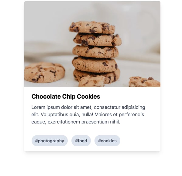
Here's the codepen link for the card example.
Example 2: Custom Buttons
The second example we'll be looking at is how to create buttons using TailwindCSS.
<button class="bg-blue-400 text-white font-bold py-2 px-5 rounded my-2">Button</button>
<button class="bg-red-600 text-white font-bold py-2 px-5 rounded my-2">Button</button>
<button class="bg-gray-600 text-white font-bold py-2 px-5 rounded my-2">Button</button>
<button class="bg-green-500 text-white font-bold py-2 px-5 rounded my-2">Button</button>

I absolutely enjoyed playing around with the docs to create these examples and one thing you can also leverage is extracting utility classes as a component.
Extracting Utility Classes as Components
You can additionally extract utility classes as a component as I mentioned earlier. Tailwind advocates for Utility-first workflow but when you find out that you're reusing the same styles over again then this is when you should think of extracting them into components. Here's how to accomplish just that.
From example 2 above, We can further reduce the number of utility classes by extracting it out as a component using @apply.
<button class="btn btn-blue">
  Button
</button>
<button class="btn btn-gray">
  Button
</button>


<style>
.btn {
  @apply text-white font-bold py-2 px-4 rounded my-2;
}
.btn-blue {
  @apply bg-blue-500;
}
.btn-blue:hover {
  @apply bg-blue-700;
}
.btn-gray {
  @apply bg-gray-500;
}
.btn-gray:hover {
  @apply bg-gray-700;
}

</style>
And you still get the same result but with a lot, fewer utility classes applied. Note that variants like hover:, focus:, and {screen}: can't be applied directly, so instead apply the plain version of the utility to the appropriate pseudo-selector or media query.
I absolutely had fun exploring TailwindCSS and I can't wait to work with it in my projects. Have you tried TailwindCSS or used it in a project? What are your thoughts about it? feel free to leave a comment.


Top comments (13)
YAFL
(Yet Another Framework Lock-In).
Why would I use TailwindCSS instead of using SASS/SCSS or LESS Mixins/classes from Bootstrap, Pure, Foundation, or some other library??? Also, never ever litter your markup with the literal classnames of the framework. You should always name the component what it actually is and then use the approach described in the last sentence to decorate your own style definitions. Not
btn btn-blue. How aboutproduct optionand then mixin/decorate your.product.optiondefinition with the.btnand.btn-primarymixins where theming of.btn-primaryis registered in yourvariables.extfile(s)? Why is the world going so mad? Oh, because of no resistance to YAFL, that's right.Tailwind is definitely not what you're calling YAFL. I would suggest you educate yourself and read the motivation behind Adam's reasons for creating Tailwind before you spread your FUD. He covers your exact argument here. You're showing your ignorance when you lump Tailwind with Bootstrap, Foundation, etc.
While I agree with you 100%, if you are making BaseComponents correctly in a framework like Vue, all of this dirty markup would be locked behind a component, meaning it's easier to access when needed, but actually doesn't dirty up your page templates.
I was totally in the boat of disregarding this (even when I'm a hardcore listener of the creator's podcast), looking at it further though, I realize the benefits. Perhaps I'll give it a try.
Seems pretty useful, but also like it can get... verbose. I could see myself storing those classes in a string variable in React or something, if they got too long or complicated. I guess I'll need to try it out myself.
I can tell you one thing, I don't like the way Style Components and others do the scoped styles. It feels clunky.
Vue has a nice way of doing it, with the tag, and you just writing plain CSS. Wish that was possible in React. Maybe it is and I just haven't discovered the library for it.
I love the way vue handle styling within the same component also wish that was possible with React.
Can you point me to some documentation or example of what you mean by that? I am coming from an angular side and a quick google did not reveal what you both meant.
vuejs.org/v2/guide/single-file-com...
I love tailwind! It meshes well with front end component architecture, while embracing css instead of hiding it inside JavaScript. I actually learned a lot about css by reading the tailwind docs, which is more than I can say for other css frameworks (looking at you bootstrap). Thanks for sharing this great introduction!
I totally agree with you on this! :)
I've been using tailwindcss for the last few months and can honestly say it's my favourite css 'framework' so far. Having everything available for creating apps from the ground up straight out of the box, including all the media queries and variants like focus/hover etc.
Tailwindcss was recently updated which came with quite a few changes for stuff like colours and key names - worth checking out this if you stumble across any older tutorials for tailwindcss and are wondering why stuff isn't working when using the latest version :)
Also, due to the vast amount of utilities and variations, out of the box Tailwind is pretty large, 58.8kb gzipped compared to Bootstrap's 22.7kb or Bulma's 23kb. There's a guide here for controlling file size. I've used purgecss with my Vue apps and have had great results with reducing file size for production (just make sure it's only enabled for production, otherwise every time you're hot reloading in a development environment you'll need to rebuild the whole thing which can take a little bit of time)
Hey Rick! I know right I love it too. I also saw the recent update and tried out a few things.
Also on the part of controlling sizes, I used purgecss while testing it out and it reduces it to less than 3kb which is pretty awesome.
So now that it's 2020, how are you liking Tailwind?
I still love it. I use across multiple projects atm 💛