I have been working on the web for a few years now but I haven't paid any attention to the W3C standards or visited the website to see where all the magic on the web is created. Well, a few days ago I stumbled on Rachel Andrew's smashing article celebrating the W3C at 25 and one thing led to another I landed on the CSS working group page several clicks down the line and I'm lost and amazed at what I had no idea existed. The web is an open platform and there are a lot of amazing people working together to build and manage the web standards we all work with from accessibility, CSS, JavaScript and a lot more. Why I'm saying all of this is because from my crazy search I learned something new and I'll like to share with others.
Now we've come across the @media CSS rule but did you know that they are cool things you can do with it asides making your website responsive? The syntax of a media query is composed of an optional media type(such as print or screen) and any number of media feature expressions. In this article, I'll share some media features I previously didn't know about and hope you learn and share them too.
NB: Some of the features I'll share are part of the CSS Working Group Draft and are not finalized yet. The features are part of the Media Queries Level 5 specifications and should be used
-
Prefers-Color-Scheme: The prefers-color-scheme CSS media feature is used to detect if the user has requested the system to use a light or dark color theme. This is very useful for aesthetics and accessibility purposes and a lot of developers now adopt the dark mode feature, most websites I have visited lately have the dark mode feature implemented mine included.
This media feature can be implemented with these modes:
- no-preference: Indicates that the user has made no preference known to the system. This keyword value evaluates as false in the boolean context.
- light: Indicates that the user has notified the system that they prefer an interface that has a light theme.
- dark: Indicates that the user has notified the system that they prefer an interface that has a dark theme.
Here's a short demo of how this feature works.
This feature was added in Media Queries Level 5 spec and is supported by major browsers you can try this out right now by switching the default theme of your device. The can I use embed give a detailed view of browsers that are fully supported.

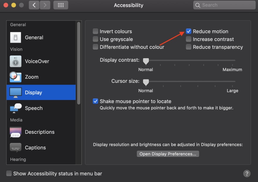
- Prefers-Reduced-Motion: The prefers-reduced-motion CSS media feature is used to detect if the user has requested that the system minimize the amount of animation or motion it uses. This feature is super important for people with the vestibular disorder or motion sickness this can be uncomfortable for them visiting a website with a lot of animation and motion so this feature is a great way to minimize or turn motion off. Luckily, Operating systems like Android, iOS, macOS, or Windows in their accessibility settings have allowed users for a long time to reduce motion wherever possible.
This media feature can be implemented with these modes:
- no-preference: Indicates that the user has made no preference known to the system.
- reduce: Indicates that the user has notified the system that they prefer an interface that minimizes the amount of movement or animation, preferably to the point where all non-essential movement is removed.
Here's a demo of how this feature works. The box will remain animated unless you switch the reduce motion option on let's try doing that by checking the accessibility settings on your device you'll immediately notice the animation is turned off.
Added in Media Queries Level 5 spec and is supported by major browsers you can try this out right now by switching the default theme of your device. The can I use embed give a detailed view of browsers that are fully supported.

- Prefers-Contrast: The prefers-contrast CSS media feature is used to detect if the user has requested that the web content is presented with a higher (or lower) contrast.
This feature is still experimental and it's currently in the process of being added to the web platform.
The media feature can be implemented with these modes:
- no-preference: Indicates that the user has made no preference known to the system. This keyword value evaluates as false in the boolean context.
- low: Indicates that the user has notified the system that they prefer an interface that has a lower level of contrast.
- high: Indicates that the user has notified the system that they prefer an interface that has a higher level of contrast.
Note: No browser currently implements this feature so I can't show an example of how it works but I look forward to seeing this feature ship.
Prefers-Reduced-Transparency: The prefers-reduced-transparency CSS media feature is used to detect if the user has requested that the system minimize the amount of transparency used across elements.
This feature is still experimental and it's currently in the process of being added to the web platform.
The media feature can be implemented with these modes:
- no-preference: Indicates that the user has made no preference known to the system. This keyword value evaluates as false in the boolean context.
- reduce: Indicates that the user has notified the system that they prefer an interface that minimizes the amount of transparent or translucent layer effects.
Note: No browser currently implements this feature so I can't show an example of how it works but I look forward to seeing this feature ship.
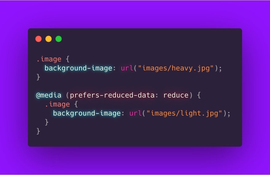
Prefers-Reduced-Data: The prefers-reduced-data media feature is used to detect if the user has a preference for being served alternate content that uses less data for the page to be rendered.
The media feature can be implemented with these modes:
- no-preference: Indicates that the user has made no preference known to the system. This keyword value evaluates as false in the boolean context.
- reduce: Indicates that the user has expressed the preference for lightweight alternate content.
Note: No browser currently implements this feature but here's an example of how it works from Adam Argyle tweet.
 TIL about the CSS media query `prefers-reduced-data`
💀🤘
If users have data saver on:
- deliver smaller images or just a gradient
- smarter <picture> <source>'s
- more!?
proposal
github.com/w3c/csswg-draf…
spec
drafts.csswg.org/mediaqueries-5…
rad work @hj_chen! 🎉02:09 AM - 06 Feb 2020


Conclusion
I'm excited about these additional media features and can't wait to start using them in my web projects. Like I mentioned earlier a few of them are still in the working draft for Media Queries Level 5 and there's no browser support for now. But 2020 is the year more capability grows on the web and I'm here to experience all of it. Share your thoughts on these if you have used it or have any thoughts on this specification.
Resources
https://drafts.csswg.org/mediaqueries-5
https://web.dev/prefers-color-scheme
https://a11y-101.com/development/reduced-motion
https://developers.google.com/web/updates/2019/03/prefers-reduced-motion


Top comments (2)
Funny! I thought I konw something about media queries, but it seems they added many things since when I last read about them :)
Thanks for sharing!
I felt the same way too. The web keeps growing and we have to keep up with it.