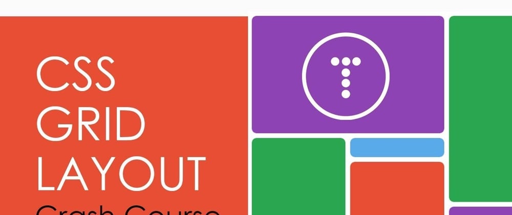
What is CSS Grid?
CSS Grid Layout is a two-dimensional grid-based layout system. CSS grid is used to lay out web pages. Grid is the very first CSS module created to solve the layout problems people have all been coding around. Grid comes with a powerful auto-placement algorithm, which makes it easier to fill up available space. Grid was created to be very flexible and provide solutions for many different cases, and it is not something that we can just pick up and use in a day.
The Basic Elements
- Columns
- Rows
- Cells
- Grid Lines
- Gutter/Gaps

How to Use CSS Grid?
- Create a container div that will contain all grid elements.
- Add
display: gridin your style.css container. - Add
grid-template-columns:, then the size of the grid (You can also usegrid-template-rows) - Create the elements that will go within the container div.
- You're done!
Tips While Using CSS Grid
- Add specified sizes for all of the grid items using a
grid-item classas well as settingwidth: pxandheight: px. - Add grid padding between grid items using
grid-column-gap: px,grid-row-gap: px, andgrid-gap: px. - Change grid column width by changing the auto's at the end of
grid-template-columns. - Use
justify-contentto horizontally space the elements as you may please, such asjustify-content: space-evenly. - Use
align-contentto vertically space the elements as you may please, such asalign-content: center.
Making Grids While Not Using display: grid
- Make each element that is non-uniform have a unique class, such as
item1,item2,item3, etc. - Define the Number of columns for elements to span using
grid-column: 1 / 3orgrid-column: 1 / span 3. - Number of rows for elements to span using
grid-row: 1 / 3orgrid-row: 1 / span 3. - For the most precision, define the entire area using
grid-area: 1 / 3 / 3 / 4, where the element goes from row 1, col. 3 to row 3, col. 4.

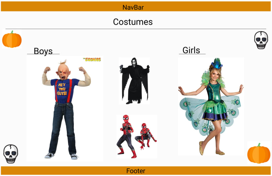
Figma Examples
Figma can be used for many different website ideas and templates. It helps us create layouts that can be redefined and reshaped. It can be used for a Halloween Costume website template or even an evil periodic table.


CSS Grid Example
After using figma to make a website template, you can use CSS Grid to make the template come alive!

https://css-grid.peteraller.repl.co/
Use of CSS Grid In Example
To format the example above, we made each space and used CSS grid to align the spaces to their appropriate locations. We repeated this for all of the spaces that were needed:
<div class="element zone noble" style="grid-column: 18;">
            <div class="inside">
                <div class="title ">He</div>
                <div class="desc">Helium</div>
            </div>
        </div>
The CSS elements created the basic periodic format:
.periodic-table{
  display: grid;
  grid-gap: 10px;
  grid-template-columns: repeat(18, 1f);
  justify-content: center;
}
Conclusion
CSS grid is an amazing tool all web developers should take advantage of. Knowing the basics of CSS Grid is only half of the practice, the other half comes from actual usage in a website. CSS grid uses a very simple way for people to visualize formatting elements. CSS grid is useful for formatting the basic structure of any website. I hope everyone becomes comfortable and interested in CSS grid. After knowing that CSS grid is so useful, I can't wait to use it!
Definitions
CSS Grid: The CSS Grid Layout Module offers a grid-based layout system, with rows and columns, making it easier to design web pages without having to use floats and positioning.
Grid Elements: A grid layout consists of a parent element, with one or more child elements.
Grid Columns: The vertical lines of grid items are called columns.
Grid Rows: The horizontal lines of grid items are called rows.
Grid Gaps: The spaces between each column/row are called gaps.
Grid Lines: The lines between columns are called column lines. The lines between rows are called row lines.
Grid Container: To make an HTML element behave as a grid container, you have to set the display property to grid or inline-grid. Grid containers consist of grid items, placed inside columns and rows.
Grid-Template-Columns: The grid-template-columns property defines the number of columns in your grid layout, and it can define the width of each column. The value is a space-separated-list, where each value defines the width of the respective column.
Child Element (Items): A grid container contains grid items. By default, a container has one grid item for each column, in each row, but you can style the grid items so that they will span multiple columns and/or rows.
References
https://gridbyexample.com/examples/
https://www.w3schools.com/css/css_grid.asp
https://developer.mozilla.org/en-US/docs/Web/CSS/CSS_Grid_Layout
https://css-tricks.com/snippets/css/complete-guide-grid/
https://www.freecodecamp.org/news/intro-to-css-grid-layout/
https://developers.google.com/web/updates/2017/01/css-grid
https://learncssgrid.com/


Latest comments (2)
Would you mind answering a question of mine? what is the difference betwen align content and justify content?
justify-content aligns the grid-items along the x-axis (or inline-axis) and align-content aligns them along the y-axis (or block-axis).
That's the difference to Flexbox, where it's defined as main-axis (justify) vs. cross-axis (align), which is important because when you switch the direction of a flex-container (row -> column) they flip around.
It's also the same for -items and -self properties of justify and align in their scope.