You would be hard-pressed to find an art class without a color wheel hanging somewhere on its walls. If you’ve ever taken an art class, you might have been introduced to paints and mixing paints by creating one of your own.
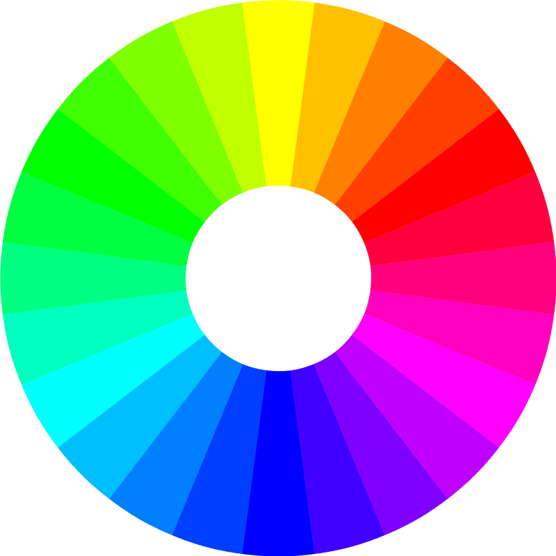
You would have learned about primary and secondary colors. Maybe even tertiary colors if you continued to take art after elementary school.

But unless you studied art in any capacity at a high school level or higher, you probably did not realize that the color wheel is the simplest way to demonstrate color theory, the practice of mixing colors and the study of specific color combinations.
But what is color theory?
A brief history: Color theory emerged when impressionists like Edouard Manet, Edgar Degas, and Claude Monet (you might have heard of them) started experimenting with capturing light rather than a perfect likeness.

Short answer: It comes down to how the human eye translates light waves into colors. Colors that match have similar or complementary waves.
Color theory can get into the science of light waves, and why colors look the way they do. For the purposes of this article however, we are going to focus on the questions:
- Why do certain colors match?
- How do I pick the "right" colors?
Color matching seems to be a "you either have it or you don't" kind of thing. Or the longest, most excruciating part of designing a webpage or an app is determining which exact green to use for your background.
Whatever your color-related woes are, here's a little cheat sheet to look at:
Level One: Monochromatic
Monochromatic is simply one or various shades of one color.
In WebDev: This is choosing a single Hex Code and making it lighter or darker without effecting the hue.

This is the simplest way to color your webpage. Sites such as Facebook and Twitter use the (mostly) monochromatic color scheme to their advantage. Black, white, and a sky blue, this color palette is part of what makes these social media apps so easy to use.
The only differentiating colors come from users' avatars, links and photos, which can become recognizable to frequent users, making it easy to find posts by their favorite accounts.
If there were more colors on Twitter's webpage, it would be harder to differentiate separate posts and who posted what.
As a rule, even if you want more than one color, it's good to have one main color--either as the background color or the main header color.
Pro-Tip: If your webpage is only monochromatic make sure each shade is easily discernible from one another. Otherwise your webpage may not be user friendly if they cannot read text or separate the webpage's elements.
Level Two: Complementary Colors
But what if you want more than just different shades of orange? What if you want your links to stand out but not clash with the nav bar or the background color?
If we're following basic color theory, one of the best ways to choose a color for immediate emphasis is to look for a complementary color.
A complementary color of another can be found at the exact opposite of side of the color wheel.
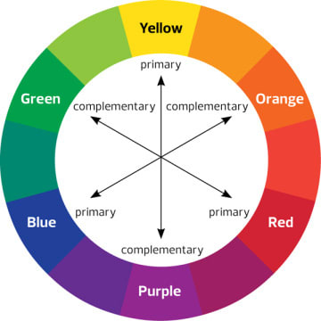
Each primary color matches with one secondary color for their complementary color. An easy way to remember which colors to match is that the secondary color matches with the primary color it does not use. For example: red's complementary color is green, which is made out of blue and yellow.
Pro Tip: Add colors one at time and keep it simple. Do not sacrifice a clean, usable layout for a full rainbow. Otherwise you might accidentally channel the classic 90s websites like this.
Leveling Up
As you get more comfortable with your burgeoning design skills, feel free to push the envelope. Color should never be scary work to with. Always be on the look out for developers and designers who utilize color masterfully. Ask what you like about it, what you don't like, and why. This is how you build your own tastes and brand.
WebDev Hack
Create color combinations/palettes with their hex codes/RBG numbers on hand. Or if you're a fan of SASS, store them in files to import on bigger projects. Especially if your job is to create the structure, not the look (which is determined by someone else, a customer or manager), then just view these colors as place holders that make the website easy to look at.
Just make sure:
- Everything is readable.
- Links, headers, anything you want to put emphasis on is obviously different from plain text.
- A user can easily discern different parts of your webpage (i.e. the nav bar, main content, separate the articles, etc.).
Online Tools
Shout out to Doug R. Thomas, Esq. for the following links:
- Color.Adobe.com
- WebAIM - Color Contrast Checker - makes sure that text is readable over backgrounds.
- Coblis — Color Blindness Simulator - tests screenshots of layout with colorblindness filters to make sure your content is readable for all audiences.
Continued Reading
Hopefully picking a color or a color palette for your website, page, or app is less daunting after reading this article. If this topic interests you, I highly recommend reading more about the subject. We've only really touched the surface, but you can get into hues and shades and more.
Ultimately, there is no “wrong” answer when it comes to color, especially if you are making a project for yourself. Many assume taste is something you’re born with, but really it’s looking at successful designs and taking inspiration, trying different combinations, and finding what works best for you and your brand. Good luck and go create!


Top comments (36)
It's amazing how much colors can affect any technical project. No software is ever purely technical with no need for aesthetics.
Even no formatting is arguably an "aesthetic". Tho you risk alienating potential users.
Where does creative inspiration come from? One of my biggest challenges when designing from scratch is coming up with a color palette from which to work. If I haven’t been given direction for employing corporate color schemes or been told the whims of the person who hired me, I usually sit and scratch my head before getting started. Choosing the ideal colour scheme begins by researching colours, styles and patterns that suit you. hexcolor.co is a free and open platform for color inspiration with thousands of trendy hand-picked color palettes. Creating a website color scheme is an important and exciting aspect to web design! hexcolor.co/color-inspiration
Thanks, I like this color tool (:
One tool that I've really used any time I need to do any color work is color.adobe.com
I really liked the "random" feature on Coolers! Helped on a project I've been working on today -- thanks for sharing.
Do you mind if I link this? (with credit, obviously)
Oh yeah, feel free - no credit needed :)
One other thing I try to think about for color schemes is accessibility:
webaim.org/resources/contrastchecker/ can help make sure that text is readable over backgrounds
and color-blindness.com/coblis-color-b... can help test screenshots of layout with colorblindness filters to make sure things still "pop"
Oooh, that color-blindness site is clutch!
As a coder, I find design more challenging, as there never seems to be the "right" answer.
It's always changing. Design comes and goes in fads. The most important thing is for the content to be readable and a website/page easy to use. Color at the very least, should make it easy to read and differentiate and emphasize important elements. If you find it difficult, make it as simple as possible. And when in doubt, ask for feedback from someone you trust. :)
yeah, readable and easy to understand is the key. completely agree.
yup, I feel the same, it's normally easy to tell if a particular code produces the right result or not, but it's sometimes hard to say which design is good as it can be very opinion based - people have different tastes and preferences, what you see is great may look completely craps in others' eyes.
But again, there are some general good design principles which can/should be applied everywhere.
Of course of course. But what I mean is like having to pick between two different, but very close shades of gray, or whether to make the menu bar 110px or 120px high or something like that. I don't know how to use Photoshop, so I just make design things on chrome AS I'm developing a website. It's a pain in the ass. When I'm given a wireframe of a static page, I can breeze through it, but making my own is hard because of design
Those tools look really interesting - good finds! I agree that colors have a lot more weight than people probably realize. Gone are the days of cyan backgrounds...I hope.
May Geocities rest in peace.
What? No! Here, I fixed it for you: wonder-tonic.com/geocitiesizer/con...
:-) and nice write-up.
HAHAHAHAHA! XD
Great post Nicole, thanks for the intro! As a developer it's always useful to have these concepts refreshed :D I've recently found out about lighten and darken which seem very helpful for monochromatic design.
If anyone wants to geek out about one the most fascinating colors in nature I suggest this article: The 6,000-Year History of Blue Pigments in Art
and this video
this post is very useful for me thanks for share your kind information with us.
This is a fantastic introduction to color theory! Thank you so much!
After years of high school art, I never knew or realized this:
This is such a great way of finding a complementary color!
So glad you mentioned coolors.co. LOVE that site. It's made for us color-wheel-challenged. I love how you can find one color (or use one you have), lock it in, then just hit the space bar as it does all the magic for you.
I have always feel slightly intimidated by color. My go to is the Adobe Color Wheel which I really like. Especially because it allows you to save color themes to your adobe ID and they automatically load in Illustrator (not sure about Photoshop). But will definitely check out these two you suggest. Thank you!
That's a great resource I got in recent times on color theory. In my recent research, I made a comprehensive research and prepared a guide to learn color theory in a generic way.
colorexpertsbd.com/blog/color-theory
It may help audience to get an appropriate idea.
Thanks for the article since i study math and science i don't have any perspective of color and their importance on a good desing.
Hey, Nicole! Noticed you didn't mention anything about the RGB vs CMYK color wheels... I recently created a resource on that subject:
learn.g2.com/rgb-vs-cmyk
I think it's important for web developers to know which color wheel to refer to! Thoughts?
You have explained the colors so amazingly, now even I feel that I can create my own pallettes to use!
Thanks for these! Color is definitely scary for me, as I don't have a natural designer "eye." I always appreciate useful color resources.