I've just completed a front-end coding challenge from @frontendmentor 🎉
Click here to see live url
Github repo
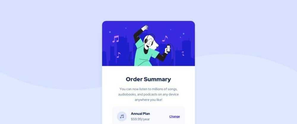
You can see my solution here
i've used only HTML and CSS to complete this challenge
here's how my html code looks like
<!DOCTYPE html>
<html lang="en">
  <head>
    <meta charset="UTF-8" />
    <meta name="viewport" content="width=device-width, initial-scale=1.0" />
    <!-- displays site properly based on user's device -->

    <link
      rel="icon"
      type="image/png"
      sizes="32x32"
      href="./images/favicon-32x32.png"
    />
    <link rel="stylesheet" href="style.css" />
    <link rel="preconnect" href="https://fonts.googleapis.com" />
    <link rel="preconnect" href="https://fonts.gstatic.com" crossorigin />
    <link
      href="https://fonts.googleapis.com/css2?family=Red+Hat+Display:wght@500;700;900&display=swap"
      rel="stylesheet"
    />
    <title>Frontend Mentor | Order summary card</title>

    <!-- Feel free to remove these styles or customise in your own stylesheet 👍 -->
  </head>

  <body>
    <main>
      <section class="container">
        <div>
          <img
            src="./images/illustration-hero.svg"
            class="hero"
            alt="dancing with music"
          />
        </div>
        <h1 class="heading">Order Summary</h1>
        <div class="description">
          You can now listen to millions of songs, audiobooks, and podcasts on
          any device anywhere you like!
        </div>
        <div class="price_container">
          <div class="pricing">
            <span class="icon">
              <svg xmlns="http://www.w3.org/2000/svg" width="48" height="48">
                <g fill="none" fill-rule="evenodd">
                  <circle cx="24" cy="24" r="24" fill="#DFE6FB" />
                  <path
                    fill="#717FA6"
                    fill-rule="nonzero"
                    d="M32.574 15.198a.81.81 0 00-.646-.19L20.581 16.63a.81.81 0 00-.696.803V26.934a3.232 3.232 0 00-1.632-.44A3.257 3.257 0 0015 29.747 3.257 3.257 0 0018.253 33a3.257 3.257 0 003.253-3.253v-8.37l9.726-1.39v5.327a3.232 3.232 0 00-1.631-.441 3.257 3.257 0 00-3.254 3.253 3.257 3.257 0 003.254 3.253 3.257 3.257 0 003.253-3.253V15.81a.81.81 0 00-.28-.613z"
                  />
                </g>
              </svg>
            </span>
            <div>
              <h2>Annual Plan</h2>
              <div>$59.99/year</div>
            </div>
          </div>
          <button class="change_button">Change</button>
        </div>

        <div class="actions">
          <button class="proceed">Proceed to Payment</button>

          <button class="cancel">Cancel Order</button>
        </div>
      </section>
    </main>

    <footer class="footer">
      <div>
        Challenge by
        <a href="https://www.frontendmentor.io?ref=challenge" target="_blank"
          >Frontend Mentor</a
        >. Coded by <a href="#">Rhythm Saha</a>.
      </div>
    </footer>
  </body>
</html>
CSS code
:root {
    --Pale-blue: hsl(225, 100%, 94%);
    --Bright-blue: hsl(245, 75%, 52%);
    --Very-pale-blue: hsl(225, 100%, 98%);
    --Desaturated-blue: hsl(224, 23%, 55%);
    --Dark-blue: hsl(223, 47%, 23%);
}

* {
    margin: 0;
    padding: 0;
    box-sizing: border-box;
}

body {
    background-image: url(./images//pattern-background-desktop.svg);
    background-size: contain;
    background-position: fixed;
    background-repeat: no-repeat;
    background-color: var(--Pale-blue);
    font-family: "Red Hat Display", sans-serif;
}

main {
    min-height: calc(100vh - 100px - 10vh);
}

@media only screen and (max-width: 375px) {
    body {
        background-image: url(./images//pattern-background-mobile.svg);
        background-size: auto;
    }
}

.container {
    width: 90%;
    background: white;
    margin: 10vh auto 0;
    max-width: 500px;
    border-radius: 2rem;
    padding-bottom: 1rem;
    box-shadow: hsla(224, 23%, 55%, 0.301) 0px 7px 29px 0px;
}

.hero {
    width: 100%;
    border-radius: 2rem 2rem 0 0;
    margin-bottom: 1rem;
    overflow: hidden;
}

.heading {
    text-align: center;
    color: hsl(223, 47%, 23%);
    margin: 2rem 0;
    font-weight: 900;
    font-size: 1.8rem;
}

@media only screen and (max-width: 375px) {
    .heading {
        text-align: center;
        color: hsl(223, 47%, 23%);
        margin: 1.5rem 0;
        font-weight: 900;
        font-size: 1.3rem;
    }
}

.description {
    width: 80%;
    text-align: center;
    margin: auto;
    font-size: 1.2rem;
    color: hsl(224, 23%, 55%);
    padding: 0 1rem;
    line-height: 1.6rem;
}

@media only screen and (max-width: 375px) {
    .description {
        padding: 0;
        font-size: 1rem;
    }
}

.price_container {
    width: 80%;
    margin: 1.5rem auto;
    display: flex;
    justify-content: space-between;
    align-items: center;
    background: var(--Very-pale-blue);
    padding: 1.3rem;
    border-radius: 1rem;
    transition: all 250ms;
}

.pricing {
    display: flex;
    justify-content: center;
    gap: 1.2rem;
    color: var(--Desaturated-blue);
}

.pricing h2 {
    font-weight: 900;
    color: var(--Dark-blue);
    margin-bottom: 3px;
    font-size: 1rem;
}

@media screen and (max-width: 375px) {
    .price_container {
        width: 85%;
        margin: 1.5rem auto;
        display: flex;
        justify-content: space-between;
        align-items: center;
        background: var(--Very-pale-blue);
        padding: 1rem;
        border-radius: 1rem;
    }
}

.change_button {
    border: none;
    outline: none;
    background: none;
    color: var(--Bright-blue);
    text-decoration: underline;
    font-size: 1rem;
    transition: all 250ms;
    font-weight: 700;
}

.change_button:hover {
    text-decoration: none;
    color: hsl(245, 82%, 68%);
    cursor: pointer;
}

@media screen and (max-width: 375px) {
    .change_button {
        font-size: 14px;
        font-weight: 700;
    }
}

.actions {
    margin: 2rem auto;
    display: flex;
    flex-direction: column;
    width: 80%;
    gap: 2rem;
}
.proceed {
    border: none;
    outline: none;
    width: 100%;
    color: white;
    background: var(--Bright-blue);
    padding: 1rem 0;
    font-weight: 700;
    font-size: 1rem;
    border-radius: 10px;
    transition: all 250ms;
    box-shadow: hsla(245, 75%, 52%, 0.45) 0px 7px 32px 0px;
}

.proceed:hover {
    background-color: hsl(245, 82%, 68%);
    cursor: pointer;
}

.cancel {
    border: none;
    outline: none;
    background: transparent;
    font-size: 1rem;
    font-weight: 700;
    color: var(--Desaturated-blue);
    transition: all 250ms;
}

.cancel:hover {
    color: var(--Dark-blue);
    cursor: pointer;
}

footer {
    color: var(--Dark-blue);
    display: flex;
    align-items: center;
    justify-content: center;
    height: 100px;
    font-size: 12px;
    font-weight: 700;
    letter-spacing: 1px;
}

.footer a:visited {
    color: var(--Bright-blue);
}

.footer a {
    color: var(--Bright-blue);
}

@media screen and (max-width: 375px) {
    .footer {
        padding: 0 2rem;
        text-align: center;
    }
}
Any suggestions on how I can improve are welcome!


Top comments (0)