In all the time I've been developing software, there was one blog post that opened my eyes, turned the lights on, and changed everything. It was just that good.
I'm sorry, did you want to read it? Did you perhaps get the impression that clicking on the words "one blog post" would cause it to open in your browser because the words were a different color, and, if you're using a mouse, when you moved it over the text it became underlined and your cursor changed?
Okay, that was a little contrived. I'll never do it again. What it demonstrates, though, is how automatically we rely on a certain "visual language" in websites and applications so that most of the time we know how to use them without reading a manual.
That doesn't mean that every website needs to be exactly the same. As with verbal language, there are different ways to express the same thought, and languages change over time. But generally, if there's a familiar, recognized way to perform a common task, most websites prefer that over something new and unfamiliar? Why because a fundamental rule of user experience (UX) is that users shouldn't have to figure out how to perform simple tasks, not even for a second.
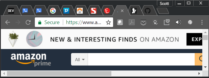
For example, take just a moment to look at www.google.com. 99.9% of users visit this page to search for something. If we've used a computer for more than five minutes in our life, how long does it take us to figure out how to interact with this page? Probably none. We type in the box and press enter. If we're on a mobile device we type and click the magnifying glass icon which universally means "search."
That's Too Easy. Let's Change It Because... Why?
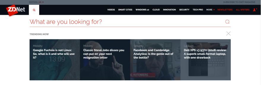
Now let's visit www.zdnet.com and search for something there.
Strike One

First, where's the search box? Are you looking for a white or light-colored box in the upper right corner or perhaps top center? It's not there. There's a magnifying class in the upper left corner, but no search box.
There's no law that says you have to put a search box in the upper right corner. But is it any more difficult than putting it where people typically look for it?
I checked several familiar sites and in each case the search was top center or top right: Amazon, CNN, Fox News, and Ebay. I didn't omit mentioning a website because it didn't fit the pattern. They all put their search top center or top right. The ones that only display a search icon (not a box) always put it in the upper right corner.
Product search is a critical feature on Amazon.com. If you view the site on a smaller screen or in a smaller window, which elements are hidden? Anything but the product search. Is search an important feature on ZDNet's site? I don't know.
ZDNet's search isn't hidden, but it's not where you look for it. That's hardly the end of the world. But they're okay with making you scan the top of the page looking for it, for no apparent reason. Strike one.
Strike Two
Using Chrome, Edge, and Firefox on Windows and Chrome on Android, what happens when I click the magnifying class search icon in the upper left corner? Nothing. In Chrome the tab indicates that a page is loading, but then it stops, and nothing has changed.
Now I feel stupid. Did I only think I clicked on it? Did I miss? I thought I knew how to do this. If I click again I get to the next step, so it must have been me, right? No, I reloaded the page and tried again and again with the same result. After experimenting I determined that it's not that it misses the first click. It just takes about 5-10 seconds after page load to wire up a response to the click event. That's seven seconds of clicking on an icon that does nothing.
That's pretty bad. Could that be why it the icon is in an unexpected location, so that the page has more time to load while I look for it? It's a feature, not a bug? Strike two.
Strike Three
What am I looking for? I'll tell you what I'm looking for. Dude, where's my search box? And if I could find that then I'd type in what I'm actually looking for!
The answer to this Where's Waldo puzzle is that I'm supposed to start typing on top of the words "What are you looking for?" Sometimes a blinking horizonal-line "cursor" appears to the left of the text. Sometimes it doesn't, even in the same browser. Even when it does, it doesn't stand out next to the words. But when it's missing, there's no visual clue to indicate that I should begin typing.
Look at the browser in front of you, or any other application. There's text all over the screen. Would it occur to most users that they should click on the text and begin typing? No, because nothing works that way. Sometimes textboxes contain placeholder text, but we're not confused because it's usually somewhat grayed out, the text says "search" or "search for products", and it's in a box with a search icon. The verbal language is consistent with the visual language.
Asking me a question and making me figure out how to answer it, after making me hunt for the search icon and then wait seven seconds for it to work? Strike three!
It's Spreading
ZDNet is not the only culprit. I love Google Keep, but I'm just as likely to search for existing notes as to take new ones. (Because that's why I took the notes.)
The Android app has the search icon in the upper right corner and the "take a note" option in the lower right. It's never confusing. If want to take a note I tap that, and if I want to search I tap the search icon.
The website, however, looks and behaves differently:

The box for entering a note is located where I'd typically look for a search box, it looks like a search box, and the cursor is placed there by default. The app has trained me that I'm not writing a note until I tell it, by clicking on "take a note", that I want to take a note. But now my cursor is in a box that looks like a search box, and as soon as I type a single character I've created a note that I need to delete.
Where is the search box? It's there, but it's barely distinguished from its background. I'm assuming that the designers deliberately decided that taking a note should be the default behavior. There was probably some discussion about it. But between the non-standard visual language and the inconsistency with the Android app, it creates confusion and extra work.
Google Keep is also by far the easiest way I know to take a quick note with the assurance that I can always find it later. I love everything else about the design. (And it's free. Google has my permission to do whatever they do and sell analytics and targeted ads. Thank you, Google.) But the website is another example of the curiously hidden search box.
Nitpicking?
To anyone who doesn't design websites or applications, yes, I'm nitpicking. But if we're concerned with user experience we know that details matter. It's like going to a grocery store where the employees look sloppy and aren't friendly. The inconvenience is momentary and the products are the same, but it influences our perception of both the store and its products, consciously and subconsciously.
When we're performing routine tasks that are common across sites we don't expect to read, look, or even think. We just do. That's not unreasonable - it's the standard that successful websites set and meet.


Top comments (10)
I have to admit I fell for the link. I was actually upset and thought "Wow this guy really screwed up, why use a link for nothing?" But then I returned and read on, and was taken by joyful surprise at how well the example worked. Used experience is certainly a difficult task! Finding issues is one thing, but coming up with a better solution is where people tend to struggle the most.
I agree - as a developer I've learned that if you point out how bad code is, it's complaining. If you figure out what you would do differently, it's not only constructive but a learning experience.
When it comes to UX in particular I've encouraged coworkers to share anything like this that looks wrong along with a how it could be improved. It promotes awareness of UX. I wrote a whole blog post on it but noticed yesterday that half of it had disappeared so I deleted it. (An article about UX with half the article missing - not good.)
Awesome post. I was hooked after the link example. Really tactile way of telling the story.
I'm not a designer, but I guess I could call myself "user performance enthusiast" - it matters to me how long it takes for me to accomplish what I want to do. If there's no reason to, it should take a minimum amount of keypresses, clicks, and other actions to accomplish exactly what I want to do. Search bars being hidden, "would you like to subscribe to our newsletter" popups when I'm trying to browse a page, etc. generally just make me think the page is not worth my time and going to another one instead to find what I was looking for.
Most people can't begin to imagine how often I'm annoyed at things that people decided to reinvent the wheel in, break the conventions etc., just because they had an artistic need to do it, or e.g. just didn't think of trying out how things work in other places. The people who can imagine often don't understand why I'm so annoyed at these things.
Good example from OSes: I'm super happy that at least since Windows 7 I can launch pretty much anything by hitting the left Windows -key and just typing in a search term and hitting enter. Most Linux desktop environments have Ctrl+F2 or similar for that, and even then you usually can just type in the exact command line to run, that's awful. Why do I need to spread my fingers wide to open a "quick launch" and then to type on
google-chromeinstead ofch<enter>? I guess the designers think "well at least it's not Ctrl+F12" and are happy with their results. I believe on OSX people generally use something bound to Ctrl+Space, which is a lot better, but not quite one key.Not saying Windows is perfect at it either, to find
Adobe Lightroomit's not enough to type inroom, and the search box decides to just bug out on some of my machines never finding anything recently installed.Oh and just as a small note, whoever came up with that damn idiotic standard of allowing websites to offer push notifications by actually opening a dialog for you to click when you visit them for the first time: Shame on you. It's like an even worse cookie popup, with a twist that there's a significant penalty for clicking the wrong thing: now you get spam for some random website. This stuff is wasting so much of my time that I'm willing to waste more of my time to complain about it in every forum I can imagine.
In the book, 'Don't Make Me Think', Steve Grugg talks about two type of users of web.
I don't remember if Steve Grugg mention about the position of the search box, but he does mention about providing a way to search and some recommendations of designing one.
In Steve Grugg's own words.
Great post. I hadn't clicked the link yet but I had planned too a little later. So thanks for telling me not too. ;).
To be fair though: I did attempt to search on zdnet.com when it was brought up and didn't find anything different than what my mind already felt would be happening. After reading your examples I actually could not recreate them. The search box made sense to me, tapping the search icon did what I thought it would, and did not experience the delay you mentioned. So maybe they fixed it already or it's actually just a browser compatibility thing (tested in Chrome on Android, on a high end Android device) or just bad code and not a UX thing.
Though your points are true for many pages and apps I've seen and a great post.
Similarly, I find the fact that in the Spotify app you have to tap the search icon, then tap again on the search box. Tapping the search icon should take me to the search screen with the box already active and the keyboard popped up. Drives me crazy. Also the fact that you have to go to "My Library" to get to settings is bonkers. Inconsistent and weird UX.
I did not click until read further, and then I was interested what will happen...
Unfortunately, there are so many bad designed web sites as well as apps. The search bar is just one of hundreds of examples...
Sweet what does my search box say?
I read the entire article, then went back to the top to check the article that opened your eyes hoping that it might turn some light on. but Dude 😅 Awesome one.