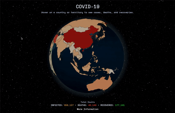
As a result of the enhanced community quarantine, I had the time to develop and open-source an interactive 3D map of latest data regarding COVID-19, provided by the World Health Organization.
Reasoning
I am seeing a lot of coronavirus dashboards using plane map views (google maps, mapbox, leaflet) and was inspired to develop an interactive way to visualize Johns Hopkins CSSE and other reliable data regarding the impact of COVID-19 to our world. It's actually based on covidvisualizer.com but decided to make one that doesn't have annoying ads (and open-source).
Here's a short demo:
Data
The interactive globe uses the NovelCovid/API which gets its data from Worldometer's real-time updates and CSSEGISandData/COVID-19's time series. Both of which utilizes reliable sources from around the world.
The GeoJSON used is from https://github.com/nvkelso/natural-earth-vector.
Tech Stack
For the front-end, I've used plain JavaScript and CSS to make it as simple as possible. The NovelCovid/API was plotted using globe.gl which is a UI component for Globe Data Visualization using ThreeJS/WebGL.
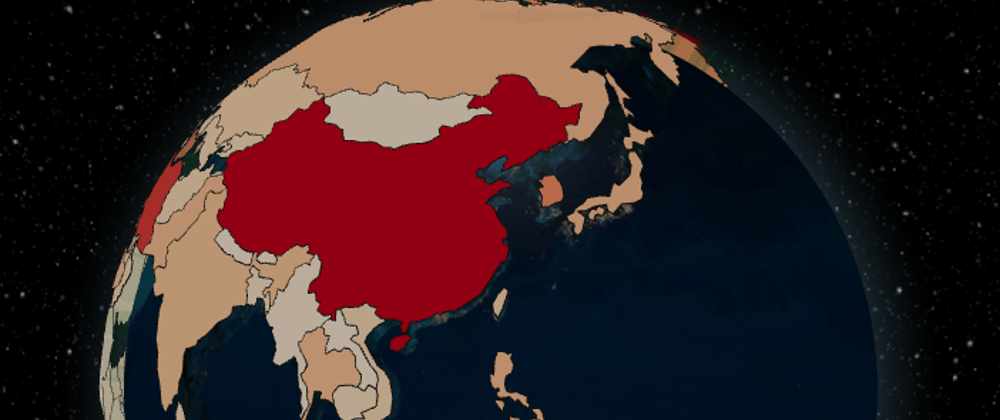
For the polygon colors, I've used D3's sequential color scales. The color starts from a very light orange (low cases) to a red (high cases). Here's a sample:

And lastly, I've used Parcel which is a blazing fast, zero configuration web application bundler to bundle the app.
Links
Repo: https://github.com/sorxrob/covid-3d
Website: https://covid3d.live
If you have questions, suggestions, or feedback, please leave it in the comment section.
I hope you all stay safe and sane during these times!


Oldest comments (50)
Wow, this is so well done.
Thanks, Ben! Appreciate it.
The map is very aesthetically pleasing. This is a great tool for showing people the scale of the virus.
Thank you Andy!
Truly amazing and inspirational.
Thanks!
Looks good! Wouldn't it make sense to set the color depending on the number of daily new cases instead of total cases?
Hi thanks. I am planning to add filters soon!
Hey, I'm a noob so could you answer this for me. How did you build that globe, specifically the functionality that the country the mouse of over hovers and displays its data?
I did not build the globe, I used globe.gl which is stated above. It has a functionality that when you hover on it, a tooltip will appear in a form of text or html. The tooltip was made using pure css and html.
Looks cool, Robert, but... this is a map without North Korea :) looks like it's been flooded
Thanks. Ill look into it.
Same goes for The Faroe Islands - not a country a lot of people are familiar with though, but felt obliged to mention it as it is my home country :) Other than that, really good job!
Thank you. I will check those!
Hey looks like North Korea has no cases that's why it doesn't have a polygon.
Best thing I have seen today
Thank you!
Just a quick suggestion, the info window could be fixed in the side instead of under the mouse, because it is really annoying for the user to interact with the globe otherwise. Other than that great work.
Thanks!
UI/UX-wise this feels way better than covidvisualizer.com.
Wow that's very nice of you. Thank you!
This is so Cool @robert . Great work!
Thank you!
What a stellar job! I am amazed, truly amazed!
Thank you!
Awesome!!
Thanks!
It's great. I got it from Facebook or somewhere else I don't know before you have posted here! It's more amazing to see the man behind it. Best of luck Robert.
BTW, doesn't it work on mobile? I've just tried now. The globe is disappearing after first load.
In nodejs group maybe? Mobile view is still wip. Thanks!
Umm how did you wrap the map around a sphere?
He didn't he's using Globe.gl
This is awesome! Amazing job.
Thank you.