The goal:
- Create a React modal dialog box using the html "div" element. Content provided as children. (Compare to: React modal using an html "dialog")
Notes:
- The "Modal" component is generic, it shows content from the parent container, provided as children.
- preventAutoClose() prevents closing when we click inside the modal dialog box.
I created two components:
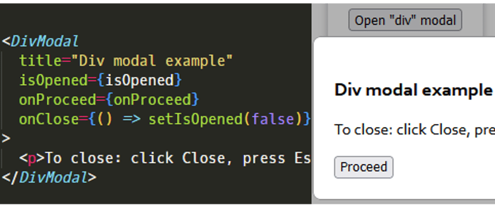
First, the "DivModalTester" component contains and opens the modal:
import { useState } from "react";

// @ts-ignore
import { DivModal } from "components";

const DivModalTester = () => {
  const [isOpened, setIsOpened] = useState(false);

  const onProceed = () => {
    console.log("Proceed clicked");
  };

  return (
    <div>
      <button onClick={() => setIsOpened(true)}>Open "div" modal</button>

      <DivModal
        title="Dialog modal example"
        isOpened={isOpened}
        onProceed={onProceed}
        onClose={() => setIsOpened(false)}
      >
        <p>To close: click Close, press Escape, or click outside.</p>
      </DivModal>
    </div>
  );
};

export default DivModalTester;
Secondly, the "DivModal" component itself:
import styled from "styled-components";

// @ts-ignore
import useKeyDown from "hooks/useKeyDown";

const Overlay = styled.div`
  z-index: 1;
  position: fixed;
  top: 0;
  left: 0;
  width: 100%;
  height: 100%;
  background-color: rgba(0, 0, 0, 0.3);
`;

const Container = styled.div`
  z-index: 2;
  position: fixed;
  top: 50%;
  left: 50%;
  transform: translate(-50%, -50%);
  width: 400px;
  border-radius: 8px;
  border: 1px solid #888;
  padding: 20px;
  background-color: white;
`;

const Buttons = styled.div`
  display: flex;
  justify-content: space-between;
`;

type Props = {
  title: string;
  isOpened: boolean;
  onProceed: () => void;
  onClose: () => void;
  children: React.ReactNode;
};

const DivModal = ({ title, isOpened, onProceed, onClose, children }: Props) => {
  useKeyDown("Escape", onClose);

  const proceedAndClose = () => {
    onProceed();
    onClose();
  };

  const preventAutoClose = (e: React.MouseEvent) => e.stopPropagation();

  if (!isOpened) return null;

  return (
    <Overlay onClick={onClose}>
      <Container onClick={preventAutoClose}>
        <h3>{title}</h3>

        {children}

        <Buttons>
          <button onClick={proceedAndClose}>Proceed</button>
          <button onClick={onClose}>Close</button>
        </Buttons>
      </Container>
    </Overlay>
  );
};

export default DivModal;
Additionally, the modal component is using the useKeyDown() hook, to close the modal if the Escape gets pressed:
import { useEffect } from "react";

// Example 1 -- function as arg2:
// useKeyDown("Escape", onClose);
//
// Example 2 (if 1 does not work properly) -- function lambda as arg2:
// useKeyDown("ArrowRight", () => setPageIndex((prev: number) => f(prev, 1)));
// see: https://reactjs.org/docs/hooks-reference.html#functional-updates
const useKeyDown = (key: string, onKeyDown: () => void) => {
  useEffect(() => {
    const handleKeyDown = (event: KeyboardEvent) => {
      if (event.key === key) onKeyDown();
    };

    window.addEventListener("keydown", handleKeyDown);

    return () => {
      window.removeEventListener("keydown", handleKeyDown);
    };
    // eslint-disable-next-line react-hooks/exhaustive-deps
  }, []);
};

export default useKeyDown;
MY PERSONAL OPINION/PREFERENCE/RECOMMENDATION: I definitely prefer the React modal using the html "div", and not the one using the new html "dialog" element. I think a modal implemented using a "div" is: simpler, more intuitive, safer, and easier to maintain/troubleshoot.
Thanks for reading. Suggestions/corrections are welcome.


Top comments (0)