
When building Angular components, have you ever found yourself looking for a way to provide fallback content for projected content slots using the ng-content element? If so, you’ve probably been able to find some work arounds to do it but, they’re probably not something you really want to do. It would be better if this concept was built-in to the framework, right? Well, this is actually happening in the latest versions of angular. In this post I’ll show you exactly how it works. Alright, let’s get to it.
Angular Version Disclaimer
Ok, a little disclaimer before we get into this example, what you’ll see here in this post will require Angular version 18 or above. If you’re on an earlier version, unfortunately, you’ll need to upgrade before you can use the techniques from this post.
The Demo Application
Ok, we’re going to start with a demo application that we built for another example where we converted static string inputs over to attributes with the inject() function and the HostAttributeToken. If you haven’t watched that video yet, you should check it out too!
For this example, we have an application built for the Vans clothing brand. We’re going to be working with these two buttons here.
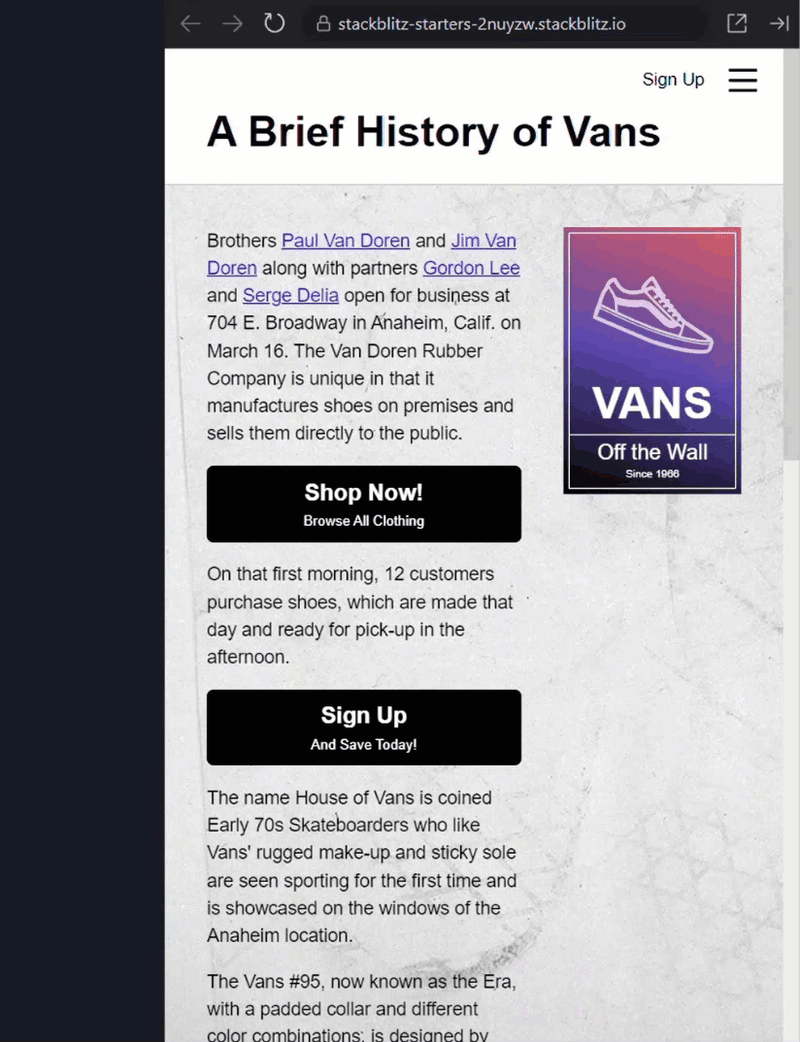
We can see that the first button has two text regions, the first reads “Shop Now!”, and the second reads “Browse all Clothing”. Then we have the labels on the second button that read “Sign Up”, and “And Save Today”.
These two buttons use an existing button component. If we look at the code for this button, we can see that we have a “primaryLabel” attribute and an optional “secondaryLabel” attribute.
button.component.ts
@Component({
    selector: '[app-button]',
    ...
})
export class AppButtonComponent {
    primaryLabel = inject(new HostAttributeToken('primaryLabel'));
    secondaryLabel = inject(new HostAttributeToken('secondaryLabel'), { optional: true });
}
Now if we look at the template, here we can see we have a strong element that contains the string interpolated value of the “primaryLabel”. And then, if we have a “secondaryLabel”, we output the string interpolated value of it within an em tag.
button.component.html
<strong>{{ primaryLabel }}</strong>
@if (secondaryLabel) {
    <em>{{ secondaryLabel }}</em>
}
Ok, so now that we know how it’s working, let’s take a look at the template for the page-content component where the usages of these two buttons exist. Here is the code for the buttons with their labels.
page-content.component.html
...
<button app-button
        primaryLabel="Shop Now!"
        secondaryLabel="Browse All Clothing">
</button>
...
<button app-button
        primaryLabel="Sign Up"
        secondaryLabel="And Save Today!">
</button>
...
So that’s how these buttons are currently configured, but in this post, we’re going to change this around a little bit. We’re going to change these labels over to projected content with the ng-content element, and then we’re going to set those slots up to have fallback content when we don’t provide content to the slots themselves.
Converting String Attributes to Slot Content Projection With ng-content
Ok, so let’s start by converting these labels over to slots. To do this, we need to start within the button component template. Let’s add an ng-content element. On this element, we’re going to add a select attribute and we’ll select the strong element.
button.component.html
<ng-content select="strong"></ng-content>
So, this will now take a strong element contained within the open and close tags for the button component and project it here. Now we’ll do the same with the “secondaryLabel” only this time we’ll select an em tag instead.
<ng-content select="em"></ng-content>
Then, we can remove the old attributes from the code for this component since we’re not using them anymore.
Before:
export class AppButtonComponent {
    primaryLabel = inject(new HostAttributeToken('primaryLabel'));
    secondaryLabel = inject(new HostAttributeToken('secondaryLabel'), { optional: true });
}
After:
export class AppButtonComponent {
}
Now, we need to update the usages of these buttons in the page-content component. For the first button, let’s move the “primaryLabel” string to a strong element within the button. And, let’s move the “secondaryLabel” string to an em tag within the button.
Before:
<button app-button
        primaryLabel="Shop Now!"
        secondaryLabel="Browse All Clothing">
</button>
After:
<button app-button>
    <strong>Shop Now!</strong>
    <em>Browse All Clothing</em>
</button>
And now let’s do the same for the second button.
Before:
<button app-button
        primaryLabel="Sign Up"
        secondaryLabel="And Save Today!">
</button>
After:
<button app-button>
    <strong>Sign Up</strong>
    <em>And Save Today!</em>
</button>
There, if we save everything should look the same. If nothing changed, we will have got it right. Kinda boring so far though right? But this is where the cool part comes in.
Adding Fallback Slot Content in ng-content Regions
Let’s say that we use this button in several places and most of the time we want it to have the text from first button, “Shop Now”, and “Browse All Clothing”. Then, more sparingly, we will want to do what we’re doing on the second button where we provide unique labels. Well, this is now really easy to do.
Let’s just go into the template for the button component. Within the first slot, let’s add a strong element with the text “Shop Now!”.
<ng-content select="strong">
    <strong>Shop Now!</strong>
</ng-content>
We can simply provide the fallback content that we want right in the slot now. Let’s add and em tag in the second slot with the text “Browse all Clothing”.
<ng-content select="em">
    <em>Browse All Clothing</em>
</ng-content>
That’s it. Now, if we don’t include a strong element or an em tag, it will show what we’ve included here.
Now all that’s left is for us to go and update the usage for the first button in the page-content component. We can just remove the strong and em tags from within the button.
Before:
<button app-button>
    <strong>Shop Now!</strong>
    <em>Browse All Clothing</em>
</button>
After:
<button app-button></button>
Ok, if we were to save, everything should still be working like we want. We should have the same text labels as we had previously on both buttons even though we arent providing any content to the first button itself. It should be falling back to the fallback content we provided in the button component template.
Fallback Content Doesn’t Work When Slots are Conditional
Now there is one thing to be aware of with this method. If the content provided to the slot is conditional, the fallback content will actually not be displayed. To illustrate this, if we take a look at the code for the page-content component, you can see that I’ve now added a “showSignUpLabel” signal with an initial value of false.
page-content.component.ts
@Component({
    selector: 'app-page-content'
    ...
})
export class PageContentComponent {
    showSignUpLabel = signal(false);
}
Let’s switch over to the template and make the label content conditional based on the current value of this signal using an if statement.
page-content.component.html
<button app-button>
    @if (showSignUpLabel()) {
        <strong>Sign Up</strong>
    }
    <em>And Save Today!</em>
</button>
Then, just for demonstration purposes, let’s toggle this value on click.
<button app-button (click)="showSignUpLabel.set(!showSignUpLabel())">
    ...
</button>
Now, when save we can see, since this value was false when the component was created, we have no value initally. Since we’re now dynamically adding the slot, we no longer get the fallback content. And if we click to toggle the value, then we see the “Sign Up” label. And when we toggle it again, it goes away.

So, just keep in mind that the fallback content will not work with dynamic slot content.
Conclusion
So that’s all pretty cool right? We now have a native way to provide fallback content to projected content with the slots using the ng-content element. No more crazy conditional logic is needed to do this type of thing.
Want to See It in Action?
Check out the demo code and examples of these techniques in the in the Stackblitz example below. If you have any questions or thoughts, don’t hesitate to leave a comment.

Top comments (0)