
Discussions about accessibility, especially in software development, often center around screen reader accessibility. With that, I mean that if accessibility is considered, it's mostly about, for example, content descriptions, setting correct semantics, and then leaving it there.
Don't get me wrong, it is important. But the problems arise when only taking these actions for accessibility and calling it done. In some apps, those actions also bring many good things for other users. But in others, many issues that create barriers to usage can be missed if the attention is only on screen reader-related accessibility.
In this and a couple of future blog posts, I'll share some things you can check to find accessibility issues, and suggest ideas for fixing them. As you might guess, these are not related to screen reader accessibility. This first blog post is about font sizing.
By the way, I'm currently writing my master's thesis, and its goal is to create an accessibility checklist for Android devs to help create more accessible Android apps. The initial checklist is live, and I'm collecting feedback, so if you want to help me, check the Android Accessibility Checklist and then answer a couple of questions in this Google Form. I'm really, really thankful for anyone participating!
Alright, let's get started.
Font Size
One interesting thing related to font sizing is that about 25% of Android users increase the font size. (source: Appt.org) So this is a big group of our users! Sometimes, accessibility is dismissed because it's said to be something that concerns only a small group of users. A quarter of the user base is already a considerable amount of users - actually, it can be bigger than, for example, some language your app supports.
But if the user increases font size, it might cause problems with, for example, text overflowing or being clipped. We will explore some of these issues later in this blog post, but first, let's talk about how to test your app for different font sizes.
Testing Font Size
For testing the font size, you have at least two options: Using a phone (real device or emulator) or Compose previews. Let's look at each of them in the following subsections.
On Phone
You can test your app by changing the font size in your Accessibility settings. It's most likely located in Settings > Accessibility > Display size and text > Font Size. Turn the font size to the biggest option.
After increasing the font size, go through your app. Notice anything that does not work? Some text is unreadable? You've found the problems. The next section will contain some suggestions on how to fix these issues.
With Compose Previews
You can also test how different font sizes behave with Compose's previews. If you're working pre-Compose 1.6, you'll need to define font scales explicitly. You can do that via the fontScale-attribute:
@Preview(fontScale = 1.8f)
@Composable
fun ComponentPreview() {
  ...
}
Compose 1.6 brings something handy: Multipreview API templates, specifically @PreviewFontScale.
@PreviewFontScale
@Preview
@Composable
fun ComponentPreview() {
  ...
}
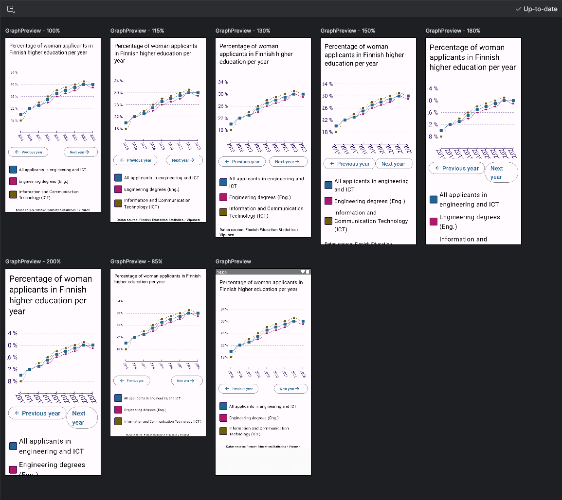
In the picture below, you can see how it adds previews for all the configured font sizes (85%, 100%, 115%, 130%, 150%, 180%, and 200%) for my graph example app:
Fixing Font Size
Okay, you tested your app, and you've found a problem. What to do to fix it? I'm going to use one of my favorite answers: It depends. I'll list a couple of issues and how to fix them.
Problem: Font Itself is not Scalable
If the font itself doesn't scale, one reason could be that you haven't configured the font size correctly.
This "not configured correctly" mainly means that the font sizes are something other than sp, scalable pixels. Check your text styling, and if it's something other than sp (for example, dp), change it to sp. That should fix the problem of the font itself not scaling.
Problem: Text Cuts Out
Another possible problem is that you've defined the components wrapping the text as not flexible enough to accommodate bigger or longer texts. This usually leads to text either overflowing or being clipped - both making the user interface harder to use.
One place where this often happens is graphs. It's not always straightforward to accommodate all font sizes when you use something like Canvas that is not so responsive to begin with. And if you can't, you should think about alternative ways to provide that data (you probably should anyway, because not everyone enjoys, or even understands, graphs).
Here's one example from a graph example app, zoomed to 200%:
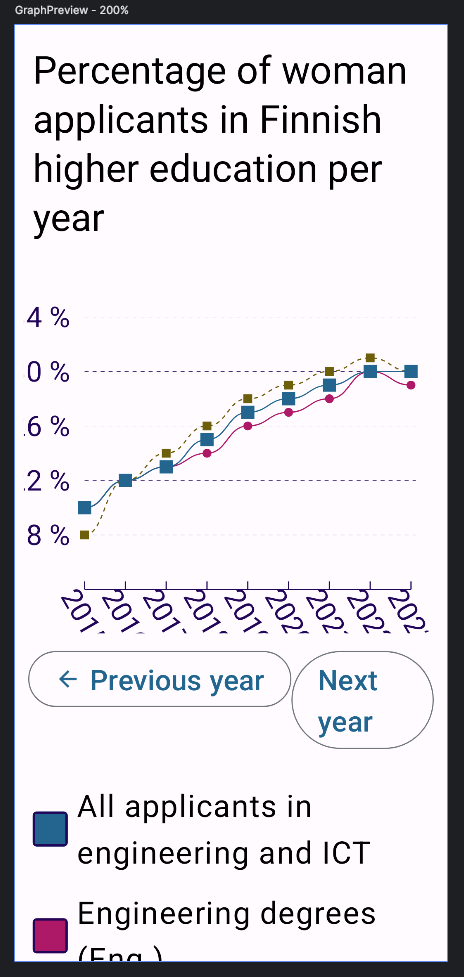
The picture shows how x- and y-axis labels cut off because there is not enough space for them when the font size increases. One way to fix this is to add some room for growth for the labels. You can even make the paddings (or whichever thing you'll need to wrangle here) dynamic based on the font scale.
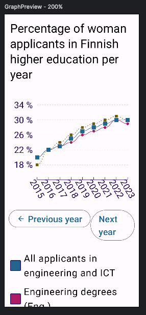
You can access the user's font scale value in Compose through their configuration. To be more precise, with LocalConfiguration.current.fontScale. It is a float value - for 100% font scale, it's 1, and for 200% 2.
The exact code for fixing the issues varies case by case, but here's what I did on my graph (I will write a more extensive blog post about this later):
// First, get the font scale
val fontScale = LocalConfiguration.current.fontScale

// Second, use it to scale the padding:
Canvas(
    modifier = Modifier
        .padding(
            bottom = GraphComponent.innerPadding * fontScale,
            start = GraphComponent.innerPadding * fontScale,
            end = GraphComponent.innerPadding / 2,
        )
... ) { ... }
This way, I get some breathing room for the axis labels. Here's the same 200% font scale picture after the changes:
I'd be happy to know if you've found other ways to solve these issues, especially with graphs and Canvas!
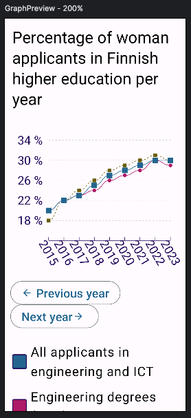
Problem: Layout is not Responsive
You might have noticed another problem related to font size in the previous pictures: When font size increases, buttons under the graph don't accommodate well. This is a common problem with layouts that must fit two or more items in a row.
One way to fix this is to allow flexibility on items. So, if these items fit on one row, they stay like that, but if not, they should be on two (or more) rows. Compose 1.5.0 added a nice, although experimental, layout composable called FlowRow, which does what I described.
When I change the current implementation to use FlowRow (So, just Row -> FlowRow), the buttons align nicely with 200% font size:
Wrapping Up
In this blog post, we've looked into font size and what problems might appear if different font sizes are not tested and accommodated. I've provided some examples of these problems and how to fix them.
Have you encountered any of these problems? Or have you gotten user feedback about font sizes? Do you have alternative ways to fix the issues? I'd love to hear, so please share them!


Top comments (2)
Nice 👏👏
This is def something I could work on. Looking forward to future posts.