Websites contain many interactive elements such as buttons, links and various types of inputs. While these elements are often activated by mouse or touch, there's a substantial minority of people that use keyboards or other input devices for navigation.
Navigating with Keyboards
Keyboard users navigate through websites using the tab key, moving from one interactive element to another in order. Focus indicators play a crucial role in this process, visually highlighting the element currently under keyboard control. Without them, it becomes a lot more difficult to know which interactive element will be activated when pressing the Enter or Space key.
Browser Defaults and Accessibility
Focus indicators are built into the browser by default and if left untouched, they automatically count as accessible even if browser defaults don't always meet all WCAG (Web Content Accessibility Guidelines) criteria such as color contrast.
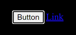
At the time of writing this (Jan 2024), Chrome-based browsers on Windows provide a double-layered focus indicator with a black outline on the inside and a white outline on the outside. This means it's more likely to work with both light and dark backgrounds.
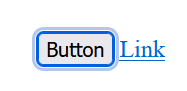
Firefox on Windows goes for a double-layered dark blue/light blue outline combination around buttons and a single blue ring around links.
So if they're already built into the browser, what's the problem?
Well, many people don't like the look of the default focus indicator, especially as they are not consistent across different browsers, and therefore use CSS to turn it off completely. Unfortunately, this leads to a much poorer user experience. So let's dive into how we can make a more accessible focus indicator.
Accessible Focus Indicators
Color Contrast
A focus indicator needs to have at a contrast of at least 3:1 for all adjacent (touching) colors. That means if the focus indicator surrounds a button it must contrast against the button background color and the background behind the button.
If you have sections of your site with different background colors or interactive elements that have different colors and one focus indicator doesn't work for all elements, it is possible to use CSS to style the focus indicator colors differently for different elements.
If you include different website themes, such as dark mode and light mode, you will also need to consider the color contrast for all themes.
Spacing around interactive elements
If you use an outline or a border as a focus indicator, leaving a small amount of space around an interactive element can also make it easier to spot which element has focus. This also means you only need to consider the focus indicator color constrast against the background color since the color of the interactive element is not directly touching the outline.
Double outlines
Double-layered outlines in two contrasting colors can be a good way to make focus indicators more flexible, especially if you're dealing with dark and light mode. This way, the dark part of the focus indicator will show on light backgrounds and the light part will show on dark backgrounds.
High contrast mode
Windows high contrast mode overrides most default colors with a minimal palette of highly contrasting colors. However, problems can arise if you've restyled your focus indicator and used
outline:none somewhere within your CSS. This means the focus indicator in high constrast mode will no longer be visible. Instead, use an outline set to transparent. This will not show up normally if you've restyled the focus indicator but will become visible in high contrast mode.
Another way to make sure focus indicators are visible even in high contrast mode is to use the forced-colors media query to apply specific styling. However, be careful to override forced colors sparingly, as the mode is styled the way it is for a reason.
Conclusion
Creating a more accessible focus indicator involves thoughtful consideration of color contrast, spacing, and adaptability to various modes. By understanding and addressing these factors, designers and web developers can contribute to a more inclusive online experience for all users, regardless of their chosen input device or accessibility needs.


Top comments (1)
Great article, Emma!