While visiting an eCommerce or an e-Learning website, you may have seen a lot of categories in the menu bar. After hovering over a specific category, you will see a large drop-down menu with more categories. This drop-down menu with more categories is called the mega menu.
A mega menu can be defined as a "web element used to guide users to navigate a website’s lower-level sub-pages, categories, and subcategories." Most of the big websites like eCommerce, news, e-Learnings and hotels, are using the mega menu.
A mega menu improves your website's UX design and attached users for a long time. However, you can also add content blocks, sliders, images, icons, videos, etc to the modern-day mega menu.
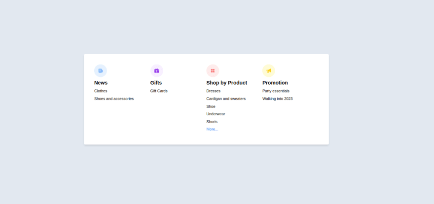
As you might have guessed, we are going to build a Big Menu. We won't really focus on making it as a drop-down, but Just build the big Menu itself.
Let's Get Started!!!!

Understanding the Task
We are building a Big Menu component. The word Big is just to indicate it has a lot of information.
Basically, we just have a lot of information. Let’s build that up.

Structure of code
The structure of our code is very simple and straight to the point.
Let’s have a look at the code, then we have an explanation for it.
<body class="bg-slate-200 flex items-center justify-center min-h-screen">
<!-- First Layer -->
  <div class="w-full md:max-w-3xl p-8 bg-white rounded shadow-md [&_*]:transition-all [&_*]:ease-linear [&_*]:duration-200">
<!-- Second Layer -->
   <div>
<!-- Big List Component -->
      <ul class="grid grid-cols-1 sm:grid-cols-2 md:grid-cols-4 gap-y-4 [&>*>div]:w-10 [&>*>div]:h-10 [&>*>div]:rounded-full [&>*>div:hover]:bg-slate-900/90 [&>*>div]:flex [&>*>div]:items-center [&>*>div]:justify-center [&>*>div]:mb-2 [&>*>div:hover]:text-slate-100 [&>*>div]:cursor-pointer [&>*>ul>h2]:text-sm [&>*>ul>h2]:font-semibold [&>*>ul>h2]:text-[1rem] [&>*>ul>h2]:mb-2 [&>*>ul>li:hover]:underline [&>*>ul>li]:cursor-pointer [&>*>ul>li]:w-fit [&>*>ul>li]:text-xs [&>*>ul>li]:mb-2">
          <li>
           <div class="text-blue-400 bg-blue-100/70"><iconify-icon icon="heroicons:newspaper-20-solid"></iconify-icon></div>
              <ul>
                   <h2>News</h2>
                   <li>Clothes</li>
                   <li>Shoes and accessories</li>
               </ul>
           </li>

           <li>
             <div class="text-purple-600 bg-purple-100/70"><iconify-icon icon="mdi:gift"></iconify-icon></div>
              <ul>
                    <h2>Gifts</h2>
                    <li>Gift Cards</li>
               </ul>
           </li>

           <li>
             <div class="text-red-400 bg-red-100/70"><iconify-icon icon="ph:squares-four-fill"></iconify-icon></div>
             <ul>
                    <h2>Shop by Product</h2>
                    <li>Dresses</li>
                    <li>Cardigan and sweaters</li>
                    <li>Shoe</li>
                    <li>Underwear</li>
                    <li>Shorts</li>
                    <li id="extra" class="hidden">T-shirts</li>
                    <li id="more" class="text-blue-500">More...</li>
             </ul>
            </li>

            <li>
              <div class="text-yellow-400 bg-yellow-100/70"><iconify-icon icon="ion:megaphone"></iconify-icon></div>
              <ul>
                   <h2>Promotion</h2>
                   <li>Party essentials</li>
                   <li>Walking into 2023</li>
              </ul>
            </li>
            </ul>
        </div>
    </div>

    <script src="https://code.iconify.design/iconify-icon/1.0.3/iconify-icon.min.js"></script>
    <script src="index.js"></script>
</body>
Let's understand this code of ours.
Before we begin, all the icons used in this component is accessible at iconify
Now, Let's dive into our code. Keeping the First and second Layer aside, let's look at the "Big List Container" first, as it contains the majority of the code.
Firstly, we made this container a grid container, with 4 columns for medium screens and above, two columns for small screens and one column for Mobile devices using styling properties grid grid-cols-1 sm:grid-cols-2 md:grid-cols-4 gap-y-4.
Also, we use a general styling method, that's to be applied to all the different children of the Big List component. The TailwindCSS property that helps us to perform this wonderful operation is [&>*]
If you are used to my posts, by now you surely know the meaning of [&>*] in tailwindcss.
But if you are new, The property [&>*] simply means “select each child individually”, this allows us to apply the same styling properties to all the immediate children.
It is worth noting that before using this approach, you should have a clear understanding of the structure of your code.
Turns out that we decided to use a big list, so the children somehow have the same structure.
We will be using a similar approach to style each part of the list of items. For example, to style the icons of each list of items, we used [&>*>div]
Using this approach, we gave it a width and height of w-10 and h-10 respectively, gave it a border-radius of rounded-full, to center the icon within this circle, we made it flexbox using [&>*>div]:flex [&>*>div]:items-center [&>*>div]:justify-center
To this icon container, we also gave it a hover effect that changes background-color and text-color [&>*>div:hover]:bg-slate-900/90 [&>*>div:hover]:text-slate-100
Using a similar approach as above, we styled the sub-list within each list item(Remember, they all have the same structure).
The header in the sub-list was given [&>*>ul>h2]:text-sm [&>*>ul>h2]:font-semibold [&>*>ul>h2]:text-[1rem] [&>*>ul>h2]:mb-2
Now, lastly, for the List items of the sub-list items, we just gave them hover effects, small margin-block-end and cursor-pointer [&>*>ul>li:hover]:underline [&>*>ul>li]:cursor-pointer [&>*>ul>li]:w-fit [&>*>ul>li]:text-xs [&>*>ul>li]:mb-2
And that's pretty much it for the major styling. Pretty easy and straightforward right?
Talking about styling, we gave some extra styling to the First Layer, and Body tags.
For the First Layer
<div class="w-full md:max-w-3xl p-8 bg-white rounded shadow-md [&_*]:transition-all [&_*]:ease-linear [&_*]:duration-200">
We gave it a width of w-full from Mobile devices to Medium screen devices, and from medium screens, we have a max-width of max-w-3xl, a background-color of bg-white and a box-shadow of shadow-md
You might be wondering what [&_*]: actually means or what it is used for? Well! I invite you to check on it and share with us what you found in the comment section. I will be very happy to hear from you
Also, for the Body styling, we gave it some styling to center the whole design. Using
<body class="bg-slate-200 flex items-center justify-center min-h-screen">
One Last thing, you might have noticed we gave some ids to two sub-list items, that show on click. this was done with the following code
const more = document.getElementById("more")
const extra = document.getElementById("extra")

more.addEventListener("click", ()=>{
    extra.classList.toggle("hidden")
    const text = "More..."
    if(more.innerText === text){
        return more.innerText = "Less..."
    }
    if (more.innerText != text){
        return more.innerText = "More..."
    }
})
And we are done! Congratulation on coming this far!

Conclusion
The wonderful thing about Building UI is that there's not only one way to build a component.
For example, in our situation, I decided to put all the different sections into an unordered list, then later on made a sub-list inside each list item.
Someone else will have of course used a different approach to build this component, and we still result in the same visual component.
You can have a Live preview on Codepen or find the code on GitHub of what we just built.
If you have any worries or suggestions, don’t hesitate to leave them in the comment section! 😊
See ya! 👋

Top comments (0)