
This is a submission for Frontend Challenge v24.04.17, Glam Up My Markup: Earth Day Celebration Landing Page
What I Built
An ordinary landing page like every other landing page you've ever seen with simple mindset. It ain't much but an honest work :]
Demo
https://ndt-challenge.gitlab.io/dev.to/frontend-240417/glam-up-my-markup
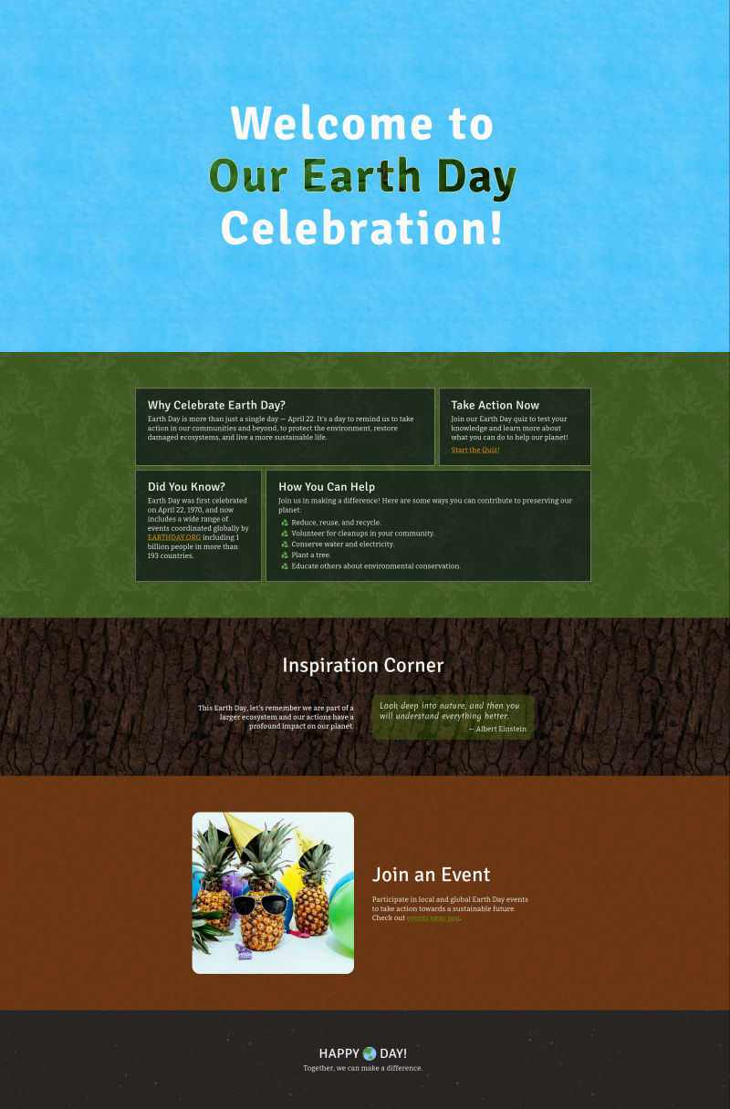
Dev.to image upload has too many restriction that I couldn't upload my website screenshot. Quite disappointed but there is nothing I can do, here is the image from imgbox.com site: https://imgbox.com/LTZBlO3R
Journey
I'm not really good in design and my ideas inverse to my age as programmer. So in short, this landing page may not be the finest in the contest but at least I did my best. With that in mind, I didn't expect to loot anything this time. However the goddam unexpected thing always be there right in the corner to do you a goddam jump scare. This time, it was a good jump scare, or jump happy 🤔 excited jump 🤔 hmn...
At first start this challenge, I admitted I'd been pretty negative about the challenge. Look at the glamup HTML code make me want to murder whoever come up with. The part of content supposed to use semantic tag didn't, class name spilled everywhere. However, after work, once I'd calmed down, I found out it was intentional from the staff. All the tags have class name was actually hints on missing information that the staff may want us, participators, to look further more. Yep, I firmly believed it was a minor challenge on encouraging us to research and understand more about earthday project. Yup yup, it was all about spreading message. That's tight 'n I like it. → lesson learnt: early judgment is usually bad, don't let it become conclusion.
After I understood the real assigment, or that what I thought, I start with the logic task first and complete it quite fast. Learning from the last time mistake, I don't want to do complex structure. So I focused on the kind of struct that can delivery well content to visitor, the classic flexbox layout. During the research, I found a few more fun/cool quotes about the earth or environment and I decide to collect a few of them to share it on the site. That make the spirit of the challenge make more sense right? Yet, my features greed refuses to leave me along. I want to add more feature that can actually put people awareness on the weather around them. And that is how my trailing cursor came in the play. If it's hot, you'll see fire and snow for being cold. From there I know what I should do next for my site design. → lesson learnt: Ideas don't always come at once. It is one thing after another. If you couldn't find an idea for your work. Do something easy, or something else. You may surprise what you got later on. (maybe)
💡 Tip
To enjoy differentharassmentfrom trailing cursor, you can modify localstorage directly by update/createtemperaturekey. The value can be any float number.
With the weather trailing cursor idea, I decided to make a website graphic design look like an outdoor zone. Instead using minimalism concerpt, I use a lot of texture and multiple color to bring out the nature element onto the website. At first I want to draw the tree and stuff content on each leafs brush on the tree. But it's too complicated and not very responsive. I gave up. I'm not an artist and the plan is unrealistic. I decide to come back to minimalism, still I only took the layout concept of it. Colorful textures didn't go elsewhere. As result, it won't look good under the eyes of professional but it surely not too horrible. → lesson learnt: Never forget these 3 things, your goal, your time 'n your skills. Know enemies (time in this case) as much as you know yourself is the key to success.
The rest is tiny elements that doesn't play big impact in the site. Those can be an animation title on the browser tab, header background moving, custom unorder list bullets, the small arrow in the quote bubble, hilarious photo in events section and footer title. They ain't much, some are not even noticable. Yet, once you remove them out, it definitely feels something's missing. Espcially the bubble arrow, at first I used the famous border trick to make the arrow. However, with border I couldn't blur the backdrop so I decided to scrap the code and go with the clip-path way.
❗Known Bug
In Firefox on Linux, even if you click allow, thegeolocationAPI still return permission denied. Since it happens on Linux, I'm not sure if it's just me or other people got the same problem. Please lemme know if you got the same like me.
What's next
I kinda like the trailing cursor so I properly build a library backed by custom element. Not sure when I could release it, tomorrow or tomorrow. Who knows 🙃
There ain't much to say so I put a period here. Hope you guys found my trailing cursor is annoying fun. I swear I didn't built that feature to share my thought about the goddam hot weather in Vietnam atm 🫠 Really, I've no intention to convert the frustration of hot onto painful look of the website... 🙃

Top comments (3)
I'm starting to regrets about the
blurfilter... I got the feeling of put it on bubble is a terrible move :(Great work, I like it!
Thanks mate