
This is the sixteenth post in a series examining modern CSS solutions to problems I've been solving over the last 13+ years of being a frontend developer. Visit ModernCSS.dev to view the whole series and additional resources.
This episode explores creating website heroes - aka "headers" - with one of my favorite ways to use CSS grid layout: by turning it into a canvas.
Support notice: The essential properties used in these techniques -
grid-template-areasandobject-fit- are not supported below IE 16. Good news - that still means they are about 96% supported!
Inspired by my years in marketing, here are the three layouts we're going to create:
1: Marketing Call-to-Action (CTA) and Image
2: Text Overlay on Background Image

3: Two-Column with Copy and Form
Base HTML and CSS Grid Setup
In the not-too-distant past, the way to achieve most of these layouts required the use of position: absolute.
With grid, we can upgrade from that solution and gain responsive, dynamic positioning superpowers!
Here's our starting point for HTML:
<header>
  <div class="hero__content">
    <h1>Product</h1>
    <p>You really need this product, so hurry and buy it today!</p>
    <a href="#" class="button">Buy Now</a>
  </div>
  <img src="http://placecorgi.com/600" alt="">
</header>
Then, we'll turn the header into a grid container, and create a single template area called "hero":
header {
  display: grid;
  grid-template-areas: "hero";
}
Use of the template area creates a single named grid cell. We then create a rule to assign all children of any type (thanks to the universal selector *) to this area:
header {
  // ...existing styles

  > * {
    grid-area: hero;
  }
}
What is this magic?
Using CSS grid layout template areas means that we get all the goodness of grid positioning which is a big upgrade from absolute positioning!
This directs that all children share the same grid cell, effectively turning it into a canvas.
We can now define items be centered or other positions relative to each other and the container instead of doing math to calculate percentages, or encountering media query headaches to get around absolute positioning interfering with responsive growing and shrinking of content.
Read on to gain more context with our header examples!
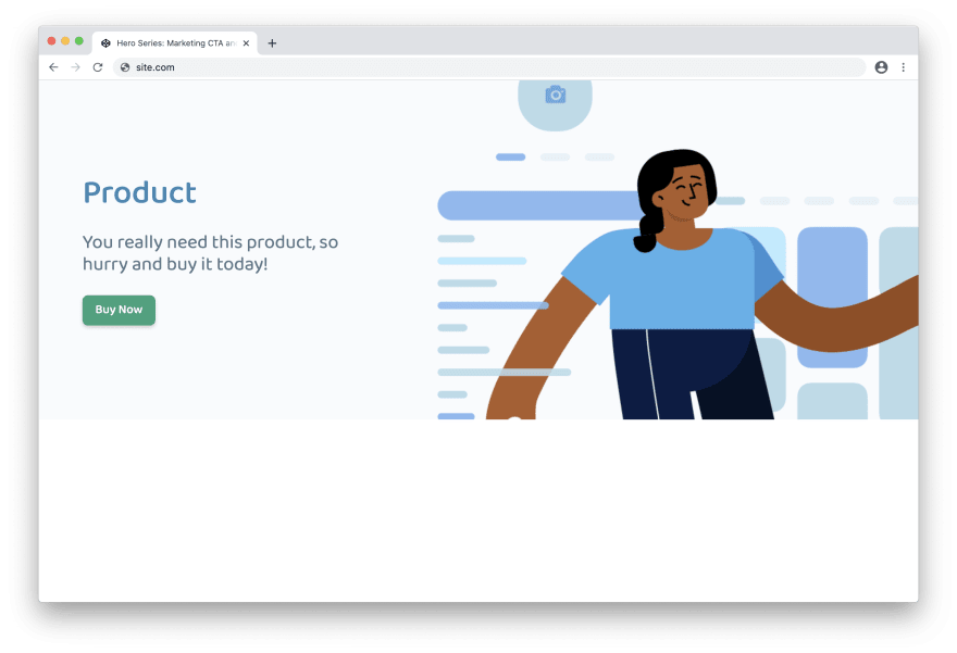
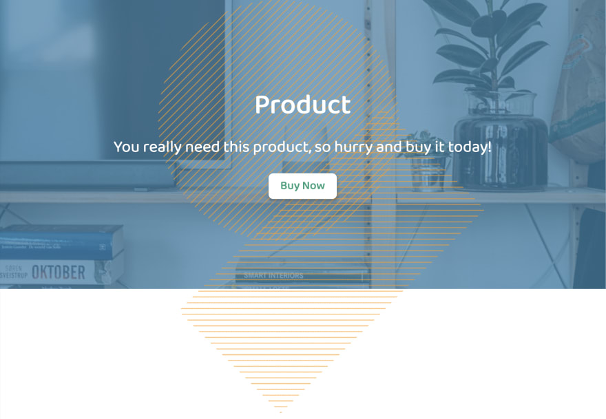
Hero #1: Marketing Call-to-Action (CTA) and Image
With no other styles yet in place besides our base, here's what we have: the elements are aligned top left, with the image layered over the .hero__content:
The first thing we'll address is setting some dimension expectations on the header:
header {
  // ...existing styles
  height: 65vh;
  max-height: 600px;
}
Viewport units such as vh are my go-to way to size heroes. This keeps them proportionate to the users viewing area by dynamically sizing them up or down depending on device size.
We are capping this particular one to prevent the image resolution from getting too stretched by way of max-height, but that is optional and circumstantial to the image in use.
Next, we need to provide some direction on the img behavior.
You may be wondering why we didn't use a background image. The first answer is so that the image retains its semantics including the alt attribute in order to be discoverable by assistive technology.
Second, keeping it as an image allows more flexibility in how we style and position it.
We will use object-fit together with object-position which actually makes its initial behavior very similar to that of a background image:
img {
  object-fit: cover;
  object-position: 5vw -5vmin;
  height: min(65vh, 600px);
  width: 60%;
}
The height: min(65vh, 600px) is important, because it directs it to fill the height of the header based on the "minimum" of either of those values, which comes from the heights we set on the base header. After giving explicit dimension parameters, object-fit takes over and scales the image contents to "cover" the dimensions including the width: 60%.
New to
object-fit? Check out episode 3 on responsive images or episode 6 on animated image captions for more examples.
Finally, we will add justify-self to the img to define that it should be placed at the end of the container - our first dip into the magic of using grid for this solution:
img {
  // ...existing styles
  justify-content: end;
}
Here's our progress:

Now for the .hero__content, the first improvement is to give it a width definition, and also give it some space from the viewport edge:
.hero__content {
  margin-left: 5%;
  max-width: 35%;
  min-width: 30ch;
}
Since our img is allowed a width of 60%, we don't want our combined margin and width to exceed 40% in order to avoid overlap.
We also provided a min-width to keep a reasonable amount of space for the content as the viewport shrinks.
Now we can again leverage the use of grid, and return to our header rule to add an alignment property:
header {
  // ...existing styles
  align-items: center;
}
This vertically aligns the content with the image. Since the image is set to 100% of the header height, optically this vertically centers the content, resulting in our desktop-ready hero:
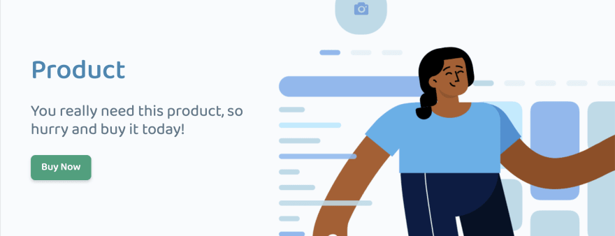
In order for this to continue working on the smallest screens, we need a couple tweaks.
First, we'll default the image width to 80% and wrap the 60% reduction in a media query. We'll also add a transition just to smooth it between viewport resizes:
img {
  // ...existing styles
  width: 80%; // < update
  transition: 180ms width ease-in;

  @media (min-width: 60rem) {
    width: 60%;
  }
}
Then on the content, we'll use a bit of trickery to set the background to an alpha of the hero background so it's only visible once it begins to overlap the image, and include an update on the margin, some padding, and a bit of border-radius:
.hero__content {
  // ...existing styles
  margin: 1rem 0 1rem 5%; // < update
  z-index: 1;
  background-color: rgba(mix(#fff, $primary, 97%), 0.8);
  border-radius: 1rem;
  padding: 0.5rem 0.5rem 0.5rem 0;
}
We did have to add one little z-index there to bring it above the img, but it wasn't too painful! 😊
Here's the final mobile-sized viewport result:

Summary of Techniques in Hero #1
-
object-fitused to controlimgsize -
align-items: centerused to vertically align the grid children
Hero #1 Demo
Hero #2: Text Overlay on Background Image
For this version with our base HTML and CSS styles, the image completely obscures the content since it's a jpg and therefore has no alpha.
So step 1: bring the content above the image:
.hero__content {
  z-index: 1;
}
Next, we'll define header dimensions:
header {
  // ...existing styles
  height: 60vh;
  max-height: 600px;
}
And again, we'll use object-fit to control our img. The difference this time is we want it to span 100% width and height so it has full coverage over the header:
img {
  object-fit: cover;
  height: min(60vh, 600px);
  width: 100%;
}
Before we show a progress shot, let's adjust the alignment of the grid children:
header {
  // ...existing styles
  place-items: center;
}
And here's the result so far:

It's quite apparent that the contrast of the text is not sufficient over the background image. One common way to both add an extra touch of branding and also aid in addressing contrast issues is to apply a color screen to an image.
Here's our slight hack to accomplish this - first, the header receives a background-color that includes alpha transparency:
$primary: #3c87b3;

header {
  // ...existing styles
  background-color: rgba($primary, 0.7);
}
Then, we direct the image to slip behind the header with z-index. In my testing, this still keeps the img discoverable with assistive tech, but reach out if you know of an issue!
img {
  // ...existing styles
  z-index: -1;
}
Resulting in the following:

To demonstrate a bit more about what is possible thanks to using grid, let's create a :before and :after pseudo-element on the header to hold an SVG pattern.
The important thing to include is to also assign the pseudo-elements to grid-area: hero. Otherwise, they would slot in as new "rows" according to default grid flow, which would break our canvas.
&::before {
  content: "";
  grid-area: hero;
  width: 50vmin;
  height: 50vmin;
  border-radius: 50%;
  transform: translate(-10%, -10%);
  background-image: url("data:image/svg+xml,%3Csvg width='14' height='14' viewBox='0 0 6 6' xmlns='http://www.w3.org/2000/svg'%3E%3Cg fill='#{svgColor($support)}' fill-opacity='0.6' fill-rule='evenodd'%3E%3Cpath d='M5 0h1L0 6V5zM6 5v1H5z'/%3E%3C/g%3E%3C/svg%3E");
}

&::after {
  content: "";
  grid-area: hero;
  width: 30vmin;
  height: 60vmin;
  transform: translate(20%, 40%) rotate(45deg);
  background-image: url("data:image/svg+xml,%3Csvg width='14' height='14' viewBox='0 0 6 6' xmlns='http://www.w3.org/2000/svg'%3E%3Cg fill='#{svgColor($support)}' fill-opacity='0.6' fill-rule='evenodd'%3E%3Cpath d='M5 0h1L0 6V5zM6 5v1H5z'/%3E%3C/g%3E%3C/svg%3E");
}
And due to the place-items: center definition, here's the result:
The first issue to resolve is the overflow, which we'll fix with:
header {
  // ...existing styles
  overflow: hidden;
}
Next, grid offers self properties to direct that specific item can reposition itself, which breaks it from the grid parent definition. So we'll update our pseudo-elements accordingly:
&::before {
  // ...existing styles
  place-self: start;
}

&::after {
  // ...existing styles
  place-self: end;
}
And with that, we've completed hero 2! Test out the demo to see that the small viewport version continues to work well:

Summary of Techniques in Hero #2
- created a color screen over the
imgby definingbackground-colorof theheaderwithrgbaand addingz-index: -1to theimgto slide it behind theheader - used pseudo-elements for additional design flair, and positioned them separately from the parent grid definition with
place-self
Hero #2 Demo
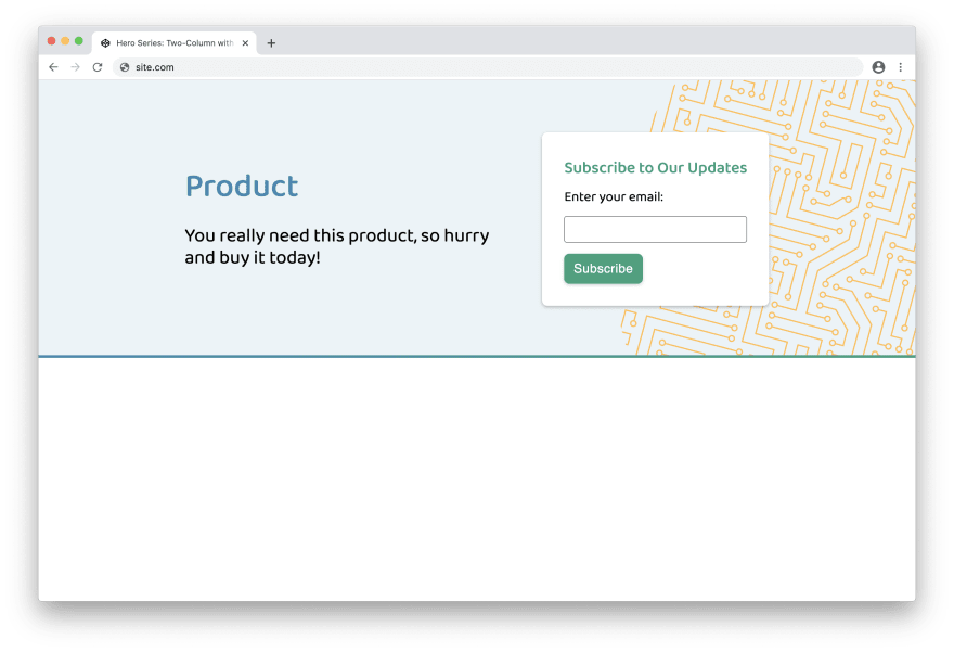
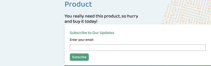
Hero #3: Two-Column with Copy and Form
For this third example, our base HTML changes a bit to add in the form. We also include a wrapper around the main content which we'll explain soon:
<header>
  <div class="hero__wrapper">
    <div class="hero__content">
      <h1>Product</h1>
      <p>You really need this product, so hurry and buy it today!</p>
    </div>
    <div class="hero__form">
      <h2>Subscribe to Our Updates</h2>
      <form action="/">
        <label for="email">Enter your email:</label>
        <input id="email" name="email" type="email" />
        <button class="button" type="submit">
          Subscribe
        </button>
      </form>
    </div>
  </div>
</header>
And here's our starting appearance, given use of things we've already learned: the header SVG pattern pseudo-element has already used place-self: end, the form styles are already in-tact (spoiler: that is using grid too!), and overflow is also already being controlled:
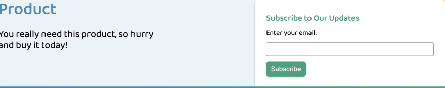
Let's start to fix this by beginning our .hero__wrapper class. An important update is to set its width to 100vw so that as a containing element it spans the header entirely. We'll also go ahead and create it as a grid container:
.hero__wrapper {
  width: 100vw;
  display: grid;
}
Next, it's time to define the grid columns. We'll use my favorite technique which is already featured in multiple episodes for intrinsically responsive grid columns:
.hero__wrapper {
  // ...existing styles
  grid-template-columns: repeat(auto-fit, minmax(30ch, auto));
  grid-gap: 2rem;
}
Learn more about this technique in episode 8: Solutions to Replace the 12-Column Grid
We've used auto for the max-allowed width instead of 1fr since we do not want equal columns, but rather for the columns to expand proportionately to their relative size. This is for a bit better visual balance between the text content and the form, and can be adjusted to taste. If you desire equal-width columns, use 1fr instead of auto.
Let's talk a minute about that bottom gradient border - how is it being positioned?
It is the :after element on the header and is the primary reason we are using a wrapper around the main header content. It is being positioned with place-self: end, and its width is due to the natural stretch behavior. Check the demo to see how minimal its style are.
Ok, now we need some additional spacing around the content. In the other heroes, we applied a height but this doesn't quite cover our use case here because on smaller viewports the form and content will vertically stack.
Instead, this is a better job for good ole padding. We'll place it on .hero__wrapper so as not to affect the position of the SVG pattern or gradient border:
.hero__wrapper {
  // ...existing styles
  padding: 10vmin 2rem;
}
Use of the viewport unit vmin for the top and bottom padding means that the smaller of "view-width" or "view-height" will be used for that value. The benefit here is helping ensure the hero doesn't cover the entire screen of smaller viewports, which may make it seem like there isn't additional page content. This is because in that case the "veiw-width" will be used making it a smaller value versus on larger, desktop viewports where it will use "view-height" and be a greater value.
To complete the large viewport appearance, we will add two positioning values to the wrapper:
.hero__wrapper {
  // ...existing styles
  align-items: center;
  justify-content: center;
}
Where align-items provides vertical alignment, and justify-content provides horizontal alignment.

On smaller viewports, our only adjustment is to ensure that the content remains legible over the SVG pattern. We'll use a similar technique to hero #1:
.hero__wrapper {
  // ...existing styles
  z-index: 1;
}

.hero__content {
  background-color: rgba(scale-color($primary, $lightness: 90%), 0.8);
  border-radius: 8px;
}

Summary of Techniques in Hero #3
- use of a wrapper to provide a secondary grid layout for content versus
headerdesign elements - creation of auto-width columns with
grid-template-columns - leveraging
vminto minimize padding on smaller viewports and increase it for larger viewports
Hero #3 Demo
Bonus: use of clamp to shrink the paragraph copy proportionate to the viewport size in order to reduce it for smaller viewports.

Top comments (9)
Voted best Dev article 2020 Category:Grid!
I leaned a little trick a while back...
As long as this is not used in a contextual way.. the string is shown in the rendered CSS and tells you where it came from!
Haha, thanks!
I think I recall seeing that tip, however be aware pseudo content can be read by assistive tech and there's no way to conceal it from them if that info is attached to a focusable/discoverable element, in which case that would give them some kind of crazy info with no context!
Stephanie,
Very informative article.
I was working step by step on Marketing Call-to-Action (CTA) and Image.
When I added the header code
The image in Firefox did not take the height of the header. What I am doing wrong here? I even checked the codepen in FF the header image still took the full height instead of max-height of 600px.
Looks like there is a mismatch in the behavior between Firefox and Chrome - changing
min-heightto justheightresolves it 👍 Thanks for commenting, I'll update the article!Thanks, the issue resolved.
Great article, Stephanie! I tried to extend your example with webp inside a picture element, but I broke it horribly. I find that I have to set a height on the picture element in order to prevent overflow. Open to better suggestions!
Answering my own question. A couple of important things to note about the working code. You need to set
grid-auto-flow: columnto be able to align the hero image on the right, as well as img height and width set to 100% in order to get it to fill the entire picture element.Excellent article. A great demonstration of how flexible css can be when combined with thoughtful, semantic HTML.
Thanks, and thanks for the coffees and compliment there, too! 💫