
Drag and drop applications are very common nowadays, they are great for the user experience inside an app. **And you would probably like to implement it in your next project.
This time, I'll show you how to make an application that has drag & drop functionality, but without using any external library, only with React JS.
🚨 Note: This post requires you to know the basics of React with TypeScript (basic hooks and custom hooks).
Any kind of feedback is welcome, thanks and I hope you enjoy the article.🤗
Table of contents.
📌 Technologies to be used.
📌 Creating the project.
📌 First steps.
📌 Creating our cards.
📌 Creating the containers for our cards.📌 Defining the type and interface for the cards information.
📌 Creating the DragAndDrop.tsx component.
📌 Adding some data to create cards.
📌 Showing some cards.
📌 Performing the Drag.
📌 Performing the Drop.📌 Creating the state to hold the cards.
📌 Performing the functions to make the drop in the containers.📌 Optional. Refactoring the code in
DragAndDrop.tsx
📌 Conclusion.
👉 Technologies to be used.
- ▶️ React JS (v.18)
- ▶️ Vite JS
- ▶️ TypeScript
- ▶️ CSS vanilla (You can find the styles in the repository at the end of this post)
👉 Creating the project.
We will name the project: dnd-app (optional, you can name it whatever you like).
npm init vite@latest
We create the project with Vite JS and select React with TypeScript.
Then we run the following command to navigate to the directory just created.
cd dnd-app
Then we install the dependencies.
npm install
Then we open the project in a code editor (in my case VS code).
code .
Then with this command we will raise the development server, and finally we go to a browser and access http://localhost:5173 (in vite version 2 the port was localhost:3000, but in the new version the port is localhost:5173)
npm run dev
👉 First steps.
At once, we create the folder src/components and add the file Title.tsx and inside we add:
export const Title = () => {
    return (
        <div className="title flex">
            <h1>Creating basic Drag & Drop 👆 </h1>
            <span>( without external libraries )</span>
        </div>
    )
}
Now, inside the file src/App.tsx we delete all the content of the file and we place a functional component that shows the title that we have just created.
import { Title } from "./components/Title"

const App = () => {
  return (
    <div className="container-main flex">
        <Title />
    </div>
  )
}
export default App
It should look like this 👀:

👉 Creating our cards.
Inside the folder src/components we add the file CardItem.tsx.
At the moment it will not receive any prop, it will do it later.
export const CardItem = () => {
    return (
        <div className='card-container'>
            <p>content</p>
        </div>
    )
}
We will NOT use the Card component in a file yet, but if you want you can import it into the src/App.tsx file so you can style it and see it on screen.
👉 Creating the containers for our cards.
Now let's create our container for the cards.
Inside the folder src/components we add the file ContainerCards.tsx and add the following:
This component for the moment receives as parameter the status ( you can see what type is the Status).
import { Status } from '../interfaces'

interface Props {
  status: Status
}

export const ContainerCards = ({ status }: Props) => {

    return (
        <div className="layout-cards" >
            <p>{status} hero</p>
            {/* Cards */}
        </div>
    )
}
🟠 Defining the type and interface for the cards information.
The type Status is as follows:
export type Status = 'good' | 'bad' | 'normal'
This type is inside the folder src/interfaces inside a file index.ts (which must be created, since the type Status will be used in several files).
While creating the index.ts in src/interfaces also add the following interface.
This is how the card data will look like.
export interface Data {
    id: number
    content: string
    status: Status
}
👉 Creating the DragAndDrop.tsx component.
Well, so far we have already created the component that will contain the cards, but we need 3 card containers:
- One for the good heroes.
- One for the normal heroes.
- One for the bad heroes.
Inside the folder src/components we add the file DragAndDrop.tsx and add the following:
import { Status } from "../interfaces"
import { ContainerCards } from "./ContainerCards"

const typesHero: Status[] = ['good', 'normal', 'bad']

export const DragAndDrop = () => {
    return (
        <div className="grid">
            {
                typesHero.map( container => (
                    <ContainerCards
                        status={container}
                        key={container}
                    />
                ))
            }
        </div>
    )
}
This component must be added to src/App.tsx.
import { DragAndDrop} from "./components/DragAndDrop"
import { Title } from "./components/Title"

const App = () => {

  return (
    <div className="container-main flex">
      <Title />
      <DragAndDrop />
    </div>
  )
}
export default App
It should look something like this for the time being 👀....

Now we have the containers where the cards can be dropped and sorted. 👋
Now we need to create some cards.
👉 Adding some data to create cards.
Now we create a folder src/assets and inside it a file index.ts which will contain a list with data to fill in the cards.
import { Data } from "../interfaces";

export const data: Data[] = [
    {
        id: 1,
        content: 'Aqua-man',
        status: 'good'
    },
    {
        id: 2,
        content: 'Flash',
        status: 'normal'
    },
    {
        id: 3,
        content: 'Green Lantern',
        status: 'good'
    },
    {
        id: 4,
        content: 'Batman',
        status: 'bad'
    },
]
Now, returned in src/components/DragAndDrop.tsx in component ContainerCards we pass a new prop called items to this prop we pass as value the data we have created in the folder src/assets.
import { ContainerCards } from "./ContainerCards"
import { Status } from "../interfaces"
import { data } from "../assets"

const typesHero: Status[] = ['good', 'normal', 'bad']

export const DragAndDrop = () => {
    return (
        <div className="grid">
            {
                typesHero.map( container => (
                    <ContainerCards
                        status={container}
                        key={container}
                        items={data}
                    />
                ))
            }
        </div>
    )
}
This will throw an error because items is not a property that ContainerCards is expecting. 😥
But we fix that in the next section. 👇
👉 Showing some cards.
To display some cards, we need to make some changes in the parameters of each component.
1 - First the component src/components/CardItem.tsx.
It will receive as props the data that is of type Data, the one that we had defined previously .
At once we show the property content inside data.
import { Data } from "../interfaces"

interface Props {
    data: Data
}

export const CardItem = ({ data, handleDragging }: Props) => {

    return (
        <div className='card-container'>
            <p>{data.content}</p>
        </div>
    )
}
2 - In the component src/components/ContainerCards.tsx we change the Props interface by adding the items property which is a list of Data and destructuring it in the component
import { Data, Status } from "../interfaces"

interface Props {
    items: Data[]
    status: Status
}

export const ContainerCards = ({ items = [], status }: Props) => {

    return (
        <div className="layout-cards">
            <p>{status} hero</p>
        </div>
    )
}
Then under the p tag we perform an iteration to the items.
And we return the CardItem.tsx sending the item to the data property of the CardItem.
import { Data, Status } from "../interfaces"
import { CardItem } from "./CardItem"

interface Props {
    items: Data[]
    status: Status
}

export const ContainerCards = ({ items = [], status}: Props) => {

    return (
        <div className="layout-cards">
            <p>{status} hero</p>
            {
                items.map(item => (
                    <CardItem
                        data={item}
                        key={item.id}
                    />
                ))
            }
        </div>
    )
}
This will give you a warning that the keys are repeated 😥.
This is because we are rendering 3 times the ContainerCards.
But wait the only property that will make the difference between these 3 components is the status.
So we will make the following condition:
- If the status received by the ContainerCards component is equal to the status of the item (i.e. of the super hero) then render it, otherwise return false.
import { Data, Status } from "../interfaces"
import { CardItem } from "./CardItem"

interface Props {
    items: Data[]
    status: Status
}

export const ContainerCards = ({ items = [], status }: Props) => {

    return (
        <div className="layout-cards">
            <p>{status} hero</p>
            {
                items.map(item => (
                    status === item.status
                    && <CardItem
                        data={item}
                        key={item.id}
                    />
                ))
            }
        </div>
    )
}
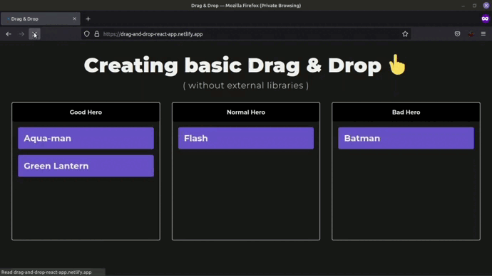
And so we avoid the conflict with the keys and the cards will be sorted as follows 👀....

👉 Performing the Drag.
To perform the drag functionality, we will first define a state and a function in src/components/DragAndDrop.tsx.
-
The state will help us to know if it is doing drag, and thus to change the styles of.
- And by default it will be false, since at the beginning of the application it will not be doing drag.
- It will only be true when dragging a card.
The function, which receives a boolean value, will help us to change the value to the state, this is done to avoid passing the setter setIsDragging as prop.
We pass as prop to the ContainerCards component:
- isDragging, it will have the value of the state.
- handleDragging, will be the function that we create to update the state.
import { ContainerCards } from "./ContainerCards"
import { data } from "../assets"
import { Status } from "../interfaces"

const typesHero: Status[] = ['good', 'normal', 'bad']

export const DragAndDrop = () => {

  const [isDragging, setIsDragging] = useState(false)

  const handleDragging = (dragging: boolean) => setIsDragging(dragging)


    return (
        <div className="grid">
            {
                typesHero.map(container => (
                    <ContainerCards
                        items={data}
                        status={container}
                        key={container}

                        isDragging={isDragging}
                        handleDragging={handleDragging}
                    />
                ))
            }
        </div>
    )
}
This will fail because ContainerCards does not expect those properties.
So we will have to change the interface of ContainerCards.
The file src/components/ContainerCards.tsx.
interface Props {
    items: Data[]
    status: Status
    isDragging: boolean
    handleDragging: (dragging: boolean) => void
}
And in one go we get those props.
Note that in the className of the div we place a condition, where if isDragging is true then we add the class
layout-dragging. This class will only change the background color and the border of the container, when a card is dragged.Note, that we also pass a new prop to the CardItem which is handleDragging, this is because the card is the component that will update the state that we created previously.
import { CardItem } from "./CardItem"
import { Data, Status } from "../interfaces"

interface Props {
    items: Data[]
    status: Status
    isDragging: boolean
    handleDragging: (dragging: boolean) => void
}

export const ContainerCards = ({ items = [], status, isDragging, handleDragging }: Props) => {

    return (
        <div
            className={`layout-cards ${isDragging ? 'layout-dragging' : ''}`}
        >
            <p>{status} hero</p>
            {
                items.map(item => (
                    status === item.status
                    && <CardItem
                        data={item}
                        key={item.id}
                        handleDragging={handleDragging}
                    />
                ))
            }
        </div>
    )
}
The CardItem will give us an error because it does not expect the handleDragging property, so we must modify its interface.
Now in the file src/components/CardItem.tsx we modify the interface
interface Props {
    data: Data,
    handleDragging: (dragging: boolean) => void
}
And now yes, we begin to add the drag functionality in this component.
First to the div which is the whole card, we add the attribute draggable to indicate that this component can be dragged.
import { Data } from "../interfaces"

interface Props {
    data: Data,
    handleDragging: (dragging: boolean) => void
}

export const CardItem = ({ data, handleDragging }: Props) => {
    return (
        <div
            className='card-container'
            draggable
        >
            <p>{data.content}</p>
        </div>
    )
}
Then we add the attribute onDragEnd that will execute the function handleDragEnd.
This function will only set the value of the isDragging status to false, because when onDragEnd is executed, the card will no longer be dragged, so we have to remove the styles when dragging, that is, return all the styles as at the beginning.
import { Data } from "../interfaces"

interface Props {
    data: Data,
    handleDragging: (dragging: boolean) => void
}

export const CardItem = ({ data, handleDragging }: Props) => {


    const handleDragEnd = () => handleDragging(false)

    return (
        <div
            className='card-container'
            draggable
            onDragEnd={handleDragEnd}
        >
            <p>{data.content}</p>
        </div>
    )
}
Then we add the onDragStart attribute (it is executed when the component starts dragging, if we did not add the draggable attribute, then onDragStart would not be executed).
onDragStart will execute the handleDragStart function.
This function receives the event and inside the event there is a property that interests us which is dataTransfer.
The dataTransfer property allows us to contain or obtain data when an element is being dragged.
The setData property within dataTransfer, establishes the data that we want to contain when dragging an element, and receives two parameters:
format: format of the data to be maintained, which is "text".
data: is the information that we want to contain while dragging the element. It only accepts a string. In this case, we will store the id of the card.
NOTE: there is also a property inside dataTransfer called clearData that clears the cache of the data we store. In this case it is not necessary to execute it, since we will be overwriting the same identifier 'text'.
After containing the data, we execute handleDragging sending the value of true to indicate to the user that we are dragging an element.
import { Data } from "../interfaces"

interface Props {
    data: Data,
    handleDragging: (dragging: boolean) => void
}

export const CardItem = ({ data, handleDragging }: Props) => {

    const handleDragStart = (e: React.DragEvent<HTMLDivElement>) => {
        e.dataTransfer.setData('text', `${data.id}`)
        handleDragging(true)
    }
    const handleDragEnd = () => handleDragging(false)

    return (
        <div
            className='card-container'
            draggable
            onDragStart={handleDragStart}
            onDragEnd={handleDragEnd}
        >
            <p>{data.content}</p>
        </div>
    )
}
And so we would have the part of dragging an element, we would already have the contained information ready to get it when we drop it in another container.
This is how it would look when we drag a card, it changes the design of the containers indicating that they are the places where you can drop the card.

👉 Performing the Drop.
Before we do the part of releasing the element, we must do other things first.
🟠 Creating the state to hold the cards.
First to establish the list of heroes in a state and to be able to update it when the card is dropped in another container, at that moment we would update the status property of the hero, which will cause that the list is rendered again organizing the cards that changed.
For that we go to src/components/DragAndDrop.tsx and create a new status.
Its initial value will be the data that we have previously defined in src/assets.
import { data } from "../assets"

const [listItems, setListItems] = useState<Data[]>(data)
And now, when rendering the ContainerCards component, instead of passing the value of data to the items prop, we will send it the value of the listItems state.
import { ContainerCards } from "./ContainerCards"
import { data } from "../assets"
import { Status } from "../interfaces"

const typesHero: Status[] = ['good', 'normal', 'bad']

export const DragAndDrop = () => {

  const [isDragging, setIsDragging] = useState(false)
  const [listItems, setListItems] = useState<Data[]>(data)

  const handleDragging = (dragging: boolean) => setIsDragging(dragging)


    return (
        <div className="grid">
            {
                typesHero.map(container => (
                    <ContainerCards
                        items={listItems}
                        status={container}
                        key={container}

                        isDragging={isDragging}
                        handleDragging={handleDragging}
                    />
                ))
            }
        </div>
    )
}
Then we will create a function to update the state of the listItems.
We will call it handleUpdateList, and it will receive two parameters:
- id: the identifier of the card, it will be of type number.
- status: the new status of the card, it will be of type Status.
Inside the function ...
1 - First we will look for the element in the listItems status value, by means of the ID.
2 - We will evaluate if the data exists and if the status that is passed to us is different from the status that it already has, then we will make the changes in the status.
3 - Within the condition, we access to the found card and we will update its status property assigning it the new status that comes to us by parameter in the function.
4 - We call the setListItems to update the status, placing:
The card with its updated status property.
A new array, filtering the items to remove the card we are updating and avoid duplicating the information.
Now, to the ContainerCards component we add a new property called handleUpdateList and send it the function we just created handleUpdateList.
import { ContainerCards } from "./ContainerCards"
import { data } from "../assets"
import { Status } from "../interfaces"

const typesHero: Status[] = ['good', 'normal', 'bad']

export const DragAndDrop = () => {

  const [isDragging, setIsDragging] = useState(false)
  const [listItems, setListItems] = useState<Data[]>(data)

  const handleDragging = (dragging: boolean) => setIsDragging(dragging)

  const handleUpdateList = (id: number, status: Status) => {

       let card = listItems.find(item => item.id === id)

       if (card && card.status !== status) {

           card.status = status

           setListItems( prev => ([
                card!,
                ...prev.filter(item => item.id !== id)
            ]))
       }
   }

    return (
        <div className="grid">
            {
                typesHero.map(container => (
                    <ContainerCards
                        items={listItems}
                        status={container}
                        key={container}

                        isDragging={isDragging}
                        handleDragging={handleDragging}
                        handleUpdateList={handleUpdateList}
                    />
                ))
            }
        </div>
    )
}
This will give us an error, because the ContainerCards component does not expect the handleUpdateList property, so we must update the ContainerCards interface.
In src/components/ContainerCards.tsx:
interface Props {
    items: Data[]
    status: Status
    isDragging: boolean
    handleDragging: (dragging: boolean) => void
    handleUpdateList: (id: number, status: Status) => void
}
👉 Performing the functions to make the drop in the containers.
We are in src/components/ContainerCards.tsx.
Inside the component we are going to set two new properties to the div element.
onDragOver*: occurs when a draggable element is dragged over a valid drop target. We pass it the **handleDragOver* function, which we will create in a moment.
onDrop*: occurs when the dragged element is dropped. We pass it the **handleDrop* function, which we will create in a moment.
<div
    className={`layout-cards ${isDragging ? 'layout-dragging' : ''}`}
    onDragOver={handleDragOver}
    onDrop={handleDrop}
>
    <p>{status} hero</p>
    {
        items.map(item => (
            status === item.status
            && <CardItem
                data={item}
                key={item.id}
                handleDragging={handleDragging}
            />
        ))
    }
</div>
The handleDragOver function will only do this.
First, it will receive the event that emits onDragOver.
Since by default data cannot be dropped on other elements and to allow dropping we must avoid the default behavior.
const handleDragOver = (e: React.DragEvent<HTMLDivElement>) => {
    e.preventDefault()
}
Now the handleDrop function
First, you will receive the event that emits onDrop.
Inside the function, we avoid the default behavior, which is more noticeable with images (when we drop an image in a place of our app, it opens the image, taking us out of the app).
-
Then, from the event, we obtain the property dataTransfer and through the getData property of dataTransfer, we execute it sending the identifier from which we will obtain the ID of the card.
- The
+sign at the beginning ofe.dataTransfer.getData('text')is to convert the value to a number.
- The
-
Then we will call the handleUpdateList function that the component passes us by props, (we have to unstructure it from the component).
- First we pass it the id that we obtained from the getData property of dataTransfer already converted to a number.
- Then we pass it the status that we received by props in the component.
Finally we call handleDragging sending the value of false to indicate to the user that we are no longer dragging anything.
const handleDrop = (e: React.DragEvent<HTMLDivElement>) => {
    e.preventDefault()
    const id = +e.dataTransfer.getData('text')
    handleUpdateList(id, status)
    handleDragging(false)
}
This is what the code in src/components/ContainerCards.tsx would look like:
import { Data, Status } from "../interfaces"
import { CardItem } from "./CardItem"

interface Props {
    items: Data[]
    status: Status
    isDragging: boolean
    handleUpdateList: (id: number, status: Status) => void
    handleDragging: (dragging: boolean) => void
}

export const ContainerCards = ({ items = [], status, isDragging, handleDragging, handleUpdateList }: Props) => {

    const handleDrop = (e: React.DragEvent<HTMLDivElement>) => {
        e.preventDefault()
        handleUpdateList(+e.dataTransfer.getData('text'), status)
        handleDragging(false)
    }

    const handleDragOver = (e: React.DragEvent<HTMLDivElement>) => e.preventDefault()

    return (
        <div
            className={`layout-cards ${isDragging ? 'layout-dragging' : ''}`}
            onDrop={handleDrop}
            onDragOver={handleDragOver}
        >
            <p>{status} hero</p>
            {
                items.map(item => (
                    status === item.status
                    && <CardItem
                        data={item}
                        key={item.id}
                        handleDragging={handleDragging}
                    />
                ))
            }
        </div>
    )
}
The end result should look like this 🥳!

👉 Optional. Refactoring the code in DragAndDrop.tsx
We have enough logic in our component, so it would be a good option to create a custom hook to manage that logic.
We create a src/hooks folder and inside a file called useDragAndDrop.ts.
First we define the function, which will receive an initial state that will be of type Data array.
export const useDragAndDrop = (initialState: Data[]) => {}
From the component DragAndDrop.tsx we cut all the logic and we place it in the custom hook.
The initial value of the state of listItems will be the one passed to us by parameter of the hook.
And finally we return as an object:
- isDragging.
- listItems.
- handleUpdateList.
- handleDragging.
import { useState } from "react"
import { Data, Status } from "../interfaces"

export const useDragAndDrop = (initialState: Data[]) => {

    const [isDragging, setIsDragging] = useState(false)
    const [listItems, setListItems] = useState<Data[]>(initialState)

    const handleUpdateList = (id: number, status: Status) => {

       let card = listItems.find(item => item.id === id)

       if (card && card.status !== status) {

           card.status = status

           setListItems( prev => ([
                card!,
                ...prev.filter(item => item.id !== id)
            ]))
       }
   }

    const handleDragging = (dragging: boolean) => setIsDragging(dragging)

    return {
        isDragging,
        listItems,
        handleUpdateList,
        handleDragging,
    }
}
Now in the component src/components/DragAndDrop.tsx we call our custom hook.
We send the data to our hook, by parameter and we just unstructure the properties and that's it.
import { ContainerCards } from "./ContainerCards"
import { useDragAndDrop } from "../hooks/useDragAndDrop"
import { Status } from "../interfaces"
import { data } from "../assets"

const typesHero: Status[] = ['good', 'normal', 'bad']

export const DragAndDrop = () => {

    const { isDragging, listItems, handleDragging, handleUpdateList } = useDragAndDrop(data)

    return (
        <div className="grid">
            {
                typesHero.map(container => (
                    <ContainerCards
                        items={listItems}
                        status={container}
                        key={container}

                        isDragging={isDragging}
                        handleDragging={handleDragging}
                        handleUpdateList={handleUpdateList}
                    />
                ))
            }
        </div>
    )
}
This will make your component more readable. 🎉
👉 Conclusion.
This process is one of the ways to build an application with Drag & Drop functionality without using external libraries.
One way to improve this application would be to use a state manager to avoid passing too many props to the components.
If you want something more elaborate and expand the functionality, you can opt for a third party package that I highly recommend, and that is
react-beautiful-dnd, a very good and popular library.
I hope I helped you understand how to perform this exercise,thank you very much for making it this far! 🤗❤️
I invite you to comment if you find this article useful or interesting, or if you know any other different or better way of how to do a drag & drop. 🙌
🟠 Live demo.
https://drag-and-drop-react-app.netlify.app
🟠 Source code.
 Franklin361
/
drag-and-drop-react
Franklin361
/
drag-and-drop-react
Creating an application using Drag & Drop with React JS 🤏
Creating an app using Drag and Drop with React without libraries 👆!
This time, we are going to implement the functionality to do a Drag & Drop with React JS and without any other external package or library!
Features ⚙️
- Card dragging.
- Dropping cards into a container.
- Sorting cards.
Technologies 🧪
- React JS
- TypeScript
- Vite JS
- Vanilla CSS 3
Installation 🧰
- Clone the repository (you need to have Git installed).
git clone https://github.com/Franklin361/drag-and-drop-react
- Install dependencies of the project.
npm install
- Run the project.
npm run dev

Top comments (7)
Nicely documented!
Awesome this would have been so useful in a previous project.
Beautifully put :)
I usually post every Friday, but as of today I'll be taking a two week break ✈️ so I won't be posting anything during that time 😔, good day! ❤️
Pros: no need third-party lib.
Cons: it doesn't work on mobile.
I saw the error!
in the first parameter of the
setDatafunction is not just any word but the format of the data to keep, which is** "text"**:Good Job!