Table Of Contents
    * [Overview](#chapter-1)
    * [Getting Started](#chapter-2)
    * [Step 1](#chapter-3)
    * [Step 2](#chapter-4)
    * [Step 3](#chapter-4)
    * [Conclusion](#chapter-5)
Overview
Today we'll be discussing the easiest way to use SVG icons in react. We'll be using an npm package that will enable us to use icons from some of the most well-known icon libraries out there.
The package we'll be discussing is called React-Icons.
Link to npm page: https://www.npmjs.com/package/react-icons
Getting Started
If you'll be following along feel free to clone this repository, as this is what we'll be using for our boilerplate: https://github.com/kevinsims1/bare-react
I'll assume you have cloned the repo from this point forward.
Step 1
Open the terminal in the root of the project and use this command:
npm install react-icons
This will download our package and give us full accessibility to it.
Step 2
Now open the boilerplate in your code editor.
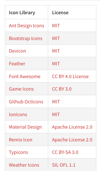
React Icons give you the option to choose icons from all of the following icon libraries:
to use them all you need to do is use the import relevant to the library.
Here is an example of each relevant import:

Go to the bare.js file and add the following import after line 1:
import {FaTwitter} from "react-icons/fa"
Now delete the return statement and add this:
const Bare = () => {
  return (
    <div>
      <FaTwitter />
    </div>
  )
}
Go into your terminal and type: npm run start
you should get a page with this icon in the top left of your page:

IT's WORKING!
But... It's a bit on the bland side.
Step 3
React Icons handles that by allowing you to import an IconContext component that allows you to do a lot of cool things to your icon. We'll be using it to add some style to ours.
Add this import after our first one:
import {IconContext} from "react-icons"
Now wrap our icon in the IconContext component like so:
const Bare = () => {
  return (
   <IconContext.Provider>
    <div>
      <FaTwitter />
    </div>
   </IconContext.Provider>
  )
}
Now all we need to do is add a value prop to our IconContext component, pass it an object. Inside of that object add a key called style, assign it the value of an object and start styling.
Example:
const Bare = () => {
  return (
   <IconContext.Provider value={{ style: {fontSize: '30px', color: "rgb(0, 123, 255)"}}}>
       <div>
         <FaTwitter />
       </div>
    </IconContext.Provider>
  )
}
If you head back to your browser you should now see this:

Conclusion
That is all for this tutorial. If you've enjoyed it please take a moment to leave a like, to help the next dev. Thank you.

Top comments (7)
Thanks for this!
I also noticed that if you are using styled-components in your app, you can wrap the icon component and style it that way:
import { AiFillAlert } from "react-icons/ai"; const StyledIcon = styled(AiFillAlert)` color: gold; transform: scale(2); `Nice!
Thanks! Really appreciate your post.
Here I live you a component that receives any type of icon. You're welcome.
No it's not the easiest way!
By default its block. How do you make it inline?
If you have to read documentation to insert the simple icon then it's far from easiest way.
@tombohub Your comment is not very helpful.
You don't even provide the link to the documentation you mention,
By the way, I have been looking for it without being able to find it.
hello, here are the docs: react-icons.github.io/react-icons
github.com/react-icons/react-icons...
Check if the icon is block or inline element, maybe I was wrong
Thanks for this!