
In modern CSS, the popular options for layout are Flexbox and Grid. In this article, I explore the features of both and highlight when each can be considered better than the other when developing layouts for websites or web applications.
The Difference
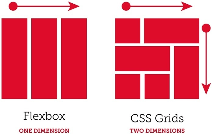
Flexbox is a one-dimensional layout system in CSS. What this means is elements are positioned in rows (side by side) OR in columns (stacked on top of each other). On the other hand, Grid is a two-dimensional layout system with an element having (neighbor) elements both to its side AND on top and/or below it. In Grid system, elements are positioned in rows AND columns.
How to Choose
Flexbox is generally suited for when elements need to be aligned in a single direction. Examples would be a navbar layout or centering elements in a container.
Grid is useful for creating more complex layouts considering both vertical and horizontal alignment, an example would be an image gallery component consisting of 15 photos. This component can take a 5-column 3-row layout.
In the component example, it can be observed that Grid layout is more effective as opposed to multiple Flexbox(es) needed to layout such a component.
Conclusion
Furthermore, Flexbox and Grid can be combined and nested within one another to develop more complex responsive layouts. Understanding the features and different applications of both is important in making informed layout decisions.
Thanks for reading x.

Top comments (1)
*Well, I don't know... Personally, I'd always preferred Flexbox
*