
Customize and enhance Vuetify components
Vue.js is a simple yet powerful front-end JavaScript framework that is designed exquisitely. In my opinion, Vue.js is the first choice for the UI of middle to large-sized projects. Over the years, there are a wide range of UI component libraries for Vue.js, and the most popular one seems to have been Vuetify. Often based on our own business and project requirements, we need to customize an open-source UI library component, and this article shows how to build our custom UI components based on Vuetify.
Create a Vue + Vuetify project
First Let’s create a new Vue.js project with Vuetify. Following the Vuetify guide, it is very easy:
We first create a new project named custom-ui using Vue CLI:
vue create custom-ui
then in the project root, run:
vue add vuetify
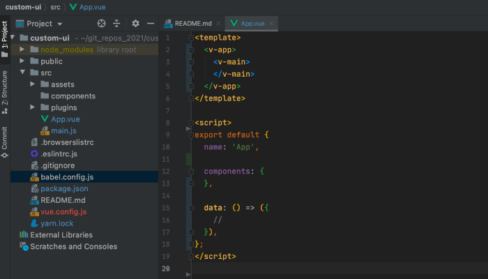
And it’s all ready to go. After cleaning up App.vue and delete HelloWorld.vue, our project structure looks like this:
It currently just renders a blank page.
Now let’s use a Vuetify button component <v-btn> and see how it works:
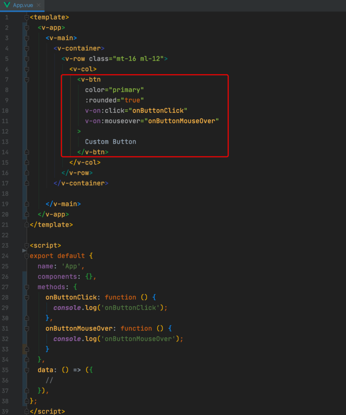
Here we used:
- a prop named
colorto specify a primary material design color (by default it is grey color), - a prop named
roundedto make the button have rounded edges (by default it is not rounded), - an event listener for the
clickevent, - an event listener for the
mouseoverevent, - the text "Custom Button" for the button.
Once clicking the button or mousing over it, the event handler functions are triggered and the text is output in the console:
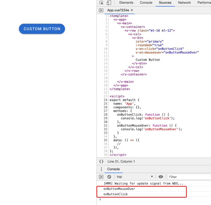
It works as expected.
Suppose now we need to use this button (with primary color, rounded edges, default text, and two mouse events) in multiple places in our project and later in other projects as well, instead of copying and pasting code, ideally it is better to encapsulate what we have done into a new component. Later we can publish our custom UI library onto npm, and whichever project needs to use them can just npm install the package.
Let’s go ahead and create this custom component first.
We will create a new directory named MyLib, and within it, we create an index.js file and a MyButton component:
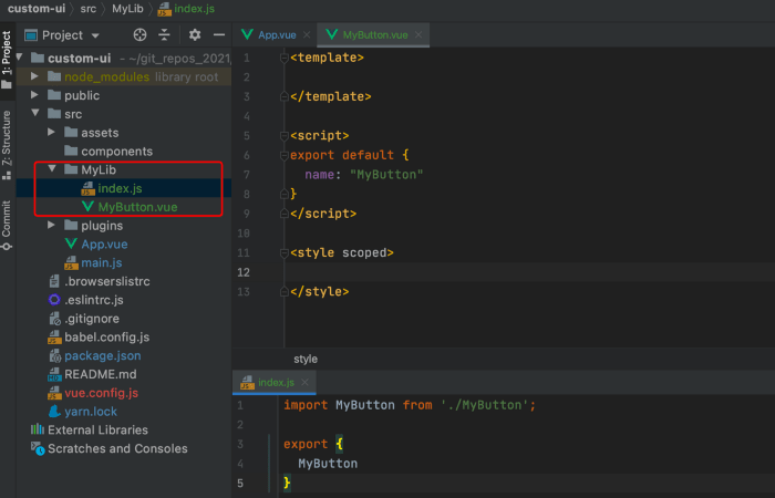
Like many open-source libraries, the purpose of the index.js file is to import all the components and export them out in one big object.
We move the <v-btn> from App to MyButton, and import MyButton from MyLib, the project now looks like this:
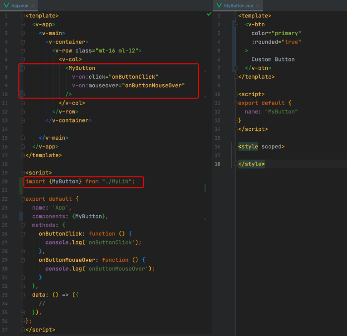
The two event handler functions are still in the parent App component, and the events are bound on the child component MyButton, which is the common practice in a component-based framework. Within MyButton, we still have the "default" value for color, rounded, and button text. For a component, we want it to be able to accept props passed from the parent, and props can have the default values that we want, so let’s add three props for MyButton:
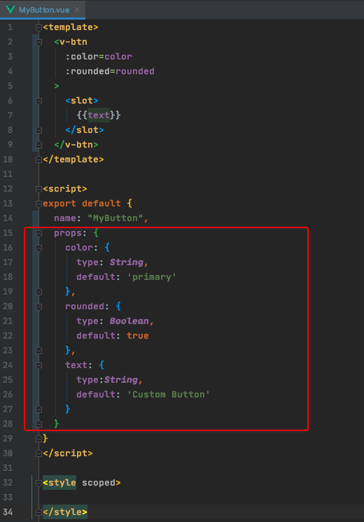
The props color and rounded are bound onto the <v-btn>’s color and rounded, and text is placed in a slot. Refresh the page, the button still looks the same as before with the default values.
Now we can pass different values for these three props in the parent App component as well:
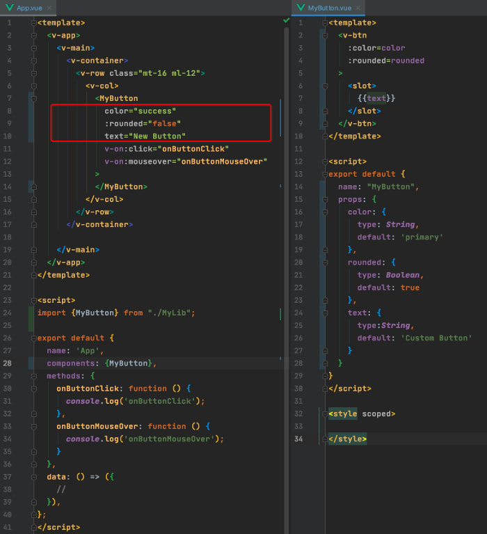
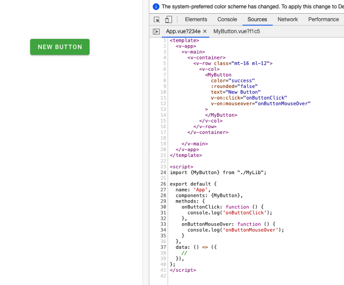
The color, edges, and text of the button are all changed. For the text, you can also pass a slot to MyButton, and it will override the default one.
If you take a look at <v-btn>'s API document, it has many other props. Let’s try some on MyButton:
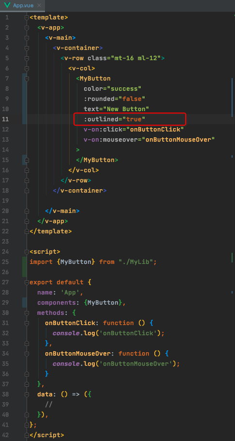
We add outlined onto our MyButton component according to <v-btn> API. If you refresh the page, the button actually does not become the outlined style. It is not working, why? Because our own component works like a wrapper component for <v-btn> — we can customize some styling, add some default values, etc., which is similar to a concept popular in React.js — Higher Order Component. What we can do now is to use a powerful feature in Vue.js —$attrs.
$attrs
The document briefs $attrs as below:
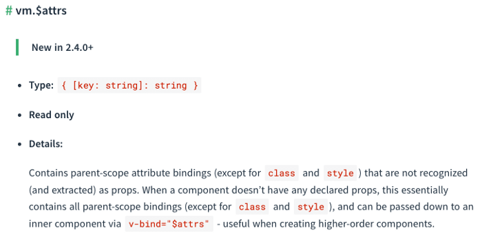
Basically what it means is, in a parent component such as App, when we bind some attributes onto a child component such as MyButton, if these attributes are not declared in the child component as props, then Vue.js will add those attributes onto the root element of the child component.
Let’s see it in action.
In App, we have already bound a new attribute outlined on MyButton, now in MyButton, we will add v-bind="$attrs" onto the <v-btn> in MyButton component:

Refresh the page, and it works:

What happened is, because of v-bind="$attrs", now any non-declared attributes passed from App to MyButton (such as outlined) are added onto the root element of MyButton, which is <v-btn>, and outlined is a prop defined in <v-btn>, so it works on it and the outlined button is rendered.
In a nutshell:
$attrsis an object on aVueComponentinstance that collects all the non-declared attributes bound onto this component.In the
$attrsobject, the key name is the attribute name, they value is the attribute value.
Correspondingly:
-
$propsis an object on aVueComponentinstance that collects all the declared properties bound onto this component.

Let’s output $attrs and $props in MyButton to see them more clearly:
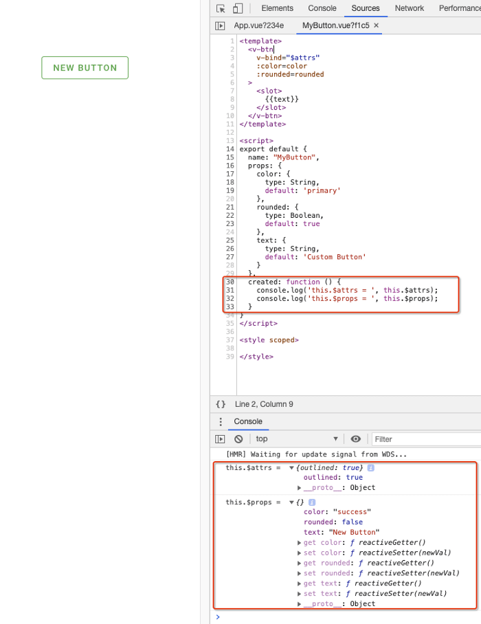
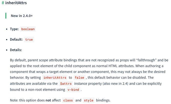
Both $attrs and $props are important properties on the VueComponent instance. Also, you can iterate $attrs or extract certain attributes out, depending on your needs. If you want to apply v-bind="$attrs" onto other elements in the <template> instead of the root one, you can set the inheritAttrs option to false in the component’s configs object. Please refer to the document about inheritAttrs.
So far we can apply all <v-btn>'s props on our MyButton, which is nice thanks to $attrs.
Let’s take a look at the two event listeners now. If you click on or mouse over the button, the two event handler functions currently are not triggered.
Similarly, there is another mighty VueComponent instance property called $listeners that can help.
$listeners
According to the document:

What it means is, in the parent component App, all the events (DOM native or custom) bound onto the child component MyButton will be collected into
the child component’s $listeners object. Let’s output it in the console to take a look:

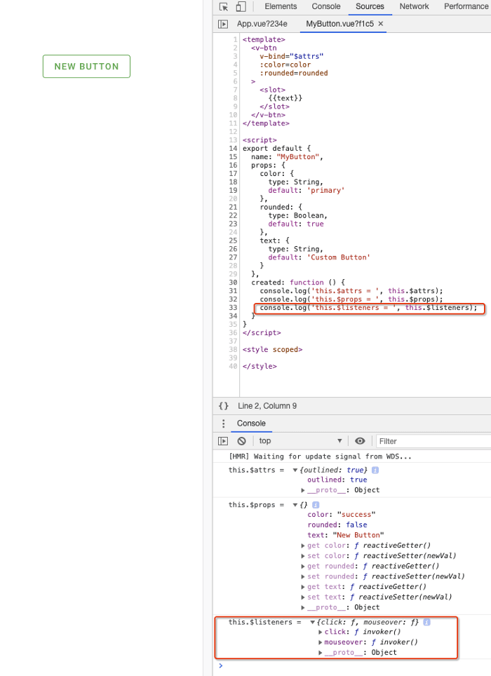
The $listeners object contains the two events click and mouseover that the parent App bound onto it.
Now we can add a new line of code v-on="$listeners" on <v-btn> in MyButton:

Refresh the page and click on the button again:

The event callback functions are working now, awesome.
In a nutshell:
$listenersis an object on aVueComponentinstance that collects all the events + event handler functions bound onto this component.Like
$attrs, a component can pass its$listenersto a descendant component.
In MyButton, by adding v-on="$listeners" on its child component <v-btn>, it passes its $listeners to <v-btn>,
and when the event (the key filed in the $listeners object) is triggered, the corresponding callback function defined in the parent will be executed.
Except for v-on="$listeners", you can also execute an event callback function directly in the child component using this.$listeners.eventname(), or you can destructure the $listeners object and even add new key:value pair into it to suit your specific needs.
Publish to NPM
Now our MyButton component is ready to go. We can import it into other places in the project, or we can enter the MyLib directory, run npm init to generate a package.json file, add the necessary metadata for our custom MyLib UI library, and run npm publish to push it onto npm. Other projects just need to install the MyLib package and can use MyButton and other custom components.
For more articles about $attrs and $listeners, please check out:
Vue.js Components Communication Patterns (without Vuex) - Part 4
Vue.js Components Communication Patterns (without Vuex) - Part 5

Latest comments (0)