
I really wanted to make a Christmas tree in CSS, I got to the part where I had the triangle shapes stacked but then I literally got stuck on the shadow...
You see I don't know everything...
I decided to ask Twitter for help, and posted this tweet:
 Help needed!! 🚨
Looking for a CSS art hero!
I made this triangle shape using borders on an empty element, how can I add a shading layer (see the black pen drawing for example)?
Can't use overflow since it has 0 width/height.
Pen: codepen.io/rebelchris/pen…05:51 AM - 02 Dec 2020


With this, I got some cool ideas from Simon Ramsay, Ꮤ 1 Z̶ Δ Я D, and Aʟᴇx Lᴏʜʀ.
So, now I've learned three ways to make Christmas trees in CSS.
Check out this article on how to create them.
Table of contents
CSS Clip-path Christmas tree
The first method is pretty cool. It uses a clip-path to deduct from a round shape! (This looks much like the border solution, but easier)
For this solution, we use a separate shadow layer, which will push down with a z-index.
The HTML for this solution:
<div class="clip-tree">
  <div class="shadow"></div>
  <div class="layer"></div>
  <div class="shadow"></div>
  <div class="layer"></div>
  <div class="layer"></div>
</div>
Now let's add some CSS to make the magic happen.
We start off by stating the tree itself is a relative element.
.clip-tree {
  position: relative;
  margin-top: 20px;
}
Now we want to start with a green layer:
.clip-tree .layer {
  position: absolute;
  width: 100px;
  height: 100px;
  border-radius: 50%;
  background: green;
  clip-path: polygon(50% 5%, 100% 85%, 100% 100%, 0 100%, 0 85%);
}
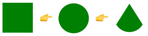
As you can see we make a square, and by using the border-radius it will become a circle.
We then add a clip-path which is set the shape we want.
To demonstrate each step check out the image below.
Next we want to add the shadow layer:
.clip-tree .shadow {
  position: absolute;
  width: 80px;
  height: 80px;
  border-radius: 50%;
  background: black;
  clip-path: polygon(50% 0%, 0% 110%, 95% 100%);
  margin-top: 20px;
  margin-left: 10px;
}
It is the same setup, but we use a slightly smaller shape and make it black.
Now we need to position each layer:
.clip-tree div:nth-child(1) {
  transform: translateY(5px);
  z-index: 3;
}
.clip-tree div:nth-child(2) {
  transform: translateY(0);
  z-index: 3;
}
.clip-tree div:nth-child(3) {
  transform: translateY(40px);
  z-index: 2;
}
.clip-tree div:nth-child(4) {
  transform: translateY(35px);
  z-index: 2;
}
.clip-tree div:nth-child(5) {
  transform: translateY(70px);
  z-index: 1;
}
As you can see the top layers will have a high z-index and a low translate, the translate will push the layers down a little bit.
Lastly, we add a star on top of our tree
.clip-tree:before {
  content: '⭐️';
  position: absolute;
  left: 42px;
  z-index: 10;
  top: -9px;
}
The end result:

I quite like this method since it's clean, it also seems pretty scalable in terms of making it fully percentage-based.
The difficult part for me is understanding what the clip-path actually does.
Note: There is a super cool clip-path generating tool: Clippy
CSS Pseudo Christmas tree
Another option is to use pseudo-elements, we cut down on some HTML elements, but it can be trickier to scale this version I find.
The HTML structure will look like this:
<div class="pseudo-tree">
  <div class="layer"></div>
  <div class="layer"></div>
  <div class="layer"></div>
</div>
As before the tree itself is a relatively positioned element.
.pseudo-tree {
  position: relative;
}
Each layer will be an absolute position element.
.pseudo-tree .layer {
  position: absolute;
  left: 0px;
  z-index: 2;
}
And then we make the green layer using the :after pseudo-element.
.pseudo-tree .layer:after {
  content: ' ';
  display: block;
  width: 0;
  height: 0;
  border-left: 60px solid transparent;
  border-right: 60px solid transparent;
  border-bottom: 100px solid green;
  border-radius: 50%;
  position: relative;
  z-index: 2;
}
What you see here is that we make use of a border solution to create the shape.
Basically, the shape is a triangle, because of the border-radius, the bottom bit will be curved.
To demonstrate the steps:

As you can see step 1 is the left border, step 2 is both border left and right, and last is the border-radius.
Now we will need to make the shaded layer using the :before.
.pseudo-tree .layer:before {
  content: ' ';
  display: block;
  border-left: 60px solid transparent;
  border-right: 60px solid transparent;
  border-bottom: 100px solid black;
  border-radius: 100%;
  position: absolute;
  top: 1.1rem;
  left: 0;
  z-index: 1;
  transform: scale(0.74);
}
The same as the after, we are using a black border and positioning it slightly off from the top. We also use transform to scale it down a little bit.
We need to make sure each layer has some space and a downgrading z-index:
.pseudo-tree .layer:nth-child(1) {
  top: 0px;
  z-index: 9;
}
.pseudo-tree .layer:nth-child(2) {
  top: 30px;
  z-index: 8;
}
.pseudo-tree .layer:nth-child(3) {
  top: 60px;
  z-index: 7;
}
Now we want to remove the shadow from the last layer:
.pseudo-tree .layer:last-child:before {
  display: none;
}
And again we can put a star on top:
.pseudo-tree:before {
  content: '⭐️';
  position: absolute;
  left: 52px;
  z-index: 10;
  top: -13px;
}
This will result in the following:

This method for me is the easiest one, it's clean HTML and I just love pseudo-elements.
The one thing that's a bit harder here is to make it fully scalable. It's hard getting this to work off percentages.
Note: There is a cool tool to generate certain shapes in CSS called the CSS Shapes generator.
CSS Border Christmas tree
The last solution is a bit of a mix of the two, it uses pseudo-elements, but in this case to hide stuff we don't need!
To start we will need the following HTML:
<div class="border-tree">
  <div class="layer">
    <div class="cut"></div>
  </div>
  <div class="layer">
    <div class="cut"></div>
  </div>
  <div class="layer">
    <div class="cut"></div>
  </div>
</div>
Now we will start with the CSS for the tree first:
.border-tree {
  position: relative;
  box-sizing: border-box;
}
This is again a relative tree, and because we are using borders for this solution, I've added box-sizing: border-box to now have them expand.
Now, the layer we will use an absolute position and this is where we will define the size of each layer.
.border-tree .layer {
  width: 100px;
  height: 100px;
  position: absolute;
  z-index: 9;
}
Inside the layer, we have the cut element. This is what defines the actual bit.
We did a reverse thing here, where we actually use the border to color the main element!
The background will then be the black shadow.
.border-tree .layer .cut {
  width: 100%;
  height: 100%;
  background: black;
  border-radius: 50%;
  border: 16px solid green;
  box-sizing: border-box;
}
Then we use :before and :after pseudo-elements again to add white rectangles that will cut out the triangle shape!
To see this in steps (the before is red and the after is blue)

These before and after pseudo elements are build using the following CSS:
.border-tree .layer .cut:before {
  content: '';
  width: 100%;
  height: 100%;
  position: absolute;
  background: #fff;
  opacity: 1;
  z-index: 300;
  transform: rotate(-45deg);
  top: -35%;
  left: 35%;
}
.border-tree .layer .cut:after {
  content: '';
  width: 100%;
  height: 100%;
  position: absolute;
  background: #fff;
  opacity: 1;
  z-index: 300;
  transform: rotate(45deg);
  top: 0%;
  left: -70%;
}
As you can see, they are squares, with a white background, which we rotate and position in place.
Next, we will have to make sure the first one does not have the black background since it's a full green layer:
.border-tree .layer:first-child .cut {
  background: green;
}
The last part of this approach is to position each layer correctly.
.border-tree .layer:nth-child(2) {
  top: 20px;
  z-index: 8;
}
.border-tree .layer:nth-child(3) {
  top: 40px;
  z-index: 7;
}
Also for this one, we will place a star on top:
.border-tree:before {
  content: '⭐️';
  position: absolute;
  left: 42px;
  z-index: 10;
  top: 36px;
}
The result on this tree:

This method was my first approach, and I think the most sloppy solution. The downside is that you're before and after the element is actually always still there and could overlap other elements on the page.
It's cool to have a play with, but not the most steady solution out there.
Demo 🎄
I've made one codepen to demonstrate these three techniques, which you can find here:
I hope you enjoyed this article and learned something new in how to create certain shapes in CSS.
For me personally, it's still weird a triangle is so difficult to make, especially a "rounded" one.
Thank you for reading, and let's connect!
Thank you for reading my blog. Feel free to subscribe to my email newsletter and connect on Facebook or Twitter

Latest comments (0)