Hi everyone in this tutorial we will learn how to make wood timer look with only tailwind css.
Tailwind CSS is self-described as a utility first CSS framework. Rather than focusing on the functionality of the item being styled, Tailwind is centered around how it should be displayed. In short by using tailwind you don't need really need to naming each class name.
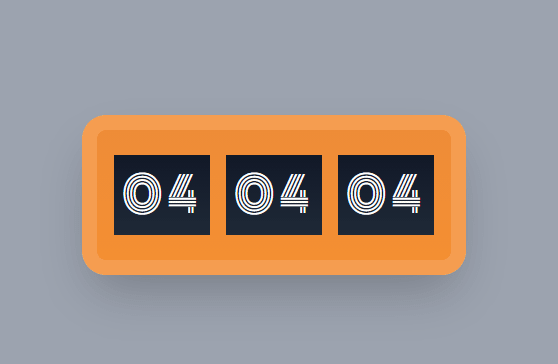
Your end project will look like this:
you can see the source code here it's working timer. for the working timer maybe we will do in another part.
Install React with tailwind
In this tutorial we're using create-react-app and tailwind
npx create-react-app my-project
cd my-project
npm install -D tailwindcss@npm:@tailwindcss/postcss7-compat postcss@^7 autoprefixer@^9
for config you can see in the official tailwind documentation
Center the div
let's put our app in the center of screen,
<div className="bg-gray-400 min-h-screen flex justify-center items-center flex-col">

</div>
we color the background gray with display flex "justify-center items-center flex-col" part is for center it to x and y axis also we'll make our flex column.
Frame and inside display
//jsx
<div className="timer-frame ">

</div>
@tailwind base;
@tailwind components;
@tailwind utilities;
.timer-frame {
  @apply w-96 h-40 bg-gradient-to-b from-firstGr to-secondGr border-border border-outer rounded-3xl flex flex-row justify-center items-center shadow-2xl;
}
module.exports = {
  purge: ["./src/**/*.{js,jsx,ts,tsx}", "./public/index.html"],
  darkMode: false, // or 'media' or 'class'
  theme: {
    extend: {
      fontFamily: {
        inputText: ["Monoton"],
      },
      colors: {
        border: "#F59D50",
        firstGr: "#EE8C38",
        secondGr: "#F48F32",
        timerBg: "#131514",
      },
      borderWidth: {
        outer: "15px",
      },
    },
  },
  variants: {
    extend: {},
  },
  plugins: [],
};
we separate the time-frame into other css file. I usually long tailwind utility to other file.
for the tailwind config, I put my costume color there. For example:
colors: {
        border: "#F59D50",
        firstGr: "#EE8C38",
        secondGr: "#F48F32",
        timerBg: "#131514",
      },
we use gradient using firstr and secondGr for inside frame, so it's not look boring. for the frame we use utility border with above color. the border has utility "rounded" as it said it make round around the div.
Inside Numbers
<div className="inside-timer">04</div>
<div className="inside-timer">04</div>
<div className="inside-timer">04</div>
@import url("https://fonts.googleapis.com/css2?family=Monoton&display=swap");

@tailwind base;
@tailwind components;
@tailwind utilities;

.inside-timer {
  @apply w-24 h-20 bg-timerBg flex justify-center items-center text-white mx-2 text-5xl tracking-widest font-inputText bg-gradient-to-b from-gray-900 to-gray-800;
}
Maybe you already notice we're using external font you can check the font here.
to use it include it in your tailwind css.
 fontFamily: {
        inputText: ["Monoton"],
      },
Again because we're using inside timer more then once we put it in new css class name and apply it.
we use bg-timerBg utility that black color we added before.

Oldest comments (0)