Have you ever had a case you want to fit a DIV block to the screen and keep the aspect ratio? Here's an example that I created. The red block keeps the aspect ratio and fits the screen.
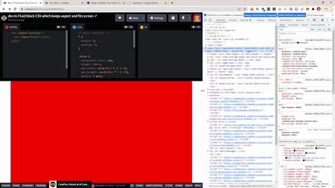
The code is like this. In the example I used 16:9 as the aspect ratio but you can change as you want. Please change 16 and 9 for your purpose :)
<div class="container">
  <div class="block"></div>
</div>
/* quick sanitizer */
* {
  margin: 0;
  padding: 0;
}

.block {
  background-color: red;
  height: 100vh;
  max-width: calc(100vh * 16 / 9);
  max-height: calc(100vw * 9 / 16);
  margin: 0 auto;
  position: relative;
  width: 100vw;
}

.container {
  align-items: center;
  display: flex;
  justify-content: center;
  height: 100vh;
  width: 100vw;
  position: relative;
}

Oldest comments (0)