
Hello. Todays post will be the last introductory post where I focus mainly on present to you some background and basic concept standing behind the CSS Grid. The idea is that I want to show you some general concept before I’ll dive deeper into how exactly use this tool. I hope this approach will allow you to easier assimilate strict usage topics that comes along in next posts. Without further talking, let’s get started.
This article is part of my CSS Grid introduction series. If you want to check out my previous posts, here you can find the whole table of contents.
In previous post I characterized CSS Grid as a one of available solutions for creating layouts inside HTML pages. I also unfolded the term layout itself, which is about positioning certain element(s) in page according to some factor. Factor may be document viewport (page is generated from HTML document), sibling element or parent element. Thus, CSS Grid can be used to position chosen element(s) in page according to some factor. In case of CSS Grid, the factor is the parent element.
Leaving definition behind, let’s talk about the general concept of using CSS Grid. For this purpose I prepared very simple example of layout and I want to show you the CSS Grid way of create such arrangement. Let’s look at the image below. This layout consist of parent and two children with some text content inside. As you noticed, I distinct children from parent using two different colors. At first glance, it’s not easy to say what layout rules are applied here. Size of each children is not obvious, position in both horizontal and vertical axis as well. Spaces between both children and parent are irregular. It may looks like children are positioned relative to some other, invisible factor (or factors), not the parent itself. If thats what your intuition was telling you, you’re on the right track. What’s important here is what we can’t see.

Let’s look again at this example, this time revealing some hidden elements we haven’t seen in previous image. This invisible elements together create what I call ‘abstract intermediate layer’. Abstract, because there are not ‘real’ HTML elements and we cannot find them in HTML document. Intermediate, because in layout context, it lays between positioned element and its factor. Instead of having direct relation between those two sides (children positioned relative to parent), we have additional layer which only purpose is to help create desired layout. I think that this is the key to understand how CSS Grid works. We position element not according to factor itself, but according to abstract layer, which is positioned relative to factor. Isn’t that clever?
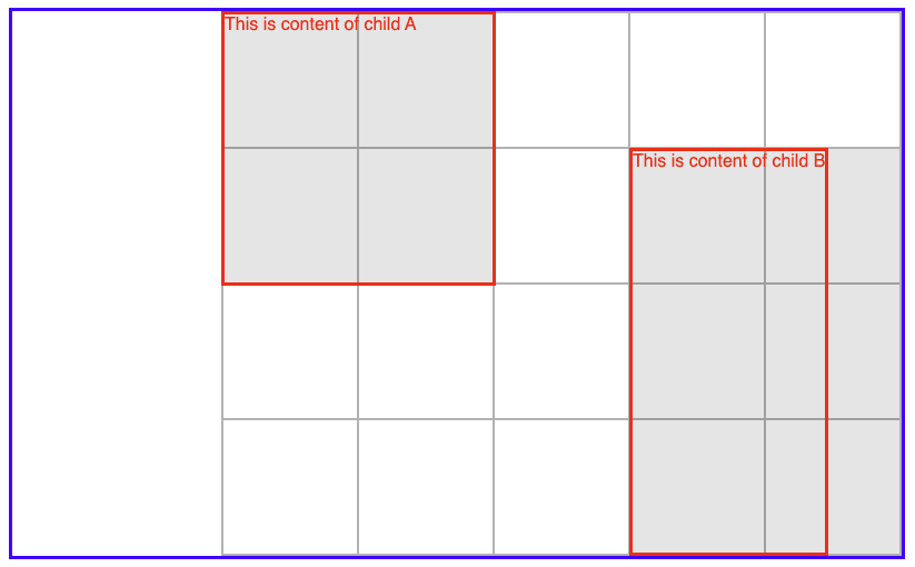
I’ve mentioned that invisible elements aren’t ‘real’. Most often they don’t even meet with definition of HTML element as we may think of. We cannot find them in HTML document and we cannot style them like normal elements. In above picture you can find an abstract grid element which may look like a HTML table but rather than consist of rows and cells it’s simply a grid of horizontal and vertical grid-lines separated from each other by a given distance. It’s important to emphasize that even though I widely use the term elements here, those elements don’t act as the HTML elements we know.
Speaking of naming things, let’s introduce now some terminology that CSS Grid provides to facilitate further learning. Looking at above picture we can distinguish blue grid-container element (parent) and red grid-items (children). I mentioned earlier about the abstract grid element which is a collection of vertical and horizontal grid-lines. There are also abstract grid-areas, which are those dark grey areas laying between two horizontal and two vertical grid-lines. This group of abstract elements is more numerous, but as their knowledge may not come in handy until the next entries, I will not introduce them yet. Below is the image that sums up all the pieces we talked so far along with their names.

According to what told you, the key part of creating layout using CSS Grid is defining abstract layer. How to do this? You already know that we cannot simply place abstract elements between children and parent in HTML document. A perfect place for defining abstract layer is CSS, where we can use well known CSS selectors along with some extra CSS Grid rules. Remember that grid element needs to be defined using grid-container selector while every grid-area needs to be defined using according grid-item selector.

Both grid and grid-area requires different definition. In case of grid you can specify number of horizontal/vertical lines and distance between them (it’s not the only way but more about it in next post). Defining grid-area is about of indicate start and end grid-lines in both directions. Moreover it’s worth to tell that CSS Grid has advanced auto-placement algorithm, which often reduce of amount of work required to define abstract layer.
Once you properly defined abstract layout on proper HTML elements in CSS you have now your basic layout. Sometimes you can adjust it even further by changing position of grid-item relative to its grid-area or grid relative to grid-container. This and more of usage examples I’ll present to you in future article.
I hope you liked today’s post and you’ve learn something new about basic concepts of CSS Grid. If so, please leave me some feedback. I appreciate every comment or reaction. See you soon in next post.
If you would like to support my work, I will be grateful for a cup of coffee. Thank you. ❤️


Latest comments (0)