CSS in JS! I feel like everything that can be said about the topic (and then some more) has already been said. If you've missed it all, consider yourself lucky. For context, though, I'll only give three links here.
The original presentation of the concept to the wide public (slides here):
An article that does a very good, emotionless, summary of all the backlash it got:
https://css-tricks.com/the-differing-perspectives-on-css-in-js/
And finally, a great, principles-based, article that will help you stay sane while trying to keep up with all the new solutions that come up in this space every day:
If that last article did its job correctly, you'll now have the strength to resist clicking this, for example:
 👇 NEW CSS-IN-JS LIBRARY ALERT!
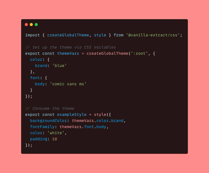
🧁 vanilla-extract
🔥 Zero-runtime Stylesheets-in-TypeScript
✨ Minimal abstraction over standard CSS
🦄 Works with any front-end framework
🌳 Locally scoped classes + CSS Variables
🎨 High-level theming system
github.com/seek-oss/vanil…05:18 AM - 26 Mar 2021


You still with me? Good, let's get started by:
Bootstrapping react
Contrary to what the ending of the last article might suggest, I've been eager to get rid of as much tooling as possible in development as soon as I saw it as a real possibility. I don't hate tools (instrumentum, for those of you fluent in latin) either, though.
What does a misogynist say when called out on their misogyny? I can't be a misogynist, I have a daughter/wife. What does a misoinstrumentist, like me, say when called out on their misoinstrumenty? I can't be a misointrumentist, I have contributed to Babel.
It shouldn't come as a surprise, then, that I'll use vite to quickly get this react project setup.
Also, last time I did
npx create-react-appit created, let me check, ah yes: 41,732 items, totaling 250.7 MB. I've had one SSD and one HDD die of bad sectors in the last two years. Coincidence? I think not!
So, yeah, that's the setup — npm init vite@latest and follow the prompts to start a react project without typescript. Then:
cd what-you-named-your-project
npm install
And to add styled-components, npm install styled-components.
Last part of the setup was deleting the unnecessary stuff before adding the base styles.
Base styles
In the last article, I spent so much time with "suggested reading" before writing the first line of code. For this one, I'll take the opposite approach: do as little reading as necessary to get started, and then go read more when I get stuck. This was my modus operandi when I was working professionally, and I assume it is so for most people.
I read from the Getting Started to the ("to the" == including; english is hard) Coming from CSS parts of the styled-components docs and started converting the base styles.
I started by renaming index.css and replacing the few rules there with my reset styles as well as the google font @import. Keeping this as a CSS file is fine: we don't need createGlobalStyle as we don't need theming or template literal interpolations for these simple CSS rules.
I modified Todo and Container a bit to make them more flexible.
The rest is straightforward: almost a one-to-one correlation of old classes to new components. I liked the collocation of @media rules with the rest of the styles for the component. I changed the --body-padding css variable into a bodyPadding js variable. I don't know why I did that.
For including images, I'm not a big fan of webpack-style importing of assets to get their URL. I was happy to find out that vite also allows the most common alternative approach: a "public" folder where you can put all your images in and have them reachable from anywhere in your code with absolute URLs. That's what I did for hero img's src and srcSet.
Navigation
There isn't much to say about converting the navigation styles to styled-components, and that's a very good thing to say about styled-components. Everything was easy to move over, including transition animations and complex CSS selectors, pseudo-selectors, and whatever this is:
.menu-visible &::before {}
We also had some JavaScript in nav.js to toggle the menu and search input on and off. This is not a React tutorial, but just one quick observation about a subtle change that happens when you port the code to react:
Doing
[document.documentElement, document.body].forEach((el) =>
  menuVisible
    ? el.classList.add('menu-visible')
    : el.classList.remove('menu-visible')
)
instead of
[document.documentElement, document.body].forEach((el) =>
  el.classList.toggle("menu-visible")
)
means we're no longer relying on HTML to tell whether the menu is visible or not. Our only source of truth for that now is the menuVisible state. I'm not pointing this out to say that I'm some genius developer who anticipated this. I only noticed it after I tried to do it with .toggle() first and it didn't work (the first time useEffect ran on mount it was toggling the class on, and then, when the button was clicked, setting menuVisible to true, it was toggling it off).
It was a nice example of react making it easy for you to almost accidentally fall into doing things right (pit of success?).
Showcase
Well, isn't it ironic that as soon as I make the case for not relying on HTML as a source of truth, I decide to go ahead and do just that for the showcase? Sure, I could've rewritten the slider logic in an idiomatic way for react, but that IntersectionObserver was my baby!
Seriously, though, going the uncontrolled component way made more sense to me here. Let's quickly go through the code in Slider.jsx.
Side note on code organization: there isn't any 😝. I didn't make different folders for components and started with one file per component instead (vite used
jsxextensions and I went with that). Still, even with region folding of code in the editor,Showcase.jsxgot too long even for me, so I turned that into a presentation component, and moved the core styling and functionality intoSlider.jsx.
A few refs keep track of the important dom nodes: for the slider itself, the ref is set directly with <StyledSlider ref={slider}>; the useEffect callback, which runs only after the first render, gets the first and last slide nodes from the slider ref with standard DOM properties firstChild and lastChild.
That same callback also initializes the IntersectionObserver. All it does, when an observed slide "intersects" 50% with the parent slider (threshold: 0.5), is set the currentSlide state to that slide's dom node. With that in place, implementing the disabled state and prev/next functions of the buttons becomes trivial.
Warning: Rambling ahead. Remember how I said in the intro to this series that I'll try to keep rambling to a minimum? Well, I failed here. Feel free to skip until the next section.
There is one bug? in chrome, though, which stops scrollIntoView dead in its tracks. I set the threshold to 0.5 to make sure prev/next buttons get the disabled attribute as the last slide is halfway in. For whatever reason, though, chrome was fine with me doing btnPrev.disabled = true;, but it's not fine with React doing it. As you know, all we can do in react is set disabled={currentSlide === firstSlide.current} and let react update the DOM however and whenever it sees fit. Well, however react is doing it, chrome doesn't like it one bit — if you click next and then previous (IMPORTANT: without scrolling the page at all in between the clicks, otherwise it works fine), as soon as the first slide comes halfway through, and the button is disabled, chrome stops the smooth scrolling.
To be honest, this whole implementation of the carousel as not a carousel is a bit flimsy, I'll admit. Its strongest point, the fact that it uses a very light touch, going with the grain of the perennial design pattern that is scrolling, instead of against it, is also its weakness because of differing browser and OS implementations. There is, for example, another bug (also found in the HTML & CSS version from the first blog) in firefox when you tab through the slides.
Nonetheless, I'm keeping it, not because it's hard to fix, but because IntersectionObserver is my baby in an aspirational way (I wanted to write aspiration "towards a better web", but I think I threw up a little in my mouth).
Last thing about the showcase implementation in react: did you maybe wonder what that cloneElement is doing in line 241? That whole acrobatics is just so we don't have to pass an id prop to each slide in Showcase.jsx:
<Slider>
  <Slide title="Lamp" img="lamp" alt="lamp photo" link="#"></Slide>
  ...
</Slider>
Worth it? I don't know; the things we do for love good API design.
Products
Things had been going really smoothly with styled-components so far, so I decided to spice it up a bit by learning about React Transition Group. There really isn't much there, but for some reason, it wasn't clicking for me at all. Maybe I was tired, maybe I was distracted by the thought of React 18 being in beta now.
Anyway, I decided to simply convert the existing animation from the HTML and CSS version to styled-components and react transition group components for now, and do a full example with loading animation and data fetching in a future article. With tailwindcss about to rewrite their documentation for the v3 release, it's very probable that I'll write that article next, before the one on tailwind. And if I ever want an excuse to not write that article either, I could always wait on Suspense for data fetching to be released...
Here's how our simple animation works:
When a new filter is selected, fade out ALL currently shown products. When the fade-out transition ends, fade in just the products that match the filter.
This was the procedural version:
function displayProducts(filter) {
  products.forEach((p) => p.classList.add("faded-out"));

  productsList.addEventListener(
    "transitionend",
    (e) => {
      products.forEach((p) => {
        if (filter === "All" || p.dataset.category === filter) {
          p.classList.remove("hidden");
          setTimeout(() => {
            p.classList.remove("faded-out");
          }, 0);
        } else {
          p.classList.add("hidden");
        }
      });
    },
    { once: true }
  );
}
A bubbling transitionend event, fired on the parent products list element once, controls the fading-in of new products. To account for the fact that you can't animate from display: none to display: block, it removes the hidden class first, and then, a moment later (with the asynchronous setTimeout(() => {}, 0), removes the faded-out class too which transitions the opacity back from 0 to 1.
Here's the react version:
export function ProductsList({ products }) {
  const [listFadeOut, setListFadeOut] = useState(false)

  useEffect(() => setListFadeOut(true), [products])

  return (
    <Transition
      in={!listFadeOut}
      timeout={timeout}
      onExited={() => setListFadeOut(false)}
    >
      {(state) => (
        <StyledProductsList
          id="products-list"
          aria-live="polite"
          aria-atomic="true"
          aria-relevant="additions removals"
          state={state}
        >
          <TransitionGroup component={null}>
            {products.map(({ id, ...props }) => (
              <Transition key={id} timeout={timeout}>
                {(state) => <Product state={state} {...props} />}
              </Transition>
            ))}
          </TransitionGroup>
        </StyledProductsList>
      )}
    </Transition>
  )
}
When a new filter is selected (new products received from parent, monitored in useEffect(() => {}, [products])), the first <Transition> component fades out the products list component itself. Not the same effect as fading out all products individually, but close enough. As soon as it fades out, it fades back in (onExited={() => setListFadeOut(false)}).
The <TransitionGroup> delays the appearing/disappearing of individual products using the same timeout as the fade-out effect of the products list. This is the equivalent of the .hidden class from the vanilla js version. There's no animation in the styling of the StyledProduct component, just:
display: ${({ state }) => (state === 'entering' ? 'none' : 'flex')};
And, as is tradition, here's the full demo and code:
Conclusions
- No conclusions :) As I said in the beginning, I feel like everything has already been said about CSS-in-JS. Here's the link to the most important article from the top again.
- What I also wrote at the beginning of the article, near the setup part, and then deleted, was a full-on rant against tooling and how we bring a whole class of problems upon ourselves with so much tooling in development. I deleted it because I thought it was too harsh, and then... I spent half a day trying to figure out why Intellisense on VS Code was suddenly so slow. I won't turn this into a rant again, just letting you know that it turned out to be the typescript types library for styled-components. Excluding styled-components from typeAcquisition in a
jsconfig.jsonfile did... nothing. So I guess you'll have to turn type acquisition off from the settings if the slow autocomplete becomes too much to handle.

Top comments (0)