
Cover photo by Alex Wong.
This is the beginning of a long journey to learn how to get things to finally, finally align properly on our webpages.
Today's tutorial is about two properties: text-align and vertical-align. Text align is a very simple property, often the first to be learned by beginners. Vertical align seems to be its simple counterpoint, but can be deceptive due to its complex rules and is an early stumbling block for many.
📌 Text align
The purpose of text-align is to align text horizontally. Play around with it:
If you've worked with any sort of text editor before, these options will be strikingly familiar.
There are more options coming soon - for example, start and end, which depend on the text direction, aligning via a specific character (such as a decimal), and justify-all, which forces the last line of text to be justified. These vary widely in support as of the authoring date (Aug 2019), as they are currently still editor's drafts in terms of specification - so make sure to check compatibility tables before using anything fancy.
References & further reading for text-align:
📌 Vertical align
As you might have guessed by the name, the purpose of vertical-align is to align text vertically. In the sample below, I have highlighted some key plant-related phrases; the buttons toggle the vertical align property of these highlights.
If you're applying vertical-align to display: inline or display: inline-block elements, then you will be able to align them with each other. You can align anything that can flow horizontally, as long as it has a valid display property set. Text, images, icons, buttons, inputs...
When using vertical-align on inline or inline-block elements, the alignment is relative to sibling elements in a horizontal line, rather than the parent element.
Vertical align also works on tables (as well as elements with display set to table-cell). Here's a sample table to play around with:
An important note:
⚠️ Vertical-align does not align block elements. ⚠️
So if you're thinking... "wait, vertical-align didn't work for me! Why are you telling lies?", look into your element's display property. Vertical-align is not an all-purpose way to align everything. Since block level elements cannot have an in-flow sibling on the same line as them, they will not be aligned. Block elements can, however, have children inherit their vertical-align property; it's not strictly invalid, just useless for positioning.
If you remember the days of table-based layout (way, waaaay back... hopefully), you might remember the valign attribute on table cells. It's speculated that the vertical-align property was created specifically to emulate the behavior of this attribute.
tl;dr
Use this for vertically aligning text, images, icons, or other things that display "in line" with each other horizontally. Unless you're using it in a table, vertical align changes items' behavior relative to each other, rather than with respect to their parent element.
References & further reading for vertical-align:
- MDN: vertical-align
- Vertical-Align: All You Need To Know (CSS)
- Understanding vertical-align, or "How (Not) To Vertically Center Content"
Bonus vertical align: A tall ghost 👻
Here's a neat trick that uses vertical align. I don't use it in production anymore now that flexbox is well-supported, but it's still a good exploration of how vertical align works.
This trick is an extension of the fact that vertical align works to center inline-block elements with one another.
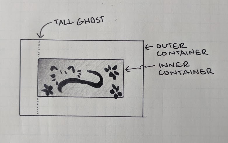
We have:
- An outer container, larger than the inner container
- An inner container that we want to center vertically
- An invisible "tall ghost" container that only assists with alignment
The important bits:
- The tall ghost and inner container are both
display: inline-blockandvertical-align: middle - The tall ghost is 100% height (that's why it's tall!)
- The tall ghost is zero width, to make sure it doesn't throw off alignment (it's invisible)
The invisible aligning element is set to be the height of its parent with height: 100%, so whatever is aligned vertically with the "tall ghost" will happen to align with its parent block element. The two elements inside the container are both inline-block, and so they are available to vertically align with each other. They're both set to vertical-align: middle. And so, the inner container that we want to align (the cat) sits in the middle.
Now, that code is a bit messy, so we can clean it up by using pseudo-elements:
There are a couple other small notes:
- The
contentattribute containing a space is just to make sure the element can render in all browsers. - While the width and height are explicitly set in this example, they do not need to be; as long as the inner content doesn't overflow the parent, this trick will work, since it's based on percentage.
- The cat is horizontally centered with
text-align: centerbecause I think it looks nice. This is optional.

Anything else you'd like to know about these properties? Any requests for the next entry in the series? I have a lot planned... it turns out CSS has a lot of ways to align stuff. (How come none of them ever work? 🤔)

Oldest comments (1)
Here is the MDN for display: developer.mozilla.org/en-US/docs/W...
The two most simple types of display property are those that affect the element itself, and those that affect the things inside of it. An image is something that won't have anything inside of it, so we will take a quick look at the most popular display properties that affect the element itself.
display: block
This makes the image not "flow" horizontally with other things; it won't sit next to any text, and even if it doesn't fit all the way across the screen width-wise, it will block other things from taking up that space. By default, these take up 100% of available width.
display: inline
This makes the element "flow" horizontally with other things that "flow" horizontally (the "inline" direction). This is the same direction that words are displayed in a sentence in the given document.
Inline elements function "like text", and so many properties are restricted. You can set left and right margin and padding, but you cannot set top and bottom, or even an explicit width or height. They are automatically as small as they can be.
display: inline-block
If you were looking for the horizontal flow of an inline element, but the ability to set standard box model properties like a block element, this is the combined property that you want to use. It's placed like an inline element, but is styled more like a block element.
display: none
This visually hides the element, and makes it so screen-readers will not read it. Effectively, it makes it "not display".
So, with regards to alignment, you can use inline or inline-block for an image if you want to align it horizontally with something else. Block will force it onto its own line.
As a note, I will be covering some other properties (such as
display: flex) in later articles in this series. They're quite complicated on their own!