Creator of TinkerHost, the no-cost hosting platform for beginners and small businesses! I enjoy programming and PHP and SQL, and learning about new technologies and techniques for building websites.
I agreed on the font type, I Dident think I made a good choice, so I was thinking someone would say that. I fixed the font and bolding, but not quite sure what you mean by “Inputs”. Does it look better now?
I will consider the Table Of Contents. It’s a god idea, and I will certainly add it to the longer ones, not sure about the shorter ones though.
One suggestion I missed regarding the UI, there should be consistency in the elements, i.e. if the buttons have border-radius, the other elements like cards, boxes, etc. should have it.
Regarding the table of contents, I suggest you add it to all articles, even if they are small, (Unless the article is just paragraphs), use for it!
What I meant with the inputs, is the padding they have, the containing box, must be the same height as the paragraph containing box.
Regarding the gray-green combination, I suggest this:
If you don't really like the idea or you don't have the possibility to change much, just put a green border, round it and remove the gray background, it's enough, ah!, and add some margin bottoms (8px recom.) between and and (12px recom) between an input, and the next label.
With the rest, it is simply layout, here I can't intervene much because I don't know the motives or the main idea of the project. Besides, I think I'm abusing dev.to by adding long comments XD.
Creator of TinkerHost, the no-cost hosting platform for beginners and small businesses! I enjoy programming and PHP and SQL, and learning about new technologies and techniques for building websites.
Creator of TinkerHost, the no-cost hosting platform for beginners and small businesses! I enjoy programming and PHP and SQL, and learning about new technologies and techniques for building websites.
Creator of TinkerHost, the no-cost hosting platform for beginners and small businesses! I enjoy programming and PHP and SQL, and learning about new technologies and techniques for building websites.
Creator of TinkerHost, the no-cost hosting platform for beginners and small businesses! I enjoy programming and PHP and SQL, and learning about new technologies and techniques for building websites.
I send an apply request to support. I have not replied.
1: Just the breadcrumb
2: That depends of the layout purpose, if you have the sidebar as Advertisements bar, content table must be after the introduction to article.
Creator of TinkerHost, the no-cost hosting platform for beginners and small businesses! I enjoy programming and PHP and SQL, and learning about new technologies and techniques for building websites.
The mail has been received. Your email provider was marked as a spam server by GMail, that is why is was not seen immediately. A filter has been implemented to prevent this in the future.
For further actions, you may consider blocking this person and/or reporting abuse
We're a place where coders share, stay up-to-date and grow their careers.

I agreed on the font type, I Dident think I made a good choice, so I was thinking someone would say that. I fixed the font and bolding, but not quite sure what you mean by “Inputs”. Does it look better now?
I will consider the Table Of Contents. It’s a god idea, and I will certainly add it to the longer ones, not sure about the shorter ones though.
With the new font it looks even better!
One suggestion I missed regarding the UI, there should be consistency in the elements, i.e. if the buttons have border-radius, the other elements like cards, boxes, etc. should have it.
Regarding the table of contents, I suggest you add it to all articles, even if they are small, (Unless the article is just paragraphs), use for it!
What I meant with the inputs, is the padding they have, the containing box, must be the same height as the paragraph containing box.
Regarding the gray-green combination, I suggest this:
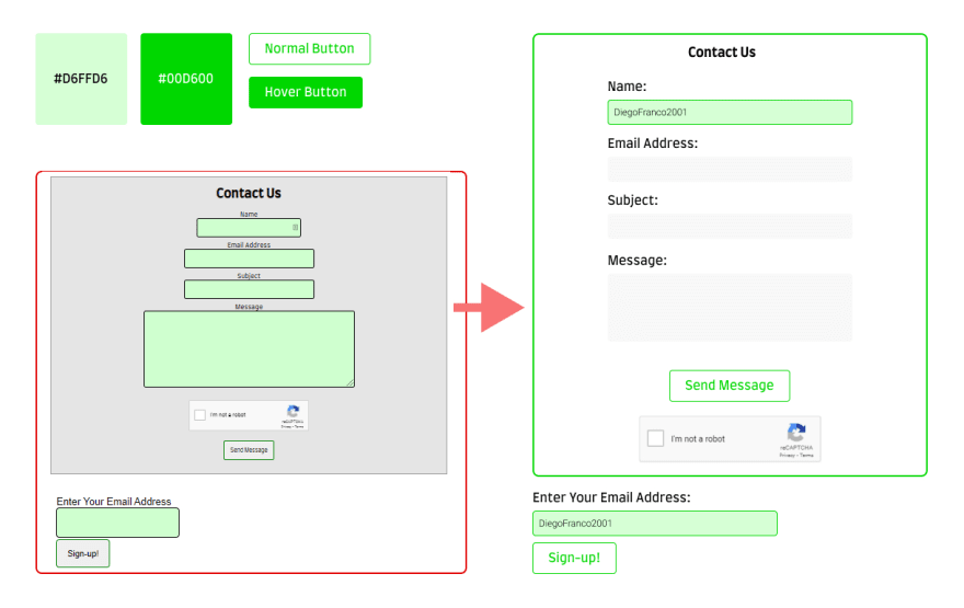
If you don't really like the idea or you don't have the possibility to change much, just put a green border, round it and remove the gray background, it's enough, ah!, and add some margin bottoms (8px recom.) between and and (12px recom) between an input, and the next label.
With the rest, it is simply layout, here I can't intervene much because I don't know the motives or the main idea of the project. Besides, I think I'm abusing dev.to by adding long comments XD.
Good luck!
"Regarding the gray-green combination, I suggest this" Wow, that's so cool! I will certainly add that.
"if the buttons have border-radius, the other elements like cards, boxes, etc. should have it."
Good idea. I think I will ditch the grey background and change it to a darker green.
I would also like to add you to my sites "Thank-you" page for all your help, what username and link should I use?
I'm glad I could help you!
Thanks for adding me, my username is DiegoFranco2001, and the link to my website is:
diegofranco2001.xyz,
If you need more support, you can contact me ;D. Good luck!
The content of your site is useful to me :D
How do things look now? Be sure to check out Site Credits - The TinkerTechLab for your attribution!
Better! - I want to join your project, Can I participate as a UI designer?
Of course! You can contact me at supporter@tinkertechlab.com
@diegofranco2001, do you think I should make the main navigation sticky on article pages?
Also, should the table of contents be placed in the sidebar, or below the article title+intro?
I send an apply request to support. I have not replied.
1: Just the breadcrumb
2: That depends of the layout purpose, if you have the sidebar as Advertisements bar, content table must be after the introduction to article.
The mail has been received. Your email provider was marked as a spam server by GMail, that is why is was not seen immediately. A filter has been implemented to prevent this in the future.