Written by Leonardo Maldonado✏️
The way you display your content can say a lot about you or your company. Having nice content and knowing how to show your content properly in a clean way that your user can understand is really important.
So how do we choose how we’re going to show our content? The responsibility of showing our content in a pretty and decent way is through our CSS code.
CSS has always been one of the most important parts of the web development, we’ve been building and improving new ways to work with it since the beginning of browsers. A few years ago, creating web page layouts was a very hard job. We were using some CSS properties such as float, positioning a lot of elements with position, and inline-block styling.
Now, we don’t depend on those properties anymore to create our web pages, it’s getting easier now to create different experiences in our web pages. The evolution of the web has come to a point that now we have two CSS layout systems that we can work with; Flexboxand CSS grid.
Thinking about which layout system is best for your project early can really help you achieve a better result and well-written CSS code. In this post, we will look at when to use Flexbox and when to use CSS grid. It’s not a very hard question to answer but it can save you some time in the future with maintenance and refactoring.
To start, we need to first understand their purposes and how they work under the hood, let’s start with Flexbox.
Flexbox
Flexbox was introduced in 2009 as a new layout system, with the goal to help us build responsive web pages and organize our elements easily, and since then, it’s gained more and more attention. It turns out it’s now used as the main layout system for modern web pages.
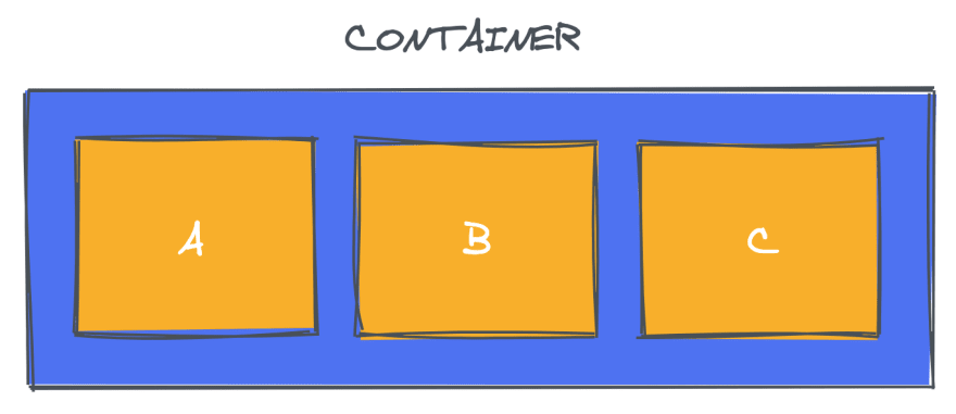
Flexbox is a one-dimensional layout system that we can use to create a row or a column axis layout. It makes our life easier to design and build responsive web pages without having to use tricky hacks and a lot of float and position properties in our CSS code.
To start to use Flexbox, all you need to do is create a flex container using the display: flex property. After that, every element that you have inside that flex container turns into a flex item.
The main direction that our flex items take in our flex container is a row.
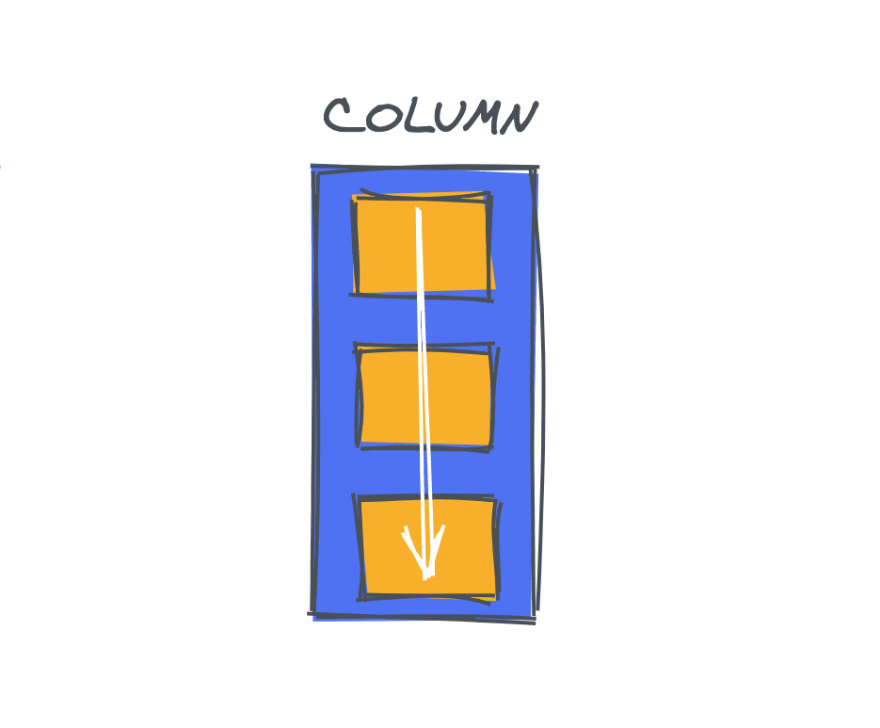
We can change the direction of our flex items in our flex container very easily to a column, by passing a flex-direction: column property to our flex container.
Flexbox has a lot of other properties that we can use to create awesome things. We can order the elements the way we want, we can reverse the order of elements, we can determine if our elements should grow or shrink, etc.
For example, let’s imagine that we have a div element and inside that div we have three elements, with the same width and height:
<div id="container">
  <div id="one">1</div>
  <div id="two">2</div>
  <div id="three">3</div>
</div>
In our CSS, we’re using Flexbox to order and align our elements:
#container {
  display: flex;
  flex-direction: row;
  align-items: center;
  justify-content: space-evenly;
  padding: 10px;
}

#one,
#two,
#three {
  width: 200px;
  height: 100%;
  background: red;
}
We can easily reverse the order of an element using the order property. If we wanted to change the order of the element with id of two, we would do this:
#two {
  order: 3;
}
Now our element is the last one in the flex container. These are some of the features that Flexbox introduced to us and they’re very useful for the style and alignment of elements.
Now that we know that Flexbox is a one-dimensional layout system, let’s understand briefly how CSS grid works and differences between these layout systems.
CSS grid
If Flexbox is a powerful layout system because it’s a one-dimensional system (meaning that we can work with rows or columns) CSS Grid is considered now the most powerful layout system available.
CSS grid is a two-dimensional layout system, we can work withs rows and columns together, which means that it opens a lot of different possibilities to build more complex and organized design systems, without having to fall back to some “hacky ways” that we were using in the past.
To define a grid container, all you need to do is pass a display: grid property to your block element. Now you have a grid, so you should define how many rows and columns do you want.
To create rows you use the grid-template-rows property, and pass how many you want, like this:
grid-template-rows: 200px 200px;
To create columns it’s almost the same, we use the grid-template-columns property:
grid-template-columns: 200px 200px;
But if you already know how to use both of these layout systems, you might have been wondering ‘which one should I use?’, we will take a look this next.
Now that we have seen how they work, we’ll emphasize the differences and best use cases for each one.
CSS grid is for layout, Flexbox is for alignment
Back in that time when Flexbox was released, we thought that it could be the best layout system to use to build our web pages, but it wasn’t.
Flexbox helped developers start to create more responsive and maintainable web applications, but the main idea of a one-dimensional layout system does not make sense when you need to build a more complex layout design.
CSS grid really came to help us build more complex layout designs using a two-dimensional way, using both rows and columns. We should aim to use both of them together, but for different purposes. For your layout, use CSS grid, for alignment of your elements, use Flexbox.
To master and know exactly when you’re going to need and how to use CSS grid, you should first learn the basics and how Flexbox works, because when you need alignment of elements in your application, it’s Flexbox that you’re going to use.
You should consider using Flexbox when:
- You have a small design to implement — Flexbox is ideal when you have a small layout design to implement, with a few rows or a few columns
-
You need to align elements — Flexbox is perfect for that, the only thing we should do is create a flex container using
display: flexand then define the flex-direction that we want - You need a content-first design — Flexbox is the ideal layout system to create web pages if you don’t know exactly how your content is going to look, so if you want everything just to fit in, Flexbox is perfect for that.
Of course, you can build your whole application using only Flexbox and get the same result as if you were building with CSS grid, that’s totally fine. But for a better CSS approach, to have a more concise, well-written, and maintainable application in the long-term, to create and fit your layout perfectly, the ideal method is to use CSS grid.
CSS grid is better when:
- You have a complex design to implement — in some use cases, we have complex designs to implement, and that’s when the magic of CSS grid shows itself. The two-dimensional layout system here is perfect to create a complex design, we can use it in our favor to create more complex and maintainable web pages
- You need to have a gap between block elements — another thing that’s very helpful in CSS grid, that we don’t have in Flexbox, is the gap property. We can define the gap between our rows or columns very easily, without having to use the margin property, which can cause some side effects especially if we’re working with many breakpoints
- You need to overlap elements — overlap elements using CSS grid is very easy, you just need to use the grid-column and grid-row properties and you can have overlapping elements very easily. On the other hand, with Flexbox we still need to use some hacks such as margins, transforms, or absolute positioning
- You need a layout-first design — when you already have your layout design structure, it’s easier to build with CSS grid, and the two-dimensional layout system helps us a lot when we’re able to use rows and columns together, and position the elements the way we want
Before you decide which one you should use, don’t forget:
CSS grid is for layout, Flexbox is for alignment
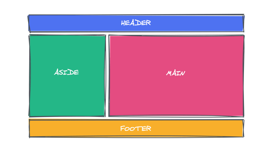
Here’s an example of the right use of CSS grid, let’s imagine that we’re going to build a simple application, and the barebones of our applications is going to look like this:
We have a header, an aside menu, main block content, and a footer. To create this layout using CSS grid, we just need to create our elements:
<div id="container">
  <header>Header</header>
  <aside>Aside</aside>
  <main>Main</main>
  <footer>Footer</footer>
</div>
And now create our grid container using display: grid and then create some rows and columns, like this:
#container {
  width: 100%;
  height: 100vh;
  background: yellow;
  display: grid;
  grid-template-rows: 80px 600px 80px;
  grid-template-columns: 0.5fr 1fr;
}

header {
  grid-column: 1 / 3;
  grid-row: 1 / 2;
  background: blue;
}

aside {
  grid-column: 1 / 2;
  grid-row: 2 / 3;
  background: green;
}

main {
  grid-row: 2 / 3;
  grid-column: 2 / 3;
  background: pink;
}

footer {
  grid-column: 1 / 3;
  grid-row: 3 / 4;
  background: yellow;
}
That’s it. Using only 30 lines of CSS we create our design very simply, without having to use hacks such as float or positioning our elements, and without having to create many flex containers.
The best decision that you can take for your application in order to create a very decent and well-built web layout for your application is to use both together.
Let’s take our example and use both CSS grid and Flexbox to show the power of both layout systems together. Inside our header, we’re going to create three div elements, and we’re going to align them in a row.
To do that, all we need to do is declare our header a flex container using the display: flex property, make the flex-direction a row using flex-direction: row and align the items.
header {
  grid-column: 1 / 3;
  grid-row: 1 / 2;
  background: blue;
  display: flex;
  flex-direction: row;
  align-items: center;
  justify-content: space-evenly;
  padding: 10px;
}
A powerful web page, using CSS grid for layout, and Flexbox for alignment.
For a major layout style, you could use CSS grid, since it’s a two-dimensional layout system, you can work with both rows and columns very easily. And for a more simple layout style, you can use Flexbox, a one-dimensional system, it’s very helpful to work with rows.
Conclusion
In this article, we learned about the differences between Flexbox and CSS grid, how they work in modern browsers, and how we can use each one of them to accomplish different results in our CSS.
Is your frontend hogging your users' CPU?
As web frontends get increasingly complex, resource-greedy features demand more and more from the browser. If you’re interested in monitoring and tracking client-side CPU usage, memory usage, and more for all of your users in production, try LogRocket.
LogRocket is like a DVR for web apps, recording everything that happens in your web app or site. Instead of guessing why problems happen, you can aggregate and report on key frontend performance metrics, replay user sessions along with application state, log network requests, and automatically surface all errors.
Modernize how you debug web apps — Start monitoring for free.
The post When to use Flexbox and when to use CSS grid appeared first on LogRocket Blog.


Top comments (5)
Nice article but incorrect in some ways.
Flex is one-dimension ok, that's true, but you can blend and nest it wherever is necessary, giving you a layout much more powerful than grid.
Let's set an example:
.flexrow { display:flex; flex-flow: row wrap;
.row-2-el {
.element {
flex: 0 1 50%;
max-width: 50%;
}
}
}
Now you can set a div class="flexrow row-2-el" with tones of div class="element" inside and it will be all a 2 per row layout. Imagine nesting it as needed and adding more layout options with flex, without needing to set the size of each column as you need on grid layout template. Simpler, clever, powerful.
I agree, some points are off.
But I think this sentence is incorrect:
In some cases you still need position or floats. But yes they are not the only choices we have 😉
of course, it's all about design and functional requirements after all, all properties and methodologies have a reason for existing (and coexisting) and a target project where to being applied on.
All front-end stuff is bigger every day and in some ways you need more aknowledgement than doing back end those days; I mean, you can do CRUD APIs applying standard security and good logic but on front you'll need logic too as well as many technologies and frameworks (react, angular, scss, html, node and so), how the turntables haha
Ohw absolutly! Totally agree.
Back in the days frontend was "just" HTML, CSS and a bit of jQuery. Now we moved a lot of those backend logic from the early days to JavaScript. Now frontend developers need more programming skills.
If you say in the current time, I'm a frontend developer you can mean a lot of things. Are you on the "front side" of the frontend (doing HTML, CSS, accesibility etc) or are you on the "back side" of the frontend (doing HTML,CSS, JavaScript, Routing etc).
A great read about that is "The Great Divide"
I'll take a look for sure, tanks! :)