Awesome site and awesome content. I've spotted 2 very small things if I may:
The icon in the cart button is a bit off: it doesn't have enough padding and it touches the margins of the button. Also I think a bit too detailed for the otherwise super minimalist style <3
The hover effect feels like loading and creates a bit of unrest (at least in my case, loading bars make me get into waiting mode, and it shouldn't be the case :) )
Thanks! Yours too! I learned a couple of things in this thread!
Also, cool idea, I didn't thought roasting could be so much fun, effective and productive.
Wow, this is a really neat and concise website. I'm having trouble trying to find things to hate on, but I do have 2 suggestions:
1 jQuery
You're currently using an outdated version of jQuery. Be sure to keep this updated to make sure you get the best in terms of security features.
2 Current date
Your site is a breeze to use, but a cool feature (in my eyes) would be to highlight the image that matches with the current date. Maybe some kind of tooltip or border styling that emphasizes it
I've been a professional C, Perl, PHP and Python developer.
I'm an ex-sysadmin from the late 20th century.
These days I do more Javascript and CSS and whatnot, and promote UX and accessibility.

bugsy.me/sunrise
Awesome site and awesome content. I've spotted 2 very small things if I may:
Great feedback!
Thanks! Yours too! I learned a couple of things in this thread!
Also, cool idea, I didn't thought roasting could be so much fun, effective and productive.
Wow, this is a really neat and concise website. I'm having trouble trying to find things to hate on, but I do have 2 suggestions:
1 jQuery

You're currently using an outdated version of jQuery. Be sure to keep this updated to make sure you get the best in terms of security features.
2 Current date
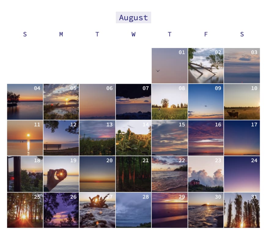
Your site is a breeze to use, but a cool feature (in my eyes) would be to highlight the image that matches with the current date. Maybe some kind of tooltip or border styling that emphasizes it
Thanks! This is nice to get critical feedback as mostly I only hear back from friends/family who aren't involved in ux/ui/dev/design.
This is awesome! 🤩
What. A. Great. Site.
It's brilliant.