
I had some great success critiquing/roasting your websites on Twitter, and I'd love to help tell you why your website sucks
As a CRO Consultant, I have a lot of experience in improving our client's products.
So show me your website, and I'll give you at least one point to improve!
😄

Top comments (64)
benhalpern.com
** heavy breathing **
Well, there are 2 things I can do here.
The first is to give a long rant about how there are so many issues on this page regarding performance, accessibility, SEO, network bandwidth, user experience, etc.
However, the thing to keep in mind is that the web is also supposed to be fun. Sara Vieira talks a lot about this and it's something I love to see in your website Ben. Thank you for putting a smile on my face 😄
I'm no expert, but I think it could use some more GIFs 😂
I'll get right on it!
This is amazing 😂 Reminds me of the first few websites I built back in the 90s...but mine had far more "under construction" gifs 🚧 which was very important at the time 😏
I lovvvvvvvvvvvve it ... was it built with love? :-)
I love the privacy policy!
bugsy.me/sunrise
Wow, this is a really neat and concise website. I'm having trouble trying to find things to hate on, but I do have 2 suggestions:
1 jQuery

You're currently using an outdated version of jQuery. Be sure to keep this updated to make sure you get the best in terms of security features.
2 Current date
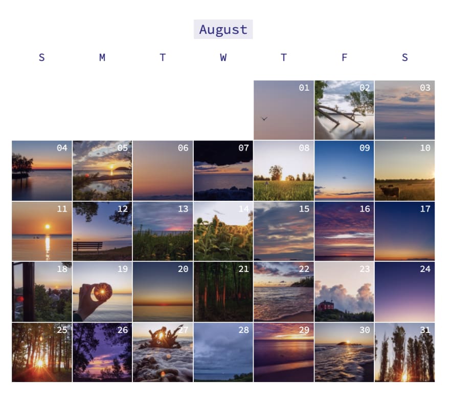
Your site is a breeze to use, but a cool feature (in my eyes) would be to highlight the image that matches with the current date. Maybe some kind of tooltip or border styling that emphasizes it
Thanks! This is nice to get critical feedback as mostly I only hear back from friends/family who aren't involved in ux/ui/dev/design.
Awesome site and awesome content. I've spotted 2 very small things if I may:
Great feedback!
Thanks! Yours too! I learned a couple of things in this thread!
Also, cool idea, I didn't thought roasting could be so much fun, effective and productive.
What. A. Great. Site.
It's brilliant.
This is awesome! 🤩
mederic.me
I'm aware of the wrong image sizes and more on the other pages than the main one.
I did a few lighthouse report and noticed i need to work on accessibility:
But if you got some other feedback I'd be glad to hear it:
Cool portfolio. The photography looks great! As you may already know, the file size of the images you're using is HUUUUGE. I'd definitely recommend compressing these. This will especially impact mobile users.
The other thing I noticed is that your contact form currently isn't working:

Oh thanks for the captcha! will fix it asap!
Yeah I have already compressed and resized homepage images but still need to do the background and other pages so it loads very fast too haha.
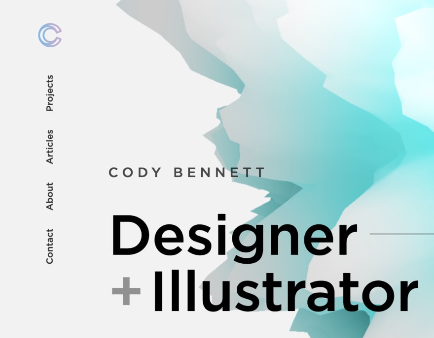
I’m scared but here it goes: cydstumpel.nl/
Hey Cyd! Really cool to see that you've worked for Pon. I currently do a lot of their CRO work, especially regarding the Volkswagen group. First up:
1 Case studies
You have some great case studies on your website which show some beautiful visuals, but what I'm currently missing is some more in-depth knowledge about how the project came to be, what steps you took to get to the end product, and maybe some next steps regarding the case. This would be a great way to clients a little more of your way of working and what they can expect of the process that is working with you.
2 Scroll Hijacking
A lot has already been said about scroll hijacking, and unless absolutely necessary, I would avoid using it on your website. There's an article I like that goes a little more into detail about it. Article here
Haha yes, but smooth scrolling just looks so much nicer😅
Thanks for the feedback Twan, maybe I'll see you at Pon sometime :)
Whatastory.agency
All in all a very solid page! I noticed a few things:
1 Chat & Privacy

A small usability bug. It seems like your chat functionality and reCaptcha Privacy are overlapping. Should be a simple fix, especially when this devalues the professional look of the website.
2 The team

I could be wrong, and please correct me if I am, but there's a person in your team who's role is "Hitler". Now as we know, Hitler isn't a name that a company would want to be associated with. So I'd suggest removing this ASAP.
3 Lighthouse

last but not least is the Lighthouse report. There are a lot of things blocking the performance of the website. WordPress is really cool, but you're loading a ton of external scripts which will also run on the main thread of the user. Think about simplifying some of your features that are now externally loaded.
4 Testimonial Carousel

Currently, on the homepage, the testimonial carousel doesn't have any indication that the items are clickable. No hover state / arrows / etc. Testimonials are important to new clients and getting them to see more of them always works in your favor.
If you're going to hide one person's name because of its association, you should probably hide everyone's.
It isn't their name, it's their role. I can't imagine any good reason to have someone working in your team with the role of Hitler.
Gotcha. I couldn't find that page when I looked at the site so I was making some sort of deliciously rash assumption.
Starting of, this is a beautiful website. I can see you put a lot of attention to detail in every single corner of the pages. Everything looks great from animations to accessibility. There are two minor things that I think will improve the usability/experience of your website.
1 Navigation
The vertical navigation looks great, but my experience tells me that there's a reduced change of people using it accordingly when it doesn't meet their expectations. I'd recommend for it to be placed horizontally on top of the page.
2 A personal touch

At the bottom of your page, you tell a little bit about yourself as a person. Something very important to do. I think this section could be greatly improved and add a little more personal connection by using a (professional) image of yourself.
Besides these small points, a great website! I'd love to see more of your articles on your own website 😄
Thanks for the offer!
Here's my super lightweight vanilla php and css website: l3m.in
microtica.com/
Thanks for sharing Sara! This site looks great! A lot of attention to detail and all the information provided to the user is beautifully visualized.
One thing I noticed is an inconsistency in the button styling currently on the website. It seems like the white CTAs look like they are "raising" when a user hovers on them, while the green one actually "descends/lowers". A small tweak in my eyes.
Besides that, a great example of a SaaS company. I especially like the CTA changing on the homepage hero changing its action based on if the user is on mobile or desktop 😄
Thank you so much, Twan! Really appreciate it :)
I world love some feedback on my portfolio mhouge.dk, since I am planning on reworking it in the near future 😀
Your site looks pretty good! Here are a few points I noticed:
1 The email contact

Currently, the text-link for your email opens itself in the email client of the user. Usually, a user prefers to have the email copied to their clipboard and pasting it in their own email client. There are some JS scripts/functions you can find online that do this.
2 Portfolio cases

Three cases to show off is a great number, however, you currently only have 1 case study on your own page worked out for this. I would advise creating case studies for all the cases on your own site or move them all to Behance. Having them on your own site would improve SEO if done correctly, and will improve the chances of people finding your page.
3 Lighthouse report

Running a Lighthouse report shows a few little things you can work on. For example, be sure to give every anchor tag a discernible name. Besides that, be sure to use
font-display: swap;when loading custom fonts using CSS. Read more about that here
Would love to hear your thoughts: designlabsco.com
Thanks for sharing Alex! All in all, a very solid website.
Something I'd check is the Lighthouse scores that you can generate from the Chrome Dev Tools. Go check out their tips on improving your performance (by, for example, compressing your images) to upgrading your accessibility (by, for example, adding discernible names to your anchor tags)
Thank you!