
When creating a multi-page website, it’s good to have a design system in place that ties everything together.
Having taken a course by the CSS guru Kevin Powell, I thought it would be great if there was a way to reference it as needed and go back to certain areas afterwards. That’s exactly what this post is about.
The course is 7 hours long and he goes into great detail about the creation of the design system, the whole website itself, and how everything works together. It’s a great resource, even for beginners with basic HTML and CSS knowledge as he does a great job explaining everything.
That being said, I would definitely recommend taking the course. It’s free, you can find it on YouTube or freecodecamp.org.
- Figma files referenced are available on frontendmentor.io
- You can visit my finished product at https://designsystemcss.netlify.app See the complete source code https://github.com/crypto3p/Design-System --- We’re going to be recreating this design system for a space travel website.
Setting up
Custom properties for colours, fonts and font sizes
:root {
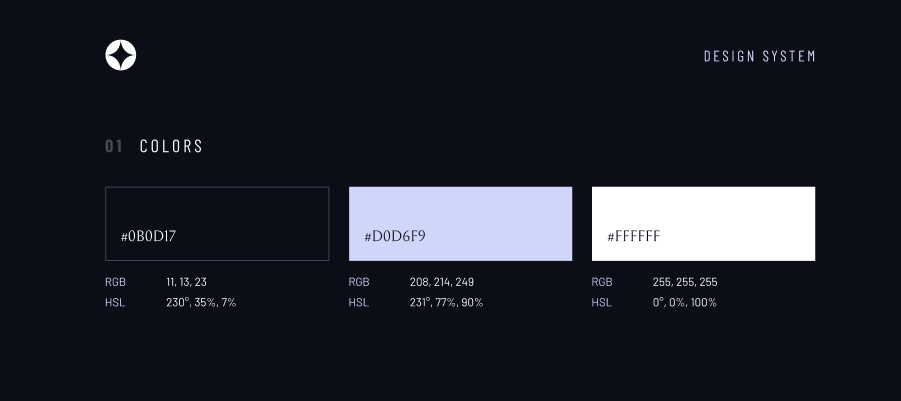
--clr-dark: 230 35% 7%;
--clr-light: 231 77% 90%;
--clr-white: 0 0% 100%;
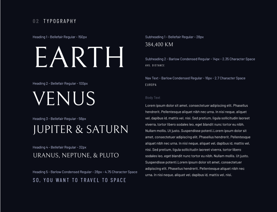
/* font sizes */
    --fs-900: 9.375rem;
    --fs-800: 6.25rem;
    --fs-700: 3.5rem;
    --fs-600: 2rem;
    --fs-500: 1.75rem;
    --fs-400: 1.125rem;
    --fs-300: 1rem;
    --fs-200: 0.875rem;
/* font families */
    --ff-serif: "Bellefair", serif;
    --ff-sans-cond: "Barlow Condensed", sans-serif;
    --ff-sans-normal: "Barlow", sans-serif;
}
Using rems instead of pixels
- using pixels may overwrite settings that the user has put in place to give them bigger/smaller default font size
- easy to convert to rems = divide any value in px by 16
Using RGB and HSL values
- Makes it easy to tweak the alpha value (opacity) when needed by adding
/ <value> - HSL being a new syntax, no commas needed, supported in all modern browsers Though storing it like this: ```
hsl(230 35% 7%)
would make it difficult to modify the alpha value later on, so we will be storing it like this:
--clr-dark: 230 35% 7%;
--clr-light: 231 77% 90%;
--clr-white: 0 0% 100%;
For example, we create a new class `.example` and if we wanted to give it a light background at 20% opacity:
background-color: hsl( var( — clr-light) / .2 );
which gives exactly the same output as writing it without a custom variable:
background-color: hsl(231 77% 90% / .2);
> Resetting body margins, box sizing, setting up the body, form elements and images can be seen in the source code with comments explaining everything more in depth if needed

##Accessibility


**Creating a screen-reader-only class:**
.sr-only {
position: absolute;
width: 1px;
height: 1px;
padding: 0;
margin: -1px;
overflow: hidden;
clip: rect(0, 0, 0, 0);
white-space: nowrap; /* added line */
border: 0;
}
**sr-only vs display:none**
- sr-only keeps it in the DOM, it just fully visually hides it, while `display:none` removes it and it is no longer on the page

**Remove animations for people who have turned them off**
- `prefers-reduced-motion` media query — meaning people took the time to turn off animations, either in browser settings or OS level
- for people who motion causes problems i.e. parallax scrolling, scroll linked animations etc.
@media (prefers-reduced-motion: reduce) {
*,
*::before,
*::after {
animation-duration: 0.01ms !important;
animation-iteration-count: 1 !important;
transition-duration: 0.01ms !important;
scroll-behavior: auto !important;
}
}
##Colour utility classes
Going on to recreate the following part of the design system:
.flex {
display: flex;
gap: var(--gap, 1rem);
}
.grid {
display: grid;
gap: var(--gap, 1rem);
}
- You may noticed that we haven’t previously defined the `--gap` property, so 1rem becomes the default. Now we can redefine this custom property, either inline in HTML or with a custom class by adding `--gap: 2rem;`
.bg-dark {
background-color: hsl( var(--clr-dark) );
}
.bg-accent {
background-color: hsl( var(--clr-light) );
}
.bg-white {
background-color: hsl( var(--clr-white) );
}
.text-dark {
color: hsl( var(--clr-dark) );
}
.text-accent {
color: hsl( var(--clr-light) );
}
.text-white {
color: hsl( var(--clr-white) );
}
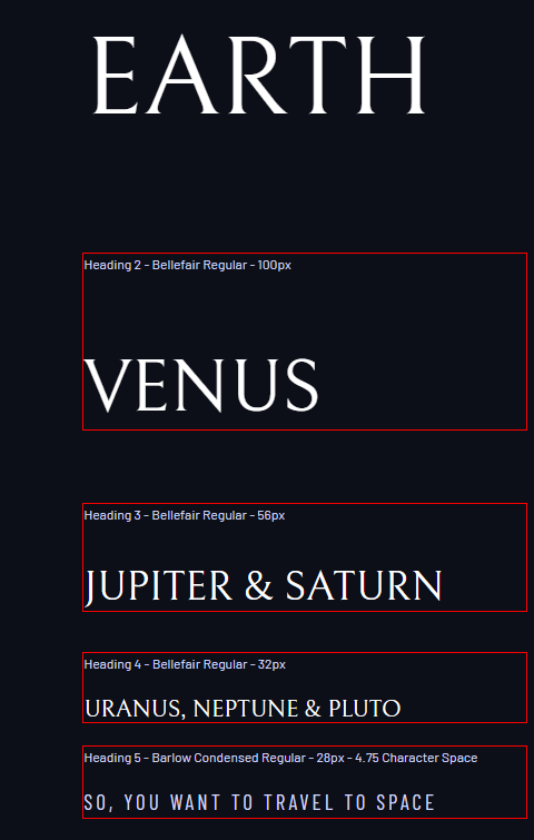
##Typography
Creating utility classes = breaking things up
- we want to keep things doing one job
- everything becomes more plug and play
- creating classes also enables us to write more semantic HTML — meaning an element is doing exactly what it should (an h2 element being a headline rather than the heading styling something ) and adding to accessibility
> I didn’t turn letter spacing into custom properties as I don’t see them changing very often, though if you prefer to set them as a custom property that would be completely fine
.ff-serif { font-family: var(--ff-serif);}
.ff-sans-cond { font-family: var(--ff-sans-cond);}
.ff-sans-normal { font-family: var(--ff-sans-normal);}
.letter-spacing-1 { letter-spacing: 4.75px; }
.letter-spacing-2 { letter-spacing: 2.7px; }
.letter-spacing-3 { letter-spacing: 2.35px; }
.uppercase { text-transform: uppercase;}
.fs-900 {font-size: var(--fs-900);}
.fs-800 {font-size: var(--fs-800);}
.fs-700 {font-size: var(--fs-700);}
.fs-600 {font-size: var(--fs-600);}
.fs-500 {font-size: var(--fs-500);}
.fs-400 {font-size: var(--fs-400);}
.fs-300 {font-size: var(--fs-300);}
.fs-200 {font-size: var(--fs-200);}
.fs-900,
.fs-800,
.fs-700,
.fs-600 {
line-height: 1.1;
}
Adding the font class to h elements might render a bit funny, since the h elements are bold by default and we didn’t include the bold in google fonts. So what we want to do is specify the font weight of those elements to be 400 since we are not going to see a lot of bold in this project.
h1,
h2,
h3,
h4,
h5,
h6 {
font-weight: 400;
}
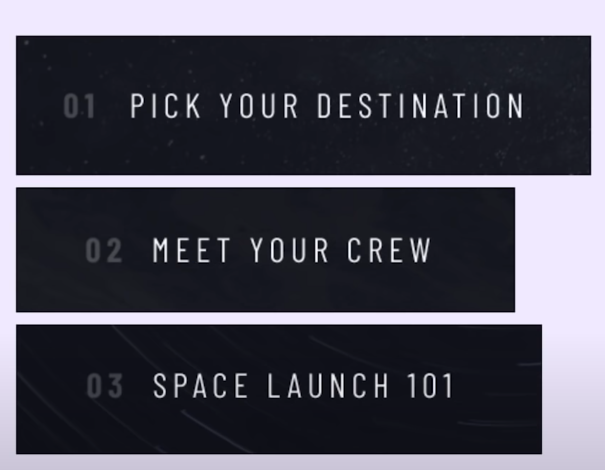
##Numbered Titles
Utility classes allow us to work quickly ,but when we have something like numbered titles here, that is always the same, it’s good to find a balance — making a utility class2.0 let’s say, just for those numbered titles
> Ems and rems for most when it comes to sizing things, but we’re leaving letter spacing as pixels since it’s quite a small value. There is nothing wrong with using pixels for very small and specific things every now and then
.numbered-title {
font-family: var(--ff-sans-cond);
font-size: var(--fs-500);
text-transform: uppercase;
letter-spacing: 4.72px;
}
.numbered-title span {
margin-right: .5em;
font-weight: 700;
color: hsl( var(--clr-white) /.25 );
}
> We’re setting letter spacing (margin) for span in ems so it’s relative to font size. If the font would be something different, margin would adapt with it.
##Spacing

Utilities for spacings are very common, but don’t think we need it for this design. We’ll use a modern solution, with one utility class and just one modern pseudo class that’s recently been added to CSS, supported by most modern browsers.
Going to general utility classes in our CSS file, we’ll add the following code:
.flow > * + * {
margin-top: 1rem;
outline: 1px solid red;
}
> idea by Andy Bell, lobotomised owl (termed by Hayden Pickering)
**How it works:**
- the + sign here is an adjacent sibling combinator. It is looking for elements that have adjacent siblings that come before it i.e. selects everything that has an adjacent sibling directly before it hence why it wasn’t applied to the first element in our div.
**Another way to write it:**
.flow > *:not(:first-child) {
margin-top: 1rem;
outline: 1px solid red;
}
- selecting anything (*) that is not the first child

_Why we would use the * + * (lobotomised owl) method :_
- * +* has no extra specificity to it.
- the `.flow` has specificity, which is important because on our paragraphs and headings we set a margin of 0. So we need the specificity to overwrite that to add a margin-top on them.

_Using *:not(:first-child)_
- this is a pseudo class, which has the same specificity as a class selector
- can lead to potential problems where you can’t overwrite something, needing an !important somewhere

A way to overcome that is with a very modern piece of CSS, adding `:where`
.flow > *:where:not(:first-child) {
margin-top: 1rem;
outline: 1px solid red;
}
:where and :is being new selectors
- using :is wouldn’t help, it would be the exact same situation
- generally used as different way to group things

For example: instead of writing
.card h1,
.card h2,
.card h3 {
}
what we can do is
card :where(h1, h2, h3) {
}
or
card :is(h1, h2, h3) {
}
The difference between :is and :where
- :is will take the highest specificity selector and apply it to the entire rule
- :where doesn’t add any specificity
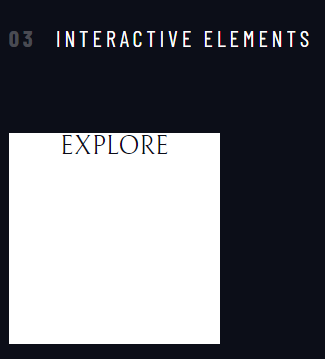
## Interactive Elements
**The Explore Button**
We’ll be adding all the existing utility classes first instead of creating another one like we did with numbered titles:
- Maybe in the future it gets updates, maybe we need a second button with slight modifications. So we don’t need to create a new class to be able to accommodate it.
So setting things up with our utility classes, finishing up with the large-button class for final touches is one approach you can take.
> We could’ve also taken the same approach on numbered titles, but for the purpose of showing different approaches and how or when they might be used we are going to switch it up
.large-button {
position: relative;
z-index: 1;
display: grid;
border-radius: 50%;
place-items: center;
padding: 0 2em;
aspect-ratio: 1;
text-decoration: none;
}
> because `<a>` is an inline element, we can’t really give it padding on top and bottom. We can, but it would overlap with the elements above or below it
Instead of using width and height of 100px, we’ll be using a modern solution `aspect-ratio` which will turn it into a perfect square when setting the value of 1 (same as 1 / 1)
- 2 / 1 would make it twice as wide as it is high
- 2 / 1 twice as tall as it is wide
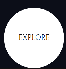
`display:grid` instead of inline block so we can easily place the text in the middle of the block with `place-items:center` (shorthand for align-items and justify-items)
- can do it with flex, but we’re keeping it shorter, just in one line we got it right in the middle
**Creating the hover effect:**
.large-button::after {
content: '';
position: absolute;
background: hsl( var(--clr-white) / .15 );
width: 100%;
height: 100%;
z-index: -1;
border-radius: 50%;
opacity: 0;
transition: opacity 500ms linear, transform 750ms ease-in-out;
}
Using the pseudo class, we need `content:’’` for it to work
- .large-button z-index of 1
- .large-button::atfter z-index of -1


> you can leave out the z-index on large-button and in this situation it wouldn’t make a difference but it’s a good practice to force the stacking context by adding a z-index of 1 when we have a absolutely positioned element inside (in this case to .large-button) to prevent any issues down the line

**Adding the animation:**
.large-button:hover::after,
.large-button:focus::after {
transform: scale(1.5);
}
## Underline Indicators
Since we have the same underline effect in two places in this case, we don’t want to be repeating the same thing for both, so we’ll be creating a new class of `underline-indicators` alongside `primary-navigation`.
.primary-navigation {
--underline-gap: 3rem;
--gap: 4rem;
list-style: none;
padding: 0;
margin: 0;
}
.primary-navigation a {
text-decoration: none;
}
.primary-navigation a > span {
font-weight: 700;
margin-right: .5em;
}
.underline-indicators > * {
padding: var(--underline-gap, 1rem) 0;
border: 0;
cursor: pointer;
border-bottom: .2rem solid hsl( var(--clr-white) / 0 );
}
You can also make it as a utility class and place it for each one of the links, Though this way, you will put the class in only one place instead of multiple, allowing for grouping and just a little bit less work.

Setting the padding on the border (our underline), might work in this situation, but we want to reuse it on another element that needs underlining and that one looks like it would need less of a padding.

To accommodate this, we are going to use a custom property — `underline-gap` and set the default to 1rem

**Hover, focus and active effects**
.underline-indicators > *:hover,
.underline-indicators > *:focus {
border-color: hsl( var( - clr-white) / .25);
}
.underline-indicators > .active {
border-color: hsl( var( - clr-white) / 1);
}
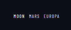
**Underline indicators — tabs**
While we’ve already done most of the heavy lifting with underline indicators above, there are a few things that would need tweaking. After adding the utility classes to button elements to style the text, adding the `underline-indicators` class to the div element gives this outcome.
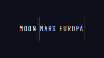
First, we see that we need more space between them, and we can easily fix that by adding the `flex` class.
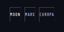
Now to tweak things further, we are going to add a custom class `tab-list`, just like we did previously with `primary-navigation` class.
What we can do now is go back to this section:
.underline-indicators > * {
padding: var( - underline-gap, 1rem) 0;
border-bottom: .2rem solid hsl( var( - clr-white) / 0 );
}
and add a cursor and a border of 0 before `border-bottom`. This will remove any borders that might be there by default — like the button borders above.
.underline-indicators > * {
padding: var( - underline-gap, 1rem) 0;
border: 0;
cursor: pointer;
border-bottom: .2rem solid hsl( var( - clr-white) / 0 );
}
Lastly, we can change the gap with the `tab-list` class we created earlier (or you can change it inline).
**Adding the active state**
Moon
Mars
Europa
-  aria-selected = accessible rich internet applications
 - Something we can use to give extra context to assistive technologies. And since we’re going to be turning this area into a tabs system, it’s a way to let them know that this is a selected tab
- It’s different than links, since with links we are going to a different html page and with tabs, we are staying on the same page but essentially moving the content around

Now we can add this attribute to the CSS
.underline-indicators > .active,
.underline-indicators > [aria-selected="true"] {
border-color: hsl( var( - clr-white) / 1);
}
**Dot indicators**
Very similar to tab indicators.
Now we will use the `sr-only` class created at the beginning by wrapping the title in a span and adding the `sr-only` class to it.
<span>slide title</span>
<span>slide title</span>
<span>slide title</span>
**Number indicators**
Following the example of previous indicators, finish up the design system with number indicators.
1
2
3
.number-indicators > *{
margin: 1.7rem;
padding: 0;
cursor: pointer;
color: hsl( var( - clr-white) );
border: 3px solid hsl( var( - clr-white) /.5 );
border-radius: 50%;
aspect-ratio: 1;
border-color: hsl( var( - clr-white) /.25 );
}
.number-indicators > *:hover,
.number-indicators > *:focus {
border-color: hsl( var( - clr-white) / 1 );
}
.number-indicators > [aria-selected="true"] {
background-color: hsl( var( - clr-white) / 1);
color: hsl( var( - clr-dark) );
}
See the finished design at https://designsystemcss.netlify.app
See complete source code at https://github.com/crypto3p/Design-System
I’m happy to receive any questions or comments here or you can contact me at info@pmweb.uk

Top comments (0)