
Originally published at Bits and Pieces.
Microfrontends are becoming more popular each day. One of the reasons is that microfrontends offer a way out of the framework prison. While this may be a good reason for adopting microfrontends, it should not be the only (let alone best) reason.
How can we efficiently build this capability ourselves and what should be considered to get a great result?
In this article, I want to share our experiences from the last four years of building various microfrontend solutions. Many of our experiences and lessons learned have been shared via our open-source project Piral, which is about to be released in its v1 version.
Independent of how you imagine composing your functional components you may need (or should actually want) a pattern library/design system for your UI building blocks. The easiest way to achieve that is through cloud component hubs like Bit.dev.
Bit.dev is a place to publish, document and organize JS components (React, Angular, Vue, etc.). Bit gives you the freedom to continuously publish new UI components (from any codebase) to your own shared component collection or design system (in Bit.dev).
Related Articles
Before you dive into this article please make sure to know (or at least understand) the content of the previous two articles:
In general, if the topic of microfrontends is interesting to you then have a look at my article 11 Popular Misconceptions About Micro Frontends. One of the points raised there is that microfrontends are not about cross-framework components, even though they can be used for this case. There are better reasons and you should know these before using or dismissing microfrontends.
In case of implementation need, I outlined a few of the available architectural patterns in my article on the 6 Patterns for Microfrontends.
But now without further ado let’s get right into the topic.
A Strong Foundation
Whatever we want to do with cross-framework components we should have a strong architecture with well-defined touchpoints. For instance, an obvious question in a single-page application may be: How does the routing work?
Obviously, every library or framework that comes up with a definition of components has an answer to these questions. While some choices are more constrained (usually then called “framework”), others give more freedom (and thus usually settle on the term “library for creating UIs”).
It makes sense to define these touchpoints first. Keep in mind that there is no need to question established choices here. For instance, when your application already makes use of React everywhere, there is no need to suddenly question the react-router package for routing.
Instead, whatever new framework you'll introduce should just be able to play nicely with React Router. This may sound odd, but as we will see, this is totally possible and - ultimately - desired.
Another point that needs to be discussed and defined upfront is the degree of isolation. While it may make sense to directly access (and therefore know about) the components from other frameworks, having component aggregation as outlined in the previous article may be desired.
Component aggregation allows individual components to use components without knowing where they come from. It also enables loose coupling as the aggregator component will work with a single registered component, multiple registered components, or even with no registered component.
Ultimately, however, it also solves the MxN problem.
Solving the MxN Problem
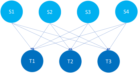
The MxN problem appears in a lot of places. Luckily, the solution to this problem is also known for a while. Let’s have a look at the problem itself. We start with an example of programming languages.
Suppose we have M programming languages and N types of machines. How many compilers do you need to write? Well, obviously the answer is MxN. That was not difficult, right?
Surprise: The difficult part is not the math. The difficult part is to keep the scaling when new types of machines and new programming languages are added.
For example, taking 4 languages and 3 machine architectures we end up with 12 edges (MxN).
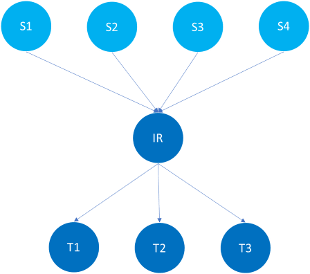
The solution to the previous problem was simple: Introduce an intermediate language (or in general: intermediate representation). So the M programming languages all compile to the same intermediate language, which is then compiled to the target architecture. Instead of having to scale MxN we only have M+N. Adding a new output architecture is as simple as adding a compilation from the intermediate language to the new architecture.
Let’s see how our example diagram changes when adding the intermediate representation (IR). We now have only 7 edges (M+N).
The same has been done for IDE support, too. Instead of supporting M programming languages for N IDEs we now have a single standard for language support (called Language Server Protocol — short LSP).
This now is the secret sauce why the TypeScript team (and others, too) can support VS Code, Sublime, Atom, and many other editors. They just update their LSP implementation and the rest follows. Supporting a new IDE is as simple as writing the LSP plugin for the respective IDE — nothing more required.
What do these tales help us now with cross-framework components? Well, if we have M frameworks than enabling cross-framework component exchange between N of them is MxN again. Solving this can now be done with the experience from the solutions above. What we need to find is a suitable “intermediate representation”.
The following diagram shows this for 3 frameworks. The intermediate representation allows converting from — and to — the different frameworks. Overall, we have 6 edges (2N) here.
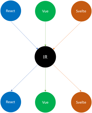
If we even take one of the frameworks as IR we end up with 4 edges (2N—2) — saving two converters, but also gaining performance in the “happy case”, i.e., when the given framework is the one that’s used most often for components.
In Piral we’ve chosen React to be this intermediate solution. There have been good reasons for this:
- React is supported in all major browsers, even IE11 or older
- React has a very well-defined component model that is lightweight
- React gives us a clear component lifecycle
- React’s context makes it possible to transport context information easily
- Lazy loading and error handling are trivial to support
- Since React was the primary choice of our render tree we wanted to remain close to it
Now for you, a different framework may be more useful. Of course, using web components can be super useful, too. We did not go for web components for a couple of reasons — which essentially match the ones just mentioned. Especially, the number of polyfills plus lack of context was concerning. Nevertheless, your list may look different here and that’s perfectly fine.
A Simple Wrapper
Let’s follow up on what we’ve discussed so far. We definitely require a well-defined component lifecycle. The full lifecycle could be specified via a ComponentLifecycle interface as seen below.
interface ComponentLifecycle<TProps> {
  /**
   * Called when the component is mounted.
   * @param element The container hosting the element.
   * @param props The props to transport.
   * @param ctx The associated context.
   */
  mount(element: HTMLElement, props: TProps, ctx: ComponentContext): void;
  /**
   * Called when the component should be updated.
   * @param element The container hosting the element.
   * @param props The props to transport.
   * @param ctx The associated context.
   */
  update?(element: HTMLElement, props: TProps, ctx: ComponentContext): void;
  /**
   * Called when a component is unmounted.
   * @param element The container that was hosting the element.
   */
  unmount?(element: HTMLElement): void;
}
This lifecycle alone is not worth much. We somehow need to connect it to a component — in our case a React component — to be mounted in the render tree.
Let’s define a simple function to create a React functional component wrapping the lifecycle as previously defined.
function wrap<T>(component: ComponentLifecycle<T>): React.ComponentType<T> {
  return (props: T) => {
    const { createPortal, destroyPortal } = useGlobalActions();
    const [id] = React.useState(createPortal);
    const router = React.useContext(__RouterContext);

    React.useEffect(() => {
      return () => destroyPortal(id);
    }, []);

    return (
      <ErrorBoundary>
        <PortalRenderer id={id} />
        <ComponentContainer
          innerProps={{ ...props }}
          $portalId={id}
          $component={component}
          $context={{ router }}
        />
      </ErrorBoundary>
    );
  };
}
Additionally, we can bring in context-transported values such as the router context (containing — among other things — the history, location, and others).
What are createPortal and destroyPortal? These are global actions that allow the registration or destruction of a portal entry. A portal uses a ReactPortal child underneath to project an element from React's render tree to a different location in the DOM tree. The following diagram illustrates this.
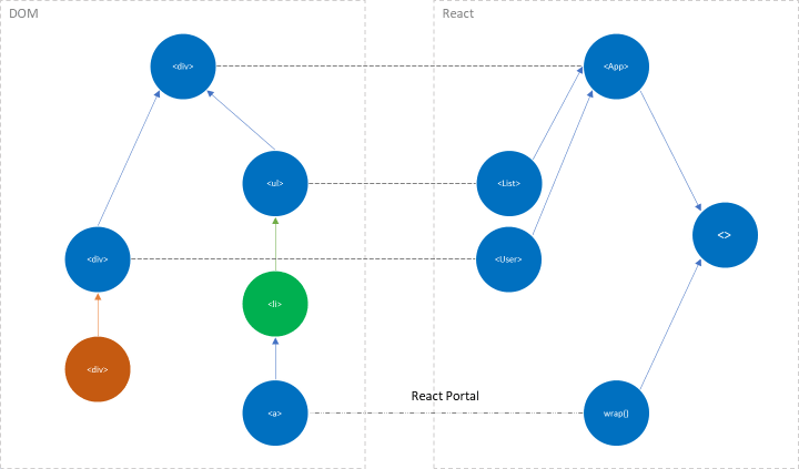
This is quite powerful. It is so powerful that is also works in shadow DOM. That way the intermediate representation can be used (i.e., projected) anywhere, e.g., in a node that is rendered by another framework such as Vue.
Error handling is left to the error boundary mentioned above. The component is rather unspectacular. Therefore, let’s tackle the PortalRenderer and ComponentContainer.
The PortalRenderer is super simple. In the end, it all boils down to get the ReactPortal and render it. Since these portals need to be globally distributed we can go over the store to retrieve them:
const PortalRenderer: React.FC<PortalRendererProps> = ({ id }) => {
  const children = useGlobalState(m => m.portals[id]);
  return <>{children}</>;
};
Now, the ComponentContainer is where the music plays. For enhanced access to the full React lifecycle we use a Component class.
class ComponentContainer<T> extends React.Component<ComponentContainerProps<T>> {
  private current?: HTMLElement;
  private previous?: HTMLElement;

  componentDidMount() {
    const node = this.current;
    const { $component, $context, innerProps } = this.props;
    const { mount } = $component;

    if (node && isfunc(mount)) {
      mount(node, innerProps, $context);
    }

    this.previous = node;
  }

  componentDidUpdate() {
    const { current, previous } = this;
    const { $component, $context, innerProps } = this.props;
    const { update } = $component;

    if (current !== previous) {
      previous && this.componentWillUnmount();
      current && this.componentDidMount();
    } else if (isfunc(update)) {
      update(current, innerProps, $context);
    }
  }

  componentWillUnmount() {
    const node = this.previous;
    const { $component } = this.props;
    const { unmount } = $component;

    if (node && isfunc(unmount)) {
      unmount(node);
    }

    this.previous = undefined;
  }

  render() {
    const { $portalId } = this.props;

    return (
      <div
        data-portal-id={$portalId}
        ref={node => {
          this.current = node;
        }}
      />
    );
  }
}
In this wrapper component, we also deal with (frankly, quite exotic) cases such as a change of the hosting DOM node. In this case we’ll need to re-mount the underlying component via the given lifecycle functions.
So let’s review the three crucial parts that all couple to the lifecycle:
-
componentDidMountis responsible for mounting - using the captured hosting DOM node -
componentDidUpdatedoes either a re-mount (if the DOM node changed) or tries a lightweight update operation -
componentWillUnmountis responsible for detaching
Why are we assigning this strange data-portal-id attribute to the hosting node? This is for finding the hosting node later when using the ReactPortal.
Consider we are in the tree controlled by a framework like Vue and we want to render a component from another framework. In this case we require our intermediate representation, which — as we defined — is also just a React component.
Mounting this React component in the Vue tree works over the DOM (alright!), but as discussed will be rendered via a portal. This way we stay in sync with the usual render tree of React and we get all the benefits, too.
To project this correctly we need, however, to identify what is the current hosting DOM node that is used by React. Luckily, we’ve added the attribute to be used for this. We only need to ascend the DOM tree and find the node with the attribute.
The code can be as simple as:
function findPortalId(element: HTMLElement | ShadowRoot) {
  const portalId = 'data-portal-id';
  let parent: Node = element;

  while (parent) {
    if (parent instanceof Element && parent.hasAttribute(portalId)) {
      const id = parent.getAttribute(portalId);
      return id;
    }

    parent = parent.parentNode || (parent as ShadowRoot).host;
  }

  return undefined;
}
This code is also prepared for usage in shadow DOM, which can make a lot of sense if web components are part of the spectrum we’re dealing with. Now we are ready to render!
An Example
Finally, let’s see how this can look in an application.
Let’s say we defined a React component to connect to the global state and show the value from a counter.
const tileStyle: React.CSSProperties = {
  fontWeight: 'bold',
  fontSize: '0.8em',
  textAlign: 'center',
  color: 'blue',
  marginTop: '1em',
};

export const ReactCounter = () => {
  const count = useGlobalState(m => m.count);
  return <div style={tileStyle}>From React: {count}</div>;
};
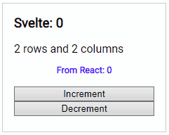
Now we can refer to this in another component, e.g., in a Svelte component we can use a custom component such as shown in the following code.
<script>
  export let columns;
  export let rows;
    export let count = 0;
</script>

<style>
  h1 {
    text-align: center;
  }
</style>

<div class="tile">
  <h3>Svelte: {count}</h3>
  <p>
    {rows} rows and {columns} columns
    <svelte-extension name="ReactCounter"></svelte-extension>
  </p>
  <button on:click='{() => count += 1}'>Increment</button>
  <button on:click='{() => count -= 1}'>Decrement</button>
</div>
Keep in mind that the svelte-extension is (in this example) the way to access the converter going from the intermediate representation (i.e., React) to Svelte.
Using this simple example in action looks as expected.
How do we define the converters here? The difficult part is certainly the connection to the custom element, which we solve with an event (called render-html) that is fired once the web component is connected.
const svelteConverter = ({ Component }) => {
  let instance = undefined;

  return {
    mount(parent, data, ctx) {
      parent.addEventListener('render-html', renderCallback, false);
      instance = new Component({
        target: parent,
        props: {
          ...ctx,
          ...data,
        },
      });
    },
    update(_, data) {
      Object.keys(data).forEach(key => {
        instance[key] = data[key];
      });
    },
    unmount(el) {
      instance.$destroy();
      instance = undefined;
      el.innerHTML = '';
    },
  };
};
Other than that Svelte makes it look very easy here. Creating a new instance of the Svelte component actually attaches it to the given target.
Conclusion
Establishing cross-framework component usage is a crucial part for most microfrontend solutions. The basic idea and concepts, however, can be applied to many other solutions, too. Given a solid architecture and a working domain model an implementation is not difficult either.
Using an aggregator component we could efficiently decouple producers and consumers. A single bi-directional converter for each framework was enough to cover all cases. Convenience (e.g., how to use the context) can then be established in each framework individually. This allows many use cases from framework-independent development to rapid prototyping or experimentation with more recent technologies.
Where do you see cross-framework components shine?

Oldest comments (3)
Hey, thanks for this article 💪👌, you should really look at Stenciljs to create cross framework webcomponents. We use it with Storybook to create a Design System which is consumed by different apps (angular, pure html, vue, ...).
Thanks yeah <3.
Note that I was not referring to single building blocks, where bits.dev and Stencil.js shine, but rather components that resemble, e.g., a full page (i.e., full fragments coming from microfrontends). So the problem is a bit different - even though in some parts they certainly overlap.
Sure thanks for the clarification, your approach is really interesting BTW 👌