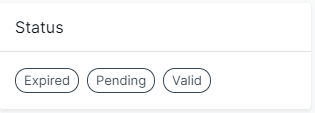
I sometimes come across scenarios where I want to display some Chips, or Buttons in a grid kind of layout like this
But I want to keep my component clean and reduced of margin/padding boxes. I don't always know what kind of component will be inside the box and I don't want to add CSS properties for each kind of element either. I usually use reacts Children to wrap the child components with a box component.
Bare in mind that use mui.
The first thing you might come to think about is doing something like this
function MyComponent(): JSX.Element {
    return (
        <CardContent>
            <Box mr={1] mb={1}>
                <Chip label="Expired" />
            </Box>
            <Box mr={1] mb={1}>
                <Chip label="Pending" />
            </Box>
            <Box mr={1] mb={1}>
                <Chip label="Valid" />
            </Box>
       </CardContent>
    );
}
And that works okay but it kind of hides what's important in this component, which is the <Chip /> components. The Material UI <Box /> component is just noise and it also adds extra nesting. And we don't like to much nesting, it's hard to read and even harder to review in a PR.
What we can do instead is to let our <CardContent /> add that <Box /> component around it childrens automatically with a thing called React.Children.
I've added an example from our codebase down below that uses Children which allows you to iterate all the children.
import { Children, isValidElement } from 'react';
// other imports

export default function CardWithPaddedContent(props: Props): JSX.Element {
    const classes = useStyles(props);
    const { children, ...rest } = props;

    const childrenWithPadding = Children.map(children, (child) => {
        if (!isValidElement(child)) {
            return null;
        }
        return <Box mb={1} mr={1}>{child}</Box>;
    });

    return (
        <CardContent {...rest} classes={classes} >
            {childrenWithPadding }
        </CardContent >
    );
}
The key part of this component is the part where I can iterate the children that gets passed to this component. I have to check if its a valid react element, if it isn't then I just return null otherwise I return the child wrapped in Material UIs <Box /> component with some bottom and right margin
Now we can go back to our original component and refactor it like this
function MyComponent(): JSX.Element {
    return (
        <CardWithPaddedContent>
            <Chip label="Expired" />
            <Chip label="Pending" />
            <Chip label="Valid" />
       </CardWithPaddedContent>
    );
}
And voilà! It looks so much cleaner and the DX get so much better because you can more easily see what's going on in this component.
Why don't add css styling to the <Chip /> component you might wonder
Well, I like to keep the small "dumb" component as dumb as they possible can be. They don't know in which context they will be used and adding margin/padding to them in this scenario will probably make them more complex.
Just add a padding/margin prop to the chip then
Could do that as well but I don't like that. A component should have as few props as possible or you can end up in a "aprocalypse" where small component have so many props that you after a while don't know whats what.

Oldest comments (0)