
Navigation menus are one of the most-viewed and most-clicked-on pieces of interface. Let’s look at some principles of nav design that will help our users have a better experience.
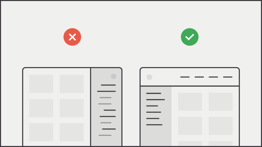
1) Placement matters
The web has developed a clear pattern for where navigation goes (very top, left side, or in the footer). When menus are placed outside of these areas, it feels awkward, confusing, and hard to find.
2) Show them where they are
Clearly communicate the user’s current location. Use multiple clues, like the ones below, to help them orient themselves. Our users should never have to wonder where they are.

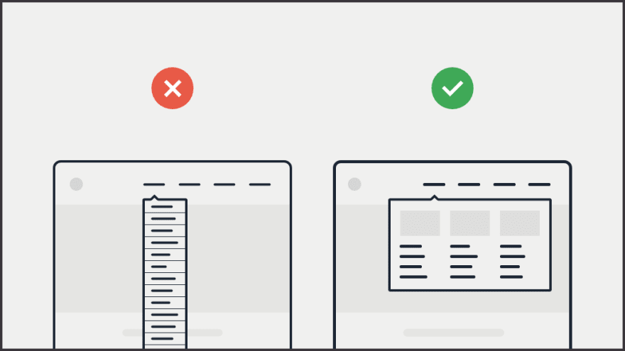
3) Mega menus vs. dropdowns
Research shows that mega menus provide a better experience than list dropdowns because they show everything at a glance, are able to utilize imagery, allow for better grouping, and feel more engaging.
4) Effective link titles
A user should be able to easily predict where a link will take them before they click it (this is called information scent). The single biggest factor in this is how good of a job we do at link labeling.

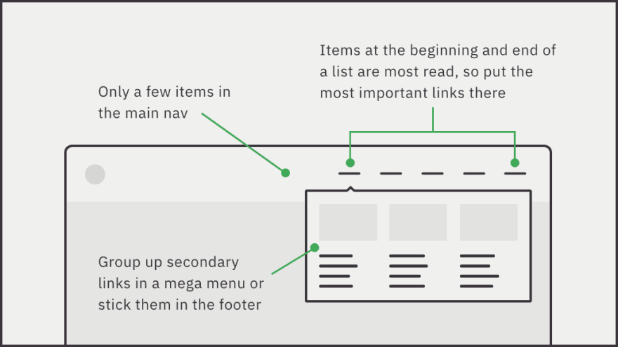
5) How many items?
The right number of items in your menu depends on a few things, like how complicated your product is or how savvy your users are. But try to get to fewer than 6 or 7 items. The order also matters.
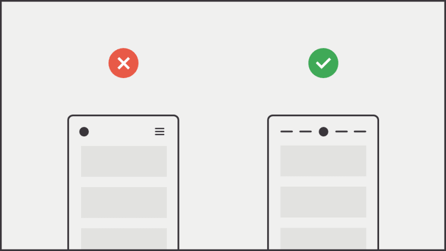
6) Don’t hide it
Navigation menus are one of the most-clicked-on pieces of interface, and they provide major contextual information to the user, so it should always be visible.
The default on mobile these days seems to be the hamburger menu, but there are alternatives that don't hide the nav completely: tabs, progressive collapsing, scrollable lists, and so on.
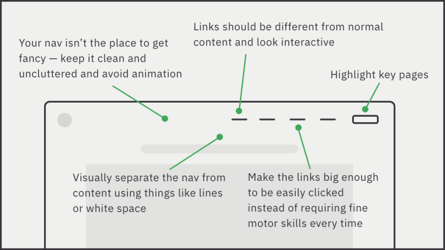
7) Visual design tips
Good UI design makes a big difference. Below are a few tips to create a better experience. When in doubt, test! And don’t forget about accessibility.
That's it! Thanks for reading. If you're feeling generous, perhaps share the thread on Twitter:
 Learn UXD@learn_uxd
 Navigation menus are one of the most-viewed and most-clicked-on pieces of interface.
Let’s look at some principles of nav design that will help our users have a better experience.11:56 AM - 08 Sep 2020


Top comments (0)