
Written by Sai Krishna✏️
Modals are very useful for quickly getting a user’s attention. They can be used to collect user information, provide an update, or encourage a user to take action. A study of 2 billion pop-ups revealed that the top 10 percent of performers had a conversion rate of over 9 percent.
However, I think it’s fair to say that modals can take some patience to build. it’s not easy to keep track of all the z-index values, the layers, and the DOM hierarchy. This difficulty also extends to other elements that need to be rendered at the top level, such as overlays or tooltips.
In React apps, a component or element is mounted into the DOM as a child of the nearest parent node. From top to bottom, the standard layer hierarchy is as follows: root node => parent nodes => child nodes => leaf nodes.
If the parent node has an overflow hidden property or has elements at higher layers, then the child cannot appear on the top layer and is limited to the parent node’s visible area. We can try setting a very high z-index value to bring the child to the top layer, but this strategy can be tedious and is not always successful.
This is where React Portals comes in. React Portals provides the ability for an element to render outside the default hierarchy without compromising the parent-child relationship between components.
In this article, we’ll demonstrate how to build a modal in React using React Portals. The methods used in this article can also be applied to building tooltips, full page top-level sidebars, global search overalls, or dropdowns within a hidden overflow parent container.
So, without further ado, let's get this magic started…
Getting started
Let’s start by creating a new React app with the Create React App boilerplate or your own React app setup.
# using yarn
yarn create react-app react-portal-overlay
# using npx
npx create-react-app react-portal-overlay
Next, change to the app directory and start the React app:
# cd into app directory
cd react-portal-overlay
# start using yarn
yarn start
# start using npm
npm run start
Components overview
We’ll create two components and render them within the already available app component from the boilerplate.
But first, here are some important definitions:
-
ReactPortal: a wrapper component that creates a Portal and renders content in the provided container outside the default hierarchy -
Modal: a basic modal component with JSX content to be rendered using theReactPortal -
App(any component): the location where we will use theModalcomponent and maintain its active state (open or closed)
Creating the React Portal
A React Portal can be created using createPortal from react-dom. It takes two arguments:
-
content: any valid renderable React element -
containerElement: a valid DOM element to which we can append thecontent
ReactDOM.createPortal(content, containerElement);
We’ll create a new component, ReactPortal.js, under the src/components directory and add this snippet:
// src/components/ReactPortal.js
import { createPortal } from 'react-dom';

function ReactPortal({ children, wrapperId }) {
  return createPortal(children, document.getElementById(wrapperId));
}
export default ReactPortal;
The ReactPortal component accepts the wrapperId property, which is the ID of a DOM element. We use this code to find an element with the provided ID and send it as a containerElement for the portal.
It’s important to note that the createPortal() function will not create the containerElement for us. The function expects the containerElement to already be available in the DOM. That’s why we must add it ourselves in order for the portal to render content within the element.
We can customize the ReactPortal component to create an element with the provided ID if such an element is not found in the DOM.
First, we add a helper function to create an empty div with a given id, append it to the body, and return the element.
function createWrapperAndAppendToBody(wrapperId) {
  const wrapperElement = document.createElement('div');
  wrapperElement.setAttribute("id", wrapperId);
  document.body.appendChild(wrapperElement);
  return wrapperElement;
}
Next, let’s update the ReactPortal component to use the createWrapperAndAppendToBody helper method:
// Also, set a default value for wrapperId prop if none provided
function ReactPortal({ children, wrapperId = "react-portal-wrapper" }) {
  let element = document.getElementById(wrapperId);
  // if element is not found with wrapperId,
  // create and append to body
  if (!element) {
    element = createWrapperAndAppendToBody(wrapperId);
  }

  return createPortal(children, element);
}
This method has a limitation. If the wrapperId property changes, the ReactPortal component will fail to handle the latest property value. To fix this, we need to move any logic that is dependent on the wrapperId to another operation or side effect.
Handling a dynamic wrapperId
The React Hooks useLayoutEffect and useEffect achieve similar results but have slightly different usage. A quick rule of thumb is to use useLayoutEffect if the effect needs to be synchronous and also if there are any direct mutations on the DOM. Since this is pretty rare, useEffect is usually the best option. useEffect runs asynchronously.
In this case, we’re directly mutating the DOM and want the effect to run synchronously before the DOM is re-painted, so it makes more sense to use the useLayoutEffect Hook.
First, let’s move the find element and creation logic into the useLayoutEffect Hook with wrapperId as the dependency. Next, we’ll set the element to state. When the wrapperId changes, the component will update accordingly.
import { useState, useLayoutEffect } from 'react';
// ...

function ReactPortal({ children, wrapperId = "react-portal-wrapper" }) {
  const [wrapperElement, setWrapperElement] = useState(null);

  useLayoutEffect(() => {
    let element = document.getElementById(wrapperId);
    // if element is not found with wrapperId or wrapperId is not provided,
    // create and append to body
    if (!element) {
      element = createWrapperAndAppendToBody(wrapperId);
    }
    setWrapperElement(element);
  }, [wrapperId]);

  // wrapperElement state will be null on very first render.
  if (wrapperElement === null) return null;

  return createPortal(children, wrapperElement);
}
Now, we need to address cleanup.
Handling effect cleanup
We are directly mutating the DOM and appending an empty div to the body in instances where no element is found. Therefore, we need to ensure that the dynamically added empty div is removed from the DOM when the ReactPortal component is unmounted. Also, we must avoid removing any existing elements during the cleanup process.
Let’s add a systemCreated flag and set it to true when createWrapperAndAppendToBody is invoked. If the systemCreated is true, we’ll delete the element from the DOM. The updated useLayoutEffect will look something like this:
// ...
  useLayoutEffect(() => {
    let element = document.getElementById(wrapperId);
    let systemCreated = false;
    // if element is not found with wrapperId or wrapperId is not provided,
    // create and append to body
    if (!element) {
      systemCreated = true;
      element = createWrapperAndAppendToBody(wrapperId);
    }
    setWrapperElement(element);

    return () => {
      // delete the programatically created element
      if (systemCreated && element.parentNode) {
        element.parentNode.removeChild(element);
      }
    }
  }, [wrapperId]);
// ...
We’ve created the portal and have customized it to be fail safe. Next, let’s create a simple modal component and render it using React Portal.
Building a demo modal
To build the modal component, we first create a new directory, Modal, under src/components and add two new files, Modal.js and modalStyles.css.
The modal component accepts a couple of properties:
-
isOpen: a Boolean flag that represents the modal’s state (open or closed) and is controlled in the parent component that renders the modal -
handleClose: a method that is called by clicking the close button or by any action that triggers a close
The modal component will render content only when isOpen is true. The modal component will return null on false, as we do not want to keep the modal in the DOM when it is closed.
// src/components/Modal/Modal.js
import "./modalStyles.css";

function Modal({ children, isOpen, handleClose }) {
  if (!isOpen) return null;

  return (
    <div className="modal">
      <button onClick={handleClose} className="close-btn">
        Close
      </button>
      <div className="modal-content">{children}</div>
    </div>
  );
}
export default Modal;
Styling the demo modal
Now, let’s add some styling to the modal:
/* src/components/Modal/modalStyles.css */
.modal {
  position: fixed;
  inset: 0; /* inset sets all 4 values (top right bottom left) much like how we set padding, margin etc., */
  background-color: rgba(0, 0, 0, 0.6);
  display: flex;
  flex-direction: column;
  align-items: center;
  justify-content: center;
  transition: all 0.3s ease-in-out;
  overflow: hidden;
  z-index: 999;
  padding: 40px 20px 20px;
}

.modal-content {
  width: 70%;
  height: 70%;
  background-color: #282c34;
  color: #fff;
  display: flex;
  align-items: center;
  justify-content: center;
  font-size: 2rem;
}
This code will make the modal occupy the full viewport and will center align the .modal-content both vertically and horizontally.
Closing the modal with the escape key
The modal may be closed by clicking the Close button, triggering handleClose. Let’s also add the ability to close the modal by pressing the escape key. To accomplish this, we’ll attach the useEffect keydown event listener. We’ll remove the event listener on the effect cleanup.
On a keydown event, we’ll invoke handleClose if the Escape key was pressed:
// src/components/Modal/Modal.js
import { useEffect } from "react";
import "./modalStyles.css";

function Modal({ children, isOpen, handleClose }) {
  useEffect(() => {
    const closeOnEscapeKey = e => e.key === "Escape" ? handleClose() : null;
    document.body.addEventListener("keydown", closeOnEscapeKey);
    return () => {
      document.body.removeEventListener("keydown", closeOnEscapeKey);
    };
  }, [handleClose]);

  if (!isOpen) return null;

  return (
    <div className="modal">
      <button onClick={handleClose} className="close-btn">
        Close
      </button>
      <div className="modal-content">{children}</div>
    </div>
  );
};

export default Modal;
Our modal component is now ready for action!
Escaping the default DOM hierarchy
Let’s render the demo Modal component in an app.
To control the modal’s open and close behavior, we’ll initialize the state isOpen with the useState Hook and set it to default to false. Next, we’ll add a button click, button onClick, that sets the isOpen state to true and opens the modal.
Now, we’ll send isOpen and handleClose as properties to the Modal component. The handleClose property is simply a callback method that sets the isOpen state to false in order to close the modal.
// src/App.js
import { useState } from "react";
import logo from "./logo.svg";
import Modal from "./components/Modal/Modal";
import "./App.css";

function App() {
  const [isOpen, setIsOpen] = useState(false);

  return (
    <div className="App">
      <header className="App-header">
        <img src={logo} className="App-logo" alt="logo" />
        <button onClick={() => setIsOpen(true)}>
          Click to Open Modal
        </button>

        <Modal handleClose={() => setIsOpen(false)} isOpen={isOpen}>
          This is Modal Content!
        </Modal>
      </header>
    </div>
  );
}

export default App;
The modal may be opened by clicking the Click to Open Modal button. The modal may be closed by pressing the escape key or by clicking the Close button. Either action will trigger the handleClose method and will close the modal.
If we take a look at the DOM tree, we see that the modal is rendered as a child to the header according to the default DOM hierarchy.
[caption id="attachment_89812" align="aligncenter" width="720"]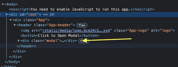 Modal built without
 ReactPortal.[/caption]
Let’s wrap the modal’s return JSX with ReactPortal so that the modal is rendered outside of the DOM hierarchy and within the provided container element. A dynamic container is appended as the last child of the body within the DOM.
The updated return method for the Modal component should look something like this:
// src/components/Modal/Modal.js
import ReactPortal from "../ReactPortal";
// ...

function Modal({ children, isOpen, handleClose }) {
  // ...

  return (
    <ReactPortal wrapperId="react-portal-modal-container">
      <div className="modal">
        // ...
      </div>
    </ReactPortal>
  );
}
// ...
Since we haven’t added a container with a react-portal-modal-container id, an empty div will be created with this id, and then it will be appended to the body. The Modal component will be rendered inside this newly created container, outside of the default DOM hierarchy. Only the resulting HTML and the DOM tree are changed.
The React component’s parent-child relationship between the header and Modal component remains unchanged.
[caption id="attachment_89814" align="aligncenter" width="720"] Modal built with
 ReactPortal.[/caption]
As shown below, our demo modal renders correctly, but the opening and closing of its UI feels too instantaneous:
[caption id="attachment_89816" align="aligncenter" width="720"] Modal built without
 CSSTransition.[/caption]
Applying transition with CSSTransition
To adjust the transition of the modal’s opening and closing, we can remove the return null when the Modal component is closed. We can control the modal’s visibility through CSS, using the opacity and transform properties and a conditionally added class, show/hide.
This show/hide class can be used to set or reset the visibility and use transition property to animate the opening and closing. This works well, except that the modal remains in the DOM even after closing.
We can also set the display property to none, but this has the same result as the return null. Both properties instantly remove the element from the DOM without waiting for the transitions or animations to complete. This is where the [CSSTransition] component comes to the rescue.
By wrapping the element to be transitioned in the [CSSTransition] component and setting the unmountOnExit property to true, the transition will run, and then the element will be removed from the DOM once the transition is complete.
First, we install the react-transition-group dependency:
# using yarn
yarn add react-transition-group
# using npm
npm install react-transition-group
Next, we import the CSSTransition component and use it to wrap everything under ReactPortal in the modal’s return JSX.
The trigger, duration, and styles of the component can all be controlled by setting the CSSTransition properties:
-
in: Boolean flag that triggers the entry or exit states -
timeout: duration of the transition at each state (entry, exit, etc.) -
unmountOnExit: unmounts the component after exiting -
classNames: class name will be suffixed for each state (entry, exit, etc.) to give control over CSS customization -
nodeRef: a React reference to the DOM element that needs to transition (in this case, the rootdivelement of theModalcomponent)
A ref can be created using the useRef Hook. This value is passed to CSSTransition's nodeRef property. It is attached as a ref attribute to the Modal's root div to connect the CSSTransition component with the element that needs to be transitioned.
// src/components/Modal/Modal.js
import { useEffect, useRef } from "react";
import { CSSTransition } from "react-transition-group";
// ...

function Modal({ children, isOpen, handleClose }) {
  const nodeRef = useRef(null);
  // ...

  // if (!isOpen) return null; <-- Make sure to remove this line.

  return (
    <ReactPortal wrapperId="react-portal-modal-container">
      <CSSTransition
        in={isOpen}
        timeout={{ entry: 0, exit: 300 }}
        unmountOnExit
        classNames="modal"
        nodeRef={nodeRef}
      >
        <div className="modal" ref={nodeRef}>
          // ...
        </div>
      </CSSTransition>
    <ReactPortal wrapperId="react-portal-modal-container">
  );
}
// ....
Next, let’s add some transition styling for the state prefixed classes, modal-enter-done and modal-exit, added by the CSSTransition component:
.modal {
  ...
  opacity: 0;
  pointer-events: none;
  transform: scale(0.4);
}

.modal-enter-done {
  opacity: 1;
  pointer-events: auto;
  transform: scale(1);
}
.modal-exit {
  opacity: 0;
  transform: scale(0.4);
}

...
The opening and closing of the demo modal’s UI now appears smoother, and this was achieved without compromising the load on the DOM:
[caption id="attachment_89818" align="aligncenter" width="720"] Modal built with
 CSSTransition.[/caption]
Conclusion
In this article, we demonstrated the functionality of React Portals with a React Portal modal example. However, the application of React Portals is not limited to only modals or overlays. We can also leverage React Portals to render a component on top of everything at the wrapper level.
By wrapping the component’s JSX or the component itself with ReactPortal, we can skip the default DOM hierarchy behavior and get the benefits of React Portals on any component:
import ReactPortal from "./path/to/ReactPortal";

function AnyComponent() {
  return (
    <ReactPortal wrapperId="dedicated-container-id-if-any">
      {/* compontents JSX to render */}
    </ReactPortal>
  );
}
That’s all for now! You can find this article’s final components and styles in this GitHub repo, and access the final [ReactPortal] and modal components in action here.
Thank you for reading. I hope you found this article helpful. Please share it with others who may find it beneficial. Ciao!
Full visibility into production React apps
Debugging React applications can be difficult, especially when users experience issues that are hard to reproduce. If you’re interested in monitoring and tracking Redux state, automatically surfacing JavaScript errors, and tracking slow network requests and component load time, try LogRocket.

LogRocket is like a DVR for web and mobile apps, recording literally everything that happens on your React app. Instead of guessing why problems happen, you can aggregate and report on what state your application was in when an issue occurred. LogRocket also monitors your app's performance, reporting with metrics like client CPU load, client memory usage, and more.
The LogRocket Redux middleware package adds an extra layer of visibility into your user sessions. LogRocket logs all actions and state from your Redux stores.
Modernize how you debug your React apps — start monitoring for free.

Oldest comments (0)